

Every tap, swipe, and notification on a mobile screen demands a slice of your user's limited working memory. When an app throws too many choices, animations, and alerts at once, the brain simply shuts down and the user leaves. Reducing cognitive overload is not about dumbing things down but about designing interfaces that respect how human attention actually works. This article walks through concrete strategies, real app examples, and a ready-to-use checklist for building mobile experiences that feel effortless.

- Cognitive overload happens when an interface demands more mental processing than a user's working memory can handle, leading to errors, frustration, and abandonment.
- Minimalist layouts, intuitive navigation patterns, and restrained notification strategies are the three pillars that keep cognitive load manageable.
- Applying these principles consistently improves both user satisfaction and measurable engagement metrics like session length and task completion rate.
Why cognitive overload kills mobile UX
A desktop browser gives you a wide canvas. A mobile screen gives you roughly 6 inches. Cramming the same information density into that space forces users to hold too many items in short-term memory at once. Psychologist George Miller's classic research suggests working memory handles about 7 (plus or minus 2) chunks of information. Most mobile screens that trigger abandonment blow past that limit within the first scroll.
The consequences are measurable. Users who feel overwhelmed close the app, uninstall it, or simply never return. For designers, the challenge is clear: every element on screen must earn its place.
Cognitive overload in mobile design shows up as:
- Decision paralysis from too many options on one screen
- Missed actions because the user cannot find the primary button
- Repeated errors in forms that ask for too much input at once
- Notification fatigue that trains users to ignore all alerts
Minimalism that actually works

Minimalist design does not mean stripping an app down to a blank screen. It means giving each screen a single clear purpose and removing anything that distracts from it.
Consider how the Calm meditation app handles its home screen. Instead of listing every feature, it presents one daily recommendation, a simple play button, and a short greeting. The rest of the library lives behind a single tab. Users complete their primary task (start a session) without scanning a grid of 30 options.
Practical principles for minimalist mobile interfaces:
- One primary action per screen. If a screen has two equally prominent buttons, neither gets clicked reliably.
- Progressive disclosure. Show advanced settings only after the user asks for them. The iOS Settings app nests detail screens behind simple labels instead of exposing every toggle at once.
- Whitespace as a tool. Generous padding between elements reduces visual noise and guides the eye to what matters.
- Consistent color hierarchy. Use one accent color for interactive elements. When everything is colorful, nothing stands out.
Top-rated apps in the App Store and Google Play tend to use less than half the available screen space for interactive elements. The rest is whitespace, imagery, or contextual text. That restraint is deliberate.
Design intuitive navigation

Navigation is where cognitive load compounds fastest. Every extra tap a user needs to reach their goal adds friction and drains mental energy.
Tab bars remain the gold standard for mobile navigation because they keep top-level destinations visible at all times. Apps like Spotify, Instagram, and Google Maps all use a bottom tab bar with 4 to 5 items. That number is not accidental. It sits comfortably within working memory limits.
Key navigation patterns that reduce cognitive load:
- Bottom tab bar with no more than 5 items. Labels under icons eliminate guessing.
- Breadcrumb-style back navigation. Users should always know where they are and how to go back.
- Search as a shortcut. For content-heavy apps, a persistent search bar lets users skip hierarchical browsing entirely. Airbnb places search front and center on launch.
- Gesture consistency. Swipe-to-go-back should work the same way on every screen. Breaking gesture expectations forces users to relearn the interface mid-task.
| Confusing Navigation | Intuitive Navigation |
|---|---|
| Hamburger menu hiding all options | Bottom tab bar with labeled icons |
| Deep nested menus (4+ levels) | Flat hierarchy (2 levels max) |
| Inconsistent back behavior | Predictable swipe-to-go-back |
| No search on content-heavy screens | Persistent search bar |
| Icon-only tabs without labels | Icon + text label on every tab |
"The most effective UX designs balance visual appeal with ease of use, effectively managing cognitive overload.">, Ease Cognitive Overload in UX Design
Tame your notifications
Notifications are the fastest way to burn through a user's goodwill. A single poorly timed or irrelevant push notification can trigger an uninstall. The goal is to send fewer, better alerts.
Best practices for notification management:
- Ask permission with context. Explain why the app needs to send notifications before the system prompt appears. Apps that show a pre-permission screen with a clear benefit statement see opt-in rates 2 to 3 times higher.
- Categorize and let users choose. Slack lets users mute specific channels. Duolingo lets users pick reminder times. Granular control reduces the feeling of being bombarded.
- Batch non-urgent updates. Instead of 8 separate social notifications, show one summary: "3 friends liked your post."
- Respect quiet hours. Android and iOS both offer focus modes. Apps that honor these system settings build trust.
Nearly half of users disable push notifications within the first week of installing an app. That stat alone should make notification restraint a design priority.
Apps that get it right

Real examples ground these principles. Here are three apps that handle cognitive load well:
Google Maps strips the driving interface down to the next turn instruction, estimated arrival time, and a simplified map. All other controls hide behind a swipe-up panel. The user's working memory handles exactly one task: follow the next direction.
Todoist uses progressive disclosure effectively. The main view shows task names and due dates. Subtasks, labels, and comments appear only when you tap into a specific item. New users are not overwhelmed by features they have not learned yet.
Headspace onboards new users with a single guided session instead of a feature tour. Each screen during onboarding contains one sentence and one button. The app teaches by doing, not by explaining.
The common thread: these apps identify the user's primary job-to-be-done and protect it from distraction.
Implement these strategies step by step
Here is a practical workflow for auditing and improving cognitive load in a mobile app interface. The diagram below summarizes the process at a glance.
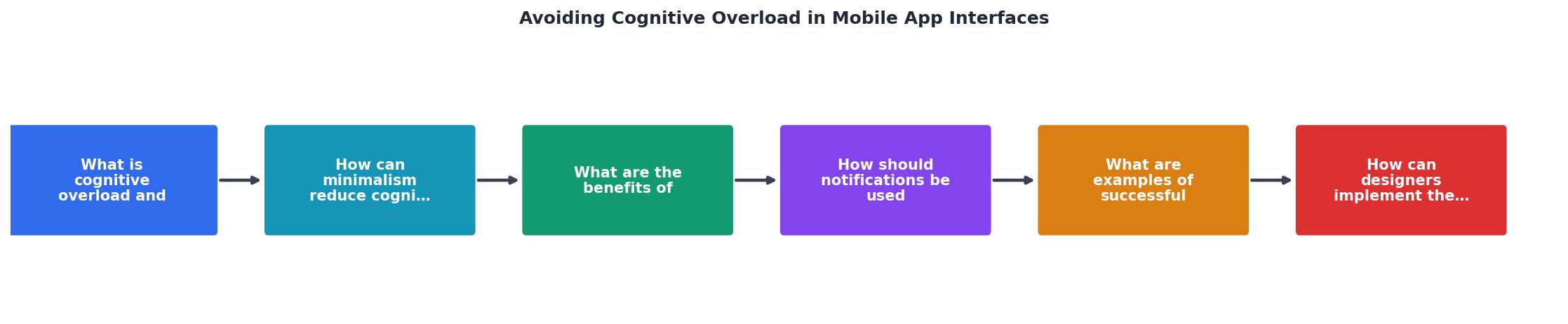
The steps break down as follows:
- Audit screens for element count. List every interactive and informational element on each screen.
- Identify primary action. Each screen should have exactly one. If you find two, split the screen or demote one action.
- Apply progressive disclosure. Move secondary options behind taps, swipe gestures, or expandable sections.
- Simplify navigation. Flatten your hierarchy. If users need more than 2 taps to reach any core feature, restructure.
- Review notifications. Categorize every notification type. Cut anything that does not directly serve the user's goal.
- Test with real users. Run a 5-second test: show a screen for 5 seconds, then ask what the user remembers. If they cannot recall the primary action, the screen is too busy.
The following interactive card shows an example breakdown of cognitive load factors across a typical mobile app audit:
Cognitive Load Audit: Example App
Checklist: Designing Cognitively Accessible Mobile Interfaces
Your progress is saved automatically in your browser.
FAQ
Frequently Asked Questions
Additional Resources
- Ease Cognitive Overload in UX Design - Learn how taxing working memory causes cognitive overload and ways to improve UX design for a better user experience.
- Minimize Cognitive Load to Maximize Usability - Minimizing Cognitive Load · Avoid visual clutter: redundant links, irrelevant images, and meaningless typography flourishes slow users down.
- Cognitive Overload & Feature Discovery in Mobile UX - The solution to cognitive load in Mobile Apps has been to “dumb-things-down”. A well-designed mobile App should assume the user's IQ is halved: ...