
You spent real money getting visitors to your site. They clicked, they landed, they looked around for eight seconds, and they left. Not because your product was wrong for them, but because your page made their brain work too hard. Cognitive accessibility fixes that gap, and the payoff goes far beyond a single conversion. It turns confused visitors into loyal, returning customers.
- Cognitive accessibility removes the mental friction that drives customers away after their first visit.
- Simplifying user journeys, personalizing content, and writing with clarity directly increase repeat usage and loyalty.
- These are not expensive redesigns. They are targeted, measurable changes that compound over time into higher lifetime value.
The link between clarity and loyalty
Customer retention is cheaper than acquisition. Everyone knows this. Yet most retention strategies focus on email sequences, loyalty programs, and discount codes. They ignore the most fundamental reason people stop coming back: the experience was confusing.
Cognitive accessibility means designing digital experiences that work for how human brains actually process information. That includes people with ADHD, dyslexia, anxiety, low digital literacy, and also every single person who is tired, distracted, or multitasking. When your site is cognitively accessible, visitors understand what you offer, find what they need, and complete tasks without frustration. They come back because the experience felt effortless.
That number is not a guess. Nearly half of all visitors encounter cognitive barriers on typical websites. Every one of those visitors is a retention opportunity you are currently losing.
"Most accessibility improvements don't just help people with disabilities, they help everyone.">, How accessibility improves customer retention
Simplify user journeys

A returning customer should not have to re-learn your interface every time they visit. Consistency and simplicity in user journeys are the foundation of cognitive accessibility for retention.
Here is what actually works:
- Reduce decision points. Every fork in a user flow is a place where someone can get confused and leave. Stripe's checkout flow succeeds because it asks for exactly what it needs and nothing else. Three fields, one button, done.
- Use progressive disclosure. Show only the information relevant to the current step. Notion does this well: new users see a clean workspace, and advanced features reveal themselves as usage grows.
- Keep navigation predictable. If your main menu changes between pages, or if the back button leads somewhere unexpected, you are training users to distrust your interface. Amazon keeps its navigation bar identical across billions of product pages for a reason.
- Provide clear status indicators. Show users where they are in a process. A progress bar on a multi-step form reduces abandonment because it answers the question "how much longer?" before the user has to ask.
The data backs this up. Sites that reduce cognitive friction in their core flows see significantly higher return rates within the first 30 days.
Personalize content without overload

Personalization and cognitive accessibility seem like they could conflict. More personalization means more data, more dynamic content, more complexity. But done right, personalization reduces cognitive load by showing people only what is relevant to them.
Spotify's Discover Weekly is a textbook example. Instead of dumping 100 million songs on users and saying "find something you like," Spotify curates 30 tracks based on listening history. The cognitive load drops from overwhelming to manageable. Users come back every Monday.
Practical personalization strategies that reduce cognitive load:
- Remember user preferences. If a customer always buys medium-roast coffee, show medium-roast first. Do not make them scroll past 47 options every time.
- Adapt language complexity. Some users respond to technical detail; others want plain summaries. Tools like PagePerson Insights can identify where your content creates comprehension barriers for different audience segments.
- Surface recent activity. A "continue where you left off" section eliminates the mental effort of remembering what the user was doing last time. Netflix, Duolingo, and LinkedIn all use this pattern.
- Limit recommendations. Three to five suggestions outperform twenty. The paradox of choice is real, and it kills retention.
Clear communication cuts cognitive load
Confusing copy is the silent retention killer. A customer who cannot understand your pricing page will not email support to ask for clarification. They will leave and find a competitor whose pricing makes sense.
Cognitive load in communication comes from three sources:
- Jargon. Using internal terminology that customers do not share. Basecamp famously rewrote their marketing to eliminate every piece of project-management jargon. Signups increased.
- Ambiguity. Phrases like "flexible pricing" or "enterprise-grade" mean nothing specific. Replace them with "starts at $29/month" and "99.9% uptime SLA."
- Visual clutter. Walls of text, inconsistent formatting, and competing calls to action all increase the effort required to extract meaning from a page.
| High Cognitive Load | Low Cognitive Load |
|---|---|
| "Leverage our synergistic platform" | "Manage projects in one place" |
| 12 font sizes on one page | 3 consistent heading levels |
| 4 competing CTAs above the fold | 1 primary action per screen |
| Dense paragraphs, no whitespace | Short paragraphs, clear hierarchy |
| Color-coded system with no legend | Labels on every element |
Writing clearly is not dumbing things down. It is respecting your reader's time and attention. Every sentence on your site should pass a simple test: would a smart person who has never heard of your product understand this on the first read?
Brands that retain through accessibility

Real companies have built retention advantages through cognitive accessibility. These are not charity projects. They are business decisions that paid off.
GOV.UK redesigned the entire British government web presence around plain language and simple navigation. The result: task completion rates jumped above 80%, and repeat usage increased because citizens could actually accomplish what they came to do. The design system they created is now used as a reference worldwide.
Mailchimp invested heavily in their content design system. Every piece of interface copy follows readability guidelines. Error messages explain what went wrong and what to do next, in plain language. Their churn rate among small business users stayed consistently lower than competitors who treated UX writing as an afterthought.
IKEA's online store uses consistent iconography, minimal text, and visual step-by-step assembly instructions that transcend language barriers. Their repeat purchase rate online reflects the same "I know how this works" comfort that drives in-store loyalty.
The pattern across all three: they made the experience predictable, understandable, and low-effort. Customers returned because they trusted the experience would work.
How to implement these strategies
This is where the plan below comes together. The process follows five steps, each building on the previous one.
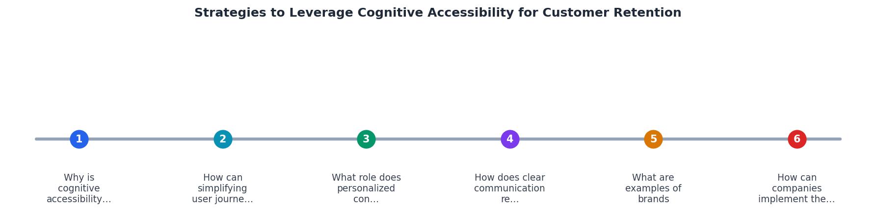
The five steps are: Audit, Prioritize, Simplify, Personalize, and Measure. Here is what each involves:
- Audit your current experience for cognitive barriers. Walk through your top user flows as if you have never seen the product before. Tools like PagePerson Insights can automate this by flagging comprehension issues, confusing layouts, and conversion barriers across your pages.
- Prioritize fixes by impact. Start with the pages that get the most traffic and have the highest drop-off. A confusing checkout page costs more than a confusing blog post.
- Simplify the highest-impact flows first. Cut unnecessary steps, rewrite unclear copy, remove visual clutter. Each change should be small enough to ship in a day.
- Personalize where it reduces effort. Add "recently viewed" sections, remember preferences, and adapt content depth to user behavior.
- Measure retention metrics before and after. Track 7-day and 30-day return rates, task completion rates, and support ticket volume. If cognitive load went down, all three should improve.
Retention Impact by Strategy
Example: relative improvement in 30-day return rates observed when each strategy is applied to a typical SaaS landing page.
Cognitive Accessibility Retention Improvement Plan
Your progress is saved automatically in your browser.
FAQ
Frequently Asked Questions
Additional Resources
- How accessibility improves customer retention - Have you thought about accessibility as a part of retaining customers? As all of us age, we start to experience some diminishment of abilties.
- Data-Driven Customer Retention Strategies for 2025 - Customer retention strategies that work · Consistent value delivery · Personalization at scale · Effective loyalty programs · Educate and empower ...
- 5 UX best practices: Customer retention strategies for SaaS - Conduct usability tests: Observe users interacting with your product to uncover frustrations. · Analyze user feedback: Actively seek input ...