

Your product site exists in four languages. You translated every string, localized the currency, and swapped the date format. Yet conversion in three of those markets trails the English version by 30% or more. The gap is not a translation problem. It is a cognitive accessibility problem, and fixing it does not require a redesign or a new CMS.

- Translating content is not the same as making it cognitively accessible across languages.
- Multilingual sites introduce unique cognitive barriers: inconsistent reading patterns, mixed metaphors, untranslated microcopy, and culturally mismatched layouts.
- A structured audit of cognitive load per locale, combined with plain-language rewrites and consistent navigation, closes the conversion gap without rebuilding anything.
The real cost of ignoring cognitive load
Most founders treat localization as a checkbox. Ship the English site, run it through a translation layer, done. But cognitive accessibility goes deeper than word-for-word accuracy. It asks: can a visitor in this language, with this cultural context, actually understand what to do next?
That number covers all disability types, and a significant portion involves cognitive, learning, or neurological conditions. Now multiply that across every locale your site serves. Each language brings its own reading direction, sentence length norms, and expectations for how information is structured.
A German visitor expects compound nouns and dense paragraphs. A Japanese visitor expects whitespace and visual hierarchy. A Spanish visitor reads 20% more words per sentence on average than an English one. If your translated site just mirrors the English layout, you are forcing every other audience to work harder. Harder means slower. Slower means fewer conversions.
"According to the Centers for Disease Control and Prevention (CDC), "more than 28.7% of adults in the United States have a disability" and 13.9% of U.S.">, Designing Digital Content For Users With Cognitive Disabilities
Common mistakes that kill conversions

Here are the patterns I see repeatedly on multilingual product sites:
- Machine-translated microcopy. The hero headline gets a professional translation. The button text, error messages, tooltips, and form labels get Google Translate. Visitors notice the quality gap instantly, and it erodes trust.
- Identical layout across locales. English is compact. German is roughly 30% longer. Arabic reads right-to-left. Cramming every language into the same grid creates overflow, truncation, and visual chaos.
- Culturally mismatched metaphors. A "shopping cart" icon works in the US. In parts of Asia, a "basket" is more intuitive. Color associations differ too: red signals danger in Western markets but luck in Chinese contexts.
- No plain-language pass. The English copy was already dense. The translation preserved that density. Nobody asked: does a non-native speaker with moderate English, or a native speaker with dyslexia, actually parse this?
- Inconsistent navigation labels. The French version says "Tarifs" but the URL slug says
/pricing. The Spanish version uses "Precios" in the nav but "Planes" on the page. These mismatches create cognitive friction that compounds across every click.
Step-by-step cognitive audit
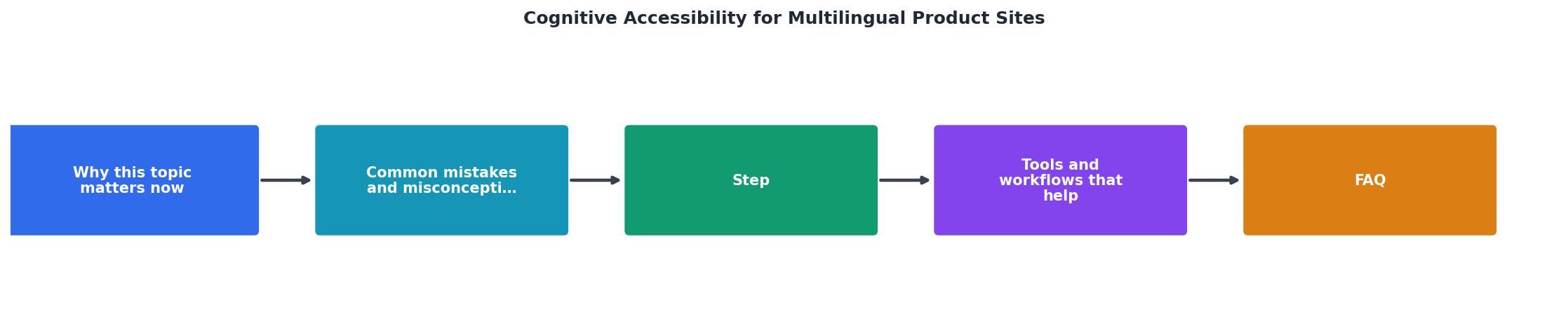
Follow these steps for each locale your site supports. The labels match the diagram above.
1. Inventory all text layers
List every text element on your key pages: headlines, body copy, CTAs, form labels, error messages, tooltips, footer links, and legal text. Most teams discover that 15-25% of microcopy was never translated at all.
2. Score reading complexity
Run each locale's copy through a readability tool appropriate for that language. For English, use the Flesch-Kincaid grade level. For German, use the Lesbarkeitsindex (LIX). For Spanish, the Fernandez-Huerta formula. Target a reading level equivalent to age 12-14 in every language.
3. Check layout overflow
Resize every translated string into the actual UI component. Flag any text that truncates, wraps awkwardly, or breaks the visual hierarchy. German and Finnish are notorious for long compound words that blow out button widths.
4. Validate navigation consistency
Confirm that navigation labels, breadcrumbs, and URL slugs align within each locale. A visitor who clicks "Fonctionnalités" should land on a page titled "Fonctionnalités," not "Features."
5. Test with real users per locale
Even three users per language reveal the biggest cognitive barriers. Ask them to complete one task (sign up, find pricing, submit a form) while thinking aloud. Record where they pause, re-read, or express confusion.
6. Fix, measure, repeat
Prioritize fixes by conversion impact. Rewrite dense copy in plain language. Adjust layouts per locale. Re-measure conversion rates after each round of changes.
Tools and workflows that help

You do not need a massive budget. Here is what actually works:
- Crowdin or Phrase for translation management with context screenshots, so translators see where their text appears.
- Hemingway Editor (English) or TextLab (German) for readability scoring before publishing.
- Pseudo-localization in your dev pipeline. Tools like
pseudolocalizeexpand strings by 30-40% with accented characters, exposing layout breakage before real translations arrive. - PagePerson Insights to scan each locale for cognitive accessibility barriers. It flags where visitors with ADHD, dyslexia, or low digital literacy are likely to struggle, giving you specific elements to fix rather than vague heatmap data.
- Figma with locale-specific frames. Duplicate your design for each language. This forces designers to account for text expansion and cultural layout differences at the design stage, not after launch.
| Translation-Only Approach | Cognitive Accessibility Approach |
|---|---|
| Same layout for all locales | Layout adapted per language |
| Machine-translated microcopy | Human-reviewed plain language |
| No readability testing | Readability scored per locale |
| Bugs found post-launch | Pseudo-localization catches issues early |
| Conversion gap across markets | Consistent conversion rates |
Measuring what matters

Track these metrics per locale, not just globally:
- Task completion rate for key flows (signup, checkout, contact form).
- Time on task compared to the English baseline. If the German version takes 40% longer, cognitive load is the likely culprit.
- Error rate on forms. Mistranslated or unclear labels cause input errors. High error rates in one locale point directly to a copy problem.
- Bounce rate on landing pages segmented by language. A 15-point bounce rate gap between English and French versions is a signal, not noise.
The following dashboard card shows an example of how locale-specific metrics might look for a typical SaaS product site serving four markets. These numbers represent a common pattern where the primary English locale outperforms translated versions due to cognitive accessibility gaps.
Example: Locale Conversion Dashboard (SaaS Product)
When the French locale takes 61 seconds for a task that English users complete in 38 seconds, the problem is not motivation. It is comprehension. That 23-second gap represents cognitive friction you can eliminate.
Plain language is not dumbing down
One objection I hear constantly: "If we simplify the copy, it will sound unprofessional." This confuses complexity with credibility. Plain language means shorter sentences, common words, and one idea per paragraph. It does not mean removing technical depth.
Stripe's documentation is a good example. Their API docs are technically precise and written at a 9th-grade reading level. They work in every language Stripe supports because the source material is already clear. Dense, jargon-heavy copy does not translate well. Clear copy does.
Multilingual Cognitive Accessibility Audit
Your progress is saved automatically in your browser.
FAQ
Frequently Asked Questions
What is the biggest cognitive accessibility gap you have found between your English site and another locale? I would like to hear what surprised you.
Additional Resources
- Designing Digital Content For Users With Cognitive ... - Complex language can cause cognitive overload, leading fusion reduce cognitive overload. Use simple and consistent layouts with clear navigation
- Making Content Usable for People with Cognitive and ... - Design, structure, and language choices can make content inaccessible to people with cognitive and learning disabilities. Examples may include:.
- Best Strategies for Cognitive Accessibility in Digital Design - Enhancing cognitive accessibility involves streamlining website language and instructions to cater to users with mental disabilities. This ...