
Most accessibility work stops at contrast ratios and alt text. The cognitive layer, how people actually process, understand, and act on what they see, gets ignored. That gap is exactly where the most creative UX breakthroughs happen, because designing for cognitive diversity forces you to rethink assumptions that have been baked into interfaces for decades.
- Cognitive accessibility goes beyond WCAG visual checks to address how users with ADHD, dyslexia, anxiety, and cognitive load actually comprehend interfaces.
- Designing for these constraints produces innovations that benefit every user: clearer flows, simpler language, reduced decision fatigue.
- Companies like Microsoft, Apple, and Gov.uk have shipped features born directly from cognitive accessibility research, improving satisfaction and conversion across the board.
What cognitive accessibility actually means
Accessibility in UX typically conjures images of screen readers and color contrast checkers. Cognitive accessibility is different. It focuses on whether a person can perceive, understand, remember, and act on the information presented to them.
Think about a user with ADHD trying to complete a multi-step checkout. Or someone with dyslexia parsing a wall of justified text. Or an anxious first-time buyer scanning a pricing page with 47 feature comparisons. These are not edge cases. They represent a significant portion of your audience.
Key principles of cognitive accessibility in UX design:
- Predictability - Consistent navigation, expected element placement, no surprise modals.
- Simplicity - Plain language, short sentences, one idea per paragraph.
- Supportive error handling - Clear error messages that explain what went wrong and what to do next.
- Reduced cognitive load - Fewer choices per screen, progressive disclosure, chunked information.
- Multiple input/output modes - Text, audio, visual cues working together, not competing.
- Adequate time - No countdown timers that create panic, generous session lengths.
How constraints spark creativity

Constraints breed invention. When you cannot rely on dense text to explain a feature, you design better visual cues. When you cannot assume users will remember context from three screens ago, you build persistent state indicators. When you cannot use jargon, you write copy that converts better for everyone.
This is the paradox of cognitive accessibility: the limitations it imposes on design produce solutions that outperform the "unrestricted" originals.
Consider progressive disclosure. This pattern, showing only what the user needs at each step, emerged partly from cognitive load research. It is now a standard best practice in form design, onboarding flows, and settings panels. Nobody calls it an "accessibility feature" anymore. It is just good design.
The same story repeats with plain language guidelines. Gov.uk rewrote its entire content strategy around a reading-age target of 9. The result was not a dumbed-down site. It was a site that reduced support calls, increased task completion, and became a global benchmark for government digital services.
Real-world innovations from accessibility

Three companies stand out for turning cognitive accessibility research into shipped features that changed their products.
Microsoft built Immersive Reader into Edge, Word, OneNote, and Teams. It strips away visual clutter, adjusts text spacing, highlights parts of speech, and reads content aloud. Originally designed for users with dyslexia and learning disabilities, it became one of the most-used features in Microsoft Education. Millions of neurotypical users rely on it daily for focus and comprehension.
Apple introduced Focus modes in iOS 15, letting users filter notifications, apps, and home screen layouts by context. The feature directly addresses attention management, a core cognitive accessibility concern. It reduced notification overload for users with ADHD and became a mainstream productivity tool adopted by tens of millions.
Slack redesigned its notification system after research showed that constant pings created anxiety and reduced productivity. The "Do Not Disturb" schedules, notification grouping, and channel-level muting all trace back to cognitive load research. These features now define how modern team communication tools work.
None of these started as "accessibility projects" in the traditional sense. They started with the question: What makes this hard to understand or act on? That question is the engine of cognitive accessibility, and it produces features that scale to every user.
What designers say about the approach
"Human skills like empathy, research, systems thinking, and ethical decision-making are more important than ever.">, Accessibility in UX: The case for radical empathy
This quote captures something that tooling alone cannot solve. Automated accessibility checkers catch contrast failures and missing labels. They do not catch a confusing onboarding flow, an ambiguous button label, or a pricing page that overwhelms users with choices.
Designers who practice cognitive accessibility develop a sharper instinct for clarity. They ask different questions during design reviews:
- "Can a first-time user complete this without reading the help docs?"
- "Does this screen ask the user to hold more than 3 things in working memory?"
- "If someone is stressed or distracted, will they still understand what to do next?"
The following dashboard illustrates how cognitive accessibility improvements typically affect key UX metrics. These numbers represent a composite scenario based on common patterns observed after teams prioritize cognitive accessibility in their design process.
Cognitive Accessibility Impact Dashboard
How to integrate cognitive accessibility

Knowing the principles is one thing. Embedding them into a team's workflow is another. Here is a process that works without requiring a dedicated accessibility team or a massive budget.
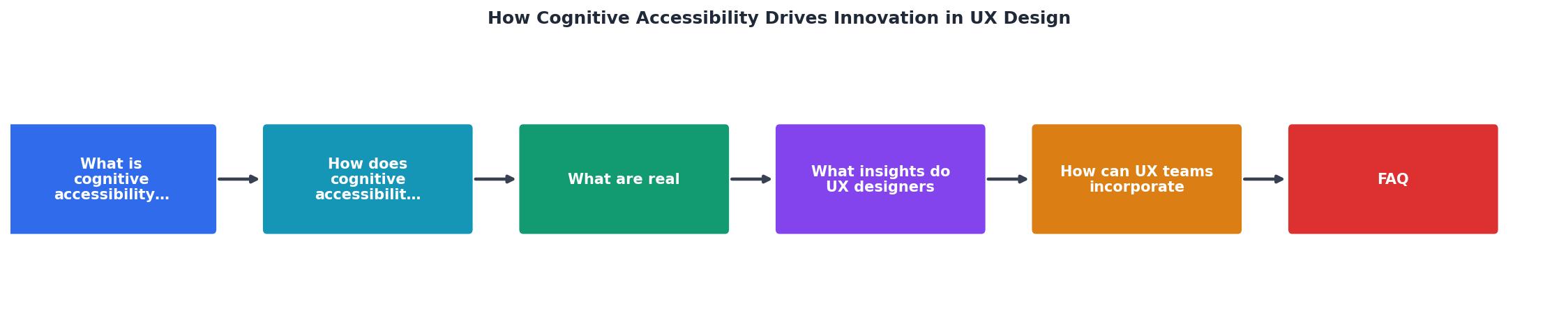
The process follows five steps: Audit existing flows for cognitive barriers, Prioritize by user impact and effort, Redesign with cognitive principles applied, Test with diverse users including those with cognitive differences, and Iterate based on comprehension metrics, not just click data.
Start with the highest-traffic, highest-value flows. A checkout page, an onboarding sequence, a pricing page. These are where cognitive barriers cost you the most.
Tools like PagePerson Insights can surface cognitive accessibility issues that standard audit tools miss, showing you where real visitors struggle with comprehension and what specific barriers cause drop-off.
Cognitive Accessibility Integration Checklist for UX Teams
Your progress is saved automatically in your browser.
FAQ
Frequently Asked Questions
Additional Resources
- Accessibility in UX: The case for radical empathy - Designing with accessibility in mind enables people with a range of abilities and disabilities to perceive, understand, navigate, interact with, and contribute ...
- Give Users' Brains a Break: UX Tips for Cognitive ... - Quickly finding the right information reduces cognitive load. A user shouldn't have to puzzle out website navigation or hunt for what they need.
- Cognitive Accessibility: A New Frontier in UX Design - Cognitive Accessibility is becoming one of the most important aspects of modern UX and most teams still don't realise it.