

Every visitor who lands on your website has a limited budget of mental energy. When your page burns through that budget with cluttered layouts, ambiguous copy, or too many choices, visitors leave before they convert. The fix is not more A/B tests on button colors. The fix is reducing the cognitive effort your site demands so the same traffic produces more signups, purchases, and engagement.

- Cognitive load is the mental effort required to use your website. When it is too high, bounce rates climb and conversions drop.
- Simplifying navigation, reducing choices, and clarifying copy can cut bounce rates by double digits and lift time-on-page significantly.
- You do not need a redesign. Targeted, evidence-based changes to layout, content, and interaction patterns deliver measurable metric improvements.
What is cognitive load?
Cognitive load refers to the total amount of working memory a person uses while processing information. Psychologist John Sweller introduced the concept in 1988 to explain why learners struggle when instructional materials are poorly structured. The same principle applies to websites: every element on a page competes for a visitor's limited working memory.
Three types matter for web design:
- Intrinsic load comes from the complexity of the task itself (comparing insurance plans is inherently harder than reading a blog post).
- Extraneous load comes from poor design: confusing navigation, inconsistent icons, walls of text, auto-playing videos.
- Germane load is the productive effort a visitor spends actually understanding your offer and making a decision.
That number is not surprising when you think about your own browsing habits. If a page makes you work to find the answer, you hit the back button.
How cognitive load affects metrics

High cognitive load shows up in your analytics as symptoms you already recognize:
- Bounce rate spikes. Visitors scan the page, feel overwhelmed, and leave within seconds. The page technically loaded fine. The problem was comprehension, not performance.
- Low time-on-page. Counterintuitively, very low time-on-page often means visitors gave up, not that they found what they needed quickly.
- Poor scroll depth. If the first screen is cluttered, visitors never reach the value proposition buried below the fold.
- Cart and form abandonment. Multi-step checkouts with unclear progress indicators or unexpected fields drain working memory and kill completion rates.
- Low satisfaction scores. Post-visit surveys and NPS scores drop when users feel confused, even if they eventually completed the task.
Compare that to well-optimized pages where scroll depth regularly exceeds 70%. The difference is not content length. It is how much effort each scroll demands.
"Most products add complexity with every release.">, Web Design Principles that Reduce Cognitive Load
This is the trap. Every feature, banner, and pop-up your team adds feels justified in isolation. Cumulatively, they create a page that exhausts visitors before they reach the CTA.
Strategies that reduce cognitive load

Reducing cognitive load does not require a full redesign. These strategies target the biggest sources of extraneous load:
Limit choices per screen
Hick's Law states that decision time increases logarithmically with the number of options. Basecamp's homepage offers one plan. Dropbox's pricing page shows three tiers. Compare that to enterprise software sites with eight-column comparison tables. Fewer choices means faster decisions.
Use progressive disclosure
Show only what the visitor needs at each step. Shopify's checkout reveals shipping options after the address is entered, not before. Accordion menus on FAQ pages let visitors expand only the question they care about. This keeps working memory free for the actual decision.
Write scannable copy
- Use short paragraphs (2-4 sentences).
- Front-load key information in each paragraph.
- Replace jargon with plain language. "Start your free trial" beats "Initiate your complimentary evaluation period."
- Use bullet points for lists of three or more items.
Establish visual hierarchy
Size, color, and spacing tell visitors where to look. A single primary CTA button in a contrasting color outperforms a page with five equally styled buttons. Stripe's documentation uses generous whitespace and clear typographic hierarchy, making dense technical content feel approachable.
Reduce animation and motion
Auto-playing carousels, parallax scrolling, and animated backgrounds consume attention. For visitors with ADHD or anxiety, these elements are not just distracting but actively hostile. Static hero images with clear headlines consistently outperform sliders in conversion tests.
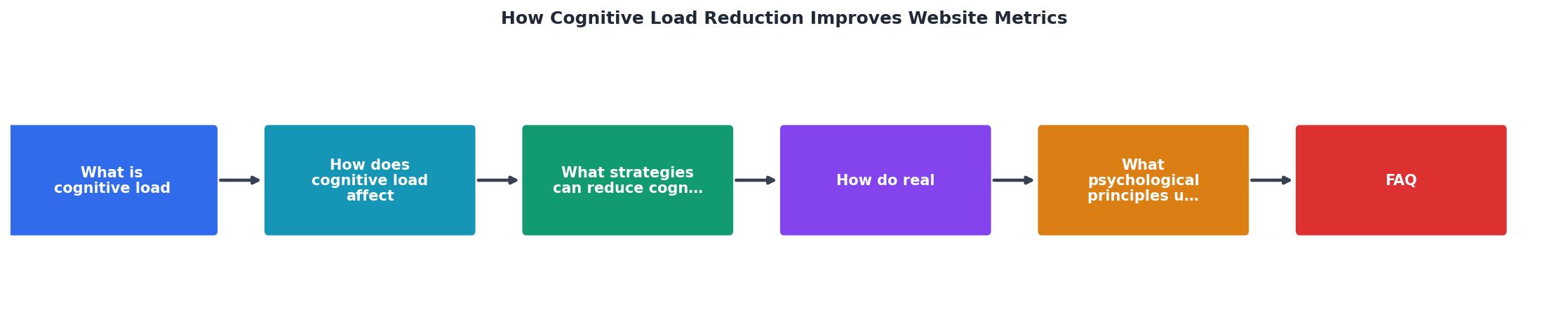
The process follows a clear loop: Audit current load, Identify extraneous elements, Simplify or remove, Measure metrics, Repeat. Each cycle tightens the experience and lifts the numbers.
Real-world metric improvements

Concrete examples show what these strategies produce in practice:
Google Search. The homepage has barely changed in 25 years. One input field, two buttons, almost nothing else. That radical simplicity handles billions of queries daily because the cognitive load is near zero.
Booking.com vs. competitors. Booking.com famously tests everything, but their highest-performing pages share a pattern: clear pricing, limited upsells per screen, and prominent "Book now" buttons. Pages with fewer distractions convert at higher rates even when they show fewer options.
Notion's onboarding. Notion reduced their onboarding flow from a multi-step tutorial to a single template picker. New users reached their first productive action faster, and activation rates improved.
E-commerce checkout simplification. The Baymard Institute has documented that reducing form fields from 15 to 7 in checkout flows lifts completion rates by 20-30%. Each removed field is one less decision the visitor's working memory has to process.
The following dashboard illustrates what a typical before-and-after looks like when cognitive load reduction is applied to a SaaS landing page:
SaaS Landing Page: Before vs. After Cognitive Load Reduction
The psychology behind it
Two principles explain why cognitive load reduction works so reliably:
Miller's Law holds that working memory can handle roughly 7 (plus or minus 2) chunks of information at once. When a page presents 15 navigation items, 4 banners, a chat widget, and a cookie consent modal simultaneously, visitors exceed that limit before reading a single word of copy.
Decision fatigue compounds the problem. Each micro-decision (where to click, what to read next, whether to dismiss a pop-up) depletes the same mental resource. By the time visitors reach your pricing section, they may lack the cognitive energy to evaluate your offer.
This is not about making visitors feel comfortable. It is about respecting the biological constraints of human attention. A page that works within those constraints converts better because it lets visitors actually process your value proposition.
Cognitive load evaluation template
Use this checklist to audit any page on your site. Walk through it once per key landing page and prioritize the items that apply.
Cognitive Load Reduction Audit
Your progress is saved automatically in your browser.
FAQ
Frequently Asked Questions
Additional Resources
- Web Design Principles that Reduce Cognitive Load - Lower cognitive load shows up in your metrics as completion rates climb, support tickets about "how do I..." drop, and time-on-task shrinks.
- 4 Principles to Reduce Cognitive Load in Forms - Four principles of form design — structure, transparency, clarity, and support — minimize users' cognitive load and improve usability.
- How To Minimize Cognitive Load In Web Design And ... - Minimizing cognitive load ensures visitors understand, navigate, and act effortlessly. Here are practical strategies to design websites that ...