
Your landing page passes every WCAG contrast ratio check with flying colors, yet visitors still bounce within seconds. The disconnect is not about color values or hex codes. It is about the gap between technical accessibility compliance and the actual cognitive experience of reading, scanning, and deciding on your page. This article breaks down where contrast checkers stop and cognitive load optimization begins, and how to bridge that gap so your conversions actually improve.

- Color contrast checker tools verify that text-to-background ratios meet WCAG thresholds (4.5:1 for normal text, 3:1 for large text). They do not measure whether your page is easy to understand or act on.
- Cognitive load on landing pages comes from information density, competing visual elements, unclear hierarchy, and decision fatigue, none of which a contrast checker can detect.
- You need both: contrast compliance as a baseline, plus deliberate cognitive load reduction to turn visitors into customers.
Why Contrast Alone Does Not Convert
A contrast checker answers one question: can a person physically distinguish this text from its background? That is a binary pass/fail. It says nothing about whether the visitor understands the text, finds the CTA, or feels confident enough to click.
Most modern landing pages already pass basic contrast requirements. Template builders like Webflow, Squarespace, and Framer ship with default color palettes that clear WCAG AA. The problem is not that pages are unreadable. The problem is that pages are overwhelming.
Consider a SaaS pricing page with three tiers, each in a high-contrast card. Every card passes the checker. But the visitor sees 47 feature bullets, 3 price points, 6 badges, and 2 toggle switches. The contrast is fine. The cognitive load is brutal.
Common Mistakes With Contrast Tools

Teams make predictable errors when they treat contrast checkers as the finish line instead of the starting gate.
- Treating compliance as optimization. Passing WCAG AA means your page is not broken for low-vision users. It does not mean your page is optimized for anyone. These are different goals with different tools.
- Ignoring context around color. A bright orange CTA button on a white background might hit a 4.6:1 ratio. But if there are four other orange elements on the page, the button does not stand out. Contrast checkers evaluate pairs in isolation, never the full visual field.
- Over-correcting into visual noise. Some teams crank up contrast everywhere after an audit. Every heading is bold black on white, every link is saturated blue, every warning is red. The result is a page where everything screams for attention and nothing gets it.
- Skipping cognitive accessibility entirely. WCAG has guidelines for cognitive accessibility (WCAG 2.2 includes criteria around consistent navigation, error identification, and input purpose), but most automated checkers skip these. Teams assume the automated report covers everything.
"The "WCAG Compliance Information" chart will tell you if the selected colors pass conformance.">, Web Accessibility Color Contrast Checker
That conformance check is necessary. It is not sufficient.
What Cognitive Load Actually Looks Like

Cognitive load is the total mental effort required to process information on a page. On landing pages, it shows up in specific, measurable ways:
- Too many choices. Hick's Law applies directly: more options, slower decisions, more abandonment. Three pricing tiers with 15 features each create decision paralysis.
- Unclear visual hierarchy. When headings, subheadings, body text, and labels all compete at similar visual weights, the eye has no path. Visitors scan randomly instead of following a designed flow.
- Jargon and abstraction. "AI-powered synergistic workflow automation" means nothing to a first-time visitor. Every unfamiliar term adds processing cost.
- Competing CTAs. "Start Free Trial," "Book a Demo," "Watch Video," "Download Whitepaper" all above the fold. Each one demands a micro-decision.
The data consistently shows that most landing page abandonment traces back to comprehension failures, not contrast failures. Visitors can see the text just fine. They cannot figure out what to do with it.
Here is a quick comparison of what each approach catches:
| Contrast Checker | Cognitive Load Analysis |
|---|---|
| Text-to-background ratio | Information density per section |
| Color pair compliance | Visual hierarchy clarity |
| WCAG AA/AAA pass/fail | Decision complexity (number of CTAs) |
| Static, per-element check | Holistic page-level assessment |
| Automated, instant | Requires human judgment or specialized tools |
Step-by-Step: Bridging the Gap
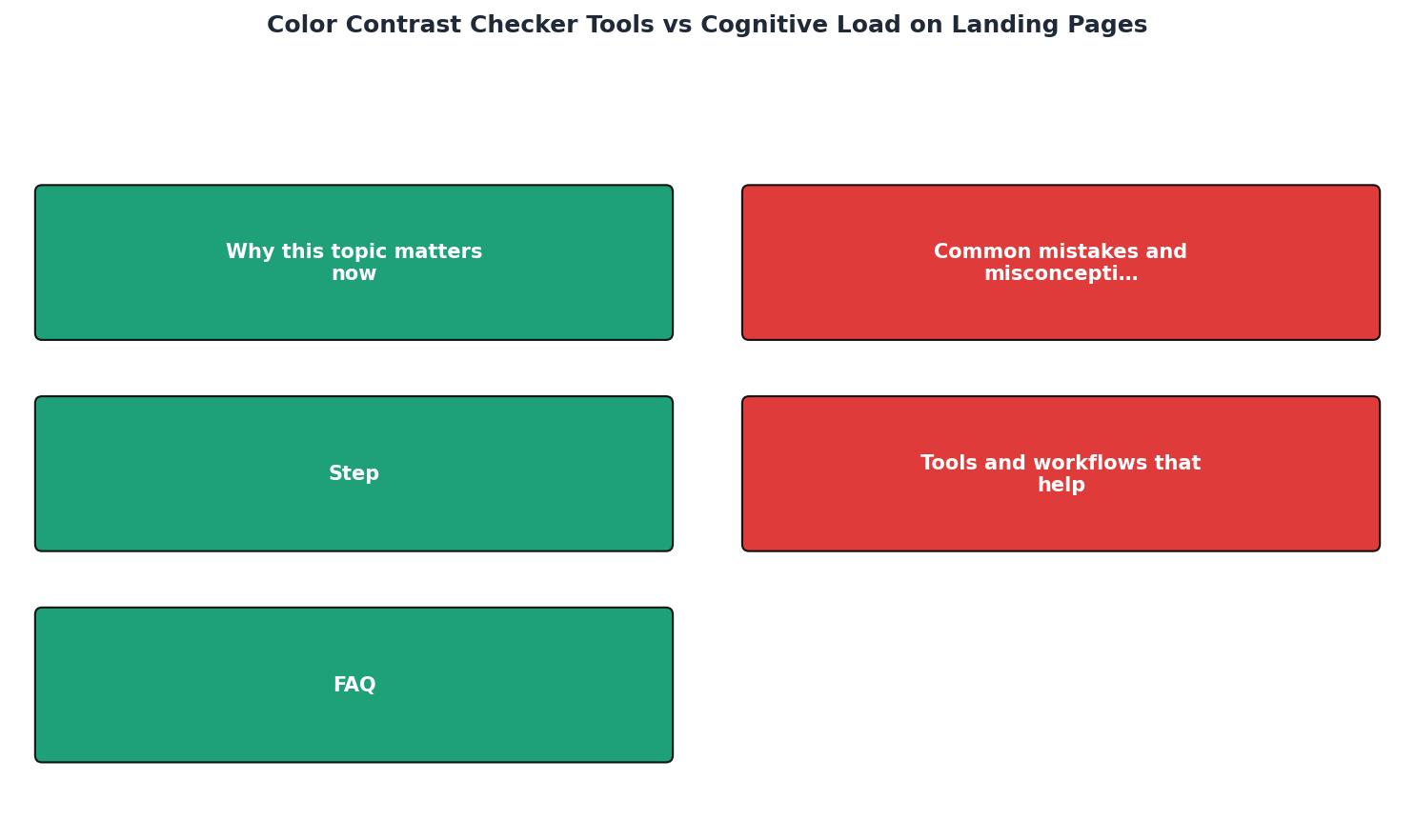
Here is a practical workflow that covers both contrast compliance and cognitive load reduction. Follow these steps in order: Audit Contrast, Map Hierarchy, Reduce Choices, Simplify Copy, Test With Real Users.
1. Audit Contrast First
Run your landing page through a contrast checker. Tools like WebAIM Contrast Checker, Accessible Web's Color Contrast Checker, or the built-in Chrome DevTools contrast inspector all work. Fix any failures. This is your baseline, not your finish line.
2. Map Visual Hierarchy
Take a screenshot of your landing page. Squint at it. Can you identify the primary heading, the main value proposition, and the CTA within two seconds? If everything blurs into a uniform block, your hierarchy is broken regardless of contrast ratios.
Assign each element a visual weight rank:- Level 1: Primary headline and CTA (highest contrast, largest size)
- Level 2: Supporting headline, key benefit statements
- Level 3: Body copy, feature details
- Level 4: Legal text, footer links
3. Reduce Choices Above the Fold
One primary CTA above the fold. One. If you have a secondary action (like "Learn more"), make it visually subordinate. Remove or relocate anything that competes for the same decision moment.
4. Simplify Copy
Read every sentence on the page out loud. If you stumble, rewrite it. Replace jargon with plain language. Cut sentences longer than 20 words in half. The Hemingway Editor is free and catches most readability issues.
5. Test With Real Users
Analytics tell you where people leave. They do not tell you why. Tools like PagePerson Insights can surface cognitive accessibility barriers that traditional analytics miss, showing you where visitors struggle to comprehend or decide, not just where they click.
Tools and Workflows That Help

Here is a realistic toolkit breakdown for teams that want to cover both sides:
For contrast compliance:- WebAIM Contrast Checker (free, web-based): paste two hex values, get instant AA/AAA results
- axe DevTools (free browser extension): scans entire pages for WCAG violations including contrast
- Stark (Figma plugin): checks contrast during design, before code
- Hemingway Editor (free): flags complex sentences, passive voice, and readability grade level
- PagePerson Insights (Chrome extension): analyzes cognitive accessibility barriers and conversion friction across your entire page
- Five-second test (manual method): show your page to someone for five seconds, ask what they remember. If they cannot name the CTA or value prop, your cognitive load is too high.
Example: SaaS Landing Page Audit Results
Notice the pattern: every contrast metric passes, but the cognitive metrics are all flagged. This is the exact scenario that costs conversions.
Your Contrast + Cognitive Load Audit
Landing Page Contrast & Cognitive Load Checklist
Your progress is saved automatically in your browser.
FAQ
Frequently Asked Questions
What is the biggest gap you have found between your accessibility audit results and your actual conversion performance? Share what surprised you.
Additional Resources
- WCAG Color Contrast Checker - Use our free web accessiblity color contrast checker to check your website's color combinations against WCAG A, AA, and AAA requirements.
- Color Contrast Checker | Free WCAG Testing Tool - Test your color combinations against WCAG 2.2 contrast ratios instantly. Our free color contrast checker helps you fix readability issues fast. Check now.
- Website Contrast Checker Tool - No Signup Required - Optimizing contrast reduces cognitive load, allowing visitors to scan your content quickly and convert more easily. How to Improve