
You picked five colors from a palette generator, dropped them into your landing page, and conversions went down. The palette looked gorgeous in the preview swatch. It scored well on contrast checkers. But real visitors with ADHD, dyslexia, or plain old decision fatigue bounced harder than before. The gap between generating a pretty palette and testing whether humans can actually process your page is where revenue disappears.

- Color palette generators produce aesthetically harmonious color sets but tell you nothing about how those colors affect comprehension, reading speed, or decision-making on a live page.
- Cognitive accessibility testing evaluates whether real users can understand, navigate, and act on your content without unnecessary mental effort.
- You need both: generate palettes for visual consistency, then test them against cognitive barriers before shipping.
The real problem with palette-first design
A color palette generator like Coolors, Adobe Color, or Khroma gives you harmonious hues in seconds. That solves one problem: visual consistency. It does not solve the problem that actually costs you money: whether visitors can parse your page fast enough to convert.
That number represents people who literally see your carefully chosen palette differently than you do. And it only covers clinical color vision deficiency. Add cognitive load from anxiety, fatigue, low literacy, or unfamiliar interfaces, and the percentage of visitors struggling with your color choices climbs much higher.
Palette generators optimize for aesthetics. They pick complementary, analogous, or triadic schemes based on color theory. None of them ask: "Will a first-time visitor with ADHD understand which button is the primary action?" None of them measure whether your teal-on-dark-blue text creates enough perceptual distinction for someone scanning quickly on a phone.
"Color can overwhelm interpretation, and since approximately 4.5% of the population has some kind of color insensitivity, it's important to convey your message without relying on color.">, Using color
Common mistakes that cost conversions

Here are the patterns I see repeatedly on landing pages that rely on palette generators alone:
- Contrast ratio tunnel vision. Teams check WCAG AA contrast (4.5:1 for text) and call it done. Contrast ratio is necessary but not sufficient. Two colors can pass 4.5:1 and still feel indistinguishable to someone with deuteranomaly or someone reading under cognitive load.
- Too many accent colors. Palette generators hand you five or six swatches. Teams use all of them. Every section gets a different highlight. The result: no clear visual hierarchy. Visitors cannot tell what is clickable, what is decorative, and what is critical.
- Ignoring context and meaning. Red means "error" or "stop" in most Western interfaces. If your palette generator gives you a red that you use for a primary CTA, you are fighting learned associations. Palette tools do not encode semantic meaning.
- Skipping real-user validation. The palette looks great on a 27-inch Retina display in a well-lit office. It looks terrible on a $200 Android phone in direct sunlight. Cognitive accessibility testing catches this. A swatch preview does not.
- Treating accessibility as a checkbox. Running a Lighthouse audit after launch is not cognitive accessibility testing. Lighthouse checks technical compliance. It cannot tell you that your pastel call-to-action disappears into the background for anxious users who scan pages in under three seconds.
That low number reflects how few teams go beyond automated contrast checks. The opportunity is enormous: if your competitors skip cognitive testing, doing it yourself creates a measurable conversion advantage.
What cognitive accessibility testing actually covers

Cognitive accessibility testing examines whether your interface works for people with varying cognitive abilities, attention spans, and mental states. When applied to color, it goes far beyond contrast ratios:
- Visual hierarchy clarity: Can users identify the primary action within two seconds? Does color guide the eye or scatter it?
- Information grouping: Do color-coded sections help comprehension or create confusion? Are related items visually grouped?
- Cognitive load from color variety: Does the number of distinct colors on a page increase decision fatigue?
- Color-independent communication: If you strip all color from the page (grayscale test), does the structure still make sense?
- Emotional and cultural associations: Does the color scheme create trust or anxiety for your target audience?
| Color Palette Generator | Cognitive Accessibility Testing |
|---|---|
| Harmonious color sets | Comprehension validation |
| Contrast ratio scores | Real-user behavior data |
| Aesthetic consistency | Visual hierarchy assessment |
| Fast, automated output | Contextual, page-specific insights |
| Works in isolation | Works on live pages with real content |
| Free or low cost | Requires tools + process |
Step-by-step: from palette to tested page
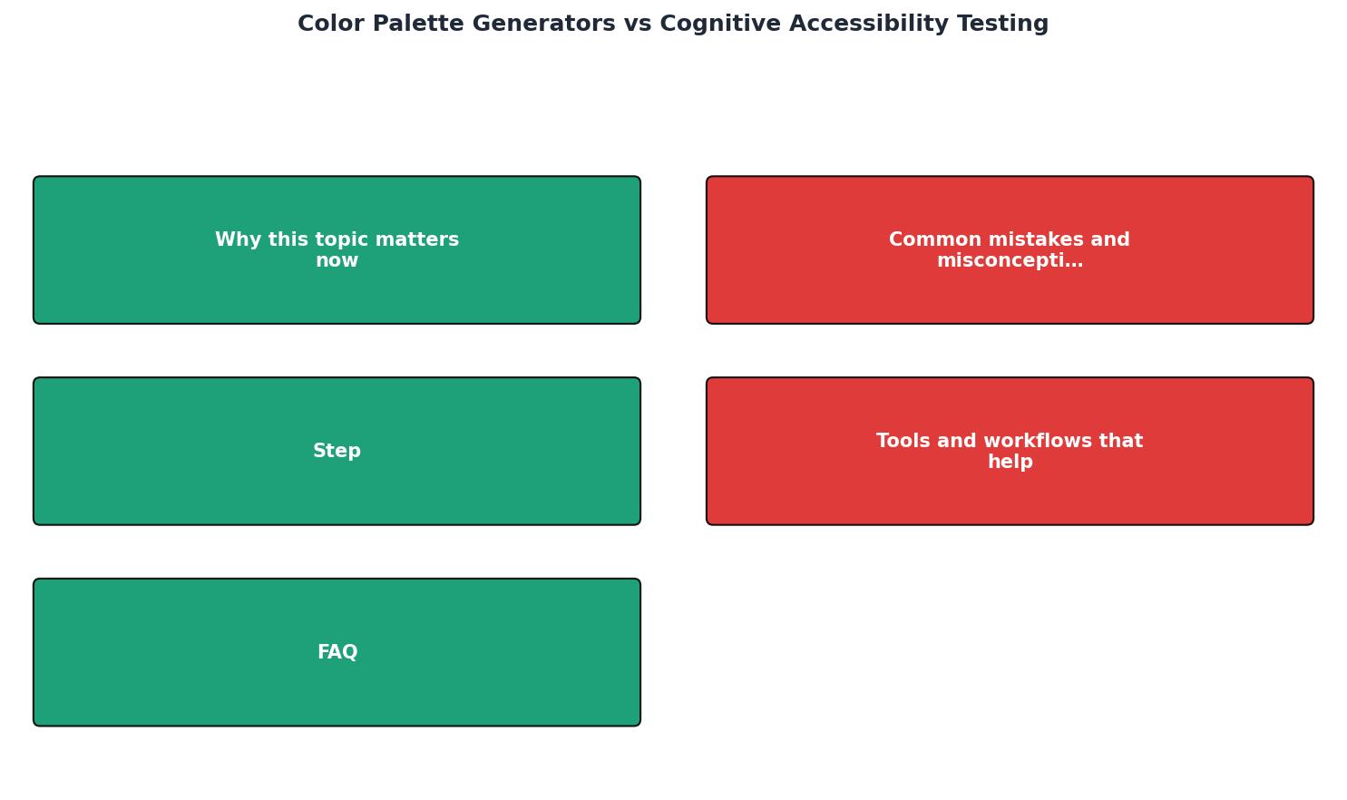
Here is a practical workflow that uses palette generators as a starting point and cognitive testing as the quality gate:
- Generate base palette. Use Coolors, Adobe Color, or Realtime Colors to create a starting palette with 3-4 core colors: primary, secondary, neutral, and accent.
- Apply semantic roles. Assign each color a job: primary actions, secondary actions, backgrounds, text, errors, success states. Write these down. If a color has no clear role, drop it.
- Build a test page. Apply the palette to a real page with real content. Not a mockup with placeholder text. Real headlines, real CTAs, real product descriptions.
- Run grayscale check. Convert the page to grayscale (browser DevTools or a CSS filter). If you cannot distinguish the CTA from surrounding elements, your hierarchy depends too much on hue.
- Simulate color deficiencies. Use Chrome DevTools rendering emulation (Protanopia, Deuteranopia, Tritanopia) to see your page through different eyes. Fix any elements that lose distinction.
- Test cognitive load. This is where tools like PagePerson Insights come in. Run an analysis on the live page to identify where color choices create comprehension barriers, where visitors with cognitive differences struggle, and where the visual hierarchy breaks down.
- Iterate and retest. Adjust colors based on findings. Retest. Ship only when both aesthetic harmony and cognitive clarity pass.
Tools and workflows that actually help

Here is a realistic toolkit, split by purpose:
Palette generation (starting point):- Coolors for quick palette exploration with built-in color blindness simulation
- Realtime Colors for seeing palettes applied to a generic page layout instantly
- Adobe Color for extracting palettes from brand images or photos
- WebAIM Contrast Checker for verifying specific color pairs against WCAG AA/AAA
- Chrome DevTools rendering tab for color deficiency simulation
- axe DevTools for automated WCAG violation scanning
- PagePerson Insights for analyzing how color choices affect comprehension and conversion on live pages
- Five-second tests (UsabilityHub/Lyssna) to measure what users notice and remember
- Session recordings (Hotjar, FullStory) filtered for rage clicks and confusion patterns near color-dependent elements
Here is an example dashboard showing how these tools map to a typical audit workflow:
Color Accessibility Audit Workflow
When palette generators are enough
Not every project needs a full cognitive accessibility audit. If you are building an internal dashboard for five people who all have normal color vision, a palette generator and a quick contrast check will do. If you are designing a personal blog with minimal interactive elements, the stakes are low.
But the moment you are spending money on traffic, selling a product, or serving a diverse public audience, palette generators alone are not enough. The cost of cognitive testing is trivial compared to the cost of losing visitors who cannot figure out your page.
Color-to-Cognition Audit Checklist
Your progress is saved automatically in your browser.
FAQ
Frequently Asked Questions
What is the biggest color-related usability problem you have found on your own site? Share your experience below.
Additional Resources
- Using color | U.S. Web Design System (USWDS) - Color is a practical and emotional tool. It conveys personality, sets a tone, attracts attention, and indicates importance. Color and accessibility Color is a ...
- Improve your Dashboards with a GREAT Colour Palette ... - We've got a great tool adobe colors for color palette matching extracting color palettes from images and color blindness checkers and so much more.
- Creating the Accessible Color Palette Generator - The Accessible Color Palette Generator takes additional complexity into account. It generates a color for cards for both content and non-content ...