
Every support ticket has a story behind it, and most of those stories start the same way: a person stared at a screen, could not figure out what to do next, and reached for the help button. The root cause is rarely a bug. It is a comprehension failure baked into the interface itself. Fix the cognitive barriers on your website or app, and you do not just help users with disabilities. You slash the volume of confused, frustrated people flooding your support channels.

- Most support inquiries stem from confusing interfaces, not product defects. Cognitive accessibility fixes target the actual cause.
- Clearer labels, simpler flows, and reduced cognitive load can cut support ticket volume by double-digit percentages.
- The investment pays for itself fast: fewer tickets means smaller support teams, lower costs, and happier customers who convert more often.
The real cost of confusing interfaces
Support teams are expensive. A single Tier 1 support agent in the US costs $40,000–$55,000 per year in salary alone, before tools, training, and management overhead. Each live chat or phone interaction costs somewhere between $5 and $12 to handle. Multiply that by thousands of tickets per month, and you are looking at a line item that grows every time your product gets more complex.
The uncomfortable truth: the majority of those tickets are self-inflicted. Confusing navigation, ambiguous button labels, walls of text with no visual hierarchy, form fields that do not explain what they expect. These are not edge cases. They are the default experience for a huge chunk of your audience, including people dealing with ADHD, anxiety, dyslexia, low digital literacy, or simply multitasking on a phone while commuting.
Cognitive accessibility means designing interfaces so that people with varying cognitive abilities can understand and use them without extra effort. It covers clarity of language, predictability of layout, error prevention, and information density. When you improve cognitive accessibility, you remove the exact friction that generates support requests.
How cognitive barriers create support load

Think about the last time you abandoned a checkout flow or gave up on a settings page. The interface probably did one or more of these things:
- Used jargon or ambiguous labels. "Configure your provisioning preferences" means nothing to a normal human.
- Buried critical actions. The button you needed was three scrolls down, styled identically to decorative elements.
- Overloaded a single screen. Twenty form fields, no grouping, no progress indicator.
- Failed to prevent errors. No inline validation, no confirmation step, cryptic error messages after submission.
- Assumed prior knowledge. The flow made sense to the team that built it, not to a first-time visitor.
Companies like Mailchimp and Stripe have invested heavily in plain-language interfaces and progressive disclosure. The result: fewer "how do I..." tickets and higher first-time task completion. Stripe's documentation redesign, for example, focused on reducing cognitive load for developers, and their support volume for integration questions dropped noticeably after launch.
First-time task success rates
First-time task success rate measures how often a user completes a goal on their first attempt without help. It is the single best predictor of support volume. If 80% of users can complete a task on the first try, 20% are potential support contacts. Push that to 95%, and you have cut your inbound volume by 75% for that task.
Cognitive accessibility improvements directly target first-time success:
- Clear labels and microcopy tell users what each field expects before they guess wrong.
- Logical grouping breaks complex forms into digestible steps.
- Consistent navigation patterns let users predict where things are.
- Error prevention (input masks, smart defaults, confirmation dialogs) stops mistakes before they happen.
- Plain language replaces jargon with words your audience actually uses.
Real cost savings in practice

Let's put numbers on this. Consider a SaaS company handling 4,000 support tickets per month at an average cost of $8 per ticket. That is $32,000 per month, or $384,000 per year.
The dashboard below shows what happens when cognitive accessibility improvements reduce ticket volume by 30%.
Support Cost Impact Model
That $115,200 annual saving comes from interface changes, not from hiring fewer people or cutting corners on service quality. The tickets simply stop being created because users stop getting confused.
GOV.UK is one of the best-documented examples. When the UK government redesigned its digital services around plain language and cognitive accessibility principles, call center volume for specific services dropped dramatically. Their design system now mandates reading-level targets, consistent patterns, and progressive disclosure as standard.
"Be wary of any provider claiming 100% automated compliance.">, Customer Accessibility Management Solutions That Scale With Your Business
Automated tools catch surface-level issues. Real cognitive accessibility requires human judgment about language clarity, information architecture, and task flow design. The savings come from doing the work, not from running a scanner.
Measuring the impact

You cannot improve what you do not measure. Here is how to track whether cognitive accessibility changes are actually reducing support costs:
- Tag tickets by root cause. Separate "confused by interface" from "actual bug" and "feature request." Most helpdesk tools (Zendesk, Intercom, Freshdesk) support custom tags.
- Track first-time task success. Use analytics to measure completion rates on key flows before and after changes.
- Monitor self-service resolution. If your help center exists, track whether users find answers without escalating to a human.
- Calculate cost per ticket. Total support spend divided by total tickets gives you the number to multiply against volume reductions.
- Run A/B tests on interface changes. Deploy the clearer version to a segment and compare support contact rates.
Tools like PagePerson Insights can help identify specific cognitive barriers on your pages, showing where visitors with different cognitive profiles are likely to struggle. That gives you a prioritized list of fixes instead of guessing which page to redesign first.
The step-by-step audit process
This is the process for systematically finding and fixing cognitive barriers that generate support tickets.
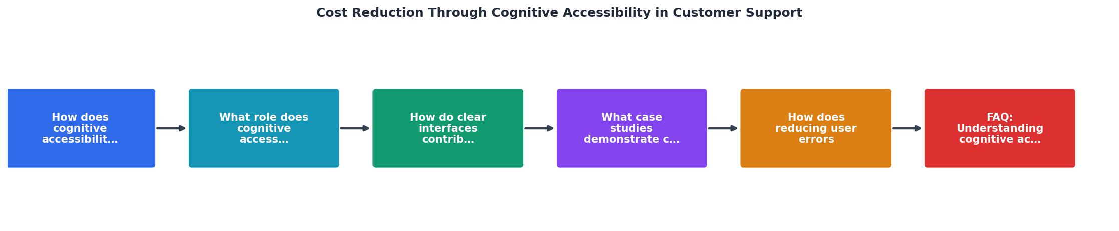
The steps break down as follows: Analyze interfaces, Identify barriers, Implement changes, Monitor results, Iterate. Each cycle tightens the feedback loop between what users struggle with and what gets fixed.
| Before Cognitive Accessibility Audit | After Cognitive Accessibility Audit |
|---|---|
| Vague button labels ("Submit", "Go") | Action-specific labels ("Place Order", "Save Changes") |
| Dense text blocks, no hierarchy | Scannable headings, bullet points, short paragraphs |
| Cryptic error messages | Plain-language errors with fix instructions |
| No progress indicators | Step counters and progress bars in multi-step flows |
| Jargon-heavy copy | Plain language at 8th-grade reading level |
| High support ticket volume | Measurably fewer confusion-driven tickets |
Cognitive Accessibility Support Cost Reduction Audit
Your progress is saved automatically in your browser.
FAQ
Frequently Asked Questions
Additional Resources
- Customer Accessibility Management Solutions That Scale ... - Operational Savings: Automating accessibility support can reduce the cost per contact in customer service.
- Barriers to creating value with cognitive accessibility features ... - One interviewee mentioned that cognitive accessibility features can reduce costs and effort. these barriers were time and resources, lack of ...
- How to Reduce Customer Support Costs in 2026 (6 Proven ... - Tuning up your FAQ and KB is a direct way to reduce customer support costs by making self-service work better. Use Keyword-Rich, Question ...