
Your website converts at 3% in the US but barely 0.8% in Japan. The design is identical, the product is the same, and the traffic quality looks comparable. The gap is not a pricing problem or a broken checkout. It is a cognitive accessibility failure rooted in cultural assumptions baked into every heading, color choice, and navigation pattern on the page. Understanding how cultural diversity shapes cognitive load is the first step toward fixing conversion leaks across global audiences.

- Cultural background changes how people scan pages, interpret icons, process color meaning, and handle information density.
- A single "universal" design creates unnecessary cognitive load for large segments of your global audience.
- Tailoring cognitive accessibility to cultural context improves comprehension, reduces bounce rates, and lifts conversion across every market you serve.
Why culture changes cognitive load
A visitor from Germany and a visitor from Saudi Arabia do not read your landing page the same way. That is not a metaphor. German readers scan left-to-right in an F-pattern. Arabic readers scan right-to-left. When your layout assumes one direction, the other group spends extra mental effort just orienting themselves. That extra effort is cognitive load, and it compounds with every section of the page.
Culture influences cognitive accessibility through several concrete channels:
- Reading direction and layout expectations. Left-to-right vs. right-to-left vs. top-to-bottom (CJK vertical text) changes where users look first, where they expect CTAs, and how they parse hierarchy.
- Color associations. Red means danger in Western markets but luck and prosperity in China. Green signals "go" in the US but can carry religious connotations in parts of the Middle East.
- Information density tolerance. Japanese and Korean e-commerce sites (Rakuten, Coupang) pack far more text and product data onto a single page than Western equivalents. Users in those markets expect density; a sparse, minimalist page can feel untrustworthy.
- Icon and metaphor interpretation. A mailbox icon means email in the US. In countries where physical mailboxes look different, the metaphor breaks. A thumbs-up gesture is positive in most Western cultures but offensive in parts of West Africa and the Middle East.
"The rising number of individuals experiencing a transition from temporary to permanent cognitive impairment will place substantial pressure on existing design and policy infrastructures.">, Accessibility for Cognition: Empowering design for social inclusion and diversit
This pressure multiplies when you serve audiences across cultural boundaries. Cognitive impairments do not exist in a vacuum; they intersect with cultural context, language proficiency, and learned interaction patterns.
Strategies for culturally aware design

Fixing cultural cognitive accessibility does not require building a separate site for every country. It requires a framework that identifies the highest-impact mismatches and addresses them systematically.
Audit your assumptions first
Start by listing every cultural assumption embedded in your current design. Common ones include:
- Left-to-right reading order
- Latin alphabet typography choices (line height, letter spacing tuned for English)
- Western date formats (MM/DD/YYYY vs. DD/MM/YYYY vs. YYYY/MM/DD)
- Currency and number formatting (commas vs. periods as decimal separators)
- Humor, idioms, and metaphors in copy that do not translate
Localize beyond translation
Translation handles words. Localization handles meaning. A button that says "Get Started" translates easily, but the concept of a free trial with a credit card requirement carries different trust signals in markets where credit card penetration is low. In Brazil, Boleto Bancário is a common payment method. In Germany, many users prefer direct bank transfer (SEPA). Ignoring these preferences adds cognitive friction at the exact moment you need the visitor to commit.
Adapt information architecture
Hofstede's cultural dimensions offer a practical lens here. Cultures scoring high on uncertainty avoidance (Japan, Greece, Portugal) prefer detailed explanations, extensive FAQ sections, and visible trust signals before making decisions. Cultures scoring low (US, UK, Denmark) tolerate ambiguity and respond better to concise, action-oriented pages.
This means your landing page structure itself should flex:
- High uncertainty avoidance markets: more social proof, longer feature explanations, visible security badges, detailed pricing breakdowns.
- Low uncertainty avoidance markets: shorter copy, prominent CTAs, less clutter.
Use the right visual hierarchy
The process below outlines a practical workflow for adapting cognitive accessibility across cultures:
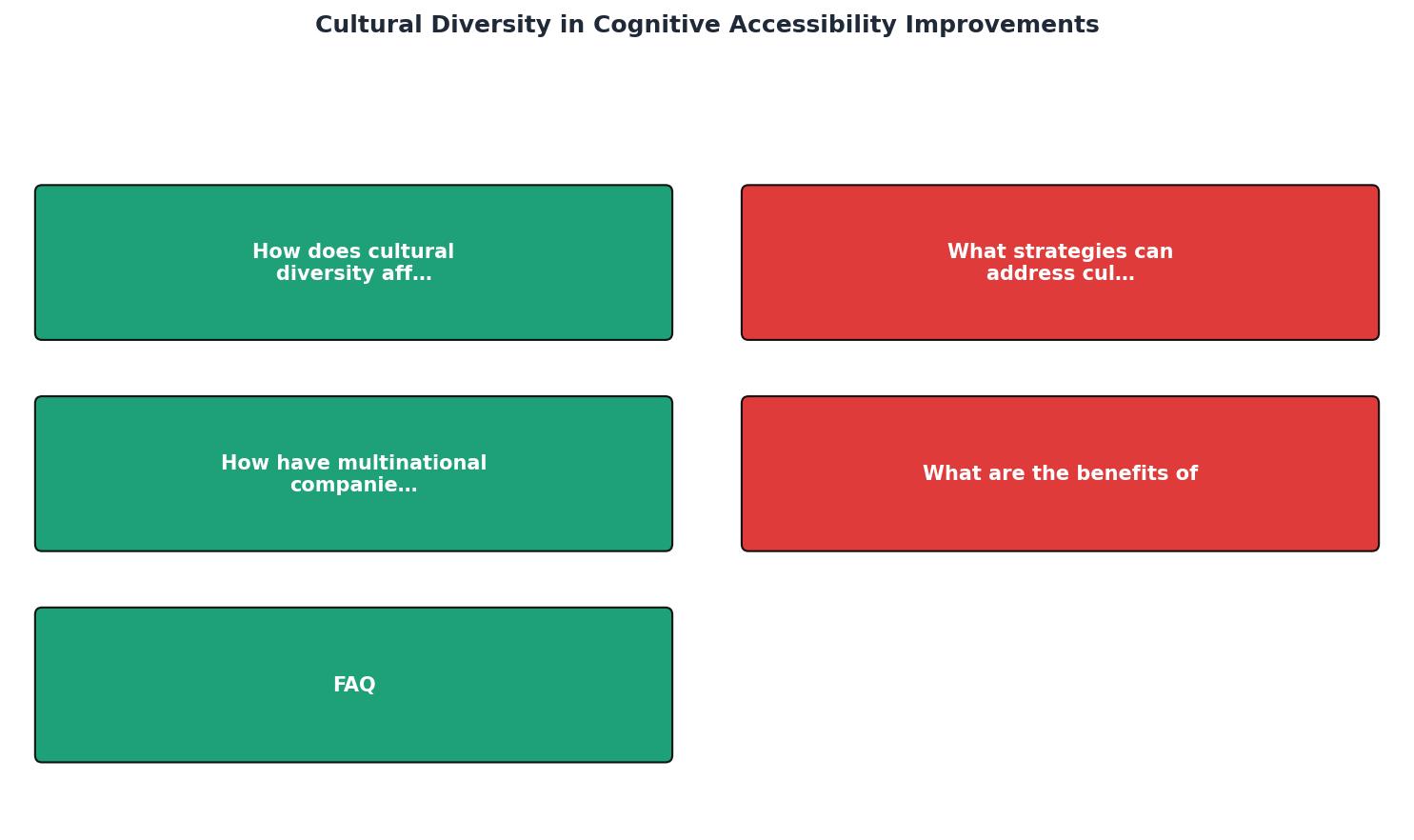
Follow the steps: Audit assumptions, Research target cultures, Adapt layout and IA, Localize content, Test with real users, Iterate based on data. Each step feeds the next. Skipping "Research target cultures" means every downstream decision is a guess.
How global companies adapt

Real examples show what culturally aware cognitive accessibility looks like in practice.
IKEA runs localized websites for over 50 markets. The Swedish site emphasizes minimalist imagery and sparse layouts. The Saudi Arabian site mirrors the layout for right-to-left reading, adjusts imagery to reflect local home styles, and modifies product descriptions to match local living patterns. This is not just translation; it is a full cognitive accessibility adaptation.
McDonald's changes menu layouts, color emphasis, and promotional hierarchy by market. The Japanese McDonald's site uses denser information layouts with more visual elements per screen, matching local expectations. The US site is comparatively sparse.
Booking.com runs thousands of A/B tests annually, many segmented by market. They discovered that urgency messaging ("Only 2 rooms left!") converts well in Western markets but can feel manipulative in Scandinavian markets where trust-based messaging performs better. That is a cognitive accessibility insight: the same message creates productive urgency for one audience and anxiety-driven cognitive overload for another.
Benefits of cultural cognitive accessibility

The business case is straightforward. Reducing cognitive friction for culturally diverse audiences produces measurable results:
- Higher conversion rates per market. When visitors do not waste mental energy decoding unfamiliar patterns, they move through your funnel faster.
- Lower bounce rates. Pages that match cultural expectations feel trustworthy. Trust reduces the impulse to leave.
- Reduced support costs. Confused users generate support tickets. Clearer, culturally adapted interfaces reduce confusion at the source.
- Broader market reach. Accessibility improvements compound. A site optimized for cognitive accessibility across cultures serves users with ADHD, dyslexia, low digital literacy, and age-related cognitive changes better in every market simultaneously.
The following dashboard illustrates how cultural adaptation metrics might look for a typical SaaS product expanding into three new markets:
Cultural Adaptation Impact (Example: SaaS expansion)
The pattern is clear: markets where cultural adaptation has been completed show the largest gains. Markets still waiting show the largest opportunity.
Cultural Cognitive Accessibility Assessment Checklist
Your progress is saved automatically in your browser.
FAQ
Frequently Asked Questions
Additional Resources
- Cultural inclusivity and diversity in dementia friendly ... - PMC - Incorporate programs that allow CALD people living with dementia/seniors to maintain their language and culture. Increase access to bilingual interpreters and ...
- Accessibility for Cognition: Empowering design for social ... - Designing for diversity remains an enduring and significant challenge. Diversity manifests in numerous forms, from environmental conditions such ...
- Cultural Considerations in Accessibility - Cultural considerations in accessibility recognize that people's backgrounds, beliefs, and lived experiences influence how they interact with and benefit