
You ran an accessibility scanner on your landing page, got a green checkmark, and still watched 40% of paid traffic bounce within eight seconds. The scanner checked contrast ratios and alt text. It never asked whether a first-time visitor could actually understand what your product does. That gap between technical compliance and cognitive comprehension is exactly where conversions leak, and it is the gap Page Person was built to close.

- Generic accessibility scanners check WCAG technical rules (contrast, alt text, ARIA labels) but ignore whether visitors comprehend your page.
- Page Person analyzes cognitive accessibility: reading complexity, information overload, unclear CTAs, and conversion barriers that confuse real people.
- Passing a standard scan does not mean your site converts. Cognitive barriers cost you signups and sales every day.
What generic scanners actually check
Standard tools like axe, WAVE, and Lighthouse Accessibility run a rule set derived from WCAG success criteria. They look at the DOM and flag issues a machine can detect: missing alt attributes, insufficient color contrast, broken ARIA roles, missing form labels, heading hierarchy violations. These checks matter. They catch real problems for screen reader users and people with visual impairments.
But here is what they do not touch:
- Cognitive load of a page (too many choices, competing CTAs, dense paragraphs)
- Reading level of your copy relative to your actual audience
- Information architecture clarity for someone who has never seen your product
- Anxiety triggers like hidden pricing, vague guarantees, or walls of text before a signup form
That number is not hypothetical. Cognitive and situational barriers affect a wide slice of any audience: people with ADHD, dyslexia, low digital literacy, stress, multitasking, or simply visiting on a phone in bright sunlight.
Why this blind spot costs you money

You spend real money driving traffic. Google Ads, Meta campaigns, content marketing, SEO. Every visitor who arrives and cannot figure out what you offer within a few seconds is wasted spend. Heatmaps show where people click. Analytics show when they leave. Neither tells you why the message did not land.
Generic scanners were never designed to answer that question. They were built for compliance, not comprehension. The result: teams celebrate a clean accessibility audit while their conversion rate stays flat.
Standard automated tools catch roughly 15% of the cognitive barriers that affect real visitor comprehension. The rest requires understanding language complexity, visual hierarchy, decision fatigue, and trust signals. That is a different category of analysis entirely.
What Page Person analyzes instead

Page Person is a Chrome extension that looks at your page through the lens of a real visitor's cognitive experience. Instead of checking DOM attributes against a spec, it evaluates:
- Reading complexity - Is your copy written at a level your target audience can parse quickly? A SaaS landing page written at a graduate reading level loses visitors who scan at a 7th-grade level.
- Information density - How many distinct concepts does a visitor encounter before reaching the first CTA? Overloaded pages create decision paralysis.
- CTA clarity - Can a new visitor tell what happens when they click the primary button? "Get Started" means nothing without context.
- Trust and anxiety barriers - Missing pricing, vague value propositions, and no social proof create friction that no contrast ratio fix will solve.
- Cognitive flow - Does the page guide attention in a logical sequence, or does it scatter focus across competing elements?
"Most browsers allow users to change text size through:.">, Easy Checks
That quote from the W3C's own preliminary evaluation guide hints at the gap. Standard checks focus on whether users can adjust the interface. They do not ask whether the content itself makes sense once adjusted. Page Person fills that layer.
The comparison below shows the difference in scope at a glance:
| Generic Accessibility Scanner | Page Person |
|---|---|
| Checks color contrast ratios | Analyzes reading complexity |
| Flags missing alt text | Evaluates information density |
| Validates ARIA roles | Identifies unclear CTAs |
| Tests keyboard navigation | Detects anxiety and trust barriers |
| Reports heading hierarchy | Maps cognitive flow and attention sequence |
| Binary pass/fail per rule | Contextual recommendations tied to conversion |
How to use both together

This is not an either/or situation. Generic scanners and Page Person solve different problems. The smart workflow uses both in sequence.
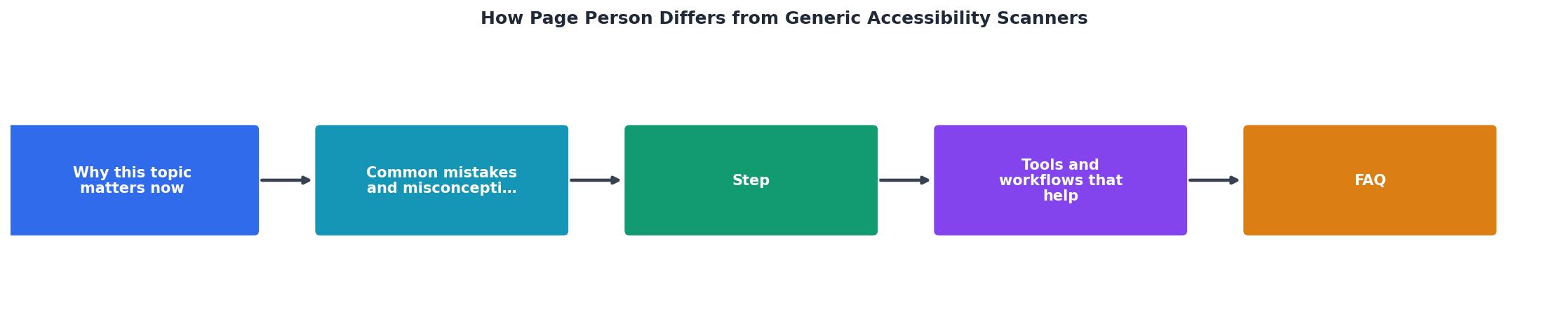
The process follows four steps:
- Run standard scan - Use axe or Lighthouse to catch technical WCAG violations. Fix missing labels, broken ARIA, contrast failures.
- Run Page Person - Analyze the same page for cognitive barriers. Identify reading level issues, overloaded sections, and unclear calls to action.
- Prioritize by impact - Technical fixes ensure access. Cognitive fixes drive conversion. Rank by revenue impact.
- Test and measure - Deploy changes, track conversion rate shifts, re-scan to confirm improvements.
Here is an example dashboard showing what a typical analysis reveals for a SaaS landing page:
Page Person Analysis: Example SaaS Landing Page
That example tells the whole story. A near-perfect technical score coexists with serious comprehension problems. The Lighthouse audit cannot see them. Page Person can.
Common mistakes to avoid
Teams make predictable errors when they rely on a single type of scanner:
- Treating compliance as conversion optimization. WCAG compliance is a legal and ethical baseline. It is not a growth strategy. Passing an audit does not mean your messaging works.
- Ignoring cognitive diversity. Roughly 15-20% of the population has a learning difference like dyslexia or ADHD. Another large segment reads below the average level. Your "clear" copy may not be clear to them.
- Fixing what is easy, not what matters. Adding alt text to decorative images is quick. Rewriting a confusing value proposition takes effort. The second fix moves revenue.
- Scanning once and forgetting. Pages change. New copy, new features, new layouts. Both technical and cognitive scans need to run after every significant update.
Your action checklist
Scanner + Cognitive Accessibility Workflow
Your progress is saved automatically in your browser.
FAQ
Frequently Asked Questions
Additional Resources
- Easy Checks – A First Review of Web Accessibility - Figure E shows the page changed by a person with low vision to make it more readable, for example, the main text is big, the footer text is very small, and the ...
- Free Accessibility Checker - WCAG & ADA Checks - Instantly! - Silktide's accessibility checker scans the page currently loaded in your browser, identifying issues that may hinder accessibility by comparing your site's ...
- Accessibility Scans Reliably Flag 13% of WCAG Criteria - Accessibility scans are very limited. The problem is many people think scans are audits or "ADA compliance checkers."