
Most websites are built for the ideal visitor who reads every word, understands every icon, and never gets distracted. That visitor does not exist. Roughly one in five people experiences a cognitive difference such as ADHD, dyslexia, or anxiety that changes how they process information on screen. When your design ignores cognitive accessibility, you lose those visitors at the exact moment they were ready to convert.

- Inclusive design goes beyond visual compliance; it accounts for how people think, focus, and decide.
- Cognitive accessibility improvements like plain language, predictable layouts, and reduced cognitive load benefit every user, not just those with diagnosed conditions.
- Integrating cognitive accessibility into your design workflow leads to measurable gains in comprehension, engagement, and conversion.
Why inclusive design matters now
Inclusive design starts from a straightforward premise: design for the widest range of human diversity from the beginning, rather than retrofitting later. Traditional accessibility work focused on screen readers, color contrast, and keyboard navigation. Those remain essential. But they cover only the perceptual and motor layers of interaction. The cognitive layer, how people understand, remember, and act on information, stayed largely unaddressed.
That gap costs real money. If 42% of visitors struggle with your site's content, every dollar you spend on paid acquisition leaks through comprehension failures that never show up in a heatmap. A bounce is a bounce, whether the visitor left because the page loaded slowly or because the pricing table made no sense.
"The simple answer to this is that disability is a social state and not a medical condition.">, What is Inclusive Design?, updated 2026
This reframing changes everything. You are not designing for a medical edge case. You are removing barriers that your own environment created.
What cognitive accessibility covers

Cognitive accessibility addresses the ability of users to perceive, understand, navigate, and interact with digital content using their cognitive functions. It covers several overlapping areas:
- Attention: Can the user focus on the task without being pulled away by animations, pop-ups, or competing calls to action?
- Memory load: Does the interface require users to remember information from a previous step or page?
- Language complexity: Is the copy written at a reading level that matches the audience, not the internal team?
- Decision fatigue: How many choices does the user face at each step? Fewer options with clear defaults convert better.
- Predictability: Do navigation patterns, button placements, and page structures stay consistent across the site?
Frameworks for cognitive inclusion

Several established frameworks help teams integrate cognitive accessibility into their process. The most practical ones share common ground:
Microsoft's Inclusive Design Toolkit
Microsoft's framework uses three principles: Recognize exclusion, Learn from diversity, and Solve for one, extend to many. The "solve for one" idea is especially useful. Design a checkout flow that works for someone with severe ADHD, and you get a flow that converts better for everyone.
WCAG Cognitive Accessibility Guidance
WCAG 2.2 includes success criteria relevant to cognitive accessibility, such as consistent navigation (3.2.3), error identification (3.3.1), and labels or instructions (3.3.2). The W3C's Cognitive and Learning Disabilities Accessibility Task Force has published supplemental guidance that goes further, covering topics like familiar design patterns, clear purpose on every page, and support for personalization.
The COGA Design Patterns
The Cognitive Accessibility Guidance (COGA) design patterns provide specific, testable recommendations:
- Make the purpose of each page clear from the first heading and first paragraph.
- Use familiar visual cues like underlined links and standard form controls.
- Provide help and support at the point of need, not buried in a FAQ.
- Avoid unexpected changes in context, layout, or content.
- Support personalization so users can adjust text size, spacing, and contrast.
Practical design adjustments
Here is where theory meets your Figma file. The following adjustments improve cognitive accessibility without requiring a full redesign.
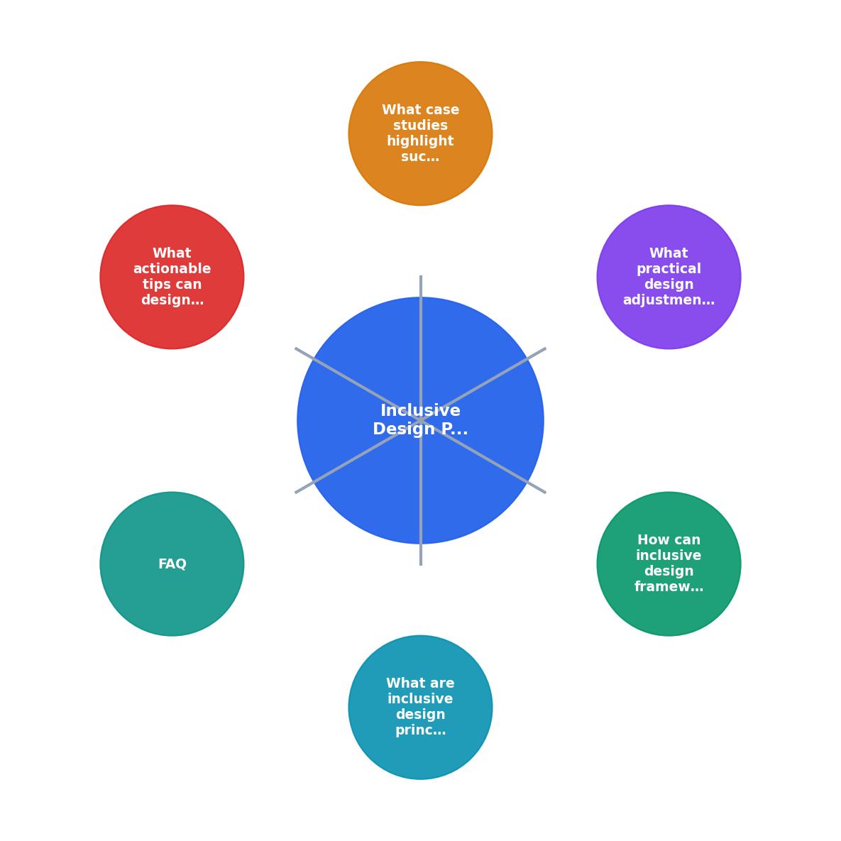
The process follows five steps: Audit existing content, Simplify language and layout, Test with diverse users, Iterate on findings, and Monitor ongoing performance.
Simplify language
Replace jargon with plain words. "Utilize" becomes "use." "Facilitate" becomes "help." Run your copy through a readability checker and aim for a grade 8 reading level or lower. This does not mean dumbing things down. It means respecting your reader's time and attention.
Reduce choices per screen
The Hick-Hyman law is not just a design trivia fact. Every additional option on a page increases decision time logarithmically. Stripe's checkout page is a textbook example: one form, one button, minimal distractions. Compare that to a checkout page with upsells, cross-sells, newsletter signups, and social proof banners all competing for attention.
Use consistent layouts
Keep navigation in the same position on every page. Use the same button styles for the same actions. When a user learns how your site works on one page, that knowledge should transfer to every other page without effort.
Provide clear feedback
After a user submits a form, tell them exactly what happened and what comes next. "Your order is confirmed. You will receive an email within 5 minutes." Not "Thank you!" with no context.
Break content into chunks
Long paragraphs lose readers. Use headings, bullet points, numbered lists, and short paragraphs. White space is not wasted space. It is cognitive breathing room.
The following interactive card summarizes the impact of these adjustments on a typical e-commerce site:
Cognitive Accessibility Impact (Example E-Commerce Site)
Real-world implementation examples

GOV.UK
The UK Government Digital Service rebuilt government websites around plain language, consistent patterns, and task-focused pages. Every page answers one question. Navigation is predictable. Reading level targets grade 6-8. The result: millions of users complete tasks like renewing a passport or filing taxes without calling a helpline. GOV.UK's design system is publicly documented and has influenced government digital services worldwide.
Mailchimp's content design
Mailchimp's content style guide explicitly addresses cognitive load. Their interface uses progressive disclosure: show only what the user needs at each step, and reveal complexity only when requested. Their email builder walks users through a linear process rather than presenting every option at once.
Banking apps and step-by-step flows
Several major banks, including Monzo and Starling, redesigned their onboarding flows to use one question per screen, plain language explanations of financial terms, and immediate visual feedback. These changes reduced drop-off during account creation by significant margins and made banking accessible to users who previously found the process overwhelming.
Measuring cognitive accessibility
You cannot improve what you do not measure. Here are concrete metrics to track:
- Task completion rate: Can users finish the primary action on each page?
- Time on task: Are users spending more time than expected? That often signals confusion, not engagement.
- Error rate: How often do users make mistakes in forms or navigation?
- Support ticket themes: Are users asking questions that the page should have answered?
- Readability scores: Tools like Hemingway Editor or readable.com give you a grade level for your copy.
Cognitive Accessibility Integration Checklist
Your progress is saved automatically in your browser.
| Traditional Accessibility | Cognitive Accessibility |
|---|---|
| Color contrast ratios | Reading level of copy |
| Alt text on images | Clarity of page purpose |
| Keyboard navigation | Number of choices per screen |
| Screen reader compatibility | Consistency of layout patterns |
| Focus indicators | Quality of error messages |
| ARIA labels | Progressive disclosure of complexity |
FAQ
Frequently Asked Questions
Additional Resources
- What is Inclusive Design? — updated 2026 - Inclusive design enhances the overall user experience. It ensures that everyone—irrespective of physical or cognitive abilities, age, culture, ...
- Inclusive design principles: How to build digital ... - When you reduce cognitive load, simplify interfaces, or clarify instructions, you're not just helping edge-case users, you're improving the experience for all.
- Inclusive Design - NN/G - Summary: Inclusive design describes methodologies to create products that understand and enable people of all backgrounds and abilities.