

Most design systems handle color contrast, focus states, and alt text well enough. But they completely ignore the cognitive layer. Visitors with ADHD, dyslexia, anxiety, or simply high cognitive load hit friction that no contrast checker will ever flag. This article walks through exactly how to embed cognitive accessibility into your design system so every component ships with comprehension built in, not bolted on.

- Design tokens can encode cognitive accessibility decisions (spacing, animation duration, reading-level hints) so every component inherits them automatically.
- Companies like Google (Material Design) and Microsoft (Fluent) already bake cognitive considerations into their systems, and you can follow their patterns at any team size.
- A structured audit-then-tokenize-then-document workflow gets cognitive accessibility into your existing design system without a full rebuild.
What cognitive accessibility actually means
Cognitive accessibility refers to making digital interfaces understandable and usable by people with a wide range of cognitive abilities. That includes people with diagnosed conditions like ADHD, dyslexia, autism, or traumatic brain injury. It also includes anyone experiencing temporary cognitive strain: sleep deprivation, multitasking, stress, unfamiliar language, or simply being new to your product.
Traditional accessibility tooling focuses on perceivable and operable criteria. Screen reader compatibility, keyboard navigation, color contrast ratios. Those matter. But they skip the "understandable" principle in WCAG entirely. Cognitive accessibility fills that gap.
"Research shows that 12.8% of adults have cognitive disabilities, but the real number of people who benefit from cognitive accessibility is much higher.">, Best Practices for Cognitive Accessibility in Web Design
That 13% figure only counts diagnosed conditions. Factor in situational impairments and the audience balloons. A design system that accounts for cognitive accessibility serves everyone better.
Inside a design system, cognitive accessibility means that components, tokens, patterns, and documentation all carry decisions that reduce cognitive load by default. A button component does not just define color and border-radius. It also defines label length constraints, icon pairing rules, and animation behavior that respects prefers-reduced-motion.
Why your design system needs this

Design systems exist to create consistency and speed. Adding cognitive accessibility to that system multiplies both benefits:
- Consistency across products. When cognitive rules live in tokens and component specs, every team shipping with the system inherits them. No one has to remember to "make it simpler" on their own.
- Reduced design debt. Retrofitting cognitive fixes page by page costs far more than encoding them once in the system.
- Defensible design decisions. Telling a stakeholder "our design system enforces a maximum label length of 3 words on primary CTAs" is concrete. Saying "we try to keep things simple" is not.
- Broader user reach. Clearer interfaces convert better for all visitors, not just those with diagnosed conditions.
- Regulatory alignment. The European Accessibility Act (effective June 2025) and evolving WCAG 3.0 drafts increasingly reference cognitive and learning disabilities.
The gap between what designers want to do and what their tools support is wide. A design system closes that gap at the infrastructure level.
How design tokens support cognitive accessibility
Design tokens are the atomic values in a design system: colors, spacing, typography scales, motion durations, z-index layers. They are the single source of truth that feeds Figma libraries, CSS custom properties, and platform-specific code.
Here is where cognitive accessibility fits into tokens:
- Spacing tokens. Generous whitespace reduces visual crowding. Define a
space-comfortabletier that components use by default, with aspace-compactoverride only when explicitly chosen. - Typography tokens. Set a minimum body
font-sizeof 16px. Define aline-heighttoken of at least 1.5 for body text. Create amax-line-lengthtoken (65-75 characters) that containers respect. - Motion tokens. Define
duration-subtle(150ms),duration-moderate(300ms), andduration-emphasis(500ms). Map all component animations to these tokens. Whenprefers-reduced-motionis active, override them to 0ms globally. - Color tokens. Beyond contrast ratios, define semantic color tokens that limit the total number of distinct hues on a page. Cognitive overload increases with color variety.
- Content tokens. This is less common but effective: define tokens for maximum label lengths, maximum options in a dropdown before switching to search, and maximum form fields per step.
| Standard Token Set | Cognitive-Enhanced Token Set |
|---|---|
font-size-body: 14px | font-size-body: 16px |
line-height-body: 1.4 | line-height-body: 1.6 |
motion-duration: 400ms | motion-duration: 200ms (0ms if reduced-motion) |
max-dropdown-items: 20 | max-dropdown-items: 7 (then switch to search) |
| No label length rule | max-cta-label: 3 words |
Industry examples that work

Several large-scale design systems already integrate cognitive considerations. Studying them reveals patterns you can adapt.
Google Material Design 3
Material Design 3 introduced "dynamic color" and adaptive layouts. The cognitive benefit: fewer arbitrary color choices per screen, and layouts that simplify on smaller viewports rather than just shrinking. Material also defines explicit motion curves and durations, with prefers-reduced-motion support built into the component library. Their guidance on "progressive disclosure" in navigation directly addresses cognitive load.
Microsoft Fluent 2
Fluent 2 explicitly references cognitive accessibility in its design principles. The system uses "density" modes (compact, normal, spacious) controlled by tokens. This lets products serving users under high cognitive load (healthcare dashboards, accessibility tools) default to spacious mode. Fluent also standardizes icon-plus-label pairing rules, reducing reliance on icon-only buttons that increase cognitive effort.
GOV.UK Design System
The UK Government Digital Service design system is arguably the gold standard for cognitive accessibility. Every component ships with plain-language guidance. Form patterns enforce one question per page. Error messages use specific, actionable language ("Enter your email address" not "Invalid input"). The system limits visual complexity by design: no decorative elements, no ambiguous icons, no multi-column layouts for critical flows.
IBM Carbon
Carbon includes an "accessibility" tab on every component page. While it leans toward WCAG technical compliance, Carbon's structured content guidelines (maximum heading levels, required helper text on form fields, standardized empty states) reduce cognitive friction. Their "AI" component patterns also include guidance on explaining automated decisions in plain language.
The following interactive card summarizes how these systems compare across key cognitive accessibility dimensions:
Material 3
Fluent 2
GOV.UK
IBM Carbon
Aligning your design system step by step

You do not need to rebuild your design system from scratch. The process below works as an incremental integration. Each step builds on the previous one.
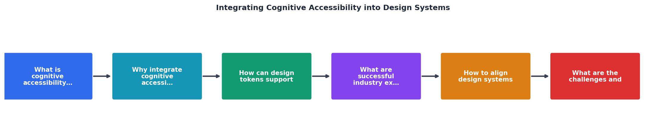
The diagram shows five stages: Audit, Define tokens, Update components, Document, and Test. Here is what each involves:
1. Audit existing components
Pick your 10 most-used components (button, input, card, modal, navigation, dropdown, alert, tooltip, table, form). For each one, answer:
- Does it enforce readable label lengths?
- Does it respect
prefers-reduced-motion? - Does it use semantic color tokens or hardcoded hex values?
- Does it provide helper text or contextual guidance?
- Does it limit choices to a cognitively manageable number (5-9 items)?
2. Define cognitive tokens
Based on audit findings, create a new token category. Call it cognitive or comprehension. Typical tokens include:
cog-max-line-length: 75chcog-min-font-size: 16pxcog-line-height-body: 1.6cog-motion-duration-default: 200mscog-motion-duration-reduced: 0mscog-max-choices-before-search: 7cog-spacing-comfortable: 24px
3. Update components
Wire the new tokens into component implementations. Start with the highest-traffic components from your audit. A dropdown that previously allowed unlimited visible options now caps at cog-max-choices-before-search and switches to a searchable input beyond that threshold.
4. Document with examples
Every component page in your design system documentation should include a "Cognitive accessibility" section. Show a before/after. Explain why the constraint exists, not just what it is. Designers and developers adopt rules faster when they understand the reasoning.
5. Test with real scenarios
Use tools like PagePerson Insights to scan pages built with your updated components. The extension flags cognitive barriers that token-level changes might miss, like confusing copy or overwhelming information density. Pair automated scanning with manual review using cognitive walkthrough techniques: attempt each task while simulating distraction, time pressure, or unfamiliarity.
Challenges and how to handle them
Every integration hits friction. Here are the most common obstacles and direct solutions:
"It slows us down." Encoding cognitive rules in tokens actually speeds teams up after the initial investment. Designers stop debating font sizes and spacing on every project. The system decides.
"We do not have accessibility expertise." You do not need a dedicated specialist to start. The audit checklist below gives any designer or developer a structured entry point. Expertise grows through practice.
"Stakeholders do not see the ROI." Frame cognitive accessibility as conversion optimization. Clearer interfaces reduce bounce rates and support ticket volume. Track metrics before and after token changes to build the case.
"Our system is too mature to change." Tokens are additive. You are not replacing existing tokens. You are adding a cognitive layer that components can adopt incrementally. No big-bang migration required.
The coverage gap is real. Most design systems address visual accessibility but leave cognitive accessibility to individual teams. Closing that gap gives your system a genuine competitive advantage.
Cognitive Accessibility Design System Integration Checklist
Your progress is saved automatically in your browser.
FAQ
Frequently Asked Questions
cog-min-font-size from 14px to 16px) propagates across every product using the system. Without tokens, each team makes these decisions independently, leading to inconsistent and often inaccessible results.What cognitive accessibility challenge has been hardest to solve in your design system? Share your experience so others can learn from it.
Additional Resources
- Accessibility in design systems | Afternow - And when it comes to incorporating accessibility, design systems offer a structured opportunity to prioritize best practices from the ground up.
- Best Practices for Cognitive Accessibility in Web Design - Unlock the full potential of your website with expert cognitive accessibility tips. Explore WCAG guidelines, design patterns, and real-world case studies.
- Play 7: Integrate Accessibility Needs into Requirements ... - Document, track, and resolve accessibility issues to maintain compliance, improve user experience, and ensure inclusive federal technology services.