

Your mobile checkout looks fine on your screen. Your team tested it, approved it, and shipped it. Yet seven out of ten shoppers who add items to their cart on a phone never complete the purchase. The gap between what your team sees and what a stressed, distracted, thumb-scrolling customer experiences is where revenue disappears.

- Mobile checkout abandonment is driven less by technical bugs and more by cognitive overload: too many fields, unclear progress, surprise costs, and ambiguous labels.
- E-commerce teams miss these barriers because they test on desktop mindsets, skip real-device cognitive walkthroughs, and treat checkout as a form instead of a decision sequence.
- Fixing it starts with auditing your checkout for working memory demands, reducing visible choices per screen, and validating with real mobile-first users.
The real cost of cognitive friction
Most e-commerce teams track cart abandonment as a single metric. They see the number, run an A/B test on button color, and call it optimization. That misses the point entirely.
Cognitive barriers are the invisible walls your checkout builds inside a shopper's head. They happen when someone has to hold too much information in working memory, parse confusing microcopy, or make decisions without enough context. On a 6-inch screen, with a toddler screaming in the background, these barriers multiply fast.
"The average online cart abandonment rate is a surprising 69.57%12, and of that, over a quarter of online shoppers abandon the checkout if it is too long or complicated.">, Loqate
That statistic is not about slow load times or missing payment methods. It is about brains giving up. Your checkout asks too much of people who are already multitasking.
Why your team keeps missing these

Three patterns explain why smart teams ship checkouts that confuse real customers:
- The curse of knowledge. Your product team knows what "billing address same as shipping" means. A first-time buyer on a phone, shopping in their second language, does not parse that checkbox the same way. Internal testers cannot unsee what they already understand.
- Desktop-first QA. Even teams that claim "mobile-first design" often review checkout flows on a 27-inch monitor. The cognitive experience of scrolling through five form sections on a laptop is fundamentally different from thumbing through them on a phone while standing on a bus.
- Metric blindness. Analytics tools show where people drop off. They do not show why. A 40% exit rate on the payment screen could mean the form is broken, or it could mean the shopper suddenly realized the total was higher than expected because shipping costs appeared too late. Those are completely different problems with completely different fixes.
Five barriers hiding in plain sight

Here are the specific cognitive barriers I see e-commerce teams overlook repeatedly. These are not edge cases. They affect the majority of mobile shoppers.
1. Too many fields visible at once
A checkout page that shows 12 form fields simultaneously on mobile forces the shopper to mentally plan their path through the form. That planning step consumes working memory. Shopify's one-page checkout works partly because it collapses sections, showing only the active step. Compare that to a WooCommerce default checkout that dumps every field onto a single scrollable page.
2. Ambiguous microcopy
Labels like "Address Line 2" or "Company (optional)" create micro-decisions. The shopper pauses: "Do I need this? What happens if I skip it?" Each pause is a tiny cognitive tax. Multiply it across 15 fields and you have a checkout that feels exhausting even though each individual field seems simple.
3. Late-revealed costs
When shipping costs, taxes, or fees appear only on the final screen, the shopper has to recalculate their mental budget. That recalculation triggers loss aversion, a well-documented cognitive bias. The item felt like a $30 purchase. Now it is $38.50. The brain registers that as a loss, not an addition.
4. No progress indication
Without a clear step indicator (Step 2 of 3), the shopper cannot estimate how much effort remains. Uncertainty about remaining effort increases perceived cognitive load. Amazon's mobile checkout shows exactly where you are and how many steps remain. Many smaller stores skip this entirely.
5. Input format confusion
Asking for a phone number without specifying the expected format (with country code? with dashes?) forces the shopper to guess. Wrong guesses trigger validation errors, which trigger frustration, which triggers abandonment. This is pure cognitive waste.
The following dashboard illustrates how these five barriers typically distribute across a mobile checkout flow. This is based on common audit patterns where cognitive load clusters around specific screens:
Step-by-step: audit and fix
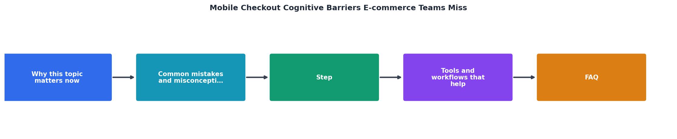
Follow these steps to find and eliminate cognitive barriers in your mobile checkout. The diagram above shows the flow: Audit, Identify, Prioritize, Fix, Validate.
Step 1: Audit on a real phone. Open your checkout on an actual mobile device. Not a browser emulator. Not a responsive preview. A phone. Complete the entire purchase. Note every moment you hesitate, re-read, or scroll back up.
Step 2: Identify cognitive load spikes. Mark each screen where you had to hold more than two pieces of information in your head simultaneously. Common spikes: the address form, the payment screen, and the order summary.
Step 3: Prioritize by drop-off data. Cross-reference your cognitive audit with your analytics. If 35% of users leave on the shipping screen and your audit flagged six form fields visible at once on that screen, you have a clear target.
Step 4: Fix one barrier per sprint. Do not redesign the entire checkout at once. Collapse the address form into an autocomplete field. Add a step indicator. Move the order total to the top of every screen. Ship each change separately so you can measure its impact.
Step 5: Validate with five users. Recruit five people who match your customer profile. Watch them complete checkout on their phones. Five users catch roughly 85% of usability issues. Tools like PagePerson Insights can also flag cognitive accessibility barriers across your checkout pages automatically, giving you a baseline before and after each change.
Tools and workflows that help

You do not need a research lab to catch cognitive barriers. Here is what works in practice:
- Session replay tools (Hotjar, FullStory): Watch real mobile sessions. Look for rage taps, repeated scrolling, and form field re-entries. These are behavioral signals of cognitive friction.
- Cognitive walkthrough method: Have someone unfamiliar with your product attempt checkout while narrating their thought process out loud. Record it. The moments they say "wait, what does this mean?" are your barriers.
- Address autocomplete (Google Places API, Loqate): Replacing manual address entry with autocomplete eliminates the highest-friction form section in most checkouts.
- Progressive disclosure: Show only the current step's fields. Shopify, BigCommerce, and Stripe Checkout all use this pattern. If your platform does not support it natively, custom CSS and JavaScript can collapse inactive sections.
| Traditional Checkout | Cognitively Optimized Checkout |
|---|---|
| All fields visible at once | One step shown at a time |
| Costs revealed at the end | Running total on every screen |
| Generic field labels | Contextual labels with examples |
| No progress indicator | Clear "Step 2 of 3" bar |
| Validation errors after submit | Inline validation as you type |
Mobile Checkout Cognitive Barrier Audit
Your progress is saved automatically in your browser.
FAQ
Frequently Asked Questions
What is the single biggest cognitive friction point in your mobile checkout right now? Open it on your phone, go through the full purchase flow, and find out.
Additional Resources
- Reducing cognitive load in the mobile checkout - Improve data quality by capturing correct addresses. Boost conversions and user experience with postal code address verification and geocoding technology.
- The Cognitive Cost in E-Commerce: Why Your Shoppers ... - The Cognitive Cost in E-Commerce: Why Your Shoppers Abandon Without Realizing It · 1. Overcrowded homepages · 2. Overly complex navigation menus.
- If Your Checkout Is Leaking Revenue, Accessibility Can Fix It - Digital inaccessibility is the silent leak in every e-commerce funnel, and it's larger than most digital teams realize.