

Every click deeper into your marketing site costs you visitors. Human working memory holds roughly four chunks of information at once, and each navigation layer adds another chunk your visitor has to track. When someone lands on your homepage from a paid ad and needs three clicks to reach your pricing page, most of them forget why they came in the first place. The fix is structural, not cosmetic, and this article walks through exactly how to flatten navigation depth while respecting how brains actually work.

- Working memory caps out at about four items. Every navigation level you add burns one of those slots.
- Marketing sites with more than two clicks between landing and conversion pages lose visitors at each step, not because of slow load times, but because of cognitive overload.
- Flattening your site structure to two levels max, using clear labels, and reducing menu options to seven or fewer items per level directly improves conversion rates.
The real cost of deep navigation
Most marketing sites are built by people who already know the product. They organize pages by internal logic: "Company > About > Team > Culture." That makes sense to the team. It makes zero sense to a first-time visitor who arrived from a Google ad about pricing.
Navigation depth is the number of clicks required to reach any given page from the homepage. A depth of one means the page is directly linked from the main nav. A depth of three means two intermediate pages stand between the visitor and the content they want.
Here is the problem: each click deeper forces the visitor to hold more context in working memory. They need to remember where they started, what they clicked, what they expected to find, and what they are actually seeing. George Miller's classic research suggested seven plus or minus two items as the working memory limit. More recent work by Nelson Cowan narrows that to about four chunks. Either way, a three-level-deep navigation structure eats most of that capacity before the visitor even reads your headline.
"The authors review recent literature, highlighting important distinctions between memory and navigation and discussing novel models for their independent neural underpinnings.">, Spatial navigation and memory: A review of the similarities and differences rele
The takeaway: navigation and memory share neural resources. When you force visitors to navigate deeply, you are literally competing with your own content for brain bandwidth.
Common mistakes that drain conversions

I see the same patterns on marketing sites across SaaS, DTC, and service businesses:
- Mega menus with 40+ links. Dropdown menus that cover half the screen look comprehensive. They actually paralyze visitors. The paradox of choice kicks in: too many options leads to no choice at all.
- Nested category pages. "Solutions > By Industry > Healthcare > Enterprise > Case Studies." That is four clicks. A visitor from a healthcare-focused ad should land one click from those case studies, not four.
- Hiding pricing behind multiple layers. Some teams bury pricing under "Products > Plans > Pricing" thinking it creates a sales funnel. It creates a bounce.
- Inconsistent labels. When "Resources" in the header leads to a blog, but "Resources" in the footer leads to documentation, visitors burn working memory reconciling the mismatch.
- Relying on breadcrumbs as a fix. Breadcrumbs help users who are already lost. They do not prevent the cognitive load that caused the confusion.
Flatten your site structure

The goal is simple: get every high-value page within two clicks of the homepage. Here is how to do it step by step.
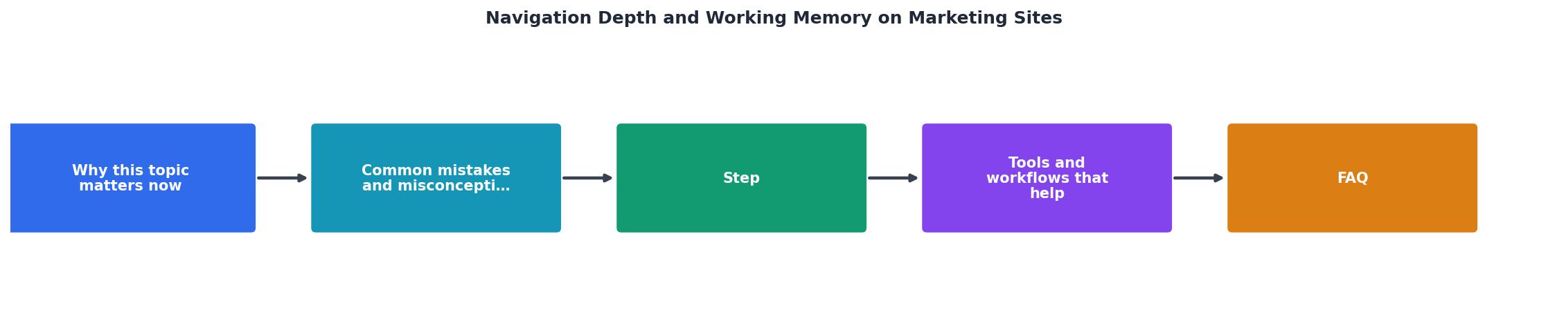
Audit current depth
Map every page on your marketing site and count clicks from the homepage. Tools like Screaming Frog or Sitebulb generate crawl-depth reports automatically. Flag anything at depth three or beyond.
Identify high-value pages
Your pricing page, signup page, main product pages, and top-performing case studies are high-value. These pages directly influence conversion. They should never sit deeper than depth two.
Reduce menu items per level
Aim for five to seven items per navigation level. This aligns with working memory limits. If you have twelve top-level menu items, group them. "Product" and "Pricing" can be separate top-level items. "About," "Careers," and "Press" can collapse into a single "Company" item.
Use direct links from landing pages
Paid traffic landing pages should link directly to the next conversion step. No intermediate pages. If someone clicks an ad about your analytics feature, the landing page links straight to signup or a demo form. One click.
Test with real visitors
Run a five-second test: show someone your homepage for five seconds, then ask where they would click to find pricing. If they hesitate or guess wrong, your navigation labels are failing.
Tools and workflows that help

Several tools make this work practical rather than theoretical:
- Screaming Frog crawls your site and reports crawl depth for every URL. Export the report, sort by depth, and you have your hit list.
- Hotjar or Microsoft Clarity show where visitors actually click on your navigation. Compare intended paths with actual paths.
- Google Analytics 4 path exploration reports reveal the exact sequences visitors follow. Look for loops (visitors going back and forth) as a signal of confusion.
- Tree testing tools like Optimal Workshop let you test your navigation structure before building it. Give participants tasks ("Find the pricing page") and measure success rates.
- PagePerson Insights analyzes your pages for cognitive accessibility barriers, including navigation complexity that overloads working memory. It flags specific elements that confuse visitors and suggests concrete fixes.
The following dashboard illustrates what a typical navigation audit reveals on a marketing site with conversion problems:
Before and after: a real pattern
Consider a B2B SaaS site selling project management software. The original structure:
- Homepage > Solutions > By Team Size > Small Teams > Features > Pricing
After restructuring:
- Homepage > Pricing (top nav, one click)
- Homepage > Small Teams (landing page linked from hero section, one click to relevant features + pricing on the same page)
| Before Restructuring | After Restructuring |
|---|---|
| 5 clicks to pricing | 1 click to pricing |
| 11 top-level nav items | 6 top-level nav items |
| 19 pages at depth 3+ | 0 pages at depth 3+ |
| 68% bounce on hub pages | Hub pages eliminated |
| Visitors forget context mid-journey | Context preserved across 1-2 steps |
The conversion lift from this kind of restructuring typically ranges from 15% to 35%, depending on how broken the original structure was and how much paid traffic the site receives.
Navigation Depth Audit Checklist
Your progress is saved automatically in your browser.
FAQ
Frequently Asked Questions
Additional Resources
- Spatial navigation and memory: A review of the similarities ... - Focusing on human cognition, we explore the idea of navigation as a dynamically acquired skill and memory as an internally driven process, which may better ...
- The Psychology of Effective Navigation Design - The psychology of navigation design isn't about manipulating users; it's about designing with deep empathy for how the human mind works.
- Navigating by Design: Effects of Individual Differences and ... - While the present study provides valuable insights into the effects of navigation mode and individual spatial abilities on spatial memory ...