
You know cognitive accessibility matters. You have read the guidelines, you understand that users with ADHD, dyslexia, and anxiety deserve clear interfaces. Yet every time you try to push cognitive accessibility into a sprint, something blocks you. Stakeholders want proof, developers call it scope creep, and the tooling barely covers contrast ratios. This article breaks down the specific obstacles and gives you concrete strategies to get past each one.

- Cognitive accessibility implementation stalls because of three forces: team misconceptions, technical gaps in existing tooling, and stakeholder resistance rooted in missing ROI data.
- You overcome these by reframing accessibility as a usability and conversion lever, adopting cognitive-specific audit tools, and building a repeatable internal process that generates evidence decision-makers accept.
- Start small with one flow, measure the impact, then expand.
Why cognitive accessibility stalls
Most accessibility programs start with WCAG 2.x automated checks. Color contrast, alt text, keyboard navigation. Those are table stakes. Cognitive accessibility covers a different layer: reading level, information density, predictable navigation, error recovery, and memory load. Automated scanners miss almost all of it.
That gap creates a false sense of completion. Teams run an axe scan, see a green score, and assume the site is accessible. Nobody asks whether a user with working memory limitations can actually complete the checkout flow. The result: cognitive barriers stay invisible until someone files a complaint or conversion data looks inexplicably bad.
Three categories of obstacles show up repeatedly:
- Misconceptions about what cognitive accessibility requires
- Technical hurdles in auditing and implementing fixes
- Stakeholder resistance when there is no clear business case
Clearing up misconceptions

The biggest misconception is that cognitive accessibility only benefits a small group of people with diagnosed disabilities. In reality, cognitive load affects everyone. A tired parent filling out a form at midnight, a non-native speaker parsing legal terms, a stressed user on a slow mobile connection. Designing for cognitive accessibility improves the experience for the entire audience.
Here are the misconceptions that come up most often in design teams:
- "We already do accessibility." WCAG technical checks cover perceivable and operable criteria well. Understandable and robust criteria, especially the cognitive parts, need manual review and user testing.
- "It means dumbing down the design." Reducing cognitive load is not about removing content. It is about structuring information so the brain processes it with less effort. Think progressive disclosure, not deletion.
- "It is too subjective to measure." Reading level scores, task completion rates, error rates on forms, and time-on-task are all quantifiable. You can measure cognitive accessibility the same way you measure usability.
"Many struggle to keep up with evolving web accessibility laws and cognitive accessibility nuances.">, Best Strategies for Cognitive Accessibility in Digital Design
Education works best when it is specific. Instead of sending the team a 40-page WCAG document, create a short internal reference that maps cognitive accessibility principles to your own product screens. Show a screenshot of your onboarding flow and annotate where memory load spikes. That makes the abstract concrete.
Technical hurdles and solutions

Tooling is the second wall. Most accessibility testing tools focus on DOM-level checks: missing labels, broken ARIA roles, insufficient contrast. Cognitive issues live at a higher level of abstraction. You need different instruments.
Here is what actually works for cognitive audits:
- Readability analyzers like Hemingway Editor or readable.com score your copy against Flesch-Kincaid and other indices. Aim for grade 8 or below for public-facing content.
- Cognitive walkthrough method where a reviewer steps through a task asking four questions at each step: Will the user notice the action? Will they associate it with the goal? Will they interpret the feedback correctly? Will they know what to do next?
- Session replay tools (Hotjar, FullStory) filtered for rage clicks, u-turns, and excessive scrolling. These behavioral signals often point to cognitive friction.
- PagePerson Insights analyzes pages specifically for cognitive accessibility barriers and conversion friction, giving you evidence you can bring to a design review without running a full usability study.
- Simplify form flows. Break multi-step forms into single-question screens. Shopify's checkout redesign proved this reduces abandonment.
- Add visible progress indicators. Users with working memory limitations need to see where they are in a process.
- Use consistent navigation patterns. Every page should have the same primary nav structure. GOV.UK is the gold standard here.
- Provide clear error messages. "Invalid input" tells the user nothing. "Please enter a date in MM/DD/YYYY format" tells them exactly what to fix.
- Limit choices per screen. Hick's Law is not just a design school concept. Reducing options from 12 to 4 on a pricing page measurably improves decision speed.
Securing stakeholder buy-in
This is where most designers get stuck. You know the problems exist. You have ideas for fixes. But the product manager wants features, the engineering lead wants to reduce tech debt, and nobody has "cognitive accessibility" on their OKRs.
The fix is framing. Stop calling it accessibility in stakeholder meetings. Call it comprehension optimization or friction reduction. These terms map directly to metrics leadership already tracks: conversion rate, task completion, support ticket volume, and bounce rate.
Build your case with this sequence:
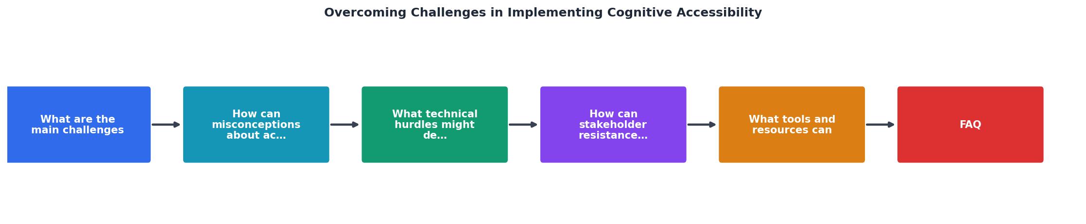
The diagram shows five steps: Audit, Evidence, Propose, Pilot, Scale. Start with a focused audit of one high-traffic flow. Collect evidence (session replays, readability scores, error rates). Propose specific changes with predicted impact. Run a pilot on a single page or flow. Measure results and use them to justify scaling.
Here is what makes each step effective:
- Audit: Pick the flow with the highest drop-off. Run a cognitive walkthrough and a readability check. Document every friction point with a screenshot and a one-sentence description.
- Evidence: Quantify the cost. If 2,000 users per month abandon a form at step 3, and your average order value is $50, that is $100,000/month in potential revenue sitting on the table.
- Propose: Present three changes, ranked by effort. Give each one an expected impact range. "Simplifying the form from 3 steps to single-question screens should reduce abandonment by 10-25% based on Baymard Institute benchmarks."
- Pilot: Implement the lowest-effort change first. A/B test it for two weeks.
- Scale: Share the results in a format leadership consumes. A Slack message with a chart beats a 20-slide deck every time.
The following interactive card summarizes the typical impact areas you can present to stakeholders when building your business case for cognitive accessibility improvements:
Stakeholder Impact Summary
Tools and resources that work
You do not need a massive budget. Here is a practical stack for cognitive accessibility work:
Free tools:- Hemingway Editor for readability scoring
- WAVE browser extension for baseline WCAG checks
- Microsoft Accessibility Insights for cognitive walkthrough guidance
- GOV.UK Design System as a reference for clear, cognitively accessible patterns
- Hotjar or FullStory for session replay analysis
- Baymard Institute research library for evidence-backed UX benchmarks
- PagePerson Insights for automated cognitive accessibility and conversion barrier analysis
- WCAG 2.2 Success Criteria under "Understandable" (Guideline 3.1, 3.2, 3.3)
- W3C Cognitive Accessibility Guidance (COGA)
- Plain Language Action and Information Network (plainlanguage.gov)
- Nielsen Norman Group articles on cognitive load
The key is picking one tool from each category and actually using it consistently. A readability check on every piece of copy before it ships. A cognitive walkthrough on every new flow before development starts. These small habits compound.
Cognitive Accessibility Implementation Checklist
Your progress is saved automatically in your browser.
FAQ
Frequently Asked Questions
Additional Resources
- Best Strategies for Cognitive Accessibility in Digital Design - Common Accessibility Challenges for Cognitively Disabled Users · 1. Difficulty Maintaining Focus: · 2. Sensory Overload: · 3. Cognitive Overload:.
- Barriers to creating value with cognitive accessibility features ... - This paper aims to identify service providers' perceptions of barriers to designing cognitively accessible digital services.
- Cognitive Disability: New Web Accessibility Challenges - It covers how everyone benefits from accessible experiences and debunks accessibility myths to help learners begin overcoming bias.