
Most blogs confuse visitors without meaning to. Long walls of text, buried key points, jargon without definition, and unclear next steps all add friction. But here's the thing: you can't fix what you don't see. Most analytics tools show where visitors bounce, not why their brains got overloaded or they stopped understanding. Cognitive accessibility, designing for how people actually process information, isn't a nice-to-have; it's the difference between a blog that converts and one that leaks traffic.

- Cognitive accessibility means designing for how people's brains process information, not just technical WCAG compliance.
- Start with three high-impact fixes: break walls of text into short paragraphs, define jargon on first use, and move key answers to the top.
- Use real data (heatmaps, session recordings, user tests) to find your biggest comprehension leaks, then prioritize by traffic impact.
- Tools like PagePerson can show you where visitors actually struggle, so you're not guessing.
The good news: you don't need a complete redesign. The biggest wins come from small, targeted changes. This guide walks you through what breaks first, how to spot it, and which fixes deliver the fastest ROI.
Why this matters now
Cognitive disabilities affect one in eight adults, but that stat misses the real picture. The number of people who benefit from clearer writing, better structure, and less cognitive load is much higher. Add in temporary conditions, exhaustion, stress, medication side effects, language barriers, and you're redesigning for almost everyone.
For your blog specifically, cognitive accessibility directly impacts conversion. A visitor who doesn't understand your value prop or gets lost in your argument bounces. They don't come back. In a world where paid acquisition costs keep climbing, wasting traffic on confusing content is leaving money on the table.
Most product blogs fail in two ways. First, they hide the answer. A visitor lands on a post about "how to reduce cart abandonment" and spends two minutes reading context before learning a single tactic. Their attention breaks. Second, they assume too much knowledge. Technical terms go undefined. Steps assume readers know what you know. The cognitive load stacks until it breaks comprehension.
Common mistakes and misconceptions
Mistake 1: Thinking cognitive accessibility is only for people with diagnosed disabilities.
Reality: Cognitive load affects everyone. A surgeon reading your blog at midnight after a long shift operates under the same cognitive constraints as someone with ADHD. Designing for clarity helps all visitors.
Mistake 2: Confusing cognitive accessibility with WCAG compliance.
WCAG rules check alt text, color contrast, and keyboard navigation. Those matter. But a page can pass WCAG and still confuse readers through dense prose, unclear structure, or undefined jargon. Cognitive accessibility is about information design, not just technical boxes.
Mistake 3: Over-simplifying as the only solution.
Some teams think "cognitive accessibility means dumbing it down." It doesn't. It means organizing complex ideas so they land. A technical post about API rate limiting can be precise and clear. The two aren't opposite.
Mistake 4: Fixing everything at once.
Cognitive accessibility improvements compound. If you rewrite all 200 blog posts in one sprint, you'll burn out and never ship. Pick the highest-traffic posts first, measure impact, then iterate.
Step-by-step approach
Measure where you're losing people

You can't improve what you can't see. Start with three data sources:
Google Analytics: Which posts have the highest bounce rates? Which ones drive conversions? Focus on high-traffic posts that leak visitors, those have the biggest ROI.
Heatmaps (Hotjar, Microsoft Clarity): Where do visitors scroll? Where do they click? If most people bounce before scrolling past the first 300 pixels, your opening is failing. If they hover over but don't click a CTA button, your call-to-action language might confuse them.
Session recordings: Watch real visitors read your post. Do they pause at certain paragraphs? Do they re-read sections? Do they scroll back up to find something? These moments signal cognitive friction, your explanation failed or came too late.
Start with the Big Three fixes
These three changes unlock the most value for the effort:
1. Break walls of text into short paragraphs.
A paragraph should make one point. Three to five sentences is the sweet spot. When readers see a dense block of text, their brain preempts: "This will take effort." They bail before reading a word.
Example of wall-of-text problem:
"One common issue with e-commerce sites is that customers get confused by too many product options and complex filtering systems, which can lead to decision paralysis, and research shows that when visitors encounter more than seven filter options they often abandon the search and leave the site, so it's important to limit your filters and group them logically to guide customers toward the products they're most likely to buy."
That sentence is 58 words. Read it twice. Your brain got tired.
Fixed version:
"Customers get confused by too many product filters. Research shows that more than seven filter options leads to decision paralysis and abandonment. Limit filters and group them logically to guide customers toward the right products."
Still accurate. Reads in 15 seconds instead of 30.
2. Define jargon on first use.
You know what "CAC" means. Your visitor doesn't. Every undefined term adds a cognitive step: Do I know this? Should I? Do I look it up or keep reading? That friction compounds across a post.
Never write: "Your CAC should decrease month-over-month."
Write: "Your customer acquisition cost (CAC) should decrease month-over-month."
Or better yet, move the definition outside the sentence flow:
"Your customer acquisition cost (CAC) should decrease. CAC is the total cost to acquire one paying customer."
3. Move your key insight to the top.
Blog readers scan. They read the headline, skim the first two paragraphs, then decide if the post deserves deep attention. If your answer is buried in section four, they've already left.
Start with the takeaway. Then prove it. Readers who want proof will stay; readers who got their answer already have it.
Instead of:
"Let me explain the history of SMS marketing… then discuss why it fell out of favor… then reveal the surprising resurgence… and finally, here's the one metric you should track."
Write:
"Track SMS open rates, not send volume. Open rates reveal whether your subscribers actually care. Here's why [proof section]. History [optional section for context]."
Identify cognitive load hot spots

Cognitive load is the mental effort a task requires. Reading a dense technical explainer while trying to understand a new concept has high cognitive load. Reading a simple checklist has low cognitive load.
Common hot spots on blog pages:
Long sentences. Over 20 words per sentence, on average, fatigues readers. Aim for 15–17 words as a baseline.
Undefined acronyms or industry terms. If fewer than 10% of your audience encounters a term weekly, define it.
Paragraphs longer than eight lines. On mobile, a paragraph that spans more than five lines feels like a wall. Split it.
Multiple CTA buttons close together. Too many choices force a decision. Which button matters most? Unclear priorities create friction.
Long lists without grouping. A checklist of 15 items overwhelms. Group them into categories with subheadings. "Audience setup (3 items) / Content strategy (4 items) / Distribution (3 items)."
Passive voice. "The metric should be optimized" requires mental translation to "You should optimize the metric." Active voice cuts cognitive load.
Mixed tones or jargon levels. If the first paragraph is conversational and the third is technical-heavy without warning, readers get whiplash. Match tone throughout or signal shifts with transitions.
Use the decision flow to prioritize
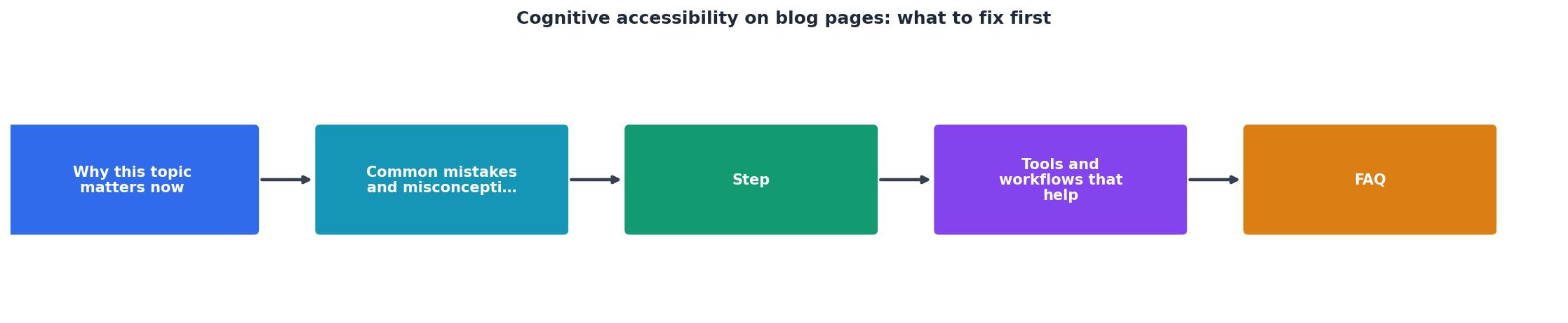
The diagram above shows the process flow: Start with your highest-traffic blog posts. Measure where visitors drop off. Audit those posts for the Big Three + hot spots. Fix the highest-impact issues first. Measure again. Repeat.
This prioritization matrix helps:- High traffic + high bounce rate: Fix first. These posts leak the most visitors.
- High traffic + lower bounce rate: Still worth auditing, but lower urgency.
- Low traffic + high bounce rate: Lower ROI to fix (fewer visitors affected), but good practice for learning.
Tools and workflows that help
Weekly Cognitive Audit Workflow
Here's a practical workflow you can run weekly without breaking your calendar:
Tools that help you spot cognitive friction:
- Heatmap tools (Hotjar, Clarity): Visualize where visitors actually look and click. A bounce often shows up as "scrolled past first 300 pixels, then left."
- Session recordings: Watch three to five session recordings per post. You'll see readers pause, re-read, or skip sections. Those moments are cognitive friction.
- Readability checkers (Hemingway Editor, Grammarly): Not perfect, but they flag long sentences, passive voice, and complex words. Use as a first-pass filter.
- A/B testing: Split-test headline rewrites, paragraph reorders, or CTA placement. Small changes compound.
- PagePerson Insights: Shows you how real visitors (including those with ADHD, anxiety, or low digital literacy) actually struggle with your page structure, copy, and call-to-action clarity. It surfaces the "why" behind bounce rates, not just the "where."
FAQ
Frequently Asked Questions
Cognitive Accessibility Blog Audit Checklist
Your progress is saved automatically in your browser.
Cognitive accessibility on your blog isn't a compliance checkbox. It's a business lever. Clearer posts hold attention longer, answer questions faster, and convert more visitors. Start with the Big Three, measure what works, and iterate. Your analytics will tell you what to fix next.
Additional Resources
- Best Practices for Cognitive Accessibility in Web Design - Start forms with clear instructions. · Show exactly what went wrong if users make mistakes. · Add confirmation steps before important actions.
- Accessibility for People with Cognitive Disabilities - Consistent navigation: Make sure your website navigation is consistent across all pages. This helps users predict where to find information, reducing cognitive ...
- Cognitive Load and Web Accessibility: Quick Tips for ... - Maintain a consistent layout and navigation. be identified consistently across all pages. Write in plain language. Avoid jargon and idioms ...