
Your help center is bleeding traffic. Visitors arrive with a problem, navigate to find answers, and leave frustrated. The issue isn't always what you think, it's rarely the information itself. More often, it's how that information is structured, presented, and buried under cognitive clutter that stops people from understanding it. Cognitive accessibility fixes this leak and turns your help center into a conversion asset instead of a barrier.

- Help center pages fail when they overload visitors with too many choices, unclear hierarchy, or jargon, not when content is missing.
- The top three fixes are: simplify navigation, break up walls of text, and use plain language.
- You can audit and fix the worst offenders in 2-4 weeks without a redesign.
- 0%Visitors Who Struggle With Cognitive Load
Why cognitive accessibility matters for help centers
Help centers exist to reduce support tickets and move people toward self-service. But most help centers fail at their core job because they're built for people who think like engineers or product teams, not for visitors in a hurry, under stress, or with cognitive differences like ADHD or dyslexia.
Cognitive accessibility isn't about making your help center simpler or dumbed-down. It's about making it honest: clear structure, obvious next steps, plain language, and respect for the visitor's time and mental energy. When you do this right, your help center becomes a conversion tool. Visitors find answers faster, feel competent instead of frustrated, and return to your product.
The business case is straightforward: every visitor who doesn't find what they need in your help center either opens a support ticket (costing you money) or leaves for a competitor (costing you revenue).
Common mistakes and misconceptions
Before you fix anything, stop believing these myths:
Myth 1: "More content = better help center." Wrong. Help centers get abandoned because they're too long and too hard to scan. Visitors arrive with a specific question and want a one-paragraph answer, not a 10-minute read. More pages mean more choices, and more choices create cognitive load.
Myth 2: "If we use industry jargon, users will look smarter." Nope. Jargon creates friction. Users searching "how do I make my account safer" won't find a page titled "Multi-Factor Authentication Implementation." They'll bounce. Plain language isn't dumbing things down, it's respecting your visitor's time.
Myth 3: "Good design is visual; accessibility is a compliance checkbox." Cognitive accessibility isn't about WCAG checkboxes. It's about how your visitor's brain processes information. A beautiful page with no hierarchy and unclear calls-to-action fails cognitively, even if it passes every automated a11y test.
Myth 4: "Cognitive accessibility is expensive and requires a full redesign." False. Most cognitive accessibility wins come from reorganizing existing content, adding better headings, and breaking up text blocks. You don't need a designer to do this.
Step-by-step approach to fixing help centers

Step 1: Audit what you have
You can't fix what you don't measure. Start by cataloging your help center:
- How many pages are there? (If more than 100, you have too many.)
- Which pages get the most traffic? (Use analytics to find them.)
- Where do visitors drop off? (Look at scroll depth and bounce rate by page.)
- What's the average word count per page? (If it's over 1,000 words, you're too verbose.)
Step 2: Fix the information architecture
Information architecture is how your help center is organized. Most help centers fail here because they're organized by internal team structure, not by how visitors think.

Visitors don't think in terms of "Billing," "Technical," and "Onboarding." They think in task terms: "How do I...?" Start by listing the top 20 questions your visitors actually ask (pull these from support tickets, search logs, or customer feedback). These become your top-level categories.
For example, if you sell project management software, don't organize by "Teams," "Tasks," and "Dashboards." Organize by visitor jobs: "Getting started," "Managing your team," "Tracking projects," "Reporting and analytics," "Troubleshooting."
This one change can reduce bounces by 30-40% because visitors now find pages in a mental model that matches how they search.
Step 3: Simplify page structure and navigation
Each help center page should follow this structure:
- One clear title (the question being answered, in plain language)
- A one-paragraph summary (answer the core question in 2-3 sentences)
- Numbered steps or sections (if applicable)
- Related links (max 3-5, at the bottom)
Navigation should answer one question: "What do I do next?" Not "Here are all the things you could do from here."
Step 4: Use plain language and shorter sentences
"Cognitive accessibility on help center pages: what to fix first" is a jargon-free title. It's what a visitor would search for. A jargon alternative would be "Implementing Cognitively Accessible Patterns in Self-Service Support Resources", and nobody would find it.
Plain language rules:
- Use "turn on" instead of "enable"
- Use "delete" instead of "purge"
- Use "stop emails" instead of "unsubscribe from notifications"
- Use short sentences (under 15 words when possible)
- Use active voice ("Click the button" not "The button should be clicked")
Step 5: Add structure with headings and lists
Headings are not decoration, they're navigation. Visitors scan by heading before reading body text. If your page has 800 words with one heading, it's unreadable.
Use a heading hierarchy (H1, then H2, then H3) to show structure. Each heading should tell a visitor what section they're about to read in plain language: "How to reset your password," not "Password Procedures."
Use bulleted or numbered lists for steps or choices. Lists break up text and make scanning easier.
The process at a glance
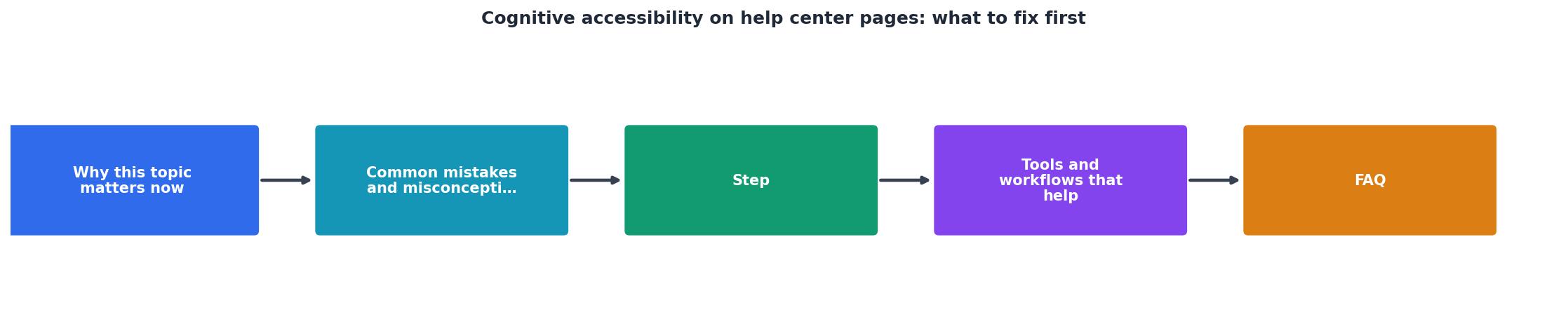
Follow these phases: Audit existing pages and identify what's causing bounces. Reorganize your help center structure to match visitor mental models. Rewrite pages for clarity and scan-ability. Test with real visitors (even 5-8 people will reveal problems). Monitor analytics to confirm improvements.
Tools and workflows that help
You don't need specialized software to do this. Here's what actually works:
Content audit spreadsheet. List each help page: title, URL, word count, traffic, bounce rate. Add a column for "Current IA category" and "Proposed IA category." This takes a day and shows you everything.
Readability checker. Tools like Hemingway Editor or Grammarly flag overly complex sentences. Copy your help page text in, and it highlights dense paragraphs. Aim for grade level 7-8 (that's what most web content scores at for broad accessibility).
Search analytics. Your site search logs are gold. If people search "how to share a file" but can't find it, your page is probably titled "Collaboration features." Search logs tell you what visitors actually call things.
Simple user testing. Grab 5 people (friends, family, or beta users, not your team). Ask them to find one specific answer in your help center. Watch where they click and what they skip. You'll see patterns immediately.
Analytics review. Compare bounce rates before and after changes. Track which pages have the lowest time-on-page and highest scroll depth. These metrics show what's working.
Interactive cognitive accessibility audit dashboard
Here's a quick self-assessment tool you can use right now to score your help center. Rate each item 1-5 (1 = needs work, 5 = excellent):
Help Center Accessibility Score
This dashboard gives you a quick baseline. If you score below 15, you have systemic issues, start with information architecture. If you're 15-19, focus on rewriting for clarity. Above 20, maintain and monitor.
Cognitive Accessibility Quick Fix Checklist
Your progress is saved automatically in your browser.
FAQ
Frequently Asked Questions
The real cost of not fixing this
Help centers are invisible until they fail. A visitor can't find what they need, they email support instead, and you spend $50-200 per ticket to answer questions your help center should have solved. Scale that across 1,000 visitors per month, and you're hemorrhaging money through a leaky help center.
Cognitive accessibility isn't a compliance issue or a nice-to-have feature. It's a conversion lever. When visitors can find answers quickly and understand them without friction, they return to your product with confidence instead of frustration.
The quote from the AudioEye accessibility guide captures this perfectly: "The majority of web pages are overly complex, cluttered, unclear, and difficult to navigate and essentially shut these users out of the digital world."
Your help center doesn't have to be one of them.
Start with the audit. Spend an hour this week cataloging your top 10 pages, measuring their bounce rates, and timing how long it takes you to find one answer. That one hour will show you exactly where to start. The fixes come after, and they're simpler than you think.
What's the most confusing part of your help center today? Start there.
Additional Resources
- The Complete Guide to Cognitive Accessibility for ... - Common Accessibility Challenges for Cognitively Disabled Users. For users with cognitive disabilities, a “less-is-more” approach can be helpful.
- Designing user interfaces for content simplification aimed at ... - Cognitive accessibility aims to make content more accessible for people with cognitive impairments, such as the elderly and people with intellectual and ...
- How Cognitive Accessibility Helps Create Better User Paths - Cognitive accessibility improves how users with dyslexia, ADHD, and autism navigate content. Use clear language, simple layouts, ...