
Your onboarding page is the front door to your product. When visitors land there, they're deciding in seconds whether to stay or leave. But most onboarding flows aren't designed for people who think differently: those with ADHD, dyslexia, anxiety, or simply high cognitive load from decision fatigue. The result is a leaky funnel that looks like a traffic problem but is actually a comprehension problem.

- Cognitive accessibility on onboarding pages means making information easy to understand, not just easy to see or click.
- The highest-impact fixes: reduce form fields, simplify language, break information into chunks, remove distracting elements, and test with real users.
- Start with your highest-traffic drop-off point and fix that first; use analytics to identify where people actually struggle.
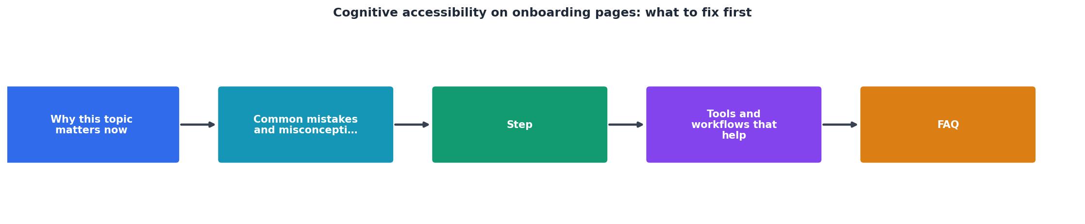
Why this matters now
Cognitive accessibility isn't about perfect grammar or fancy design. It's about whether someone can understand what you're asking them to do without burning out their mental energy. And onboarding pages are where this breaks down most.
Consider what happens on a typical landing page. A visitor arrives. They see a headline, a value proposition, a form with six fields, two trust badges, a video they didn't ask for, a chat widget, and a banner notification about a sale. Their brain is already working hard to figure out if this product is for them. Then you ask them to fill out a form with choices they don't understand, copy written for marketing teams instead of humans, and submit their information to a company they just met. No wonder they leave.
"The most accessible core product is worthless if users can't get through the door.">, Onboarding Flows, Forms, and Funnels: Where Accessibility Fails Users First
The cost is real. A form that loses 30% of visitors to cognitive friction isn't a minor UX issue, it's revenue walking out the door. And it's preventable.
Common mistakes and misconceptions
Before you can fix your onboarding, you need to stop doing what doesn't work. Here are the big ones.
Mistake 1: Confusing simplicity with infantilization. Some teams hear "make it simple" and respond by dumbing down the copy, using oversized fonts, or adding patronizing language. Cognitive accessibility isn't about treating people like children. It's about respecting their attention and making your core message impossible to miss.
Mistake 2: Assuming your team's mental model is universal. Your team has spent months thinking about your product. You know what "API integration" means, what "role-based access control" is, and why someone would want your tool. A first-time visitor doesn't. They're not dumb; they're just new. Test with people who've never heard of your product, not your team.
Mistake 3: Treating accessibility as an add-on. Cognitive accessibility isn't a checkbox you tick at the end. It's a principle that shapes every decision from copy to interaction design. A form you "add accessibility to" after launch will always feel bolted on.
Mistake 4: Ignoring form abandonment as a cognitive problem. You see that people drop off your signup form at the third field. Your assumption: maybe the field is confusing or feels intrusive. Your solution: move it around or make it optional. The real problem might be that three questions into a cold encounter, your visitor's brain is saying "this is too much friction." The fix isn't moving the field, it's asking fewer questions upfront.
Mistake 5: Over-automating based on guesses. You autodetect the user's company name from their email domain, auto-fill their country from their IP, auto-select their industry. You think you're helping. You're actually removing decision points and introducing errors. When the auto-fill guesses wrong, it creates confusion. When the user can't change it, it creates frustration. Automate only what you're confident about.
The step-by-step approach
Here's how to actually fix cognitive accessibility on your onboarding pages. Start with diagnosis, move to design, then validate.
Step 1: Find your worst leak

Open your analytics. Find the step in your onboarding funnel where the most people drop off. That's your starting point. Don't fix everything at once; fix the highest-impact problem first.
If you're a SaaS company, this is often the signup form. If you're an e-commerce site, it might be the product category selection. Whatever it is, that's where you focus.
Why? Because fixing a 50% drop-off on step three is worth more than fixing a 5% drop-off on step seven. Priority is about leverage, not comprehensiveness.
Step 2: Audit for cognitive load

Cognitive load has three sources: extraneous load (noise that doesn't help), intrinsic load (the difficulty of the task itself), and germane load (the mental effort needed to understand the concept).
On your onboarding page, audit each:
- Extraneous load: Is there a chat widget? Notifications? Multiple CTAs competing for attention? Remove or defer anything that doesn't directly support the user's immediate task. A visitor trying to understand your product doesn't need your customer success team reaching out in real time.
- Intrinsic load: How many decisions does the visitor have to make? How many form fields? How many product tiers to choose between? Each one adds friction. Strip this down to the absolute minimum. If you can defer a question to after signup, defer it.
- Germane load: Is your core value proposition clear in one sentence? Can someone understand what you do in 10 seconds without domain expertise? If your pitch requires jargon or domain knowledge, simplify it. Shopify's pitch isn't "omnichannel commerce platform optimization." It's "sell anywhere." That's germane load done right.
Step 3: Simplify information architecture

Break your onboarding into clear, linear steps. One question per screen (or one logical cluster). No mixing three different concepts on one page.
If you're showing feature highlights, use progressive disclosure: show the one feature that matters most first. Don't dump all features at once. If you're explaining a complex concept, chunk it into pieces. Don't write a paragraph; write three sentences followed by a specific example.
For forms specifically:
- Ask for one piece of information per question, not multiple in one field.
- Use clear labels, not placeholders. "Email address" is a label. "name@example.com" is a placeholder. Don't confuse them.
- Explain why you're asking. "Email (so we can send you a confirmation link)" beats "Email" without context.
- Offer a default where possible. "How many team members?" with a pre-selected default of "1" is faster than leaving it blank.
Step 4: Test with real users
This is non-negotiable. Sit with someone who's never used your product. Have them go through your onboarding. Don't help. Don't explain. Watch where they hesitate, where they re-read something, where they get confused.
You'll spot cognitive friction points your team never saw. The form field that seems obvious to you is baffling to someone seeing it for the first time. The term you use internally has no meaning to outsiders. The button color you chose blends into the background on someone else's monitor.
Test with at least three people. More is better, but three will surface the majority of problems.
Tools and workflows that help
You don't need fancy tools to improve cognitive accessibility, but a few make it easier.
Run Page Person on your site. Page Person is a Chrome extension that analyzes your website for cognitive accessibility barriers. It flags forms with too many fields, copy with unnecessary jargon, pages with competing CTAs, and distracting elements. It won't solve your problems for you, but it will surface them fast so you know where to focus. Rather than guessing, you'll have data.
Use readability scoring. Tools like Hemingway Editor or the Flesch Reading Ease score help you identify overly complex language. Aim for eighth-grade reading level on your onboarding copy, not MBA. If your tool says "this sentence requires a PhD to understand," simplify it.
Conduct a heuristic audit. Walk through your onboarding with Nielsen's 10 usability heuristics in mind. Does your system keep users informed? Can users undo actions? Is the language clear and task-focused? You don't need to hire a consultant; you can do this yourself in an afternoon.
Set up session recordings. Tools like Logrocket or Clarity record user sessions (with consent). Watch how real visitors interact with your onboarding. Where do they pause? Where do they abandon? This is raw data on cognitive friction.
Create a baseline metric. Before you change anything, measure your current signup completion rate, form abandonment rate, or conversion rate at each step. After you make changes, measure again. You'll know if your fixes work.
Practical implementation checklist
Here's your action plan to improve cognitive accessibility on your onboarding pages.
Cognitive Accessibility Onboarding Audit
Your progress is saved automatically in your browser.
Interactive cognitive load assessment
To help you visualize where your onboarding stands, here's an interactive assessment tool. Rate your page on each factor, and the dashboard will show your overall cognitive accessibility score.
Cognitive Load Assessment
Use this tool to score your current onboarding. A score under 50 means you have significant cognitive friction to address. A score above 75 means you're on the right track but should still test with real users to find edge cases.
FAQ
Frequently Asked Questions
The truth is simple: your onboarding page is too complicated. Not intentionally, it crept up gradually as you added features, forms, and assurances. Every element felt necessary at the time. But necessary for whom? For your team, or for a first-time visitor trying to decide if your product is for them?
Cognitive accessibility on onboarding pages isn't about dumbing down your product. It's about respecting your visitor's attention and mental energy. It's about designing for someone's first encounter with you, not someone's hundredth. Start with your biggest leak, fix it, measure the impact, then move to the next problem. That's how you turn an onboarding page from a friction point into a conversion lever.
Additional Resources
- Onboarding Flows, Forms, and Funnels: Where Accessibility ... - Onboarding is where many users fail first. Learn how to fix sign-up flows, tours, and forms so everyone can get started.
- Cognitive accessibility toolkit | Fable - Conduct cognitive testing when your flow includes: Multi-step tasks; Form fields or complex instructions; Navigation choices; Onboarding or ...
- 5 Onboarding Mistakes to Fix for Better User Retention - Ignoring edge cases and accessibility. Fix: include basic accessibility checks early and test on representative devices.