
Your pricing page is where interest becomes commitment. A visitor reads your plans, compares options, and decides whether to sign up. But what if the page itself gets in the way? Unclear language, too many choices, confusing feature lists, and overwhelming visual clutter can stop people from converting before they even reach the checkout button. Cognitive accessibility on pricing pages isn't a nice-to-have, it directly impacts your bottom line.

- Cognitive accessibility on pricing pages reduces bounce rate and increases conversion by removing comprehension barriers.
- Start with three high-impact fixes: simplify language, reduce decision paralysis through scoped pricing tiers, and reorganize information hierarchy.
- Test your pricing page with real visitors (especially those with ADHD, dyslexia, or anxiety) to uncover blind spots your team misses.
- Use tools to audit cognitive load, what reads clearly to your team often confuses first-time visitors.
When people talk about website accessibility, they usually mean technical compliance, alt text, color contrast, keyboard navigation. Those matter. But pricing pages fail for different reasons. They fail when someone reads three different pricing tiers and can't remember what each one includes. They fail when the language assumes too much technical knowledge. They fail when too many options create decision paralysis. These are cognitive barriers, and they cost you revenue.
Roughly 42 percent of website visitors experience some cognitive friction, whether from ADHD, dyslexia, anxiety, low digital literacy, or just being overwhelmed by complexity. On a pricing page, that friction is expensive. You've already paid for the traffic. You've proven value in your product. Now a confusing page layout kills the deal.
The good news: you don't need to rebuild from scratch. Most pricing pages fail the same way. Fix the core issues and watch conversion move up.
Why this matters now

Paid traffic costs more every year. CAC (customer acquisition cost) keeps rising. That means the margin between a visitor landing on your site and them converting has to stay razor-thin. A confusing pricing page is a leak in that funnel that most teams don't measure.
Meanwhile, regulatory pressure is tightening. The European Accessibility Act, ADA litigation trends, and Section 508 compliance all include cognitive accessibility language now. Ignoring it isn't just bad for conversion, it's creeping into legal exposure.
But the real driver is simpler: your competition probably has a confusing pricing page too. Fix yours and you win.
Common mistakes on pricing pages
Most pricing pages repeat the same three mistakes:
1. Feature list overwhelm. You list every single feature, grouped by tier. A visitor reads 30 features across three plans and gives up. Their brain can't hold that much information. The most common reaction: choose the cheapest option or leave.
2. Jargon and assumption. You use product language that makes sense inside your team. "Role-based access controls," "API rate limiting," "custom webhooks." To an outsider, it reads like static. They don't know what it means and assume they don't need it.
3. Visual hierarchy failure. All three plans are equally prominent. There's no clear recommendation. The visitor has no signal for what's "right" for them, so they freeze.
Add decision paralysis to any of these and conversion drops hard.
Step-by-step approach
Audit your current page

Start by measuring. Open your pricing page and ask: How many decisions does a first-time visitor have to make? How many features are listed? How many words of description exist?
Then bring in a test user, someone who's never seen your product. Watch them read the page. Where do they get stuck? What do they skip? Do they know which plan is recommended? Can they explain the difference between tiers in their own words?
This test takes 15 minutes and reveals what your team can't see. You're too close to the product. A fresh pair of eyes catches everything.
Document what you find:- Where does reading flow break down?
- Which features create confusion?
- How many words until comprehension drops?
- Do visitors compare all three plans or pick one immediately?
Simplify the feature list
Most pricing pages list too many features. Cut the list in half. Seriously.
Start by defining three categories of features:- Core: What every plan includes. List these once at the top, not repeated per tier. Example: "All plans include email support, basic reporting, and 5 user seats."
- Differentiators: Features that actually separate tiers. These go in the comparison. Example: "Advanced analytics," "Custom integrations," "Priority support."
- Rarely mentioned: Features that don't drive conversion decisions. Move these to a separate FAQ or delete them.
Use plain language. Replace "Compliance-grade audit logging" with "Access logs for security." Replace "Distributed rate limiting" with "Handles 10,000 requests per second." Assume the reader has never heard of your product.
Reduce decision load
Visitors should know which plan fits them within seconds. That's possible if you group the pricing by use case instead of just "Basic / Pro / Enterprise."
For a project management tool:- Individuals, Solo freelancers, small personal projects.
- Teams, 5 to 50 people collaborating.
- Enterprise, 50+ people, custom security needs.
Frame each tier around what the visitor can do, not what features they get. "Track projects across your entire company" reads better than "Unlimited projects." It tells them what they'll actually gain.
Reorganize the visual layout

Space is a cognitive tool. A cramped pricing table forces your brain to work harder.
- Add white space between tiers.
- Increase font size for the plan name and price.
- Make the recommended plan visually distinct (highlight it, add a badge, increase contrast).
- Stack tiers vertically on mobile, not horizontally.
- Use color to group features by category, not randomly.
Test with real visitors
Before launch, run your pricing page through a test. Use a tool that audits for cognitive barriers, or recruit five people outside your company and watch them read it.
"The specific version of WCAG is crucial for comprehensive accessibility.">, Accessibility for People with Cognitive Disabilities Ask them:
- "Which plan would you pick and why?"
- "Can you explain the difference between plans?"
- "What features confuse you?"
How it works in practice
Here's a real workflow showing how these steps come together:
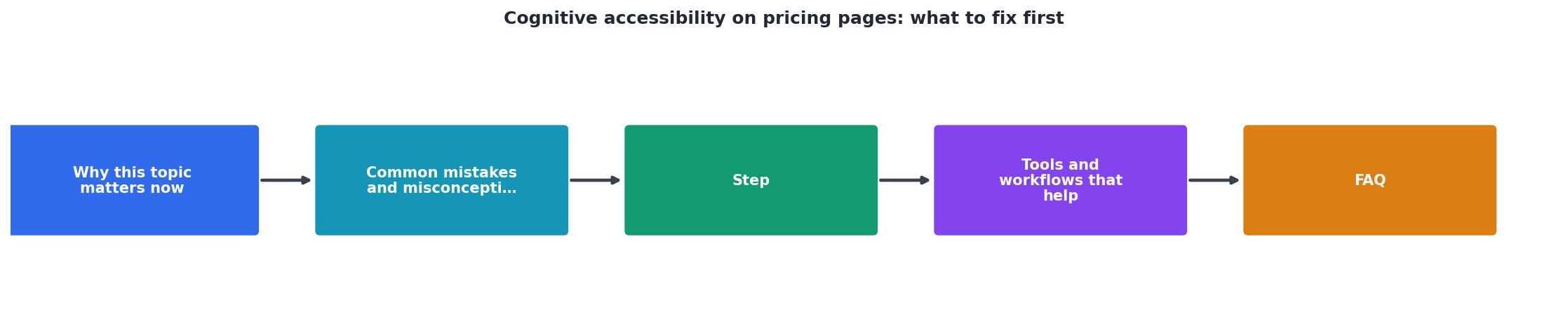
The flow is: Audit → Simplify → Scope → Reorganize → Test → Ship. Each step removes friction.
An audit surfaces what's confusing. Simplification cuts the fat. Scoping by use case replaces generic tiers. Reorganization makes the hierarchy obvious. Testing with real people validates your changes. Then you ship and measure conversion lift.
Tools and workflows that help
You don't need expensive usability software to audit cognitive accessibility. Start with these:
PagePerson Insights, A Chrome extension that spots cognitive accessibility barriers on any page. It identifies confusing language, cognitive load hotspots, and decision paralysis traps specific to pricing pages. Run it on your page and it flags what's hard to understand.
Heatmap tools (Hotjar, Microsoft Clarity), Show where visitors look and how long they spend in each area. If 80 percent of visitors skip the feature list, that's a sign it's too complex.
A/B testing, Test two versions of your pricing page. Add white space to version B. Simplify the feature list in version C. Measure conversion lift. Real data beats opinions.
Read-it-aloud tools, Copy your pricing page text into a screen reader. Does it make sense when read aloud? Many cognitive barriers appear when someone listens instead of reads.
The workflow: audit with PagePerson → validate with a heatmap tool → test variants → measure conversion. Iterate each month until you hit your target.
The example above shows typical metrics from a pricing page audit. When features outnumber users' working memory (34 vs. 7), comprehension drops. A reading grade of 8.2 means you need college-level reading to understand it. Real visitor testing reveals where to focus first.
FAQ
Frequently Asked Questions
Practical checklist
Use this to track your pricing page optimization work:
Pricing Page Cognitive Accessibility Checklist
Your progress is saved automatically in your browser.
Additional Resources
- Accessibility for People with Cognitive Disabilities - Consistent navigation: Make sure your website navigation is consistent across all pages. This helps users predict where to find information, reducing cognitive ...
- Best Practices for Cognitive Accessibility in Web Design - Input assistance: Help users avoid and correct mistakes by making it obvious when that happens and allowing them to fix whatever is needed.
- Best Strategies for Cognitive Accessibility in Digital Design - Enhance user experience with inclusive design! Discover best strategies for cognitive accessibility in digital design.