
Search results pages are gateways. Your visitor lands there from a search engine, scanning dozens of options in seconds, deciding whether to click your link or move on. But if that page overwhelms them with visual clutter, vague descriptions, or confusing navigation, they won't stick around. Cognitive accessibility on search results, how clearly you present what people are looking for, directly impacts clicks, comprehension, and conversion. This article walks you through what to fix first, why it matters, and how to spot these barriers before your visitors do.
Photo by Yan Krukau from Pexels
TL;DR:- Search results pages often fail on clarity: titles and descriptions are vague, jargon-heavy, or too long to scan quickly.
- Cognitive barriers include visual overload, poor hierarchy, inconsistent labeling, and confusing calls-to-action.
- Start by auditing your titles and meta descriptions for clarity, then simplify layout and remove redundant information.
- Test your changes with real users and use tools that measure comprehension, not just technical compliance.
Why search results pages matter for cognitive accessibility
You don't get a second chance on a search results page. A visitor has already typed a query, seen your listing among competitors, and made a micro-decision in under three seconds. If your title and description don't answer their question immediately, they click elsewhere. If the visual design overwhelms them with too many competing elements, they skim past you. If the layout is inconsistent with what they expect, they assume you're not the right fit.
Research shows that 42% of your visitors may struggle with your website due to cognitive load, distractions, or unclear information architecture. On a search results page, that friction multiplies: they're already making a fast decision under uncertainty, and any added confusion tips the scales toward a competitor.
Cognitive accessibility here isn't just about legal compliance or inclusive design as an abstract principle. It's about revenue. Clearer results pages attract more clicks. Confusing ones leak traffic to the next option. That's why fixing cognitive barriers on search results pages is one of the highest-ROI accessibility moves you can make.
Common mistakes and misconceptions
Cognitive accessibility on search results pages gets overlooked because most teams focus on what they can see: contrast ratios, button sizes, alt-text. Search results pages, though, fail for reasons that technical audits miss.
Mistake 1: Treating titles and descriptions as afterthoughts. Many teams fill these fields with SEO keywords, not clarity. The result is a title like "Best SaaS Tools for Remote Team Collaboration | Pricing & Reviews" that tries to cram too much into one line. A visitor with cognitive load or low digital literacy reads this and bounces because it doesn't answer their question fast enough.
Mistake 2: Visual overload without hierarchy. Too many colors, icons, badges, and competing visual elements make the page hard to scan. A visitor's eyes don't know where to look first. They get frustrated and leave.
Mistake 3: Inconsistent formatting and labeling. One result has a star rating, another has a label, another has neither. One result shows three lines of description, another shows one. This inconsistency forces the visitor to re-learn the page structure for each result, burning cognitive energy.
Mistake 4: Jargon-heavy or overly technical descriptions. A product page that says "leverage dynamic optimization algorithms" instead of "makes your site faster" loses a large slice of visitors who don't speak the language.
Mistake 5: Call-to-action ambiguity. Results don't clearly signal what happens next. Is it a product page? A pricing page? A blog? A sign-up? If visitors can't answer that question from the title and description alone, they move on.
"Research shows that 12.8% of adults have cognitive disabilities, but the real number of people who benefit from cognitive accessibility is much higher.">, Best Practices for Cognitive Accessibility in Web Design
Step-by-step approach to fixing search results pages
Start with the highest-impact changes. Don't try to overhaul everything at once; focus on the elements that have the most influence over comprehension and click-through rate.
Step 1: Audit your titles and meta descriptions
Your title and description are the entire interface. Everything else is secondary. Audit them for clarity, brevity, and specificity.
Pull a representative sample of your search results pages (aim for 20-30 different pages or query variants). For each one, ask:- Does the title answer the visitor's probable question within the first 6-8 words?
- Is the description written in plain language, free of jargon?
- Does it describe what the page offers, not just list keywords?
- Is it under 160 characters (title) and 155-160 characters (description)?
- Does it set clear expectations for what happens next?
Weak: "Advanced solutions for digital transformation and enterprise-grade infrastructure optimization"
Strong: "How to speed up your website, step-by-step guide"
The second one is shorter, clearer, and answers a specific question. A visitor knows exactly what they'll find.
Step 2: Simplify layout and visual hierarchy
Search results pages often pack too much information into the available space. Every additional visual element, a logo, a star rating, a tag, a secondary description, competes for attention and makes the page harder to scan.
Identify the elements that serve a purpose:- The page title (essential)
- A one-line description (essential)
- A primary call-to-action or link (essential)
- An optional metadata field (e.g., date published, review count, or category, pick one, not three)
A simple rule: if you can't explain why an element is on the page, remove it.
Step 3: Test clarity with real language
Walk through your pages and rewrite titles and descriptions in plain English, as if you were explaining the page to a friend over coffee. Avoid:- Acronyms without explanation
- Multiple ideas in one sentence
- Passive voice ("is designed to be" → "helps you")
- Hedging words ("may help", "could improve")
Weak: "A resource designed to educate teams about implementation best practices across modern technology stacks."
Strong: "Learn how to set up your team for success, our implementation guide covers everything."
Step 4: Create a visual hierarchy map

- The title is the dominant visual element
- The description is readable without squinting
- The call-to-action is obvious
- There's at least 12-16px of padding between result blocks
- Colors and spacing are consistent across all results
Step 5: Measure comprehension, not just clicks
Comprehension Audit Baseline
Before and after metrics matter. Track not just click-through rate (CTR) but also dwell time, bounce rate, and conversion rate after you land visitors. If your new titles and descriptions attract clicks but visitors leave immediately, clarity is still broken, it's just broken after they click, not before.
Use tools that measure comprehension. Ask real users (not your team) to look at your search result and explain what they think the page offers. Record whether they get it right on the first read. If fewer than 80% of users understand your result correctly, rewrite it.

Implementation workflow
The process diagram below shows how these five steps connect:
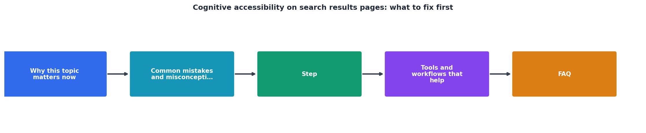
Start with Audit titles & descriptions, move into Simplify layout, then Test clarity with users, and finally Measure & iterate. Each step informs the next. You'll loop through steps 4 and 5 multiple times as you refine.
Search Results Page Cognitive Accessibility Checklist
Your progress is saved automatically in your browser.
FAQ
Frequently Asked Questions
Additional Resources
- Best Practices for Cognitive Accessibility in Web Design - Unlock the full potential of your website with expert cognitive accessibility tips. Explore WCAG guidelines, design patterns, and real-world ...
- Web search Content Accessibility Guidelines (WCAG) - Ensure seamless keyboard access · Add a role=”status” message · Don't worry about images in search results · Provide keyboard-accessible pagination.
- Provide Search | Cognitive Accessibility Design Pattern | WAI - Provide a friendly search capability. Ideally search should include: autocomplete,; grouping of results when appropriate with headings for each ...