

Settings pages are where users go to control their experience, yet most companies treat them as a dumping ground for options nobody reads. If your settings are confusing, you've just handed a frustrated user the fastest path to unsubscribe or delete their account. Cognitive accessibility isn't a nice-to-have on settings pages, it's the difference between retention and churn. This guide shows you what breaks first, what matters most, and where to start fixing it.
TL;DR
- Settings pages fail cognitive accessibility most often through overwhelming choice, unclear consequences, and poor information hierarchy
- Start with three quick wins: group related settings, simplify decision trees, and preview what changes will do
- visitors, including those with ADHD, anxiety, dyslexia, or low digital literacy, abandon settings they don't understand0%Visitors Who May Struggle with Your Site
- Fix the highest-traffic settings first, then expand to less common ones
- Use labels that explain what happens, not just what the setting does
Settings pages carry a heavy cognitive load by design. Users arrive already stressed, they want something fixed or configured, and they're reading walls of toggles, dropdowns, and unfamiliar terminology. Unlike a homepage or landing page, where visitors can bounce and try again, settings are often a prerequisite to using the product at all. Get it wrong, and users either make expensive mistakes, give up, or leave.
The cognitive accessibility problem isn't that settings exist. It's that most companies pile options without organizing them, explain consequences using jargon, and hide the results of changes until users save and reload. This article walks through what actually fails, why, and how to fix it starting today.
Why Settings Pages Matter
This visual shows what happens when settings pages lack cognitive accessibility. Over half of visitors give up without changing anything. Those who do proceed often make mistakes because the UI doesn't clarify consequences. When you fix the clarity, retention jumps significantly.
Why settings pages fail first

Settings pages are cognitive death traps by default. Unlike narrative content, a blog post, a landing page, settings are pure decision trees. Every toggle, dropdown, and text field is a choice. If each choice is unexplained or the consequences are hidden, users' working memory fills up instantly.
Three patterns destroy cognitive accessibility on settings:
Flat, undifferentiated lists. Most settings pages dump every option into one long scroll. "Enable notifications", "Two-factor authentication", "Export data", "Privacy mode", "API key rotation", "Dark mode", "Weekly digest", all listed with equal visual weight. A user looking to silence email notifications has to scan past thirty options to find it. The brain's attention span is finite; after scanning twelve items, comprehension drops.
Missing consequences. "Enable advanced caching" tells you nothing about what happens. Does it speed up your page? Use more storage? Cache your private data? A user with cognitive load or anxiety reads it and leaves it alone. Setting a value without understanding its result creates risk, users feel they might break something.
Jargon without explanation. "Adjust CORS headers", "Configure webhook retry logic", "Set TTL threshold", these phrases make sense to engineers and confuse everyone else. Even non-technical decision-makers need to configure products. If settings use acronyms without defining them, you've excluded half your user base.
"The hierarchical organization of information simplifies users' processing and understanding of content.">, Ten strategies and best practices for cognitive accessibility in digital design
Settings pages that lack hierarchy force users to work harder. When you group related settings, label them clearly, and explain what happens when you change them, users understand their choices without strain.
Step-by-step approach to fixing settings

There's no single "cognitive accessibility audit" for settings. Instead, follow a progression: identify what users actually use, fix the highest-traffic options first, then expand.
Audit what matters
Not all settings are equal. Some, like notification frequency or data export, get used by half your users. Others, like webhook authentication mode, matter to 2% of power users. Start by tracking which settings pages users visit and which toggles they interact with.
Pull this data from your analytics. Look for:- Which settings tabs get the most traffic
- Which toggles or dropdowns get changed most often
- Where users spend the most time (a sign of confusion) or leave without changing anything
Group settings by task, not by system
The worst settings pages group options by back-end system. "Account settings", "Notification settings", "Privacy settings", "Integration settings", each a grab-bag of unrelated options. This mirrors your technical architecture, not user intent.
Instead, group by what users are trying to do:
- Reduce communication (mute notifications, unsubscribe from digest, disable marketing email)
- Protect my data (two-factor auth, session timeout, API keys, export my data)
- Control my experience (dark mode, language, timezone, data density)
- Manage team access (invite members, set roles, audit logs)
Write labels that explain the consequence
Change every label from action to outcome. Not "Enable caching", "Speed up page loads by storing recent data locally". Not "Set session timeout", "Sign me out after X minutes of no activity to protect security". Not "Configure webhook retries", "Resend failed events automatically to ensure no data loss".
Each label should answer: what will happen if I change this?
A 10-word label instead of a 3-word label adds seconds to scanning but cuts decision anxiety in half. Users need to know what's safe, what's reversible, and what matters before they touch anything.
Add help text, not tooltips
Tooltips hide information until users hover. On mobile, users never see them. On desktop, they break scanning flow. Instead, use permanently visible help text below each setting.
Keep help text to one sentence: "Turning this on lets team members see your calendar availability." If you need more, you're over-complicating the setting itself. Reduce the setting to its simplest form first, then add help.
Show previews or confirmation
When a setting will change what users see, like switching to dark mode, changing language, or hiding fields, show a preview or ask for confirmation before saving.
"Switching to dark mode will look like this: [preview]" takes an extra click but eliminates the fear of "what if I hate this and can't get back?" Users with anxiety or decision paralysis commit to changes they can preview.
Create a process flow
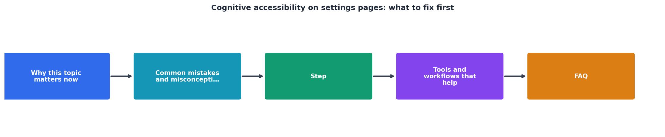
This process walks through the prioritization and implementation flow. Start with auditing usage, group by task, rewrite labels, add help text, and preview changes before deployment. Each step simplifies the next.
Tools and workflows that help
Google Analytics event tracking captures which settings tabs users visit and which toggles they interact with. Set up events for every setting change so you know what matters.
Hotjar or Clarity shows where users spend time in settings, where they scroll past options, and where they get stuck. Heatmaps reveal which sections feel overwhelming.
Accessibility audit tools like WAVE or Axe check settings pages for WCAG compliance (contrast, labels, keyboard navigation), but they miss cognitive issues. Use these as a base, then manually review readability and terminology.
Usability testing with real users is your best signal. Recruit 5-10 people who represent your user base, including people who aren't power users or product experts. Watch them complete a task: "Change your notification frequency to weekly." You'll see instantly where they get stuck.
Content audit templates let you inventory every setting, its label, its help text, and its consequence. Shared in a spreadsheet, this becomes your source of truth as you redesign.
Cognitive Accessibility Settings Audit Checklist
Your progress is saved automatically in your browser.
FAQ
Frequently Asked Questions
Settings pages that respect cognitive limits aren't just nicer. They're competitive advantages. Users who understand their options trust your product, stay longer, and don't blame you when something goes wrong because they're not confused about what they've enabled.
Start by grouping your settings by user task. Rewrite every label to show consequences. Ask five real users to navigate it. Fix what breaks their flow. That's not a complete redesign, it's clarity, and clarity is always a win.
Additional Resources
- Designing user interfaces for content simplification aimed at ... - this article presents cognitive accessibility design patterns and their application in designing the Easier web system's user interface.
- Ten strategies and best practices for cognitive accessibility ... - 1. Clear and consistent layouts · Using a straightforward and intuitive design with predictable navigation patterns · Consistent placement of ...
- How Cognitive Accessibility Helps Create Better User Paths - Cognitive accessibility improves how users with dyslexia, ADHD, and autism navigate content. Use clear language, simple layouts, ...