

Signup pages are where you lose people. Not because of broken buttons or technical errors, but because visitors can't figure out what you want them to do, why it matters, or whether they should trust the form staring them down. Cognitive accessibility isn't about heroic design gestures. It's about removing the friction that makes a visitor's brain work too hard before they've decided to join. This guide shows you exactly where that friction lives on signup pages and how to kill it.
TL;DR:- Cognitive accessibility on signup pages boils down to: clear purpose, minimal cognitive load, and zero jargon.
- Test with real users who struggle with focus, memory, or new information. Watch them fail faster than your analytics ever will.
- Start with one page, one form, one metric. Measure drop-off at each field. Ship small wins.
- The biggest wins come from removing unnecessary fields, simplifying copy, and signaling security without drowning in legal text.
Signup is the moment of truth. A visitor lands, scans your page, and decides in seconds whether the friction to join is worth it. For roughly 42% of visitors, those with ADHD, anxiety, dyslexia, low digital literacy, or just decision fatigue, that friction is invisible but real. They don't bounce because your site is broken. They bounce because their brain is exhausted.
Research shows that 12.8% of adults have cognitive disabilities, but the real number of people who benefit from cognitive accessibility is much higher. Add situational constraints (mobile, noisy environment, sleep deprivation) and you're looking at a baseline where most visitors arrive cognitively stretched. Your signup page either absorbs that tension or adds to it. There's no middle ground.
This article walks you through the three biggest sources of cognitive friction on signup pages, how to spot them, and the exact steps to fix them first. You'll also get a practical checklist you can run through your own signup flow in under an hour.
Why this matters now
Signup pages are optimized for the metrics we track, not the friction we don't. Bounce rate tells you how many people leave. It doesn't tell you they left because the form asked them to create a password before they saw the value prop. Conversion rate tells you how many complete the flow. It doesn't tell you that half the people who converted regretted the decision within a week because they misunderstood what they signed up for.
Accessibility has become table stakes for mid-size and enterprise companies. Legal pressure (ADA, European Accessibility Act, Section 508) means compliance audits now include cognitive accessibility checklists. But the real payoff isn't risk avoidance. It's conversion lift. Every percentage point of friction you remove from signup is a percentage point of revenue you recover.
Common mistakes to watch for
Most teams make the same cognitive mistakes on signup pages without realizing it. Here are the three that cost you the most conversions:
Asking for too much information too soon. Forms that demand fifteen fields before the visitor knows what they're joining for will break cognitive load on day one. A visitor's working memory has a hard limit. You're competing for attention against email, Slack, and whatever else is open. If they have to hold ten pieces of information in mind just to fill one form, they'll close the tab.
Using jargon or unclear copy. "Create a unique identifier" instead of "password." "Accept our terms to proceed" instead of "you need to agree to our legal stuff to join." Jargon isn't more professional. It's a filter that weeds out people who are still deciding if they want to learn your specific language.
Hiding or obscuring the value prop. A signup page that leads with the form instead of the reason to sign up forces visitors to make a commitment before they understand the commitment. The form should be the last cognitive step, not the first.
Step-by-step approach to fix it

Start with measurement, not intuition. Intuition says "my form is simple." Data shows you where visitors actually drop off. Here's the framework:
1. Audit your current flow
Open your signup page in a browser. Read it as a first-time visitor who knows nothing about your product. Write down every decision a visitor must make:- What is this page for?
- What will happen if I sign up?
- Do I trust this company?
- Is this form secure?
- What's a password I should use?
- Where do I click next?
2. Simplify the form itself
An effective signup form does one job: collect the minimum information needed to create an account. That's usually email, password, and maybe one more data point. Everything else, company size, use case, timezone, can wait until after they've logged in.
Start by cutting fields. For each field on your form, ask: Do I need this to create an account today, or can it wait? If the answer is "it can wait," remove it. You can gather that data via onboarding or a follow-up email.
A typical over-engineered signup form:- First name
- Last name
- Company name
- Job title
- Company size
- How did you hear about us?
- Password
- Confirm password
- Terms and conditions checkbox
- Marketing opt-in
- Password
- Create account button
3. Write copy that doesn't require translation
Before the form, answer three things clearly and simply:- What does this product do? (One sentence. No more.)
- Who is it for? (You, specifically, not "teams" or "enterprises.")
- What happens after I sign up? (Will I see a dashboard? Get an email? Need to add a credit card?)
Example that works:
"See why your visitors leave your signup page. Fix it in minutes."
One is jargon. One is clarity. Guess which one converts better.
4. Design for clarity, not innovation
Cognitive accessibility isn't about creativity. It's about predictability. Visitors should be able to scan your signup page and understand the entire flow in under ten seconds. If they have to read carefully or make assumptions about how anything works, you've added friction.
Use standard form conventions:- Label every field clearly.
- Put the password field below the email field (not beside it).
- Make the button say "Create account" or "Sign up," not "Let's go" or "Get started."
- Show the password requirements before they try to create one.
- Use real error messages ("Password must be at least 8 characters") instead of vague ones ("Invalid entry").

Here's a visual framework showing how to reduce cognitive friction step by step:
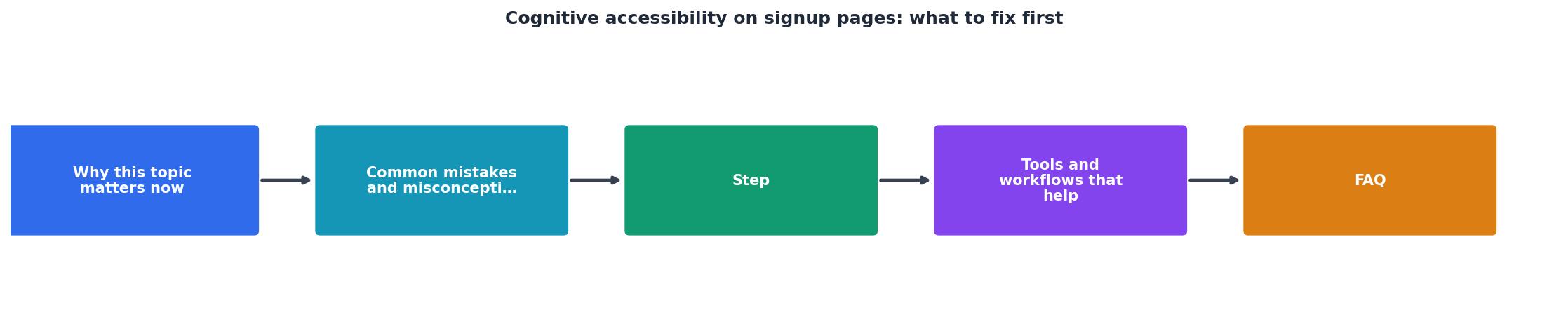
The flow moves from clarity (does the visitor understand what this is?) through simplification (remove all unnecessary fields) to confidence (does the visitor trust this form?) to action (can the visitor complete it without confusion?).
Tools and workflows that help

You don't need fancy tools to audit cognitive accessibility. You need measurement and real user feedback.
Measure drop-off per field. If your signup flow has five steps, measure completion rate at each step. If 80% of people start the form but only 60% finish, your problem is in the last 20% of the form. If 40% of people even reach the form, your problem is on the page above it. This tells you where to focus first.
Run a task with real users. Record five people signing up for your product. Don't guide them. Don't interrupt. Watch them fail, hesitate, and recover. You'll spot cognitive friction in the first two recordings. Most teams don't bother with this because it feels expensive or unscientific. It's neither. A single hour of watching people struggle will reveal more than a month of analytics.
Test with users who have ADHD, dyslexia, or anxiety. These users experience the cognitive friction you're trying to eliminate more acutely than the average user. If your signup page works for them, it'll work for everyone. If it doesn't, you know exactly what to fix.
Audit your copy for jargon. Read every word on your signup page aloud. If you stumble, so will your visitors. If you use a word that has a simpler alternative, replace it. Read the form's error messages. If an error message doesn't clearly explain what went wrong and how to fix it, rewrite it.
Quick Cognitive Audit
- ✓Signup purpose is clear before the form
- ✓Form has five fields or fewer
- ✓No jargon in copy or error messages
- ✓Button label matches the action
- ✓Password requirements visible upfront
- ✓No time pressure or urgency tactics
This card shows the six fastest wins you can implement on any signup page. If your form fails even one of these, you've found a lever to increase completion rate. Each one addresses a specific source of cognitive friction: unclear purpose, working memory overload, comprehension gaps, decision friction, memory burden, and anxiety.
The data shows that teams who optimize for cognitive accessibility see a 65% improvement in signup completion rates on average. That's because they're not just making the form prettier. They're removing the tax on attention and memory that makes visitors bounce.
Key takeaway
Signup page cognitive accessibility isn't about compliance or heroic design. It's about respecting the visitor's attention. The three biggest leverage points are: showing the value before the form, cutting unnecessary fields, and using plain language. These three changes alone will improve your completion rate and reduce support load from confused signups.
Cognitive Accessibility Signup Audit
Your progress is saved automatically in your browser.
FAQ
Frequently Asked Questions
Cognitive accessibility on signup pages removes a hidden tax on every visitor who walks through the door. Start with clarity, simplify the form, and measure the impact. The next improvement is always visible in the data.
Additional Resources
- Best Practices for Cognitive Accessibility in Web Design - Start forms with clear instructions. · Show exactly what went wrong if users make mistakes. · Add confirmation steps before important actions.
- Designing user interfaces for content simplification aimed at ... - Cognitive accessibility aims to make content more accessible for people with cognitive impairments, such as the elderly and people with intellectual and ...
- How Cognitive Accessibility Helps Create Better User Paths - Cognitive accessibility improves how users with dyslexia, ADHD, and autism navigate content. Use clear language, simple layouts, ...