
Onboarding microcopy, those brief button labels, input hints, and error messages, often becomes the invisible barrier between a new user and success. Most teams write these fragments the same way they'd write emails or help docs: verbose, formal, self-focused. The result is confusion, abandonment, and lost conversions. Plain language for onboarding microcopy isn't about dumbing down; it's about eliminating friction so visitors can move forward without stopping to decode what you're asking.
Photo by Miguel Á. Padriñán from Pexels
TL;DR:- Onboarding microcopy wins when it's action-focused, outcome-clear, and jargon-free.
- Most visitors (especially those managing cognitive load or anxiety) stop interacting when instructions feel ambiguous or corporate.
- Test your copy with real users; what feels obvious to the team often confuses first-time visitors.
- Use specific, concrete language: replace "Submit" with "Create my account" or "Start free trial."
- Plain language microcopy reduces support tickets, improves conversion, and lowers cognitive barriers for all users.
Why onboarding microcopy matters
Microcopy appears at every decision point in the funnel. A button label. An error message. A field placeholder. An empty state. These aren't decoration, they're instructions. And when instructions are unclear, ambiguous, or feel like corporate jargon, users either bail or waste time figuring out what you mean.
Consider the difference:- Corporate: "Leverage your credentials to authenticate"
- Plain: "Log in with your email"
Visitors with ADHD, anxiety, or cognitive load make this urgency visible. They're scanning faster, filtering harder, and dropping off quicker when the path forward isn't crystal clear. But this isn't just about accessibility, clear microcopy helps everyone. It speeds up the flow, reduces support burden, and builds confidence in your product.
Common mistakes and misconceptions
Most teams make microcopy mistakes not from malice but from proximity blindness. You've lived in your product for months. The buttons make sense to you. You don't see what a stranger sees.
Mistake 1: Prioritizing brand voice over clarity. Your brand might be playful or formal, but onboarding microcopy isn't the place to flex that. A button that says "Let's goooo!" instead of "Start free trial" might feel fun in a draft, but it's also vague and wastes cognitive energy. Save personality for post-onboarding moments.
Mistake 2: Using vague verbs. "Submit", "Proceed", "Confirm", "OK", these words are everywhere because they're generic defaults, not because they're clear. "Submit what?" a visitor asks. "Proceed to where?" Replace these with specific, outcome-driven verbs: "Create account", "Save preferences", "Schedule demo", "Download report".
Mistake 3: Hiding the next step. When microcopy doesn't explain what happens next, users hesitate. "Click here" doesn't tell you what clicking does. "Schedule a 30-minute demo" does. Users who know what to expect commit faster.
Mistake 4: Assuming your jargon is universal. "Authenticate", "provision", "sync", "leverage", these are domain words that feel normal inside your company but trip up newcomers. Test with someone outside your team. If they pause, rewrite.
Mistake 5: Being too formal or too casual. Extremes break trust. Overly formal language feels corporate and distant. Too casual feels flip or unprofessional. Aim for conversational but authoritative, like a knowledgeable colleague, not a CEO or a TikTok account.

Step-by-step approach to plain language microcopy
Here's a concrete process to audit and rewrite your onboarding microcopy.
Step 1: Map your onboarding flow. List every text element users encounter during signup or activation: button labels, form labels, field hints, error messages, success messages, empty states, help text. Don't assume you know them all, actually click through as a first-time visitor and write them down.
Step 2: Audit for clarity. For each element, ask:- Would a first-time visitor understand what this does or means?
- Does it explain the outcome, not just the action?
- Are there jargon words or acronyms that aren't explained?
- Could a visitor be confused about what happens next?
Step 3: Apply the formula. UX microcopy research identifies three core shapes for onboarding text:
"Most microcopy is one of three shapes: verb + outcome for buttons, what/why/next for errors, and what/payoff/action for empty states.">, UX Microcopy: Examples, Formulas & Best Practices for SaaS (2026) Use this:
- Buttons: Specific verb + clear outcome. "Create account" not "Submit". "Start 14-day trial" not "Begin".
- Errors: What went wrong + why it matters + what to do. "Email already registered. Try logging in instead" not "Error 409".
- Empty states: What this space is for + why it's empty + how to fill it. "No integrations yet. Connect your first tool in under 2 minutes" not "No data".
- Articles ("the", "a") when they don't add meaning: "Create Account" not "Create an Account".
- Hedging words ("Please", "Sorry", "unfortunately") unless they're genuinely needed.
- Redundancy: "Enter your password here" can be "Password".
- What do you think this does?
- What happens if you click it?
- Any words confuse you?

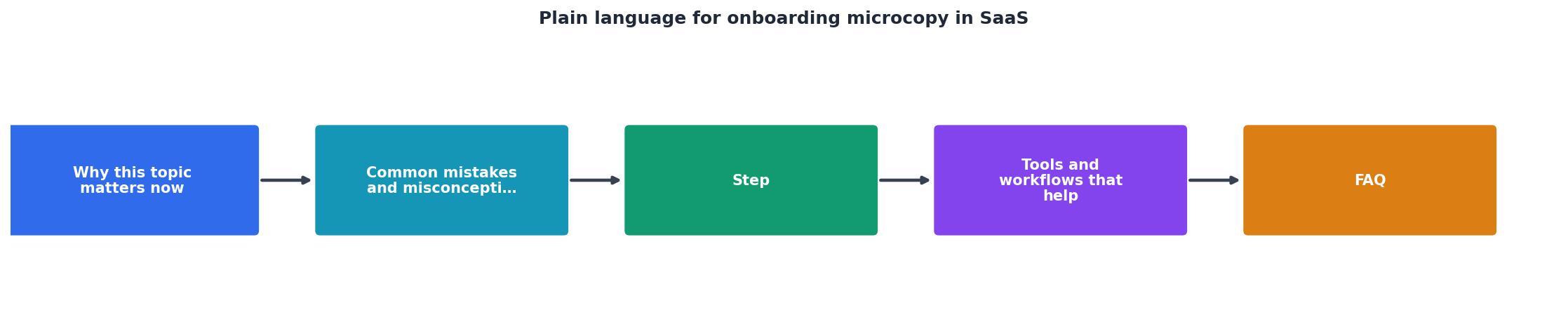
The plain language workflow
Here's a streamlined workflow to keep microcopy clear as you build and iterate:
Audit your current state. Run through your signup flow. Screenshot or list every text element.
Identify problem spots. Which elements caused confusion in testing or drew support questions? Start there.
Rewrite using the formula. Apply specific verb + outcome for buttons, what/why/next for errors.
Test externally. Run 3–5 unmoderated user tests or ask someone outside your team.
Refine and ship. Adjust based on feedback, deploy, and monitor.
Measure impact. Track conversion rate, support ticket volume, and user confidence (via surveys if possible).

Tools and workflows that help
You don't need expensive software to audit and improve microcopy. Here's what actually works:
Google Docs or Sheets. Create a spreadsheet listing every microcopy element, its current state, and your rewrite. Share it with the team for feedback before implementation.
Figma or your design tool. Update all button labels, form hints, and error messages in your design system. Document the pattern so new screens follow it automatically.
UserTesting or similar. Unmoderated testing is cheap ($50–200 per session) and gives you video of real people encountering your microcopy. You'll see exactly where they pause or misread.
Hemingway Editor or similar. Paste your microcopy into a readability checker. It flags dense sentences and jargon automatically. Use it as a starting point, not gospel, it won't catch domain-specific clarity issues.
Slack or team feedback channel. Before deploying, ask your team: "Does this tell you what happens next?" Listen for hesitation. That's your signal to simplify.
Analytics and support logs. Track which onboarding steps have the highest drop-off or generate the most support questions. Those are your priority rewrites.
The best workflow combines a simple audit doc (Sheets), a design-system update (Figma), external testing (UserTesting or a casual call with friends), and ongoing monitoring (your analytics and support inbox).
Make it interactive, your microcopy improvement dashboard
Understanding the microcopy landscape can feel abstract. Here's a visual breakdown of how different microcopy types impact the onboarding journey:
This dashboard shows the real impact of treating onboarding microcopy seriously. Each improvement compounds, clearer buttons speed up signup, reduce errors, and lower support burden simultaneously.
Real-world examples
Slack. Their button says "Create a new workspace" not "Proceed". Every CTA in onboarding tells you the outcome.
Stripe. Error messages are specific: "This email is already registered. Sign in instead." not "Error 409". They guide you forward, not just report failure.
Zapier. Integration onboarding says "Connect your apps" not "Authenticate integrations". Plain, action-focused, outcome-clear.
Notion. Empty states are inviting: "No pages yet. Start by creating one" not "Empty".
These companies don't use plain language because they're nice, they use it because it converts better, drives fewer support tickets, and scales onboarding without adding complexity.
Plain Language Onboarding Microcopy Audit
Your progress is saved automatically in your browser.
FAQ
Frequently Asked Questions
Plain language for onboarding microcopy is the fastest lever you can pull to improve conversion and reduce friction. It costs nothing, takes hours not weeks, and the payoff is measurable. Start today, pick one element, rewrite it, test it, and ship it. Then watch what happens to your funnel.
Additional Resources
- UX Microcopy: Examples, Formulas & Best Practices ... - Three parts, in order: what happened, why, and the next step — in plain language, with no error codes as the headline and no blame. 'That ...
- UX Writing for SaaS: Microcopy that Clarifies and Converts - Use plain language Don't Use only icons or “Success!” without context Overload with details—save those for in-line alerts
- SaaS UX Writing: Principles, Examples, and Best Practices - How do you write effective onboarding microcopy? Focus each message on the next useful action, rather than explaining the whole product. Use ...