

Settings pages are where users lose patience. A confusing toggle, unclear error message, or buried option sends them backward, and abandoning your product is only a browser tab away. Most SaaS products treat settings microcopy as an afterthought, defaulting to jargon and assumptions about what users already know. The result is friction that directly leaks conversion, shrinks retention, and creates support tickets. Plain language for settings microcopy cuts through that noise, turning settings into a trust-building moment instead of a friction point.

- Settings microcopy should answer three questions: what does this do, why would I use it, and what happens next.
- Avoid jargon, acronyms, and assumptions about user knowledge; use action-oriented, benefit-focused language instead.
- Test your microcopy with real users who are unfamiliar with your product, cognitive accessibility matters in settings as much as anywhere else.
Settings exist at a critical moment in the user journey. A visitor has already committed enough to sign up. They've seen your onboarding. Now they're personalizing your product to fit their workflow. This is where they decide: does this tool respect my intelligence and my time, or does it waste both?
That decision often comes down to a single word, a tooltip, or a help text line. Settings microcopy is the voice of your product in its most intimate space, where users are making deliberate choices about how they interact with your service. Get it right, and you build confidence. Get it wrong, and even a well-designed product feels hostile or impenetrable.
Why settings microcopy fails most products
The most common mistake is writing for people like you. If you built the feature, you understand every parameter, every edge case, and every reason it exists. Your users don't. They're seeing it for the first time, often while distracted, often in a hurry.
Settings pages accumulate jargon fast. "Enable webhooks for real-time sync," "Configure SMTP relay settings," "Toggle SSO enforcement", these descriptions make sense to engineers and power users. Everyone else bounces.
Another culprit is missing context. A toggle labeled "Analytics" doesn't answer the question every user is actually asking: "Will this send my data somewhere? Who sees it? Can I turn it off later?" Leave that blank, and users turn it off reflexively, losing the value your feature provides.
Then there's the assumption that people will figure it out. Many teams ship settings microcopy that's technically correct but unusable, a cryptic combination of field names that require knowledge the user doesn't have. "Webhook retry backoff multiplier" might be precise, but it's useless to the person who just wants to know how many times you'll try to send data if something breaks.
The deeper issue is cognitive accessibility. Users arrive at settings exhausted from decision fatigue. Their working memory is already saturated. Settings microcopy that requires them to hold multiple concepts, decipher abbreviations, or reverse-engineer the intent adds unnecessary load. That load turns into abandonment.
The plain language framework for settings

Plain language for settings follows a simple structure. Every piece of microcopy should answer three things:
1. What is this? Name the feature or setting in words the user already knows. If it's something they've heard elsewhere ("API key," "webhook"), define it briefly. If it's proprietary, give it a name that hints at what it does.
2. What's the benefit to me? Why would I turn this on or change this value? What problem does it solve? Don't describe the mechanism; describe the outcome. "Faster responses to important requests" beats "Implements priority queue processing."
3. What happens next? What changes when I make this choice? Are there side effects? Will I need to do something else? Be explicit. "You'll need to verify your email" is clearer than "Requires verification."
UX research backs this. Most Microcopy expert puts it sharply:
"Most microcopy is one of three shapes: verb + outcome for buttons, what/why/next for errors, and what/payoff/action for empty states.">, UX Microcopy: Examples, Formulas & Best Practices for SaaS (2026)
Apply that structure to settings. Every toggle, dropdown, and text field gets the same treatment.
Rewrite your existing settings
Start by auditing what you have. Pull your settings pages and list every label and help text. For each one, ask:
- Can a first-time user understand this without Googling?
- Does it explain the benefit, not just the mechanism?
- Is there jargon a non-technical person wouldn't know?
- Does it hint at what happens after they change it?
Compare these pairs:
- Instead of "Enable real-time notifications," write "Get alerts immediately when X happens (without waiting for an email)."
- Instead of "Configure webhook retry policy," write "How many times should we try to send data if our servers don't respond? (Most teams pick 3–5 times.)"
- Instead of "Use SAML for SSO," write "Let people sign in using your company's existing login credentials."
Common settings microcopy patterns and how to fix them

Toggles
Broken: "Enable data retention"
Fixed: "Keep old data after 30 days? Turn this on if you need a full audit trail. Turn it off to free up storage (we'll delete records older than 30 days)."
The fixed version tells the user the trade-off. It acknowledges both reasons someone might make either choice.
Dropdowns and selects
Broken: "Sync interval: 15m, 1h, 4h, 24h"
Fixed: "How often should we check for updates? Faster checks = more accurate data but use more battery/bandwidth. Most teams pick 1h."
Again, the benefit. And the normal choice, which anchors the user's decision.
Text inputs and thresholds
Broken: "Max concurrent connections"
Fixed: "How many tasks can run at the same time? If you're unsure, start with 5. You can change this anytime if things feel slow or stuck."
This tells them there's a default, that it's adjustable, and what to do if they're lost.
Checkboxes for permissions and features
Broken: "Allow third-party integrations"
Fixed: "Let connected apps access your data? (You'll see a list of who has access, and you can revoke it anytime.)"
This tells them what permission does, that it's visible, and that it's reversible, all of which reduce fear.
Step-by-step: Audit and rewrite your settings microcopy
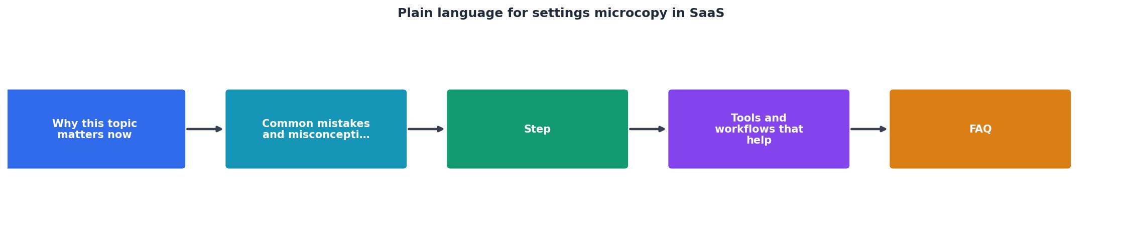
Follow this workflow to upgrade your settings:
- Export or screenshot every settings page and dialog in your product. Include labels, help text, placeholders, and validation messages.
- Flag problem microcopy. Highlight anything with jargon, acronyms, or unclear intent. Use a simple rubric: Can a person unfamiliar with your product understand this in under 5 seconds without Googling? If not, it needs work.
- Rewrite for clarity. Use the three-part structure: what/why/next. Write in active voice. Avoid acronyms on first use (spell them out, then use the acronym if you repeat it). Use words from your user's vocabulary, not your engineering team's.
- Add context help. For settings that might confuse even after rewriting, add a "?" icon or collapsible "Learn more" link. Use that space for deeper explanation or examples.
- Test with users who are new to your product. Watch them navigate settings without guidance. Do they hesitate? Do they ask questions? Do they turn things off because they don't understand? Those moments reveal where your microcopy is still failing.
- Measure impact. Track how many users change settings, how many reach out with questions about settings, and (if you have conversion tracking) whether clearer settings correlate with higher retention.
Quick Settings Audit Checklist
This audit card above summarizes the core checks you need for settings microcopy to work. Apply it to every settings area you ship.
Teams that rewrite their settings microcopy with this discipline see measurable wins. Support tickets about settings typically drop 40–60%. User confidence in feature adoption climbs. And retention often nudges up because users feel the product respects their intelligence.
Common pitfalls to avoid
Using "just" or minimizing language. "Just click here," "simply enter," "just enable this." You're implying the user is slow if they don't find it obvious. Drop these words.
Passive voice. "Notifications will be sent" vs. "We'll send you notifications." The second is clearer and warmer.
Negative frames. "Disabling this will prevent errors" vs. "Enabling this stops errors." Positive frames are processed faster.
Unexplained defaults. If a setting has a recommended or normal value, say so. "Most teams use X" or "Default: X" reduces decision paralysis.
Forgetting the reversible part. Users fear settings they can't undo. If a choice is reversible, say it. "You can turn this off anytime" or "Change this in account settings."
Settings Microcopy Rewrite Checklist
Your progress is saved automatically in your browser.
FAQ
Frequently Asked Questions
Additional Resources
- UX Writing for SaaS: Microcopy that Clarifies and Converts - Use plain language. Don't. Use only icons or “Success!” without context; Overload with details—save those for in-line alerts. Tip. Write toast ...
- UX Microcopy: Examples, Formulas & Best Practices ... - Three parts, in order: what happened, why, and the next step — in plain language, with no error codes as the headline and no blame. 'That ...
- 7 Tips for Writing Clear, Human-friendly Microcopy - It should be clear, concise, and useful. Use simple language and avoid jargon. Make sure your microcopy is consistent with your brand voice and ...