

Visitors land on your blog and immediately face a wall of text, nested menus, sidebars crammed with CTAs, and auto-playing videos. Your content is good. Your research is solid. But within seconds, readers bounce because their brains are overloaded, not because your ideas lack merit. Working memory, the mental scratchpad where people hold and process information for seconds at a time, has a strict capacity limit, and most blog layouts ignore it entirely.
Photo by George Milton from Pexels
TL;DR
- Working memory holds roughly 3-5 pieces of information at once; overload it and comprehension collapses, triggering immediate bounce.
- Common layout mistakes include excessive sidebar content, unclear visual hierarchy, long paragraphs, and competing calls-to-action that split attention.
- Strategic layout reduces cognitive load through white space, short paragraphs (2-4 sentences), one dominant CTA per section, and clear visual breaks.
- Measure success by tracking scroll depth, time on page, and conversion, all spike when cognitive barriers drop.
Your readers are not lazy. They are cognitively constrained. Working memory operates under strict limits: humans can hold and manipulate roughly three to five pieces of information simultaneously. Add a sixth competing element, and the stack overflows. A paragraph of 200 words requires readers to hold context, follow logic, and anticipate direction all at once. Throw in a sidebar, a pop-up, and three CTAs, and you've created a cognitive traffic jam.
The difference between a blog layout that converts and one that bleeds visitors is not fancy design or trendy animations. It is ruthless simplification, removing everything that competes for mental resources and layering what remains so readers process one idea at a time.
Why working memory matters for blogs

Working memory is your reader's active thinking space. When someone reads a sentence, they hold its subject, verb, and object in working memory while simultaneously checking it against what they already know and predicting what comes next. If the layout fractures that focus, with distracting elements, unclear hierarchy, or competing visual anchors, working memory fills up and the reader stops processing.
This is not a accessibility feature for people with ADHD or cognitive disabilities (though it helps them significantly). This is fundamental neuroscience affecting everyone. Studies show that cognitive load directly predicts bounce rate, time on page, and conversion likelihood. A reader who is cognitively overwhelmed will leave, even if the content is exactly what they searched for.
Blogs fail not because ideas are weak but because layouts waste working memory on navigation noise. Every pixel that doesn't serve the primary message competes for mental resources.
Common layout mistakes that drain working memory

Most blogs repeat the same structural errors:
Oversized sidebars. A 30% sidebar means the main content column shrinks to 70 words per line. Readers toggle between the sidebar's "Related Posts," newsletter signup, ads, and the main text. Working memory fills with navigation choices instead of article content.
Unclear paragraph structure. Paragraphs of 150+ words force readers to hold too much context. By line four, the topic sentence fades from working memory, and readers lose the argument.
Multiple competing CTAs. A blog post with CTAs in the sidebar, mid-article, end-of-article, and footer creates decision paralysis. Working memory allocates resources to "which one should I click" instead of "do I understand this concept."
No visual rest. Text, text, text, text, then a stock photo, then more text. Readers need visual breaks to refresh working memory, not for decoration, but as a cognitive reset.
Poor heading hierarchy. Tiny, indistinguishable headings force readers to re-parse visual structure constantly. Each parse consumes working memory.
Auto-playing video or sound. Suddenly, readers must process audio + text + visual motion simultaneously. Cognitive overload is instant.
Nested menus or unclear navigation. If readers must think about how to navigate your site, that thinking displaces article comprehension.
"When working memory is so limited, it's imperative that design is intuitive.">, Medium
Step-by-step approach to working-memory-aware layout

Redesigning a blog layout to respect working memory is not complex. It requires discipline, not genius.
1. Define the single primary action. What is the one thing you want readers to do after finishing the post? Subscribe? Download a resource? Click a demo link? Choose one. Everything else is secondary. Your layout must make this action obvious by the end, no competing secondary actions above the fold.
2. Simplify the header and navigation. Strip the navigation menu to essentials. Remove "Browse by Category" and "Popular Posts" from the header. Readers came for the article, not to navigate the site. Move secondary nav to the footer.
3. Use a single-column layout for the article body. Desktop readers benefit from narrow, text-focused columns (60-75 characters per line). Sidebars are not mandatory. If you must include one, load it only with content directly supporting the article, not promotions or unrelated posts.
4. Break paragraphs aggressively. Aim for 2-4 sentences per paragraph. No paragraph should exceed 80 words. Shorter paragraphs reduce cognitive load and improve scannability.
5. Use generous white space. Space between sections, between paragraphs, and around images gives working memory a chance to refresh. White space is not wasted real estate; it is a cognitive reset.
6. Add visual hierarchy through headings. Use H2 for major sections, H3 for subsections. Make headings short (4-6 words max). Readers scan headings to understand structure before reading prose, this preview step reduces cognitive strain.
7. Limit inline links. Every hyperlink tempts readers to click away, fragmenting focus. Include links only when they genuinely clarify the current thought, not for SEO.
8. Use one dominant CTA per section. If you must include multiple CTAs, position them far apart and make one visually dominant. Avoid button confusion.
9. Add visual breaks with images, lists, and pull-quotes. Lists (like this one) give working memory a visual and conceptual break. Images and pull-quotes serve the same function.
10. Test on mobile first. Mobile screens force simplicity. If your layout works on mobile, desktop will feel spacious.
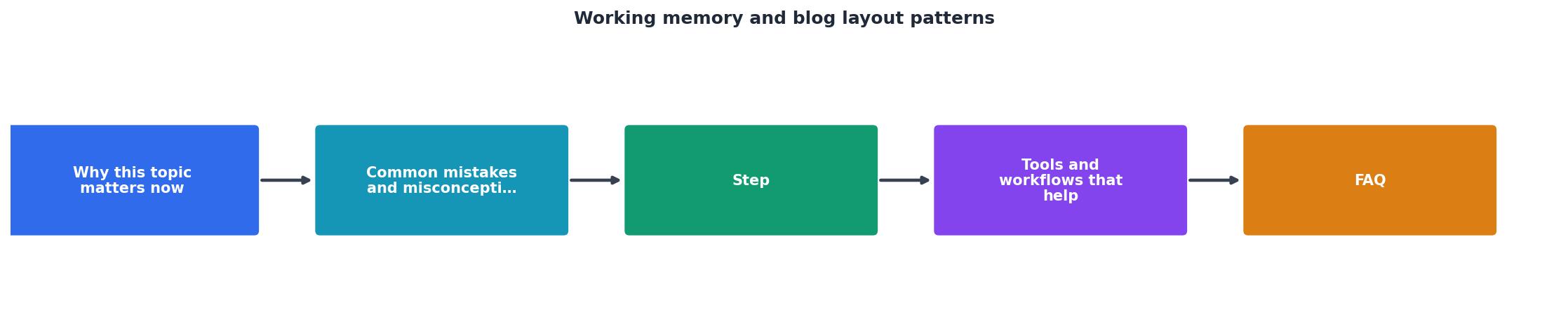
Tools and workflows that help
Redesigning a blog layout for working memory is not a technical problem; it is a prioritization problem. You don't need new tools. You need discipline and feedback.
Heatmaps and session recordings (tools like Hotjar or Crazy Egg) show where readers click, how far they scroll, and when they leave. If readers bounce at a specific paragraph or section, that section is likely cognitively overwhelming. Look for patterns: do most readers skip past a sidebar? Do they abandon before a particular CTA? Data reveals what text alone won't.
Readability analyzers (Hemingway Editor, Grammarly, or even browser plugins) measure sentence length, paragraph density, and readability scores. Aim for a "high school" reading level, not because your audience is unsophisticated, but because simpler language uses less working memory.
Cognitive accessibility audits reveal comprehension barriers that heatmaps miss. A tool like PagePerson Insights can highlight sections where cognitive load spikes, dense paragraphs, unclear navigation, competing visual elements, and flag which barriers most hurt comprehension and conversion.
Iterative user testing beats guessing. Have five unrelated people read your draft blog post aloud, sharing their thinking as they go. Watch for moments of hesitation, re-reading, or confusion. These moments signal working-memory overflow.
A/B testing your layout changes. Two versions, equal traffic, measure scroll depth, time on page, and conversion. Data beats opinion.
Why conversion rises when cognitive load drops
Conversion is not mysterious. Lower working memory demand means readers finish and remember what they read. Remember leads to action. A reader who makes it to the end of your blog without cognitive fatigue is ten times more likely to click your CTA than one who skimmed two paragraphs before bouncing.
Impact of Working-Memory-Aware Layout
When you remove cognitive friction, readers stay. When they stay, they read deeper. When they read deeper and understand, they act. The layout that wins is the one that gets out of the way and lets the content do the work.
Working-Memory-Aware Blog Layout Checklist
Your progress is saved automatically in your browser.
FAQ
Frequently Asked Questions
Working memory is not negotiable. It is how all humans think. A layout that respects it converts better, ranks better (through signals), and reflects respect for your reader's time and attention. Strip away everything that competes, keep only what serves the idea, and watch what happens to your metrics.
Additional Resources
- Working Memory: A Complete Guide to How Your Brain ... - Working memory enables you to generate new thoughts, change them, combine them, search them, apply different rules and strategies to them, or do ...
- A comprehensive comparison of attentional templates ... - This study systematically compared the attentional guidance of WM and LTM templates across various contexts (independent/competitive) and template loads, ...
- Designing for Working Memory - When working memory is so limited, it's imperative that design is intuitive. Otherwise, you're relegating the user's working memory from ...