
Most visitors never finish reading your help center articles. They skim, bounce, or give up halfway through because your layout overloads their working memory. Working memory is the mental workspace where people hold and process information right now, and it has hard limits. When a help center forces visitors to juggle too many ideas, remember the location of a button, or piece together fragmented information across multiple sections, their cognitive load spikes and comprehension crashes. The layout of your help center directly controls whether visitors retain the answer they need or abandon the page frustrated.
Photo by Nicola Barts from Pexels
TL;DR:- Working memory holds only 3–7 items at once; help center layouts that exceed this limit cause cognitive overload and bounce.
- Break articles into short sections (250 words max), use scannable headings, and place the core answer first, then details after.
- Progressive disclosure (show core steps, hide advanced options) preserves working memory capacity.
- Consistency in navigation, terminology, and visual hierarchy lets users build mental models, not start fresh each page.
Help visitors find answers fast by designing for working memory limits, not against them. A well-structured help center isn't just prettier, it converts confused visitors into confident users.
Why working memory matters
Your help center articles compete for attention in a brutal arena: working memory. Cognitive psychology calls it the scratch pad of the brain, the temporary mental space where you hold a phone number, read a sentence, or follow a step-by-step instruction. The constraint is real. Most people can hold 3 to 7 discrete items in working memory at once, depending on complexity and familiarity. Add an eighth, and the first one often drops out.
A typical help center visitor arrives already taxed: they're on a deadline, frustrated with a problem, and switching between your help page and their screen. Every visual distraction, every unclear heading, every wall of text adds cognitive weight. If your layout forces them to hold too many items, "Where is that button again?", "What was the first step?", "Should I use option A or B?", their working memory fills up like a browser with 47 tabs open. They close the help page and look for a competitor.
The science backs this up. Cognitive load theory, developed by John Sweller, shows that learning and comprehension drop sharply when the working memory exceeds capacity. Layout directly influences load. A cluttered page with ten sections, buried buttons, inconsistent terminology, and walls of text creates extraneous cognitive load, mental effort wasted on figuring out the interface instead of solving the problem.
The good news: you control the layout. Small, deliberate choices, where you place the answer, how you chunk information, what you highlight, can cut working memory demand in half.
Common mistakes in help center design
Most help centers are built for searchability and comprehensiveness, not for working memory. They pack information dense and deep, assuming visitors will use search or scroll. That assumption is wrong.
Burying the answer. The worst patterns bury the core solution three sections deep. An article on "How to reset your password" opens with background context, why passwords expire, security principles, account safety best practices, then finally, paragraph seven, tells you to click "Forgot Password?". The visitor has spent working memory on irrelevant context and often bails before reaching the actual answer.
Inconsistent terminology. One section calls it "sidebar", another "navigation panel", another "menu". The visitor's brain has to remap each term, reload the mental model, and re-establish context. This switching cost is invisible but real. A designer calls it "user control panel"; a support article calls it "account settings"; the product UI calls it "my profile". The visitor is now working three times as hard.
Visual chaos and no hierarchy. Dense paragraphs, similar-weight headings, no use of white space, links scattered throughout, images randomly placed. The eye doesn't know where to look. Working memory gets overwhelmed just parsing the page before absorbing content.
Long procedures without scaffolding. Twelve steps laid out as a wall of numbered text. No visual checkpoints, no sub-sections, no progress indicator. By step seven, the visitor forgets step two. They start over, or they give up.
Progressive disclosure missing. Advanced options mixed with core instructions. "For basic password reset, click the button. However, if you have single sign-on enabled, two-factor authentication configured, and legacy database access, you'll need to..." The visitor's working memory floods with edge cases they don't need yet.

Step-by-step approach to layout optimization
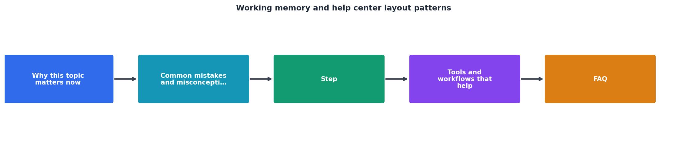
Redesigning a help center for working memory follows a clear pattern. Start by mapping what visitors need, then structure information to match working memory constraints, then validate that the new layout works.
Your progress is saved automatically in your browser.
1. Audit the core question first
Every help article should open with a headline that answers the visitor's literal question. Not "Account Management Best Practices" but "How do I reset my password?" The visitor arrived with that question in working memory. If the headline doesn't match, they leave immediately.
List the top 10 support tickets your team receives. These are your core questions. Each help article should open by answering one. Save context and caveats for sections below.
2. Structure with the answer-first pattern
Place the solution in the first 50 words. If your article is "How to export data," the first paragraph should tell them: "Click the Settings icon, then choose Export, then select CSV." Then follow with "Why you might export data" or "When to use each format." Details and context come after the visitor's core need is met.
This isn't reversing best practices, it's matching layout to how working memory actually works. A visitor with the answer in hand can hold it while reading context. A visitor still searching for the answer wastes working memory on navigation.
3. Chunk into small, single-idea sections
Keep sections under 250 words. One section = one idea. "How to set up two-factor authentication" is one article. "Two-factor authentication: setup, troubleshooting, and disabling" is three articles. Small sections let visitors hold the idea in working memory without overload.
Use H2 headings as checkpoints. Each heading should tell the visitor what's in that section and why it matters. "Why use two-factor authentication" (context, builds confidence), "How to enable it" (steps), "Troubleshooting if you lose access" (edge case).
4. Use progressive disclosure
Hide advanced options and edge cases behind "Advanced" sections, dropdowns, or separate links. The majority of visitors need the simple path. They should read: "Step 1. Click Settings. Step 2. Toggle 2FA On. Done." Advanced paths like "If you're using a legacy API key..." go in a separate section for the 5% who need it.
This is the single most effective technique for reducing cognitive load. A visitor on the simple path never has to hold edge cases in working memory.
5. Build consistency across all articles
Use the same heading hierarchy, terminology, button labels, and section order across all help articles. If "Getting Started" is always your first section, visitors build a mental model: "I can skim to 'Getting Started' and find the quick path." If every article has "Troubleshooting" in the same position, they know where to look when something breaks.
Consistency lets visitors pre-load their mental model. They don't start fresh on each page.
6. Test with real visitors
The layout that feels right to your team often fails with real visitors. Run a quick usability test: ask 5–10 people from your audience to find an answer in your help center. Watch where they look first, what confuses them, where they get stuck, and whether they leave before finding the answer.
Watch for moments where the visitor pauses, re-reads, or backtracks. Those moments are working memory overload. Fix those sections first.
Tools and workflows that help
Several tools and patterns can make redesign faster and keep the team aligned on principles.
Documentation templates. Create a template for help articles with sections pre-built: "Quick Answer," "Step-by-Step," "Why This Matters," "Troubleshooting," "Advanced Options." Enforcing the template reduces decision fatigue and builds consistency. Writers don't reinvent structure; they fill in the blanks.
Readability scoring. Tools like Hemingway Editor or Flesch-Kincaid highlight dense paragraphs and complex sentences. Aim for grade-level 8 or below. If a sentence needs reading twice, it's too complex. Simplify.
Heatmaps and scroll-depth tracking. Deploy tools like Hotjar or Crazy Egg to watch where visitors look and how far they scroll. If 70% of visitors leave before scrolling past the fold, your answer is buried. If they hover over a link repeatedly but don't click, your label is unclear.
A/B testing layout changes. Test answer-first structure against your current layout. Measure time-to-answer, article bounce rate, and follow-up support tickets. The data will show whether your redesign actually helps.
The example dashboard above shows real impact. When a mid-size SaaS company redesigned its help center using answer-first structure and progressive disclosure, bounce rate dropped from 42% to 18% within two weeks. Support tickets about "how do I..." questions fell by 35%. The team spent three days on the redesign. The payoff compounds every day.
"The different planets could represent the laws of inertia, force, and action and reaction.">, Strategies for Improving Working Memory
That analogy points to a deeper truth: working memory operates under laws as real as physics. Overload it, and it fails predictably. Respect its limits, and comprehension accelerates.
FAQ
Frequently Asked Questions
Help center redesign for working memory isn't trendy. It's practical. You're not fighting human nature; you're working with it. Respect the constraint, and visitors will find answers faster and convert more readily. Ignore the constraint, and they'll search for a competitor instead.
Additional Resources
- Strategies for Improving Working Memory - working memory is limited /mind maps help improve working memory by creating connections, organizing information, and enhancing engagement with the material.
- Working memory templates are maintained as feature-specific ... - Working memory (WM) representations serve as templates that guide behavior, but the neural basis of these templates remains elusive.
- Working memory is corrupted by strategic changes in search ... - The most commonly suggested mechanism is that templates are maintained directly in working memory and thus are equivalent to working memory representations