

Photo by Nicola Barts from Pexels
Search results pages are cognitive minefields. A visitor lands on your site, sees 20 links, three ads, two sidebars, and a newsletter signup box all fighting for attention. Their working memory, the mental scratch pad that holds active information for seconds, runs out of capacity. They leave confused, empty-handed, or worse, bouncing to a competitor.
This isn't a design flaw. It's a math problem. Human working memory holds about 4-7 items at once. Most search result layouts present 15-20 simultaneously. The mismatch is predictable and fixable.
TL;DR:- Working memory holds 4-7 items; search results often display 15-20, creating cognitive overload
- Limit visible results per page, group related items, use consistent layout patterns, and remove redundant elements
- Implement progressive disclosure, clear visual hierarchy, and whitespace to align design with how working memory actually functions
Why this matters now
Visitors are drowning in information, not starved for it. The problem is presentation. When someone searches your site or lands on a results page, they have a specific goal. Every extra choice, every competing visual element, every paragraph they have to parse takes mental resources away from that goal.
The rise of AI-generated content and low-quality link farms has made signal-to-noise ratios worse. Users are more defensive now. They scan faster, trust slower, and abandon pages quicker. If your search results don't respect their working memory limits, they'll assume your site isn't worth the cognitive effort.
Companies that fix this see measurable wins: lower bounce rates, higher click-through rates on primary actions, and better conversion from search traffic to signup or purchase.
Common mistakes that drain working memory

The most common problem is pagination theater. Sites show 10-20 results per page, then bury pagination controls at the bottom. A visitor scrolls through all 20, forgets what they saw on the first 5, clicks page 2, and loses context entirely. They're now mentally re-scanning what they've already considered.
Another killer: inconsistent result formatting. One item has a thumbnail, the next has a title and two paragraphs, the next is a video embed. The visitor's brain spends cycles parsing the layout pattern instead of evaluating the content. Consistency removes that friction.
Redundant metadata is another silent killer. Showing the result title, URL, description, date, author, category, and three action buttons on every item gives the user 7 decisions per result. Multiply that by 15 results, 105 micro-decisions. Their working memory is exhausted before they find what they're looking for.
Many sites also fail to differentiate primary results from secondary information. Ads, related searches, filters, and organic results are all given equal visual weight. A visitor can't quickly answer "Where is the main content?" Working memory dedicates cycles to navigation that should go to evaluation.
How working memory actually works
Your working memory is like a whiteboard with 4-7 dry-erase slots. You can hold active thoughts in those slots while you manipulate them. Once you fill all slots, adding new information means erasing something already there. On search results, this means a visitor can comfortably compare 4-7 options, but 15 overwhelms the system.
Two design patterns reduce working memory load: chunking and progressive disclosure.
Chunking groups related items so the brain treats them as a single unit. Instead of 15 individual results, you show 3 groups of 5 results each, labeled by category or relevance tier. Now the visitor's brain processes 3 decisions instead of 15.
Progressive disclosure reveals information in stages. Show the title and one-line description first. Let the user click to expand for full details. This keeps the active information set small and lets visitors decide what deserves deeper cognitive investment.
Step-by-step approach to fixing search results

Start by auditing your current search results page or results listing. Count how many items appear above the fold. Count how many metadata fields each item displays. Note where ads, sidebars, and related-content boxes appear.
If you're showing more than 10 items above the fold, you're overloading working memory. Aim for 5-7 as the initial visible set. This isn't about limiting results, it's about controlling what competes for attention in the first 5 seconds of cognitive load.
Next, standardize the result format. Every result should follow the same template: title, brief description (one line), and one or two metadata fields. If you need more info, tags, dates, author, use a collapsed/expandable format or hover state.
Then, create a clear visual hierarchy using size, color, and spacing. The primary action (clicking a result) should be the most visually obvious option. Secondary metadata should be smaller and lighter. This lets visitors scan quickly and focus where you want them to.
Remove competing elements from the initial view. Sidebars, related searches, and ads can move below the primary results or into a secondary panel. Tests consistently show that removing clutter above the fold increases engagement with the main content.
Implement pagination that preserves context. Don't force visitors back to page 1 when they click "next." Preserve filter state, search terms, and scroll position. Better yet, use infinite scroll or "load more" so visitors stay in the same mental context.
Here's the process in visual form:
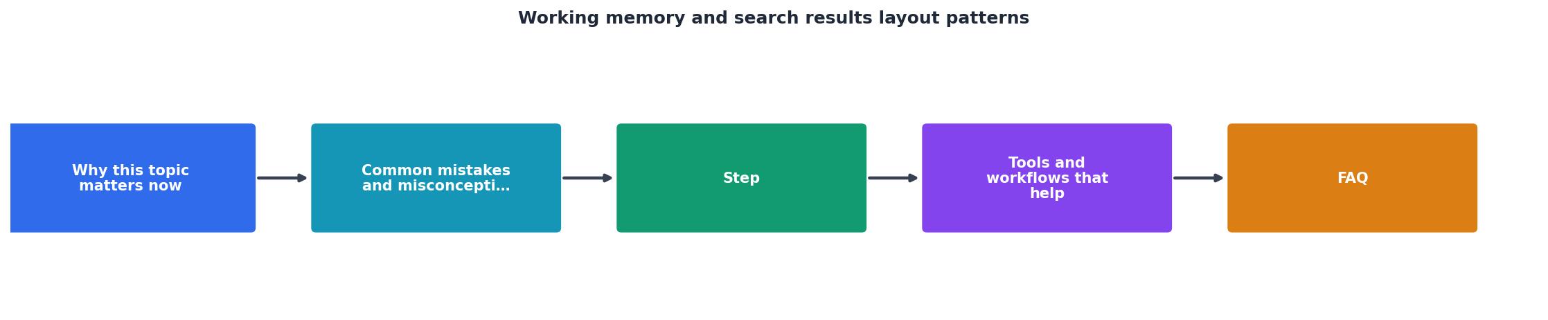
Audit current state → identify overload → Reduce visible items → standardize layout → Test with real users → measure bounce and engagement → Iterate.
Each step compounds. Reducing from 20 to 8 visible results improves scannability. Standardizing format improves parsing speed. Removing sidebars reduces decision points. Together, these changes can cut time-to-decision by 30-40%.
Information overload and when to use filters

Filters are effective but dangerous. They reduce results, which feels like they're helping. But every filter is a decision. A visitor looking at 15 filter options (date, category, author, price range, type, status, rating...) is burning working memory before they've even applied a filter.
Follow the rule of three: expose no more than three filters initially. Group related filters under collapsible headings. Let visitors apply one filter and see the results narrow before they decide on the next. This staggers decisions and reduces cognitive load per step.
Mobile compounds this problem. A side-by-side filter layout that works on desktop becomes a tall, scrollable list on mobile. Visitors scroll up and down between filters and results, losing context repeatedly. Use a filter modal or slide-out panel on mobile so filters and results don't compete for screen space.
The best search results pages don't show all filters at once. They show the most common ones (usually 2-3), then group others under "More filters" or "Advanced search." Visitors who need specificity can find it; visitors who want simplicity get it.
Tools and workflows that help
Several tools help audit and fix search result layouts.
Chrome DevTools is free and effective. Open DevTools, highlight each result element, and count the number of children. If you're seeing 12+ DOM nodes per result, you have too many metadata fields or nested elements competing for visual space. Simplify.
Heatmap tools like Hotjar or Microsoft Clarity show where visitors' eyes go on search results. You'll often find they skip over metadata you thought was important and focus on title and thumbnail. Use that data to remove what doesn't get looked at.
A/B testing frameworks let you compare layouts. Run a test with 8 results per page vs. 15. Measure bounce rate, click-through rate on primary results, and time-to-first-click. Most will show that 8 wins on engagement.
PagePerson Insights can analyze your search results for cognitive load, checking for visual clutter, consistent formatting, and whether the layout matches working memory limits. It shows which elements create friction for visitors and prioritizes what to fix first.
For internal workflows, create a results template in your design system. One standardized component for search results, product listings, or any paginated content. Enforce it across your site. This removes the design decision-making per page and ensures consistency.
Interactive working memory capacity calculator
Understanding your specific cognitive load is easier when you can visualize it. Here's an interactive tool to see how your search results page stacks up:
Working Memory Load Calculator
Total cognitive decisions: 72
Safe limit (7 items): 49
⚠️ Overload detected
This calculator helps you see the real cognitive load of your results layout. Adjust the numbers to match your site, if you show 12 results with 5 metadata fields and 3 actions each, that's 72 micro-decisions. The safe limit (based on 7-item working memory) is 49. You're overloading your visitors. Reduce results to 8, cut metadata to 3 fields, and you drop to 32, well below cognitive capacity.
Search Results Cognitive Load Audit Checklist
Your progress is saved automatically in your browser.
FAQ
Frequently Asked Questions
The cognitive science here is solid, but the execution is where most teams stumble. They know their search results feel cluttered, but they're hesitant to remove elements, each field was added for a reason. The key insight is that no single field matters more than the overall scannability of the page. Respect working memory, and you'll see the engagement data prove it.
Additional Resources
- Working memory is corrupted by strategic changes in search ... - Here, we show that changes in search templates influence working memory. Participants were asked to remember the orientation of a line that changed every trial, ...
- Working memory is corrupted by strategic changes in search ... - Here, we show that changes in search templates influence working memory. Participants were asked to remember the orientation of a line that ...
- Is a search template an ordinary working memory? ... - Visual search requires the maintenance of a search template in visual working memory in order to guide attention towards the target.