
Your signup form probably sounds like a legal document. "Proceed to create account." "Acknowledge terms and conditions." "Submit information for account provisioning." Real visitors don't talk like that, and they're not reading your form with a dictionary. They're tired, skeptical, and one click away from your competitor. Plain language in signup microcopy is the difference between a visitor who hits "Sign up" and one who closes the tab. It's not about dumbing things down, it's about respecting your visitor's time and attention.
Photo by Cup of Couple from Pexels
TL;DR:- Plain language microcopy reduces friction, increases clarity, and improves conversion on signup flows
- Focus on three core patterns: action + outcome for buttons, what + why + next for errors, what + payoff + action for empty states
- Test every word with real users; remove jargon, passive voice, and unnecessary words
- Use tools like hemingwayapp.com and cognitive accessibility testing to validate readability
- Prioritize the first-time visitor experience, they don't know your product vocabulary yet
Why signup microcopy matters now
Signup flows are where visitors make their first commitment. In that moment, every word in your form, the button label, the error message, the placeholder text, the validation feedback, is either building trust or creating doubt. When a visitor sees "Provide valid email format," they might wonder if their email is actually invalid or if your system is just unclear. When they see "Please enter a valid email," it's friendlier. When they see "We'll send a confirmation to this address," they understand why you're asking.
The competitive reality is brutal. Conversion rates for SaaS signup flows average between 10-20%, and a significant portion of drop-off happens not because the form is long, but because the language creates friction. Visitors get confused, feel judged by error messages, or simply don't understand what's being asked. Plain language fixes this.
But there's another reason this matters now: cognitive accessibility is becoming both a legal obligation and a business imperative. The European Accessibility Act and growing ADA lawsuits mean accessible language isn't optional, it's mandatory. Plain language helps everyone: people with ADHD, dyslexia, cognitive load, or low digital literacy all benefit from clear, direct words.
Common mistakes in signup microcopy

Most signup microcopy fails because teams default to formal, passive, or overly technical language. Here are the patterns that kill conversion:
Passive voice and hidden subjects. "An account has been created" instead of "You're all set." Passive voice makes the reader feel like a bystander, not an agent. They want to know what they should do next.
Jargon and assumed knowledge. "Configure your OAuth scope" assumes the visitor knows what OAuth is. If they don't, they bounce. Use terms your first-time visitor understands without Googling.
Negative framing in errors. "This password does not meet complexity requirements" makes the visitor feel bad. "Use at least one number, one uppercase letter, and one special character" tells them exactly what to do.
Too many words. "Please kindly enter the email address associated with your account to proceed with verification" could be "Enter your email to verify your account." Half the words. Same meaning. Faster reading.
Contradictory or unclear buttons. "OK" or "Next" don't tell the visitor what happens when they click. "Create account" or "Send verification link" are specific and build confidence.
The three-pattern framework
"Most microcopy is one of three shapes: verb + outcome for buttons, what/why/next for errors, and what/payoff/action for empty states.">, UX Microcopy: Examples, Formulas & Best Practices for SaaS (2026)
This framework simplifies the work of writing signup microcopy. Every piece of text on your form fits into one of these buckets.
Pattern 1: Action + Outcome (Buttons)
Buttons are your primary calls to action. They need a verb (what the visitor does) and the outcome (what happens next).
Bad: "Submit" or "OK"
Better: "Create account" or "Send verification code"
Why it works: The visitor knows exactly what happens when they click.
- Slack: "Create new workspace" (not "Next")
- Dropbox: "Continue with email" (not "Proceed")
- Figma: "Sign up with email" (not "Register")
Bad: "Error 401: Invalid input"
Better: "This email is already in use. Enter a different email or sign in to your existing account."
Why it works: The visitor understands the problem and has a clear path forward.
- Stripe: "Card number is invalid. Check it and try again." (What + why + next)
- GitHub: "Password too short (minimum 8 characters)." (Why + what to do)
- Mailchimp: "Hmm, we don't recognize that email. Create a new account or check your spelling." (Outcome + two paths)
Bad: "Complete profile to unlock features"
Better: "Add a profile photo so teammates recognize you in comments."
Why it works: The visitor understands the immediate benefit.
- Notion: "Add a profile picture to make your Notion account look like you." (What + payoff)
- Calendly: "Set your time zone so invitations show in your local time." (Payoff + reasoning)
- Airtable: "Verify your email to access all features." (Outcome + action)
Step-by-step approach to writing plain signup microcopy
Step 1: Audit your current microcopy
Open your signup flow in a private browser (or have a friend do it). Write down every word on the form:- Button labels
- Placeholder text
- Error messages
- Field labels
- Help text
- Confirmation messages
Step 2: Apply the three-pattern framework
Go through each element. Ask:- Is this a button? Use action + outcome.
- Is this an error? Use what + why + next.
- Is this a field label or helper? Use what + payoff + action.
Step 3: Cut unnecessary words
Eliminate hedge words (perhaps, seem to, quite, fairly), modifiers (very, really, really important), and passive constructions. Use a tool like Hemingway Editor (hemingwayapp.com) to spot dense sentences.
Compare:- "Please enter your organization's name so we can better serve your team." (22 words)
- "Organization name" (2 words, field label is enough; the user already knows why)
Step 4: Test with users unfamiliar with your product
Show the form to someone who's never used your product. Don't explain it. Watch them interact with it. Do they:- Know what each field is for without reading extra help text?
- Understand what happens when they click the button?
- Know how to fix an error without frustration?
Step 5: Implement and measure
Release the clearer version. Track:- Form completion rate (signup starts → confirmations)
- Time to complete the form
- Return rate within 24 hours (did they come back, or was it a regretted signup?)
- Support tickets related to signup confusion

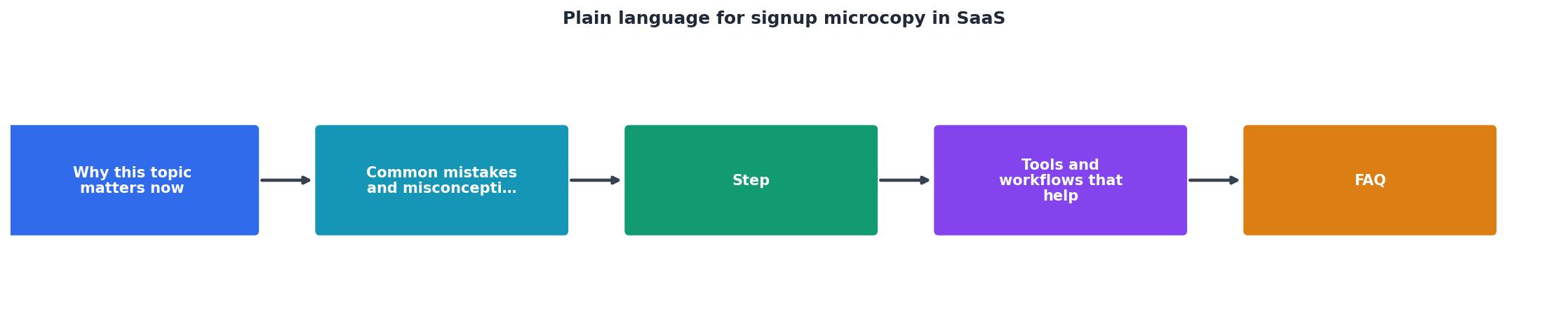
The full process at a glance
Tools and workflows that help
Writing plain microcopy is craft work, but tools can catch mistakes and enforce consistency.
Hemingway Editor (hemingwayapp.com) flags dense sentences, adverbs, passive voice, and complex words. Paste your microcopy in and it highlights areas to simplify. Not perfect, but a quick first pass.
Readable.com scores readability on multiple scales (Flesch-Kincaid, Gunning Fog, etc.). Aim for an 8th-grade reading level for most SaaS. This isn't about talking down, it's about accessibility.
Grammarly catches grammar, tone, and clarity issues in real-time as you draft. Useful for catching passive voice and vague constructions.
User testing tools like UserTesting or Validately let you watch real people interact with your form. Pay attention to where they hesitate or ask questions, that's where microcopy is failing.
Cognitive accessibility audits via tools like PagePerson Insights surface how clarity and cognitive load affect different users. You can see exactly where visitors with ADHD, anxiety, or dyslexia struggle, often in form microcopy.
Versioning and A/B testing platforms like Optimizely or VWO let you run two versions of signup microcopy and measure which converts better. Test one change at a time: button label, error message, field label. Small wins add up.
Interactive microcopy optimization guide
To help you visualize the optimization process, here's an interactive example showing how a typical signup form evolves with plain language:
❌ Before (unclear)
Submit Information
Organization Identifier
Invalid format detected
✓ After (plain language)
Create my account
Company name
Use letters, numbers, and hyphens only (e.g., "Acme-Co")
This visual comparison shows the shift from corporate jargon to conversational clarity. "Organization Identifier" becomes "Company name" because that's what your visitor calls it. "Submit Information" becomes "Create my account" because it's specific. "Invalid format detected" becomes actionable help. The result: faster comprehension, fewer abandoned forms.
Practical workflow for your team
Plain Language Signup Microcopy Checklist
Your progress is saved automatically in your browser.
FAQ
Frequently Asked Questions
Your signup form is the moment a visitor becomes a user. Every word in that flow either moves them forward or creates doubt. Plain language isn't a nice-to-have, it's the difference between 10% conversion and 25% conversion. It's also the difference between an accessible form and one that locks out visitors with cognitive load or language barriers. Start with one section: rewrite your button labels and error messages using the three-pattern framework, test with a real user, and measure the change in completion rate. You'll be surprised how much a few clearer words move the needle.
What's the biggest source of friction you see in your signup flow? Share it in the comments and I'll help you rewrite it in plain language.
Additional Resources
- UX Microcopy: Examples, Formulas & Best Practices ... - Three parts, in order: what happened, why, and the next step — in plain language, with no error codes as the headline and no blame. 'That file ...
- Microcopy: SaaS UX and Signup Impact - Use plain language, no jargon, no technical fallbacks. • Test with real users, the best microcopy comes from watching people get stuck.
- UX Writing for SaaS: Microcopy that Clarifies and Converts - Use plain language. Don't. Use only icons or “Success!” without context; Overload with details—save those for in-line alerts. Tip. Write toast ...