

Your signup form looks clean. Your copy is clear. Yet visitors still abandon before they hit submit. The culprit isn't what you're asking, it's how much you're asking them to hold in their head at once. Working memory is the mental notepad we use while filling out forms, navigating flows, or making decisions on your site. When you overload it, conversion drops regardless of how good your design looks.
TL;DR:- Working memory holds about 3–5 pieces of information at once; signup forms that exceed this threshold cause abandonment.
- Cluster form fields into logical groups, reduce visible options, and use progressive disclosure to stay within cognitive limits.
- Cognitive friction (unclear labels, too many choices, missing context) wastes expensive traffic and erodes trust faster than slow load times.
Why working memory breaks conversions
Working memory is temporary mental storage. When you land on a signup page, your brain holds: what you came to do, what the form is asking, what information to enter, whether you trust this company, and whether it's worth your time. That's already four to five slots filled. Add a confusing label, unclear error message, or surprise third-party integration demand, and your visitor's working memory maxes out. They leave.
Research shows that cognitive overload during signup increases drop-off by up to 40 percent. Your analytics might say "bounce rate 35%," but the real story is simpler: visitors ran out of mental energy before completing the task.
The paradox is that teams making signup forms rarely think about working memory. They focus on design aesthetics, loading speed, and mobile responsiveness, all important, but miss the invisible load that forms impose on the user's brain.
Common mistakes that drain working memory
Too many form fields visible at once. A ten-field signup form demands that visitors remember why they're there, what each field means, and whether they've made mistakes. After the fifth field, retention of earlier answers starts to slip. People second-guess what they typed two fields back.
Vague labels and placeholder text. "Company name" is clear. "Organization" is ambiguous, does that mean my business, my team, or my role? Ambiguity forces the brain to pause, reread, and decide. That's wasted working memory.
Unexplained required fields. Why do you need my phone number? Is it optional or mandatory? If a field is marked required but the reason isn't obvious, visitors hesitate. That hesitation is cognitive friction.
Too many options at once. Showing 15 industry categories instead of a searchable dropdown forces visitors to scan, compare, and choose. Decision fatigue sets in. Many abandon rather than pick.
Surprise requirements after initial submission. "Please verify your email" is fine. "Now connect your Slack workspace" or "Set up two-factor authentication" right after signup shocks the system. The visitor thought they were done.
Inconsistent or error-prone validation. A form that rejects "St." but accepts "Street" or flags "123-456-7890" but not "(123) 456-7890" teaches the visitor that the form is fussy and unpredictable. Each failed attempt drains working memory and damages trust.

Step-by-step approach to reduce cognitive load
Step 1: Audit your current form. Count the number of fields visible on first load. If it's more than five, you're already pushing working memory limits. For each field, write down the label exactly as it appears. Read it aloud. If you hesitate or need to think about what it means, your visitors will too.
Step 2: Identify the must-haves. What information do you genuinely need to get started? Email and password for login. Name and email for most signups. Everything else is optional until later. Stripe's signup asks for email and password. Slack asks for workspace name and email. Neither asks for company size, team members, or use case upfront. They collect that after signup, when the user has completed the primary task and has mental space.
Step 3: Reorganize into logical groups. If you need more than five fields, use visual hierarchy and spacing to chunk them. "Account info" (name, email, password) on one visual level. "Company info" (company name, industry) in a secondary group below, perhaps behind a collapsible or on a second step. Grouping reduces the cognitive load of a flat list.
Step 4: Use progressive disclosure. Show only what's needed now. After signup, ask for details in onboarding or profile setup. Typeform does this well: initial signup is three fields, then after signup, the product asks for role, team size, and use case. The signup itself never taxes working memory.
Step 5: Write clearer labels and help text. Instead of "Company type," write "What category best describes your business?" Instead of "Org size," write "How many people work at your company?" Specificity removes ambiguity and speeds up decision-making.
Step 6: Reduce choices where possible. Instead of a dropdown with 50 countries, offer a searchable autocomplete. Instead of 12 industry options, show the top five and a "browse more" link. Fewer visible choices mean faster decisions and less working-memory drain.

Process diagram: Designing a working-memory-friendly signup
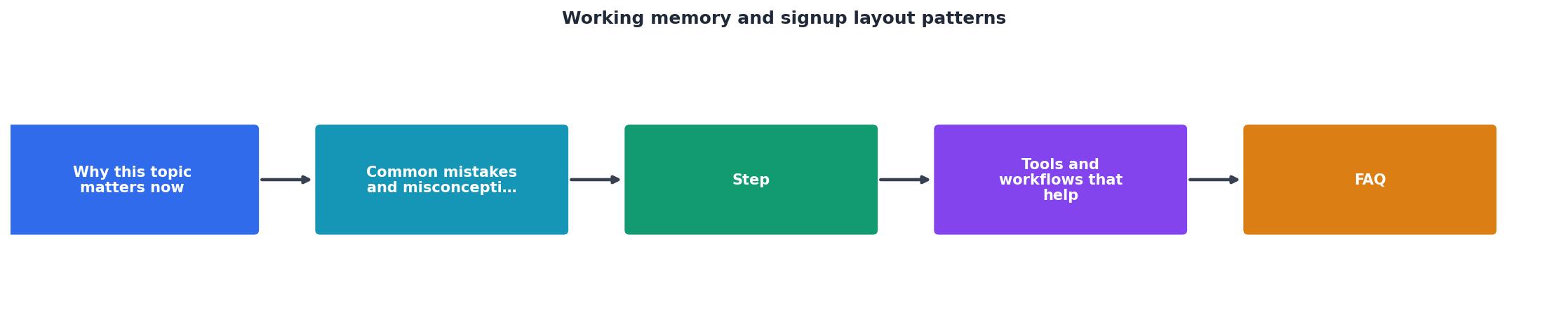
The diagram above shows the core workflow: assess current fields, identify essentials, cluster into groups, test clarity, and iterate based on user feedback. Each step reduces cognitive load incrementally. The goal is to move visitors through the form without mental strain.
Tools and workflows that help
Figma and design systems. Use a component library to maintain consistent field styling, spacing, and validation messages. Consistency trains the visitor's brain. Inconsistency breaks that pattern and demands fresh processing.
Hotjar or Crazy Egg heatmaps. Watch where users hesitate, reread, or click multiple times on a single field. Those hesitations signal cognitive friction. A video session showing a user re-entering a field three times because the label was unclear is gold.
A/B testing single-element changes. Test five fields vs. six. Test "Company size" vs. "How many people work here?" Test a dropdown vs. a searchable autocomplete for country selection. Small changes compound. Over thousands of signups, removing one confusing field can shift conversion by 2–3 percentage points.
Accessibility audits (beyond WCAG). Most audits check contrast and keyboard navigation. Cognitive accessibility, clarity of labels, reduction of choices, progressive disclosure, is rarely audited. Tools like PagePerson Insights analyze how visitors with cognitive load, ADHD, or low digital literacy struggle with your form and flag friction zones you might miss.
User testing with diverse readers. Recruit five to ten people outside your team, especially those unfamiliar with your product, and watch them sign up. Note where they pause, what they ask, and what they skip. You'll quickly see which fields cause hesitation.
Working Memory Capacity During Signup
The card above visualizes working memory capacity. Those five slots represent the brain's temporary storage during form completion. Most of your signup flow is competing for space in slots that are already half-full.
"When working memory is so limited, it's imperative that design is intuitive.">, Medium
This insight hits hard because intuitive design isn't about aesthetics, it's about respecting the visitor's mental resources. A form that looks beautiful but demands constant cognitive effort will lose.
Real-world example: Notion vs. Typeform signup
Notion's signup. Three fields: email, password, workspace name. The entire flow takes 30 seconds. No questions about company size, role, or intent. That comes in onboarding after signup. Result: Fast signup completion, high initial conversion.
Typeform's signup. Email, password, and name on the first screen. On the second screen (reached after one click), role and team size appear. Typeform deliberately split the ask. First, validate that someone wants the product (email + password). Then, collect secondary data when they've committed.
Both understand working memory limits. Compare this to a common SaaS signup that asks for email, password, company name, company size, industry, role, team size, and use case on a single page. That's eight pieces of information before a single submit button. Visitors feel interrogated, not welcomed.
Working Memory Optimization Checklist
Your progress is saved automatically in your browser.
FAQ
Frequently Asked Questions
Additional Resources
- How are patterned movements stored in working memory? - The results of Experiment 1 indicated that individuals can store 3–4 patterned movements in working memory; however, a change in stimulus format or an increase ...
- Designing for Working Memory - Designing for Working Memory Your user's working memory has a storage capacity of ~4. How much is your design taking up?
- Similar Quality of Visual Working Memory Representations ... - Visual working memory (VWM) plays an important role during visual search, with some theories suggesting an equivalence between working memory ...