


Your checkout abandons before customers reach payment. Your landing page makes sense to your team but visitors click away within seconds. The culprit isn't bad design or weak copy. It's working memory overload. Most checkout and form layouts ignore how human attention actually works, forcing visitors to juggle too many pieces at once. The fix is practical: remove cognitive friction by respecting the limits of working memory.
TL;DR
- Working memory holds 3-5 chunks of information at once. Checkouts and forms that exceed this create abandonment and errors.
- Common patterns that fail: Too many form fields visible, unclear progress indication, inconsistent labels, distracting secondary information, and unclear what happens next.
- What works: Progressive disclosure (show only what's needed), clear step indicators, consistent terminology, visual hierarchy, and confirmation before submission.
- Test your checkout for cognitive load. Most checkouts fail because they were never measured against working-memory limits, not because they're poorly designed.
Why checkout layout matters now
Checkout isn't just about collecting data. It's the moment when a committed buyer becomes an abandoner. You've already won the sale in their mind. Now you need to execute the final step without asking their brain to do too much.
The problem runs deeper than clutter. Each additional field, each ambiguous label, each unexplained error message consumes working memory. After a few seconds of cognitive overload, visitors don't see a checkout form anymore. They see friction. They leave.
The stakes are direct: every abandoned checkout is revenue lost. Every field that requires re-reading to understand is a conversion point failure. The layout of your checkout determines whether visitors complete the journey or bail.
How working memory shapes behavior
Working memory is the mental workspace where you hold active information. It's not permanent storage. It's the notepad your brain uses right now to think through a problem.
The constraint is real. George Miller's research established that working memory holds roughly 3 to 5 chunks of information simultaneously. A chunk is any meaningful unit: a number, a word, a concept, a decision. When you exceed this capacity, people forget what they were doing. They make mistakes. They abandon the task.
"The problem is that this interpretation is almost entirely wrong.">, Miller's Law and Form Design
The implication for checkout is brutal: if a visitor lands on your checkout page and must simultaneously remember their shipping address, their billing address, the coupon they wanted to apply, the payment method they chose, and whether they opted into marketing, you've exceeded their working memory. They're now operating on cognitive autopilot, and mistakes follow.
Common checkout mistakes
Most checkout abandonment traces back to one of five patterns that overload working memory.
Too many fields at once
The most obvious failure: showing 15 form fields on a single screen. A visitor sees address, phone, email, company name, preferred shipping method, billing address, payment method, invoice details, newsletter signup, and more. Their working memory fills up at field five. Fields six through fifteen get random or abandoned entries.
Real example: Major retailers often show billing and shipping on one page, then payment on the next. The visitor must remember details from the previous screen. If the billing address was auto-filled incorrectly, they might not notice because they're focused on the new screen.
Solution: Progressive disclosure. Show only the fields required for the current decision.
Unclear progress indication
A visitor doesn't know how many steps remain. Are they on step 2 of 3 or step 2 of 7? This ambiguity taxes working memory because they can't predict the effort required. They're uncertain whether completing checkout is worth the time.
The worst case: No visible steps at all. The visitor assumes there are more screens after payment. They hesitate. They leave.
Inconsistent or confusing labels
Your checkout says "Ship to" on one screen and "Delivery address" on the next. Or it labels a field "Contact details" when you mean "Phone number." The visitor has to re-interpret every label, consuming working memory on translation instead of data entry.
Distraction from secondary information
A checkout page that includes product recommendations, live chat prompts, newsletter signup, exit-intent popups, or other secondary elements competes for attention and working memory. The visitor must decide whether to engage with each distraction or ignore it. That decision is a cognitive cost.
Missing or unclear next steps
The visitor completes the payment form but sees no confirmation that the button submission worked. Did it go through? Should they wait? Click again? The uncertainty creates cognitive load.
Step-by-step approach to fix checkout

Redesigning checkout for working memory follows a process. You audit what's there, identify the cognitive load, and reduce it systematically.
1. Map the current flow
Write down every screen, every field, every instruction, every error message. Count how many distinct decisions the visitor must make on each screen. If a screen requires more than 5 decisions or more than 7 field entries, it's overloaded.
Example: Your current checkout has:- Screen 1: Email, shipping address (6 fields), shipping method (1 decision)
- Screen 2: Billing address (6 fields), billing method (1 decision)
- Screen 3: Payment details (4 fields), apply coupon (1 optional decision)
2. Identify what can move or hide
Not every field is equally important. Some can be optional. Some can be pre-filled based on prior information. Some can move to a post-checkout step.
Ask for each field: Is this essential to complete the transaction right now? Or can it wait until after payment?
Subscription boxes: This can move to post-checkout.
Company name: Unless you're B2B, this is often not essential. You already have email.
Newsletter consent: Can be a post-purchase email instead of a checkout field.
3. Test for clarity
Read each label aloud as though you've never seen it. Does it tell you exactly what information is needed and why? Or do you have to infer?
Weak: "Additional details"
Strong: "Apartment or suite number (if applicable)"
Weak: "Preferences"
Strong: "How would you like us to contact you about your order?"
4. Group related fields
If you must show multiple fields, group them logically. All address fields together. All payment fields together. This reduces the cognitive cost of scanning and remembering context.
5. Add explicit progress indication
Show the visitor where they are in the journey. Three formats work:
- Numbered steps: Step 1 of 4: Shipping Address
- Progress bar: Visually shows how far through checkout they are
- Breadcrumbs: Shipping > Billing > Payment (clickable to return if needed)
6. Confirm before final submission
Before charging the card or processing the order, show a summary screen: "You're ordering X items. Total: $Y. Shipping to [address]. Charged to [card ending in 1234]." Let the visitor confirm or edit. This reduces the anxiety that comes from uncertainty.
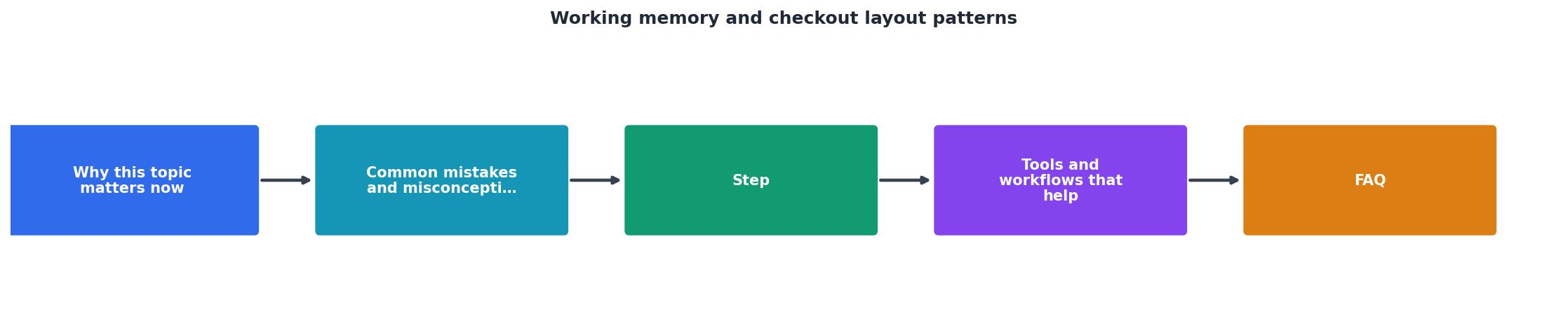
Tools and workflows that help
Cognitive load audit tools
Most analytics platforms (Google Analytics, Hotjar, etc.) show where visitors drop off but not why. You need a tool that flags cognitive barriers. This is where testing for working memory constraints comes in: Can you identify which screens or fields cause the most confusion?
Run a small usability test with 5-10 first-time visitors. Watch them complete checkout without assistance. Note where they pause, re-read, or make errors. Those are your working-memory hot spots.
Heatmaps and session recordings
Tools like Clarity or Hotjar show where people click, how far they scroll, and where they get stuck. Session recordings let you watch a visitor attempt checkout in real time. You see hesitation, re-reading, and abandonment patterns that raw data doesn't show.
A/B testing checkout changes
Don't guess. Test. Run one version of checkout (fewer fields, clearer labels, better progress indication) against another. Measure conversion rate, time to complete, and error rate. Working memory improvements show up immediately as fewer errors and faster completion.
Accessibility checklist
Beyond working memory, ensure your checkout meets basic accessibility standards:
- All form fields have associated labels (not just placeholders).
- Error messages are clear and linked to the field that failed.
- You can tab through the form in logical order.
- Color is not the only way to distinguish between required and optional fields.

Interactive checkout assessment
To help you evaluate your current checkout, here's an assessment tool showing how working memory constraints typically map to checkout problems:
Typical Working Memory Checkout Risks
Use this as a quick self-check: Run through your checkout and score yourself honestly on each dimension. Any "High Risk" or "Caution" item is a conversion leak worth fixing.
Checklist do wdrożenia
Użyj tej listy kontrolnej, aby systematycznie zmniejszyć obciążenie poznawcze w kasie.
Your progress is saved automatically in your browser.
FAQ
Frequently Asked Questions
What you should do now
Audit your checkout this week using the checklist above. Pull up your checkout flow on desktop and mobile. Count the fields per screen. Note the progress indication. Read the labels aloud. Watch 5 users complete checkout without help.
Then pick one change: Remove 3 fields, add a progress indicator, or clarify the most confusing label. Test it using the A/B testing approach outlined in the checklist. Measure conversion before and after. Let the data guide the next change.
Start with the checklist today. Work through each item systematically over the next two weeks. Your checkout doesn't need to be fancy. It needs to respect how your visitors' brains work. That's the conversion opportunity you're sitting on right now.
Additional Resources
- Miller's Law and Form Design | Atticus Li - human working memory can hold approximately seven items simultaneously. real-world tasks is closer to four items than seven,
- How are patterned movements stored in working memory? - The results of Experiment 1 indicated that individuals can store 3–4 patterned movements in working memory; however, a change in stimulus format or an increase ...
- Baddeley & Hitch Working Memory Model: 4 Components - Every abandoned checkout is partly a working memory story. A novice holds thirty-two chess pieces and drowns; a master holds four meaningful ...