

Your checkout page converts at 2.1%. You have spent months optimizing button colors, headline copy, and trust badges. Yet nearly half your visitors still abandon their cart, and your analytics cannot tell you why. The answer is often cognitive accessibility, the invisible layer of usability that determines whether a real human brain can actually process your checkout flow without getting stuck, confused, or overwhelmed.

- Cognitive accessibility on checkout pages means reducing the mental effort required to complete a purchase, not just meeting WCAG contrast ratios.
- Fix form complexity, unclear error messages, and information overload first. These three issues cause the most abandonment.
- A structured audit of cognitive load, reading level, and decision points can recover revenue you are already losing from existing traffic.
The checkout page is where money dies
Every visitor who reaches your checkout has already decided to buy. They clicked the ad, browsed the product, added it to the cart. Then something on the checkout page breaks their momentum. Not a 404 error. Not a slow server. A cognitive barrier.
Cognitive accessibility refers to how easily a person can perceive, understand, and act on the information presented to them. It covers working memory limits, reading comprehension, attention span, decision fatigue, and anxiety triggers. When a checkout page violates these limits, visitors leave.
This is not a niche concern. People with ADHD, dyslexia, anxiety disorders, low digital literacy, or simply high stress levels all experience cognitive barriers differently. But even a well-rested, neurotypical user hitting your checkout at 11 PM after a long day has reduced cognitive capacity. The fixes that help people with cognitive disabilities help everyone convert.
"Many brain areas may be affected by dementia - this blog post takes a look at the most common of these.">, What is cognition?, DPUK
Understanding cognition means understanding that checkout is not just a form. It is a sequence of decisions made by a brain with limited resources.
Common mistakes that kill conversions

I have reviewed hundreds of checkout flows. The same cognitive accessibility failures show up repeatedly, across Shopify stores, SaaS signup pages, and custom-built platforms.
Too many form fields
Every field is a decision. "Should I use my work email or personal email?" "Do they need my phone number?" "What format do they want for my address?" Each micro-decision drains working memory. Checkout forms with more than 7-8 fields see measurably higher abandonment.
Cryptic error messages
"Invalid input" next to a phone number field. What is invalid? The format? The country code? A missing digit? Unclear error messages force the user to guess, retry, and guess again. For someone with anxiety, this loop can trigger a full exit.
Information overload
Showing shipping options, promo code fields, upsells, trust badges, security icons, return policy links, and a newsletter signup all on one screen creates visual noise. The brain cannot prioritize. The "Place Order" button competes with 15 other elements for attention.
No progress indication
A checkout that does not show where you are in the process (step 1 of 3, step 2 of 3) forces the user to hold the entire flow in working memory. "How much more do I have to fill out?" is a question that causes abandonment.
Assuming literacy and familiarity
Terms like "billing address," "CVV," or "expedited shipping" are not universally understood. Neither is the convention of a small lock icon meaning "secure." If your checkout assumes a specific level of digital literacy, you are excluding real customers.
Step-by-step: audit and fix
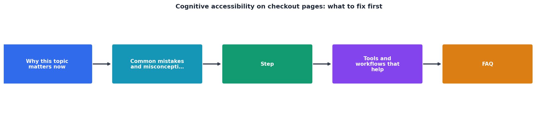
Here is a concrete process. Follow these steps in order: Audit fields, Simplify errors, Reduce noise, Add progress, Test with users.
1. Audit fields
Open your checkout page. Count every input field, dropdown, checkbox, and radio button. For each one, ask: "Does the order fail without this?" If the answer is no, remove it or move it to a post-purchase screen. Guest checkout should require name, email, payment, and shipping address. That is it.
2. Simplify errors
Go through every validation rule on your checkout form. For each one, write an error message that tells the user exactly what to do. Not "Invalid input." Instead: "Phone number needs 10 digits, like 555-123-4567." Place the error message directly next to the field, in red text with an icon. Do not rely on color alone.
3. Reduce noise
Remove or collapse anything that is not essential to completing the order. Promo code fields can be a text link that expands on click. Upsells belong on the cart page, not the payment page. Trust badges should be small and near the payment form, not scattered everywhere.
4. Add progress
If your checkout has more than one step, add a visible progress bar or step indicator. Label each step clearly: "Shipping," "Payment," "Review." This gives the brain a map. People tolerate effort when they can see the finish line.
5. Test with users
Not your team. Not your developer. Find 3-5 people who have never seen your site. Watch them complete a purchase (use a test card). Note where they pause, squint, re-read, or ask questions. Those moments are cognitive barriers.
Tools and workflows that help

Standard accessibility checkers like axe or WAVE catch contrast issues and missing alt text. They do not catch cognitive load problems. You need different tools for this layer.
- Readability analyzers (Hemingway Editor, readable.com) score your checkout copy. Aim for a 6th-grade reading level on all labels, instructions, and error messages.
- Session replay tools (Hotjar, FullStory) show where users hesitate. Look for repeated clicks, cursor hovering over labels, and back-and-forth scrolling.
- PagePerson Insights analyzes your pages specifically for cognitive accessibility barriers, showing you which elements cause confusion and what to fix. Running it on your checkout page surfaces issues that generic tools miss entirely.
- Manual cognitive walkthroughs remain the gold standard. Walk through your checkout pretending you are tired, distracted, and unfamiliar with online shopping. Every moment of confusion is a fix waiting to happen.
Simplified checkout flows on platforms like Amazon (1-Click), Shopify (Shop Pay), and Apple consistently outperform traditional multi-step forms. The pattern is clear: fewer decisions, more completions.
What good looks like

A cognitively accessible checkout page has these characteristics:
- Single-column layout. No side panels, no competing columns. One path, top to bottom.
- Labeled inputs with examples. "Email address" with placeholder "you@example.com" removes ambiguity.
- Inline validation. Green checkmarks appear as each field is correctly filled. Errors appear immediately, not after clicking submit.
- Visible progress. A step indicator at the top shows exactly where the user is.
- Minimal distractions. No navigation menu, no footer links, no promotional banners. The only action available is completing the purchase.
- Plain language. "Pay now" instead of "Submit order." "Free delivery in 3-5 days" instead of "Standard shipping."
| Cognitively Inaccessible | Cognitively Accessible |
|---|---|
| 15+ form fields | 6-8 essential fields |
| "Invalid input" errors | "Enter 10-digit phone number" |
| Promo codes, upsells, banners on payment screen | Clean single-purpose layout |
| No progress indicator | "Step 2 of 3: Payment" |
| "Submit" button | "Pay $49.00 now" button |
| Jargon: "Expedited fulfillment" | Plain: "Fast delivery (2 days)" |
Here is an example dashboard showing the cognitive accessibility impact areas on a typical checkout page:
Checkout Cognitive Barrier Severity
The encouraging part: most cognitive accessibility fixes on checkout pages do not require engineering. Rewriting error messages, removing unnecessary fields, and restructuring the visual layout are content and design tasks. You can start today.
Checkout Cognitive Accessibility Audit Checklist
Your progress is saved automatically in your browser.
FAQ
Frequently Asked Questions
What is the single biggest cognitive barrier on your checkout page right now? Open it in a new tab, go through the purchase flow yourself, and notice where your brain hesitates. That hesitation is costing you money.
Additional Resources
- COGNITIVE Definition & Meaning - The meaning of COGNITIVE is of, relating to, being, or involving conscious intellectual activity (such as thinking, reasoning, or remembering).
- What is cognition? — DPUK - Cognition is a term for the mental processes that take place in the brain, including thinking, attention, language, learning, memory and perception.
- Cognition - Cognition encompasses mental processes that deal with knowledge. It includes psychological activities that acquire, store, retrieve, transform, or apply ...