

Pricing pages confuse buyers more often than they help them. Jargon like "overage charges," "seat-based licensing," and "annual commitment discounts" create friction exactly where you want clarity. The difference between a pricing page that converts and one that loses deals sits in word choice, how you describe what people pay and what they get.
TL;DR
- Pricing microcopy is the small text on pricing pages, button labels, plan descriptions, footnotes, and billing toggles. It's often the last line of defense before a visitor bounces or converts.
- Plain language cuts confusion: Replace "concurrent user licenses" with "users at once," ditch hidden-fee disclaimers buried in 8pt text, and explain what happens at billing time in one sentence.
- The payoff is real: Clear pricing microcopy reduces support tickets, lowers objection rates, and makes the pricing page itself a selling tool instead of a liability.
Most SaaS companies don't think of their pricing page as a communication challenge. They think of it as a feature list. Billing model, plan names, feature rows, price tags, all displayed in a table. But the magic happens in the small text: the button that says "Get started" or "Buy now," the footnote explaining what "per user per month" actually means, the toggle that switches annual billing on, the label that warns "credit card required."
These small phrases, pricing microcopy, shape how visitors interpret your offer. Get them right, and a visitor moves from confusion to confidence. Get them wrong, and they land on a competitor's site instead.
The stakes are real. When pricing is unclear, buyers hesitate. They search for more information. They compare you to rivals who explain themselves better. And they often choose not to sign up at all.
This article walks through why pricing microcopy matters, the mistakes most SaaS companies make, and a step-by-step approach to rewriting it for clarity.
Why pricing clarity matters now
SaaS buyers spend less time on pricing pages than you'd think. They scan. They look for a price, check if it includes what they need, and decide in seconds.
That scanning habit means every phrase carries weight. A visitor reads the plan name. They scan the feature list. They land on a button. They check the fine print. If any of these pieces confuse them, they leave.
And confusion is everywhere. Here's why:
SaaS pricing is genuinely complex. You have usage-based models, tiered plans, annual discounts, seat pricing, add-ons, and overage fees. It's not like buying a pair of shoes. The buyer needs to do mental math and make assumptions about their future usage.
Your team knows the model too well. You've explained it 500 times internally. The terms feel normal to you. But a first-time visitor doesn't have that context. They read "per active user per month" and wonder if that means something different than "per user per month." They see "20 GB included" and don't know if that's a lot.
"The stakes are real: 60.6% of IT leaders had to cut projects or initiatives due to unplanned increases in SaaS costs.">, SaaS Pricing: Key Insights for Buyers
Buyers are wary of hidden fees. Every bad SaaS experience leaves a scar. They assume there's a catch. So they read the fine print looking for traps. If your microcopy feels evasive or buries important details, they'll assume the worst.
This is why plain language isn't optional. It's the difference between a pricing page that sells and one that scares people away.
Common mistakes in pricing microcopy
Before you can fix pricing language, you need to see the problem. Here are the mistakes almost every SaaS company makes:
Using insider jargon. Terms like "concurrent connections," "provisioned instances," "seat-based licensing," and "resource allocation" make sense to your engineering team. To a buyer, they sound like you're hiding something. Replace them with what actually happens: "users at once," "automatically available when you need it," "pay per person," "storage you can count on."
Burying the price in the plan name. Don't say "Professional Plan." Say "Professional, $99 per user per month." The visitor should see the price without clicking. If they have to hunt for it, they will hunt somewhere else.
Vague billing language. "Flexible billing" means nothing. Does it mean you can pause? Cancel anytime? Pay monthly or annually? Be specific: "Cancel anytime, no questions asked" or "Monthly billing. No annual commitment."
Mixing currencies, time units, and billing models. If some features are billed per month and others per year, or some are one-time and others recurring, say so explicitly. Don't make the buyer guess.
Hiding annual discounts in fine print. If you offer a 20% discount for annual billing, put it front and center: "Save 20% with annual billing." Let them see the math.
Unclear trial or free tier boundaries. "14-day free trial" raises questions. 14 days from when? Does it include email support? What happens on day 15, do I lose my data or just lose access? Say: "14-day free trial. Full access. Credit card not required. Your data stays even if you don't upgrade."
Feature rows that don't mean anything. "Advanced analytics," "priority support," "unlimited users", these phrases are so common they've become wallpaper. Instead, describe the benefit: "See which features your team uses most" beats "Advanced analytics." "Someone on our team responds in 24 hours" beats "Priority support."
Contradictory or redundant language. Don't say "Unlimited users up to 500." That's not unlimited. Say "500 users included. Add more for $5 per user per month." Contradiction kills trust faster than honesty about limits.
How to rewrite pricing microcopy

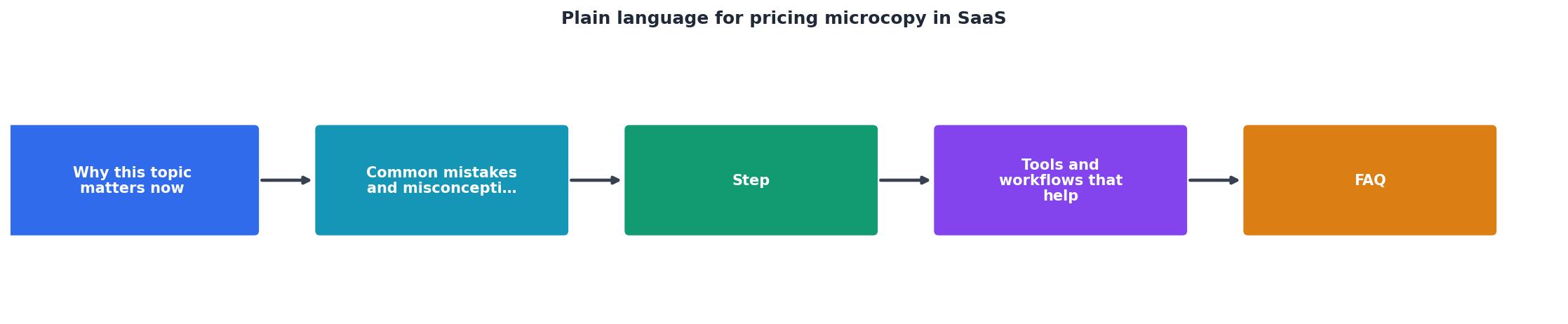
Fixing pricing microcopy follows a clear process. The steps are:
- Audit, Collect all the text on your pricing page.
- Identify, Find every phrase that could confuse a visitor.
- Simplify, Rewrite each phrase in plain language.
- Test, Watch real visitors interact with the new language.
- Deploy, Roll out changes and measure impact.
Audit your current microcopy
Write down every piece of text on your pricing page. Include headlines, plan names, feature labels, billing toggles, buttons, footnotes, and warnings. Don't just screenshot, copy the actual text. You need to see it all in one place.
Pay special attention to:- Plan names (e.g., "Professional," "Enterprise")
- Plan descriptions (e.g., "For growing teams")
- Price labels (e.g., "$99 per user per month" or just "$99"?)
- Feature descriptions (e.g., "Real-time collaboration")
- Buttons (e.g., "Get started," "Start free trial," "Contact sales")
- Billing toggles (e.g., "Annual," "Monthly")
- Disclaimers and fine print (e.g., "Prices exclude tax," "Credit card required")
- Upgrade/downgrade language (e.g., "Upgrade anytime")
Identify confusion points
For each phrase, ask: Would a first-time visitor understand this without asking support?
Test it on someone outside your company. Show them your pricing page. Ask them to explain what each plan includes, what it costs, and what happens if they sign up. Watch where they hesitate or ask questions. That's where your microcopy is failing.
Common confusion points include:
- Price ambiguity. Is it per person? Per month? Does it include tax? Are there setup fees?
- Feature vagueness. What does "advanced analytics" actually give you that the basic plan doesn't?
- Commitment uncertainty. Can I cancel tomorrow? Do I lose my data? What about refunds?
- Billing surprises. What happens if I go over my limits? What counts as an "active user"?
Rewrite using concrete language
For every phrase that confused your tester, rewrite it in plain language. Here's the pattern:
- Replace jargon with outcomes. Not "Role-based access control." Instead: "Control what each team member can see and edit."
- Add specifics instead of generalizations. Not "Advanced reporting." Instead: "Export usage data to CSV. See which features your team uses most. Track time spent per project."
- Show the money clearly. Not "Competitive pricing." Instead: "Pro plan is $99 per user per month. Annual billing saves you 20%. No setup fees."
- Explain the boundary. Not "Unlimited storage." Instead: "10 GB included per user. Add storage for $2 per GB per month, paid monthly."
- Be direct about commitment. Not "Flexible cancellation policy." Instead: "Cancel anytime from your account settings. No penalties. Keep your data for 30 days after you cancel."
Interactive pricing clarity checklist
Here's a practical tool to guide your rewrite:
Pricing Microcopy Clarity Checklist
Your progress is saved automatically in your browser.
Testing your new microcopy
Once you've rewritten, test it with real visitors before you launch.
Run a quick usability session. Recruit 3-5 people who match your target buyer. Show them your pricing page (new version). Ask them to read it aloud and explain what they see. Don't help them. Let them struggle or succeed on their own. Record where they get confused.
A/B test before full rollout. If you have traffic, show half your visitors the old pricing page and half the new one. Measure:- Time spent on pricing page
- Click-through rate to signup
- Support tickets mentioning pricing confusion
- Questions asked during sales calls about pricing
Monitor support tickets. After you launch, watch your support queue. If you get fewer questions about your pricing terms, you've won. If you still get the same questions, the new language isn't working. Adjust and test again.
Typical Improvement After Plain Language Rewrite
These are realistic benchmarks from SaaS companies that invested in pricing clarity. The improvement comes from reducing friction, not from changing your actual pricing model.
Tools and workflows that help
You don't need new software to rewrite pricing microcopy, but a few tools make the process faster:
Readability checkers. Use Hemingway Editor or Grammarly to catch complex sentences. Pricing microcopy should read at a 7th-grade level. If the checker flags it as "hard to read," rewrite it plainer.
Heat mapping and session recording. Tools like Hotjar or Fullstory show you where visitors look on your pricing page and how long they spend on each section. If they're hovering over a phrase, it's probably unclear. If they're skipping a section, it probably looks unimportant.
A/B testing platforms. Unbounce, Convert, or VWO let you test pricing page variations without code. Run two versions, measure, pick the winner.
Customer feedback tools. Typeform or SurveyMonkey embedded on your pricing page can ask visitors why they didn't convert. Their answers tell you which microcopy is still confusing.
Accessibility tools. PagePerson (or similar tools) can surface cognitive load issues on your pricing page, like too much text at once, unclear hierarchy, or confusing call-to-action buttons. Clear microcopy also means clear comprehension.
The workflow is simple: audit → rewrite → test → measure → repeat. You don't need to be perfect on the first try. Each round of testing reveals what still confuses people.
FAQ
Frequently Asked Questions
What's your biggest pricing confusion point?
If you implement these changes and see results, I'd like to hear what worked. Or if you hit a snag rewriting your microcopy, tell me what's tripping you up. The goal is to make pricing pages work for buyers and sellers alike.
Want to see how your pricing page is tracking from a cognitive clarity perspective? Run PagePerson on your site to uncover where visitors might be struggling to understand your offer, then use the process in this guide to fix it.
Additional Resources
- UX Writing for SaaS: Microcopy that Clarifies and Converts - Use plain language. Don't. Use only icons or “Success!” without context; Overload with details—save those for in-line alerts. Tip. Write toast ...
- SaaS Pricing: Key Insights for Buyers - The buyer's playbook for negotiating SaaS pricing: when to start, what levers to pull, and how to win at renewal.
- UX Microcopy: Examples, Formulas & Best Practices ... - Three parts, in order: what happened, why, and the next step — in plain language, with no error codes as the headline and no blame. 'That ...