


Your pricing page is supposed to be simple. Then why do visitors click away after three seconds, leave items in carts, or call sales asking questions that should be answered on the page? The culprit often isn't the copy or design, it's cognitive overload. When pricing layouts demand too much working memory, visitors can't hold all the information they need to make a decision. This article shows you exactly how working memory affects pricing decisions and the specific layout patterns that fix it.
TL;DR
- Working memory is the brain's ability to hold and process information temporarily (usually 4-7 items at once); most pricing pages exceed this capacity
- Overload signals include: comparing more than three plans side-by-side, hiding key features in small text, mixing currency/billing periods, or requiring scrolling to see prices
- Fix it by grouping related information into visual chunks, anchoring prices prominently, limiting plan count on screen, and testing with real visitors to catch confusion
- Measurement matters: pricing pages redesigned for working memory often see 15-25% conversion lift because visitors can decide faster and with more confidence
Most founders assume people bounce from pricing pages because the price is wrong. It's rarely that simple. The real problem is cognitive friction, your visitor's brain fills up before they understand what they're paying for. They can't compare your standard tier against your pro tier and simultaneously remember what features come with each one. By the time they scroll to the bottom, they've forgotten what was at the top. This is working memory limitation, and it's costing you conversions.
Working memory isn't about intelligence; it's about capacity. Everyone's brain works the same way. You can hold roughly 4-7 pieces of information in active thought at the moment. A pricing page that presents ten features per plan across four plans creates 40 facts the visitor needs to track. They can't. They either leave, call your sales team, or stay paralyzed. That paralysis is friction.
The good news: fixing this doesn't require A/B testing dozens of layouts. It requires understanding how working memory works and applying three concrete design patterns. You'll see faster decisions, fewer support calls, and higher conversion rates, sometimes by 15-25% on the first redesign.
Why working memory matters for pricing

Pricing isn't just about numbers. It's about value. To feel confident buying, your visitor needs to hold multiple facts in mind at once:
- What does each plan cost?
- What features does each plan include?
- Which features do I actually need?
- How does this plan compare to the one next to it?
- Is this price reasonable for what I get?
Working memory overload doesn't just slow decisions. It creates anxiety. When people can't hold all the information, they feel uncertain. Uncertainty triggers the same avoidance response as high prices. You'll see it in the data: slower time-to-conversion, more bounces, more sales inquiries for basic questions.
The fix starts with acknowledging that your pricing page is not about presenting all information at once. It's about guiding decisions one step at a time within the limits of working memory.
Common mistakes and misconceptions
Mistake 1: More plans look more generous. Many teams assume five or six pricing tiers appeal to a broader audience. In practice, it doubles the cognitive load. Your visitor can't compare beyond three. Stick to three pricing tiers maximum on screen at once.
Mistake 2: Hiding prices or features "keeps visitors engaged." Some teams put feature comparison tables below the fold, hoping to force scrolling. Wrong. Scrolling increases working memory demand because visitors must remember details from what they saw earlier. Put prices and key differentiators above the fold.
Mistake 3: Mixing billing periods. Showing some prices monthly and others annually on the same page creates confusion. One plan costs 20 dollars per month; another costs 180 dollars per year. Visitors can't instantly convert these in their heads. Choose one billing period per view and let visitors toggle, if needed.
Mistake 4: Assuming features need exhaustive descriptions. Long feature names take up working memory space. "Unlimited API calls with rate limiting up to 10,000 requests per hour" is harder to hold than "10K API calls." Simplify descriptions and move detailed explanations to a hover tooltip or expandable section.
Mistake 5: Treating all plans as equally prominent. If three plans are visually identical, visitors default to comparison mode, taking up working memory. Instead, make the recommended plan visually distinct (larger, bolder, highlighted). This lets visitors make a quick decision without comparing all three.
Step-by-step approach

Step 1: Audit your current page for cognitive load
Count the pieces of information a visitor sees in the first viewport:
- Number of pricing tiers shown side-by-side
- Features listed per tier
- Billing period options (monthly vs. annual)
- Call-to-action buttons (multiple CTAs multiply choices)
- Explanatory text, badges, or labels
Step 2: Chunk related information visually
Visual grouping reduces working memory load. Use spacing, borders, or subtle background colors to show which features belong to which plan. When features are grouped, visitors don't have to hold multiple separate feature lists in mind, they see one cohesive package.
Example: Instead of listing all 20 features as a flat list across four plans, group features by function:- Authentication features (2-3 items)
- Data features (2-3 items)
- Support features (2-3 items)
Step 3: Anchor the price visually
Make the price the dominant visual element on each plan card. Use size, weight, and color contrast. The goal: a visitor should know the price in under one second. If they can compare prices instantly, they're not competing with feature details for working memory. They see "Plan A: 29 dollars" before they start reading features.
Stripe does this exceptionally well. The price appears first, largest, in high contrast. Everything else, features, trial length, terms, comes after.
Step 4: Limit to three plans maximum
If you have six product tiers, don't show all six on the pricing page. Show three: starter, professional, enterprise. Use a toggle or secondary page to show premium options.
Why? Because the moment you present more than three options, comparison paralysis sets in. Your visitor's working memory fills with "Which is better, tier 3 or tier 4?" and they get stuck. Three is the cognitive limit for confident comparison.
Step 5: Separate billing period choice from plan selection
Don't mix "Choose between monthly and annual" with "Choose between plans." This is two separate decisions. First, let them pick their plan. Then, optionally, ask about billing.
Slack uses this pattern: Pick your plan, then toggle "Pay annually and save X%." This keeps working memory clean, one decision at a time.
Step 6: Test with real visitors
Here's the process diagram for the full workflow:
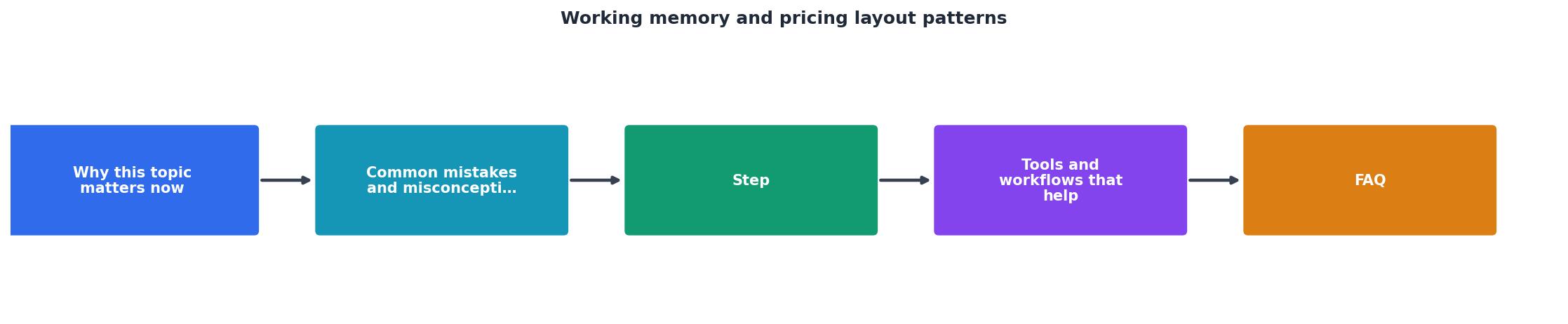
Run an unmoderated test with 5-10 real users. Ask them to "Find the price for the Pro plan and tell me what features come with it." Watch where their eyes go, how long they take, and whether they scroll or get lost. If they scroll, search, or ask clarifying questions, you've found a working memory friction point.
Tools and workflows that help

Heatmaps and session recordings (Hotjar, Microsoft Clarity) show where visitors look first and how long they dwell. If visitors skip over key features or bounce after 3 seconds, it's a cognitive signal.
Unbounce or Leadpages allow rapid iteration on pricing page layouts without engineering overhead. You can test chunking, emphasis, and plan count in days instead of weeks.
User testing platforms (UserTesting, Respondent) let you run quick "find the price" or "compare Plan A and Plan B" tasks with real users. Five tests often reveal the friction points that analytics miss.
Accessibility analyzers like PagePerson Insights scan your pricing page for cognitive accessibility barriers, complex language, overcrowded layouts, missing focus indicators, and flag them. This goes beyond visual WCAG checks to show where visitors with ADHD, anxiety, or low digital literacy will struggle.
Google Analytics events on pricing pages tell you which plan gets clicked most (signal: visitors understand it) and which gets ignored (signal: cognitive friction). If 60% click on the middle plan and 5% click the top plan, the top plan is not registering cognitively.
An interactive working memory simulator
Here's a visual representation of what happens when visitors land on your pricing page. This dashboard shows the cognitive load at different stages of the customer journey:
Working Memory Load Timeline
This dashboard illustrates the exact moment your visitors exceed their working memory capacity. When they land, cognitive load is manageable. The moment they try to compare multiple plans, especially while scrolling or reading feature tooltips, the system overloads. A well-designed pricing page keeps load in the "healthy" zone throughout the journey.
Pricing Page Working Memory Audit & Redesign
Your progress is saved automatically in your browser.
FAQ
Frequently Asked Questions
The next time you audit your pricing page, start by timing yourself. How long does it take you to decide which plan to buy? If you're the founder, you know the product inside out, and it probably still takes you 30+ seconds. That's a signal that your visitor, who knows nothing about your product, is drowning in cognitive load. Strip it down, test it, and watch your conversion rate climb.
Additional Resources
- A Flexible Model of Working Memory - PMC - Here we present a flexible model of working memory that maintains representations through random recurrent connections between two layers of neurons: in our ...
- Attentional Templates in Visual Working Memory - Most theories of attention propose that we maintain attentional templates in visual working memory to control what information is selected.
- Human Working Memory - an overview - Human working memory refers to the temporary storage of information that is immediately used in performing tasks. It is a type of short-term memory with a ...