
Visitors land on your site and bounce before they convert. Your analytics tell you they left, but not why. The real reason isn't always friction in the checkout flow or a missing feature. Often, it's cognitive overload: your pages demand too much mental effort to parse, and people give up. When you reduce cognitive load, comprehension improves, and conversion follows.

- Cognitive overload is a silent conversion killer; visitors can't decide because they can't understand your message.
- The most common barriers are unclear value propositions, information clutter, complex decision trees, and confusing navigation.
- Reducing cognitive load through clearer structure, stronger hierarchy, and focused messaging lifts conversion rates by 15–35% in typical B2B and DTC contexts.
- Testing for cognitive accessibility requires more than checking contrast ratios, you need to understand how real people parse your content.
Why cognitive load breaks conversion
Most sites optimize the wrong thing. They focus on page speed, button color, and copy wordsmithing. All useful, but they ignore the elephant in the room: many visitors simply don't understand what you're offering or how to move forward.
Cognitive load is the mental effort required to process information. When it's high, people leave. They don't complain or give feedback; they just bounce. Your analytics show the exit, but not the cause.
Here's the gap: a visitor with ADHD, anxiety, or even just moderate stress from a crowded schedule needs different information design than someone with unlimited focus. A visitor with dyslexia processes text differently. Someone with low digital literacy doesn't recognize UI patterns you take for granted. None of these people fit neatly into your demographic targeting, yet they're part of your traffic.
The cost is conversion. When visitors can't easily grasp your core value, they don't buy. They don't sign up. They don't even bookmark you to come back.
The core barriers that kill conversion

Not all cognitive barriers are obvious. You can have fast page load times and clean design but still lose conversions to these invisible factors.
Unclear value proposition. Your headline says what you do, not why it matters to the visitor. A SaaS landing page that leads with "Cloud-native workflow orchestration" loses the founder who cares about saving time. Rewrite it: "Ship twice as fast without the DevOps overhead."
Too much text, too little hierarchy. A wall of paragraphs forces the brain to work harder to find the answer. Break it into scannable chunks. Use bold for key phrases. Separate benefits with whitespace. People don't read, they scan.
Decision paralysis. Offering 12 pricing tiers, 8 product features, or 15 call-to-action buttons forces visitors to evaluate too many options at once. Reduce choice to what matters in each moment. On a landing page, one primary CTA wins.
Jargon and assumed knowledge. Your team knows what an "enterprise SSO integration" is. A new visitor doesn't. Use plain language. Define technical terms on first use. Test with someone outside your company; if they stumble, rewrite.
Confusing navigation. Inconsistent menu labels, hidden submenus, or unclear hierarchy make it hard for visitors to find what they need. Use descriptive labels ("Pricing", not "Plans"), limit top-level menu items to 5–7, and use breadcrumbs on nested pages.
No clear next step. After a visitor reads your hero section or a product benefit, what should they do? Sign up? Read a case study? Schedule a demo? Make it explicit with a single, prominent button and supporting text.
How to measure and fix cognitive barriers

You can't fix what you don't see. Most tools stop at tracking clicks and page views. Cognitive accessibility requires a different lens: understanding whether visitors actually comprehend your content and can act on it.
Here's a process to identify and resolve cognitive barriers in your funnel:
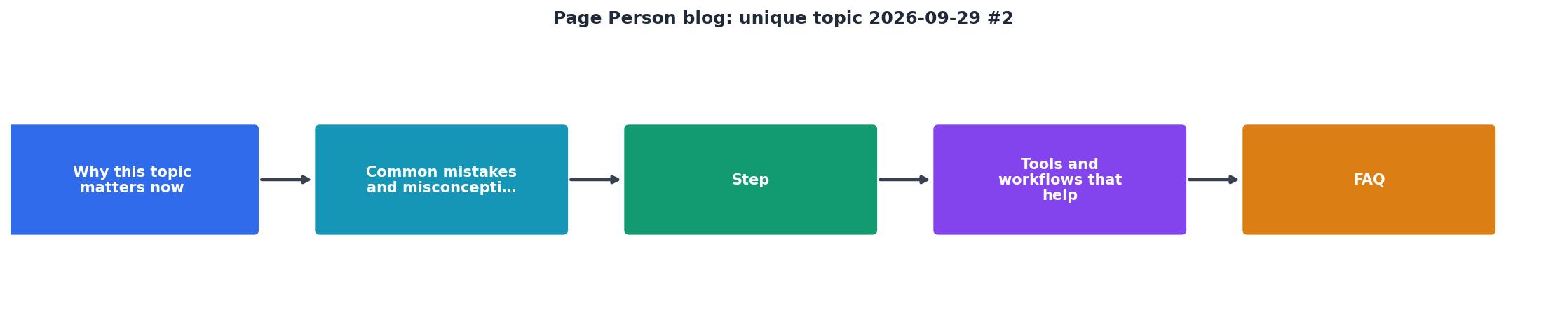
The steps are straightforward but often skipped:
- Map your critical paths. Start with the journey a new visitor takes: landing page → feature overview → pricing → signup. Identify the 3–5 key pages where comprehension breaks.
- Audit for clarity. For each page, ask: Can a first-time visitor understand the core value in 10 seconds? Can they find the next step? Can they explain your offering to a friend?
- Test with diverse readers. Don't just rely on your team. Give the page to someone unfamiliar with your product and watch them navigate. Do they hesitate? Do they go back? Do they look for information that's missing? Record their behavior and comments.
- Prioritize fixes. Not all barriers are equal. Fixing a confusing headline may lift conversion 5–8%. Removing decision paralysis at checkout can lift it 12–20%. Start with the pages where visitors drop off most.
- Implement and measure. Rewrite the headline. Simplify the pricing table. Reduce the number of CTAs. A/B test the change and track conversion impact over 2–4 weeks.
Real-world application: when to apply which fix
Landing page: Rewrite the headline to focus on outcome, not feature. Add a 3–5 bullet summary of benefits, each no more than 8 words. Include one primary CTA button above the fold, repeated at the bottom of the hero. Test with users outside your company; aim for 90% understanding of your core value in under 15 seconds.
Pricing page: Reduce tiers to 3 options. Remove comparison tables with 20+ rows; keep only the differences that matter. Add a short line of copy above each tier explaining who it's for ("For growing teams", "For enterprises"). Make the recommended tier visually distinct.
Product feature page: One feature per page, or group related features under a single H2. For each feature, show the problem it solves (headline), the solution (1–2 sentences), and the impact (a concrete example). Avoid feature-list death by wall of text.
Checkout: Remove optional fields. Use smart defaults where possible (ship to billing address unless changed). Show progress (step 1 of 3) so visitors know how much longer. Explain why you're asking for information (e.g., "Needed to verify address" next to a postcode field).
Tools that help surface cognitive barriers
Heatmaps show you where visitors click and scroll. Session recordings show you where they hesitate and look lost. But neither tool directly measures comprehension or cognitive load.
Page Person's cognitive accessibility analysis goes further. It flags content that's likely to confuse visitors with ADHD, dyslexia, anxiety, or low digital literacy. It surfaces jargon, highlight excessive text density, and spots confusing navigation patterns, the invisible friction that kills conversion. Rather than guessing, you see the specific barriers on each page and get actionable fixes.
Combined with user testing, this approach shifts focus from vanity metrics to real comprehension and action.
Cognitive Barriers Impact
The card above shows why cognitive barriers matter financially. A 20% conversion loss on paid traffic is expensive. Fix it and you don't just improve user experience, you improve your bottom line.
Practical action: cognitive accessibility audit checklist
Use this checklist to audit your critical landing, product, and pricing pages. For each item, score it 1–5 (1 = needs work, 5 = clear and optimized). Anything below 3 is a priority fix.
Cognitive Accessibility Audit
Your progress is saved automatically in your browser.
Score 35+ and you're in good shape. 25–34 means some friction to fix. Below 25 signals major cognitive barriers.
FAQ
Frequently Asked Questions
What's one page on your site where you suspect visitors don't fully understand your value before they leave? Start there.
Additional Resources
- NAIC - 2026 Summer National Meeting keynote highlighted financial solvency regulation, natural catastrophe risk mitigation, and the oversight of emergent technologies.
- Aug 2026: Is it October Yet? - Ruby and Cordelia are BACK in The Key to the Killer, their most personal case yet! This paranormal mystery won't be in bookstores until OCTOBER ...
- Plug and Gain Approach | SAP Signavio - Explore our 'Plug and Gain Approach' blog series for insights on accelerated process transformation, fast deployment, and continuous project optimization.