

Your website works fine for you and your team. You know where everything is, your messaging makes sense, and navigation feels intuitive. But your visitors are leaving without converting. The problem isn't your design or copy, it's cognitive load. Real visitors, especially those with ADHD, anxiety, dyslexia, or just decision fatigue, struggle to understand what you're asking them to do. This article shows you exactly how to identify and fix the cognitive barriers that are costing you conversions.

- Cognitive overload causes 42% of visitors to struggle, even if your site is technically accessible
- Common culprits: too many choices, unclear copy, inconsistent patterns, and visual clutter
- Fix it systematically: audit user confusion, simplify flows, test with real visitors, and measure comprehension, not just clicks
Why this matters now
Conversion optimization has stalled for most companies. You've optimized copy, tested buttons, tweaked colors, and run A/B tests. But your conversion rate won't budge. Why? Because the bottleneck isn't persuasion, it's understanding. Visitors don't convert because they don't understand what you want them to do, how to do it, or why it matters.
The shift from technical accessibility (color contrast, alt-text, keyboard navigation) to cognitive accessibility is where real conversion gains live. A visitor who understands your value proposition converts. A visitor who is confused, overwhelmed, or unsure of the next step bounces.
Most accessibility work focuses on technical compliance. But 68% of sites that pass WCAG audits still fail visitors with cognitive barriers. Your site could pass every automated checker and still confuse people with ADHD, decision anxiety, or low digital literacy.
Common mistakes and misconceptions

More options look sophisticated, not confusing
Wrong. Founder-brains love options. "We have three pricing tiers, five integrations, and seven ways to get started." You see flexibility. Visitors see chaos. The paradox of choice paralyzes decision-making. Visitors presented with too many equally-valid options often choose nothing.
Shopify's checkout famously simplified to one path. Stripe's signup asks one question at a time. These aren't oversimplifications, they're conversions.
If it's pretty, it's clear
Design polish and clarity are not the same thing. A beautiful landing page with gradient overlays, animated text, and layered imagery can be visually stunning and cognitively exhausting. Cognitive clarity means: one job per section, short sentences, consistent terminology, and white space.
Many SaaS sites cram too much into hero sections. They layer headline + subheadline + secondary CTA + explainer video + social proof + countdown timer. Your eye doesn't know where to go. Your brain gives up.
Comprehensive is better than focused
Comprehensive documentation, detailed feature lists, and thorough explanations feel like they should help. They don't. They overwhelm. Most visitors (especially those skimming or under cognitive load) want to know three things: what is this, why should I care, what do I do next. Everything else is noise.
Step-by-step approach
Step 1: Audit confusion points with real visitor data
Don't guess where visitors struggle. Measure it. You need three types of data:
- Heatmaps and session recordings show where visitors click, scroll, and pause. Tools like Hotjar or Clarity reveal when people hover over copy trying to understand it, or scroll frantically looking for a button.
- Funnel analytics show where drop-off happens. If 40% of visitors leave after viewing your pricing page, you have a cognitive clarity problem there.
- User testing (even unmoderated, rapid testing with 5-10 real visitors) surfaces confusion you can't see in metrics. "I don't understand what you do" or "I'm not sure if this is for me" are gold.
Step 2: Simplify through constraint

Constraint is your secret weapon. Decide what one thing each page must accomplish. Your homepage doesn't do everything, it funnels people to the right next step. Your pricing page doesn't explain every feature, it helps visitors choose their tier.
Apply these constraints:
- One primary action per page. Secondary actions are fine (contact sales, see integrations), but bury them. Make them obviously less important than your primary CTA.
- Three key points, max. If you have seven reasons to buy your product, pick three. The best three. You can add more in a FAQ, but the main flow stays focused.
- Short, simple sentences. Aim for 15-word average. Shorter than that sounds robotic; longer and people zone out.
- Consistent terminology. If you call it "organizations" on one page and "teams" on another, visitors get confused. Use one word everywhere.
Step 3: Reduce decision friction

Decision fatigue is real. Every choice a visitor makes drains cognitive energy. Your job is to eliminate unnecessary choices.
- Remove pricing tiers nobody buys. If 85% of customers choose your mid-tier, hide the others. You can show them on request, but stop highlighting them.
- Hide optional fields. Every form field a visitor sees is a decision. "Do I need to fill this out? Is it important?" Make everything optional or make truly required fields obvious.
- Pre-select smart defaults. If 90% of your users choose the same setting, make it the default. Visitors can change it, but you've removed a decision.
- Limit color and visual choices. Too many button styles, link colors, and icon types confuses the eye. Stick to one button style, one link color, one icon set.
Step 4: Test with real workflows
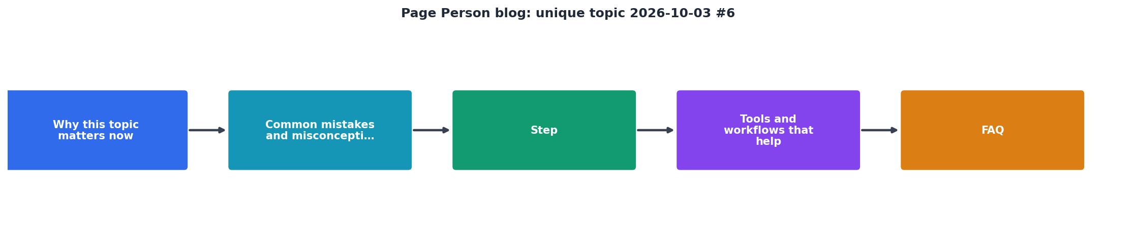
Run this workflow every two weeks:
- Record one user session. Use Hotjar, Clarity, or Google Analytics session recording. Watch how a real person behaves.
- Ask yourself three questions: What confused them? Where did they pause? What should they have done faster?
- Make one change. Don't change three things at once. Change the thing that confused the most people.
- Measure impact. Run that change for two weeks. Did conversion rate improve? Did drop-off decrease?
- Repeat.
Tools and workflows that help
Use analytics to find the problem, not just to count visitors. Funnels in Google Analytics or Mixpanel highlight where visitors drop off. Session recordings in Hotjar or Clarity show why. User testing platforms like UserTesting or Maze give you direct feedback from real people.
For measuring comprehension specifically, set up micro-conversions: click to pricing, expand FAQ, watch explainer video, download guide. These tell you where visitors are confused (or confident).
Build a feedback loop: find confusion → simplify → test → measure. This is your conversion machine.
"Tip: Get started right away with our how to start a fashion blog guide.">, Best Niches & Trending Topics to Start a Blog in 2026
Interactive clarity scorecard
Understanding your current state is the first step to improvement. Use this visual tool to assess where your site stands on cognitive clarity:
Your Clarity Score
This scorecard represents a typical SaaS founder site: you've reduced decision points somewhat, but copy is still too complex, and you're not actively testing for visitor confusion. The goal is to move all bars toward the right.
Cognitive Clarity Action Plan
Your progress is saved automatically in your browser.
FAQ
Frequently Asked Questions
Additional Resources
- Best Niches & Trending Topics to Start a Blog in 2026 - Find out what to blog about in 2026—top niches, trending topics, and money-making ideas to help you grow and profit from your blog.
- 13 Personal Growth Blogs That Can Change Your Life - Recipes, organizing tricks, DIY projects, and money-saving strategies are just a few of the categories
- The 50 Best Blogs in the World, Ranked by Popularity - Detailed - The best blogs in the world are tracked and ranked daily by our unique algorithm.