
Visitors land on your site, scan for 3 seconds, and leave. Your analytics tell you what happened, but not why. They didn't bounce because the headline was weak or the call-to-action was ugly. They left because they couldn't follow the logic. Cognitive accessibility isn't just an ethical obligation or compliance checkbox, it's the difference between visitors who understand your offer and visitors who get lost and bail. When 42% of your audience may struggle with information overload, unclear language, or overwhelming page layouts, fixing those barriers directly lifts conversion. This guide walks you through why cognition matters more than you think, the mistakes most sites make, and the concrete steps to turn confused visitors into confident buyers.

- Cognitive barriers cost conversions: unclear copy, visual clutter, and information overload make sites feel impenetrable to real visitors.
- Test with real people early and often, heatmaps and scroll depth don't reveal why someone bails.
- Simplify ruthlessly: one clear idea per section, active voice, concrete language, white space.
- Use Page Person to audit your site for cognitive accessibility issues and find where visitors struggle.
Why Cognitive Accessibility Wins Now
You've heard "mobile-first" and "accessibility." But cognitive accessibility, whether visitors can actually understand and trust your site, flies under the radar. Most tools catch alt-text and contrast ratios. None of them measure whether a visitor with ADHD, anxiety, dyslexia, or just information overload can follow your pitch.
The stakes are concrete. Visitor comprehension directly affects conversion. A confusing checkout flow doesn't just hurt accessibility; it burns money on paid traffic. A landing page with seven value propositions, dense paragraphs, and clashing CTAs frustrates power users and first-timers alike.
The research is clear: roughly 42% of your audience faces cognitive, attentional, or literacy barriers on any given day. That's not 5% or 10%, it's nearly half. And it includes people without diagnoses: jet-lagged travelers, stressed parents, people on mobile with low bandwidth, readers for whom English isn't native.
The payoff for fixing this is immediate. Clearer copy, better structure, and less visual noise don't just help people with diagnosed conditions, they help everyone. Stripe reports that simpler checkout flows reduce abandonment across all segments. Medium's switch to shorter paragraphs and clearer headings improved engagement for all readers, not just those scanning quickly.
Common Mistakes That Kill Comprehension

Most sites stumble on three predictable patterns.
Dense paragraphs with jargon. "Leverage our synergistic platform to optimize stakeholder alignment." Your team knows what this means. A first-time visitor reading this on a 5-year-old phone in a coffee shop does not. Dense text, long sentences, and abstract language force readers to re-read. They don't. They bounce.
Stripe's checkout uses "Card number," not "Primary Payment Instrument Token." Shopify says "Save 50%," not "Achieve a 50% unit-cost reduction." Concrete, short, scannable.
Overwhelming visual hierarchy. Five equally-sized headlines, competing colors, ads in the margins, pop-ups on load, it signals "This site isn't for me" within 2 seconds. A visitor with ADHD or low digital literacy sees noise, not direction. No clear next step means they leave.
Unclear call-to-action or too many options. "Submit," "Go," "Click here," or a button hidden below the fold doesn't convert. Neither does a page with 12 CTAs. One clear action per page, placed where the eye naturally lands, wins.
Information dumped without hierarchy. A product page that lists 47 features in a paragraph, no grouping, no visual rest. Visitors can't prioritize what matters. They abandon instead of deciding.
Assuming everyone reads top-to-bottom. Most visitors scan. They skip words, jump to bold text and subheadings, look for white space. If your content doesn't support that pattern, you've already lost them.
Step-by-Step Approach to Cognitive Clarity

Fixing cognitive barriers isn't expensive. It's methodical.
1. Audit your current state.
Pull your top 5 pages: homepage, main product page, pricing, checkout, FAQ. Read each one cold, as if you've never seen your product. Note every moment you pause, re-read, or feel lost. That's a barrier.
Then test with real people. Not your team. Five to eight people unfamiliar with your product, no script, just "Here's the site. Tell me what we do." Record where they hesitate, backtrack, or ask for clarification. Heatmaps show where they click; user testing reveals why.
2. Simplify copy ruthlessly.
Start with one core message per page. Not five benefits, one. One problem solved, one result, one call-to-action.
Replace jargon with everyday words:- "Utilize" → "Use"
- "Facilitate" → "Enable" or "Make it easy to"
- "Leverage synergies" → Delete this entirely
Test readability with a tool like Hemingway or Flesch-Kincaid. Aim for an 8th-grade reading level. It doesn't dumb things down; it clarifies.
3. Restructure layouts for scanning.
Use short headings as questions or promises ("How it works," "Save time," not "Operational Framework Overview").
Break text into bullets and short paragraphs. Use bold for keywords. Add white space, it's not wasted space, it's breathing room.
Lead with the benefit. Bury the mechanism. "Sign up in 60 seconds" beats "Our three-step OAuth flow integrates with 200+ identity providers."
4. Test the funnel with real users.
Before and after. Same five to eight testers, new prototype. Watch where they move faster, where they ask fewer questions, where they naturally find the CTA.
Measure: time to complete a task, number of clicks to convert, dropout rate at each step.
5. Iterate based on data.
You won't get it right first. Simplify further. Test again. One tweak per round. If you change five things, you won't know which one worked.
Practical Application: The Cognitive Clarity Process
Here's how to apply these steps to a real page. Let's say you're auditing a SaaS landing page.
Audit phase: Load the page fresh. What's the one thing it's selling? If it takes more than 5 seconds to answer, the headline is too abstract. Count the number of different CTAs (buttons, links, pop-ups). If there's more than one, you have a problem.
Copy simplification: Rewrite the headline to be concrete and benefit-focused. "Automate your workflow" → "Ship 2x faster with no manual updates." Rewrite the body in bullet points. Delete sentences that don't move someone toward yes or no.
Layout restructuring: Kill the sidebar ads. Move the CTA above the fold. Group related features, don't list them individually. Add breathing room. Use one accent color for the CTA; make it unmissable.
User test: Five people, 10 minutes each. Ask them: "What does this product do?" "Who's it for?" "What's the next step?" Record hesitations. If they get it wrong or need clarification, your copy isn't there yet.
Iterate: Based on feedback, rewrite again. Test the new version. Measure time to CTA click. Compare to the old version.
Tools and Workflows That Help

Hemingway Editor, Highlights dense sentences and passive voice. Real-time. Free online.
Flesch-Kincaid readability score, Shows grade level of your copy. Aim for 6–8th grade for consumer sites, 9–10th for technical products.
UserTesting.com or Maze, Recruit testers, record sessions, watch where they struggle. More scalable than in-person testing.
Page Person, Analyze your site for cognitive accessibility barriers: information overload, unclear hierarchy, confusing language patterns. Get a report showing exactly where visitors are likely to struggle.
Figma or Miro, Design and iterate layouts collaboratively. Test variations fast.
"2,059,675 Posts in 123,134 Topics by 9,590 Members - Latest Member: MisterTonicLatest Post: "Re: Xenos Rampant - what..." (Today at 05:28:29 PM) View the most recent posts on the forum." >, Lead Adventure Forum
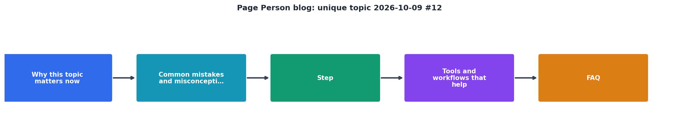
The workflow: Audit (tools + manual review) → Simplify (copy + layout) → Test (users) → Measure (time, clicks, conversion) → Iterate.
Visual Progress: Cognitive Clarity Metrics
A typical improvement from clarity work:
Once you've audited and iterated, you'll see clearer movement through the funnel. The key metric: comprehension speed. How fast does a new visitor understand what you do and who it's for. Measure it in seconds, not minutes. If it's under 10 seconds on mobile, you're doing well.
Cognitive Clarity Audit Results
This dashboard represents typical metrics from a landing page audit after cognitive clarity work. Notice the single CTA, short sentences, accessible reading level, and clear information grouping. These aren't minimalist constraints, they're the levers that move conversion.
Cognitive Clarity Audit & Fix Checklist
Your progress is saved automatically in your browser.
FAQ
Frequently Asked Questions
Additional Resources
- UVS: Oathmark Odyssey - Victrix Greek Hoplite 11/01/2026 - A Living Statue for Oathmark. A Crooked Dice Titan with the Titan weapons upgrade. More on my blog at http://ultravanillasmurf.blogspot.
- 2026 Seminar Classes | Wish upon a Stitch - We are offering a limited number of classes on Friday, October 9, then a full schedule of wonderful opportunities October 10 – 14, 2026.
- Molecular mechanisms in evolution and ecology - The focus of this conference series is on interspecies and cell-environment interactions across living organisms, aiming to highlight the latest technological ...