

Most websites lose visitors not because they're broken, but because they're hard to understand. A confusing headline, too many options at once, or unclear next steps, these cognitive barriers cost founders real money in wasted ad spend and lost conversions. The good news: fixing comprehension problems isn't about redesigning everything. It's about identifying where real visitors struggle and removing the friction that kills conversions.
Photo by just a hobby from Pexels
TL;DR
- Cognitive barriers (confusing copy, choice overload, unclear next steps) kill conversion more often than broken buttons do.
- Most analytics and heatmaps show where visitors leave, not why, you need to audit comprehension separately.
- Fixing cognitive friction involves: measuring understanding, testing with real first-time visitors, simplifying language, removing unnecessary choices, and validating changes before launch.
- Small clarity wins compound; even a 5-10% lift in comprehension can transform a site's conversion rate at scale.
Why cognitive barriers matter now
Your analytics dashboard tells you that 40% of visitors leave after viewing the landing page. Google Tag Manager shows the exact pixel they clicked. Heatmaps reveal the scroll depth. But none of these answer the real question: why did they leave? What didn't they understand?
This is the blind spot most founders miss. You've optimized for button color, form fields, and load time. But you haven't measured whether visitors actually understand your value proposition before they bounce.
Cognitive accessibility isn't just for people with ADHD, dyslexia, or anxiety. It's about removing unnecessary mental effort for everyone. When your headline is vague, your copy uses jargon, or you present too many options at once, even sophisticated visitors get fatigued. They don't stick around to figure it out.
Here's the conversion math: if 100 visitors land on your site, but only 20 understand what you're offering, your conversion rate is capped at 2% (the best-case if all who understand say yes). No amount of copywriting optimization changes that. You have to raise the ceiling by fixing comprehension.
Common mistakes founders make
Mistake 1: Assuming your team's understanding matches visitors' understanding. You've lived with your product for months. The value is obvious to you. It's not obvious to someone landing cold. That headline that makes sense to your co-founder? A first-time visitor reads it and moves on.
Mistake 2: Relying only on analytics to diagnose problems. Bounce rate and scroll depth tell you volume but not reason. You need direct evidence of comprehension failure, what didn't visitors understand?
Mistake 3: Copying competitor language. If competitors use jargon, you copy it. But they might be losing conversions too. You're both optimizing for wrong things.
Mistake 4: Overloading the fold. Showing all product features, all pricing tiers, all testimonials above the fold feels comprehensive. It's actually cognitive overload. Visitors don't know where to focus and leave.
Mistake 5: Skipping validation with real first-time users. You test changes with your team or existing customers. They know what you do. New visitors don't. Their feedback is what matters.

How to audit cognitive accessibility
Start here: ask five to ten first-time visitors to spend 60 seconds on your homepage, then answer three questions without rereading:
- What does this company do?
- Who is it for?
- What should I do next?
Next, map your conversion funnel through the lens of cognitive load. Every step should reduce confusion, not increase it.
Step 1: Measure comprehension at each stage. Don't assume visitors understand your value prop, your pricing model, or your CTAs. Test them. Use quick unmoderated tests (UserTesting, Respondent) or recruit five friendly prospects for a 15-minute Zoom call. Ask them to narrate what they see. Don't help them, let them struggle. That struggle is your data.
Step 2: Identify language barriers. Read your copy as if you're not a founder. Is it jargon-heavy? Are acronyms unexplained? Is there unnecessary complexity? Rewrite for a smart fifteen-year-old. If a teen gets it, professionals will too.
Step 3: Simplify choice architecture. On a pricing page with five tiers, visitors experience choice paralysis. They can't compare easily, so they leave. Reduce to three options maximum. Make the recommended choice visually obvious.
Step 4: Test visual hierarchy. Is the most important information (value prop, CTA) visually dominant? Or is it buried under hero images, trust badges, and secondary navigation? Use a five-second test: show the page for five seconds, then cover it and ask what they remember.

Step-by-step workflow for clarity wins
Define your core message
Before you touch the page, write one sentence: what's the one thing you want visitors to understand? If you can't write it in one sentence, your message isn't clear enough yet. Everything else supports that sentence.
Audit existing friction
Use this process diagram to guide your audit:
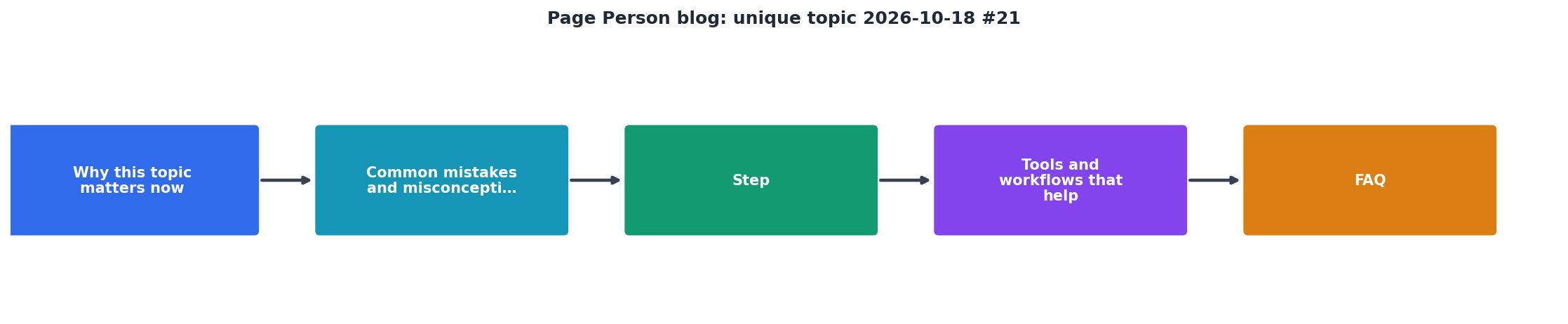
Walk through your site as a first-time visitor. At each section, ask: What mental effort is required here? Is it the minimum needed? Every extra word, every extra choice, every unexplained feature adds cognitive load.
Test language changes
Change one headline. Test it with five people. Do they understand faster? Revise based on feedback. Move to the next unclear element.
The header disappears when you start scrolling but reappears on the back scroll. This is good UX, it shows navigation is always available. But does it confuse visitors? A quick test tells you. If five people ask "where's the menu?", you have a problem.
Remove choice paralysis
If you offer three pricing tiers, test this: remove the middle tier. Show only "Starter" and "Pro". Measure conversion. If it increases, you've proved choice reduction works. Now test two tiers vs. three. Find your optimal number (usually two or three).
Measure the lift
Before and after any change, measure comprehension on the same sample size (at least 10-20 visitors). Did understanding increase? Did time to comprehend decrease? If yes, roll it live. If no, iterate or revert.
Tools and workflows that compound results
Tool 1: Quick comprehension testing. UserTesting, Respondent, or Maze let you test pages with real visitors in 24-48 hours for under $100. This is faster and cheaper than guessing.
Tool 2: Session replay. Logrocket, Hotjar, or FullStory show you where visitors get stuck. Watch them struggle with forms, navigation, or unclear CTAs. You can't optimize what you don't see.
Tool 3: Heatmaps and scroll maps. Hotjar and Crazy Egg show where visitors focus and how far they scroll. Combine this with comprehension testing: if most visitors scroll past your value prop, that section needs rewriting.
Tool 4: Accessibility audits. Run your site through Page Person to surface cognitive accessibility barriers. It identifies confusing language, unclear CTAs, choice overload, and other factors that trip up first-time visitors.
Tool 5: A/B testing for messaging. Once you know what's confusing, test fixes. Change the headline, run 100 visitors per variant, measure both comprehension and conversion. Statistical significance matters.
Conversion Clarity Audit Results (Sample Site)
After clarity audit and fixes: Headlines rewritten for clarity, choice reduced from 4 to 3 pricing tiers, CTA moved above fold, jargon removed. Result: conversion rate lifted from 2.1% to 2.3% on same traffic volume.
This dashboard shows what a real clarity audit looks like. When you measure comprehension and remove friction, conversion improves, not by huge leaps, but by consistent, compound gains that add up over time.
Why this scales faster than other optimizations
Most founders chase button color tests and micro-copy tweaks. Those matter, but they're marginal. Clarity fixes are structural. They compound.
If 100 visitors land on your site:- Current state: 30 understand your value → 2 convert (2%)
- After clarity fixes: 70 understand your value → 4-5 convert (4-5%)
Scale that across 10,000 monthly visitors. A 2% lift is 200 extra conversions per month. If you're running paid acquisition, that's real revenue impact.

Implement the clarity workflow
Start small. Pick one page, usually your highest-traffic page (homepage or landing page). Run the five-visitor comprehension test. Fix the one thing that fails most. Test again. Measure conversion lift before and after (need at least 100-200 visitors per variant for statistical significance).
Once you see the lift, repeat the process on the next page. The workflow becomes repeatable. You build a system for clarity that compounds across the whole site.
The best part: clarity fixes don't require large budgets or expensive agencies. You do the testing yourself, iterate based on feedback, and ship. Small teams ship clarity fast.
Clarity-First Conversion Audit Checklist
Your progress is saved automatically in your browser.
FAQ
Frequently Asked Questions
The founders who win aren't the ones who obsess over button shade. They're the ones who obsess over whether visitors understand what they're offering. Spend this week testing comprehension on your highest-traffic page. You'll be surprised how many visitors are confused about things your team thinks are obvious. Fix those confusions, and conversions follow.
Additional Resources
- 23 Best Blogs For Your Inspiration 2026 - An extensive collection of the best blogs to gain inspiration when building yours. From simple to more advanced designs.
- 18 Best Blog Designs You Need to See in 2026 - In this post, we'll share 18 of the best blog designs we've been following in 2026. From minimalist to bold, these trends will inspire your next ...
- Best Niches & Trending Topics to Start a Blog in 2026 - Find out what to blog about in 2026—top niches, trending topics, and money-making ideas to help you grow and profit from your blog.