

Most founders assume bounce rates spike because the offer isn't compelling enough. The truth is simpler and more fixable: your visitors' brains are working too hard to understand what you're asking them to do. Cognitive load, the mental effort required to process information on your page, is one of the biggest hidden drains on conversion rates. Reduce it, and the same traffic converts better without spending another dollar on ads.
TL;DR:- Cognitive load is the mental effort visitors spend parsing your page; high load = faster bounces and lower conversion.
- Fix it by simplifying copy, removing distractions, using clear hierarchy, and testing with real first-time visitors who don't know your product.
- One-sentence summary: clarity beats cleverness every time.
What is Cognitive Load and Why It Kills Conversion
Cognitive load refers to the total amount of working memory required to process information on a page. Every paragraph, button, image, and choice taxes your visitor's brain. Too much, and they leave before reaching your value prop.
Think of it as a mental budget. A first-time visitor to your SaaS landing page has limited processing capacity. They're distracted, possibly on mobile, and ready to bounce to a competitor in under 10 seconds. If they burn through that budget trying to understand what you do before they've decided to care, you've lost them.
The stakes are real. Founders often design for themselves, people who already understand the product, the industry, and the problem. That's the opposite of your actual first-time visitor. They're looking at your page cold, making snap judgments, and interpreting every word through the lens of skepticism.
There are three types of cognitive load:
- Intrinsic load – the complexity of the task itself (unavoidable, but you can explain it better)
- Extraneous load – friction from poor design, confusing copy, or bad navigation (entirely within your control)
- Germane load – effort spent understanding your value and benefits (necessary, but worth the cognitive cost)
Common Mistakes That Spike Cognitive Load

Most sites stumble on the same few patterns:
Jargon and industry speak. You use "asynchronous data syncing" because it's technically accurate. Your visitor reads it and wonders if they're in the right place. Replace jargon with plain English: "updates in real time, even when you're offline."
Too many choices above the fold. Five navigation items, three CTAs, and a newsletter signup all visible before scrolling? Your visitor doesn't know where to look first. They freeze. A frozen visitor is a gone visitor.
Wall-of-text paragraphs. A six-line paragraph forces your visitor to hold multiple sentences in working memory before they can extract meaning. Short paragraphs, one idea each, scan faster and stick better.
Visual clutter. Stock photos that don't match your message, too many colors, misaligned elements, dense information layouts, all of these force your brain to work harder to extract signal from noise. Clean layouts aren't just prettier; they're cognitively lighter.
Unclear hierarchy. If your most important point isn't visually distinct from supporting details, visitors struggle to parse what matters. Hierarchy (size, color, positioning, whitespace) is the scaffolding that guides attention.
Unexplained features. "AI-powered" and "machine learning" sound impressive but don't explain benefit. Visitors need to know what it does for them, not what algorithm runs under the hood.
How to Measure and Identify Cognitive Load on Your Site

You can't fix what you can't see. Start by watching someone who's never seen your product use your site.
Run a five-minute user test. Recruit a stranger (not a friend, not a customer, someone from your target market who knows nothing about you). Ask them to visit your homepage, explain what you do, and point out what confuses them. Don't help. Record it. Watch their face. Do they scroll aimlessly? Do they re-read things? Do they leave?
Ask these specific questions after:- What does this company do?
- Who is it for?
- Is this for me?
- What should I do next?
Heatmap and session replay analysis show where visitors get stuck. High scroll rage (rapid scrolling up and down), clicks on non-clickable elements, and early exits all signal cognitive friction.
A/B test clarity directly. Run a simpler version against your current page. Strip one section of jargon. Remove unnecessary navigation. Simplify the CTA copy. Measure conversion lift. You'll often see 10-30% improvements from clarity alone, with zero product changes.
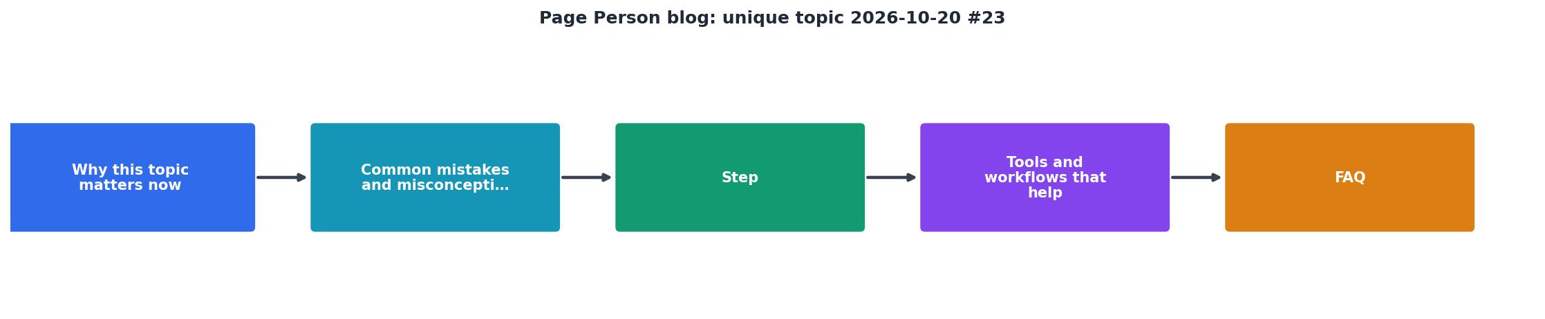
Step-by-Step: Reduce Cognitive Load and Lift Conversion
Step 1: Audit your copy for jargon.
Go through your homepage, landing page, and key flows. Highlight every term that someone outside your industry wouldn't immediately understand. Rewrite using language your visitor already knows.
Step 2: Simplify hierarchy.
What's the one thing you want visitors to understand first? Make it the biggest, boldest, highest-contrast element. Secondary points should fade visually. Tertiary details live in modals or hidden sections, not above the fold.
Step 3: Remove extraneous elements.
Every image, every navigation item, every feature callout competes for attention. Ask: does this move the visitor closer to conversion? If no, delete it. Less is almost always better on first-time-visitor pages.
Step 4: Break up walls of text.
One sentence per line if it's a key point. Three to four sentences per paragraph maximum. Use bullet lists for multiple benefits or steps. White space is not wasted space; it's breathing room for the brain.
Step 5: Test and measure.
Show your simplified version to ten strangers. Ask the clarity questions. Measure conversion. Compare to baseline. Ship the winner. Repeat.
Tools and Workflows That Help
Several tools can surface cognitive friction without needing to recruit testers every week:
- Session recordings (Hotjar, Crazy Egg, Fullstory) let you watch real visitors struggle in real time. Play back five recordings and you'll spot patterns you never noticed.
- Heatmaps show where visitors click, how far they scroll, and where they get stuck. Red zones of rage-scrolling are cognitive load red flags.
- Survey tools (Typeform, Qualtrics) embedded mid-page let you ask visitors directly: "What's confusing about this?" Real-time feedback beats guessing.
- A/B testing (Optimizely, VWO, ConvertKit) lets you run clarity experiments without dev overhead. Test a rewritten headline, simpler copy, or clearer CTA.
Real-World Example: How One SaaS Cut Bounce Rate by 28%
A mid-market HR tech company noticed 35% of landing page visitors bounced in under 10 seconds. Their copy was technically accurate but stuffed with acronyms (HRIS, SSO, PTO workflows) and feature names only power users cared about.
They simplified:- Changed headline from "Cloud-based HRIS with real-time workforce analytics" to "See your team's time and performance in one place."
- Removed the six-item feature list and replaced it with three benefit statements: "Save 5 hours a week on payroll. Know who's doing what. Catch problems early."
- Dumped the purple-and-teal color scheme for cleaner hierarchy with one accent color.
- Cut nav from eight items to four.
Interactive Cognitive Load Checker
To help you audit your own site quickly, here's a framework you can use right now:
Quick Cognitive Load Audit
Score yourself on each criterion. If you're not hitting all five, you have extraneous load to shed.
Cognitive Load Reduction Checklist
Your progress is saved automatically in your browser.
FAQ
Frequently Asked Questions
The simplest shift in thinking: assume your visitor is skeptical, distracted, and ready to leave. Design for them, not for yourself. Every word, every element, every choice should reduce friction, not add it. The companies that nail this, clear, simple, fast to understand, convert better and grow faster.
Run Page Person on your site to uncover exactly where real visitors struggle with comprehension and cognitive barriers, then use this framework to fix them.
Additional Resources
- Starting a Blog in 2026 // Here's What to Do! - If you're looking to start a blog, this video offers essential blogging tips based on years of experience. Learn how to avoid common blogging ...
- Best Niches & Trending Topics to Start a Blog in 2026 - Find out what to blog about in 2026—top niches, trending topics, and money-making ideas to help you grow and profit from your blog.
- 23 Best Blogs For Your Inspiration 2026 - An extensive collection of the best blogs to gain inspiration when building yours. From simple to more advanced designs.