

When a visitor lands on your site, they have seconds to decide whether to stay or leave. But here's what most founders miss: they're not just deciding based on design or pricing. They're struggling to understand what you're asking them to do. Cognitive friction, the mental effort required to parse your page, kills conversions silently. You won't see it in Google Analytics. You need to see it through your visitor's eyes.
Photo by Alexander Zvir from Pexels
TL;DR
Cognitive accessibility barriers cost you conversions because visitors with ADHD, anxiety, dyslexia, low digital literacy, or simple cognitive overload abandon your site before they understand your offer. The fix isn't a redesign, it's identifying friction points, simplifying language, reducing mental load, and testing with real visitors. Most sites lose 20–40% of potential conversions due to comprehension gaps alone.
Cognitive accessibility sits at the intersection of user experience and genuine inclusion. It's not a trendy buzzword. It's about recognizing that your visitors don't all think the same way, and your site shouldn't demand they do. When you eliminate cognitive barriers, you don't just help people with disabilities, you help everyone. Clearer copy converts better. Simpler flows reduce bounce rates. Lower cognitive load improves retention.
The business case is straightforward: if you're paying for traffic, you're bleeding money when visitors can't figure out what you want them to do. Every point of confusion is a leak in your funnel.
Why cognitive barriers exist

Most sites are built by teams who know the product inside out. You've lived with your terminology, your workflow, your mental model for months. When you read your own copy, your brain fills in gaps that a first-time visitor can't. You don't see the jargon. You don't feel the cognitive overload. You see a clean page; they see a puzzle.
Cognitive barriers fall into several categories:
- Language and jargon: Using industry terms, acronyms, or abstract language that first-time visitors don't understand.
- Information overload: Too many options, too much copy, too many visual elements competing for attention at once.
- Unclear hierarchy: No obvious path forward. Visitors waste mental energy figuring out what button to click or where to scroll.
- Inconsistent patterns: Buttons that look different, labels that change meaning, interactions that behave unexpectedly.
- Poor contrast and typography: Text that's hard to read strains the eyes and cognitive load, especially for people with dyslexia or low vision.
- Forced decision-making: Asking visitors to make choices before they have enough information to decide.
Common mistakes and misconceptions
The biggest mistake is assuming accessibility is only about people with disabilities. It's not. Cognitive barriers affect everyone, especially in high-stress moments (shopping on a mobile phone, making a quick decision, working during a break).
Another misconception: "My site looks clean. It must be easy to understand." Clean design is not the same as clear design. A minimalist homepage with one button teaches nothing. A homepage packed with feature lists confuses everyone. The goal is clarity, not simplicity.
Founders also underestimate the cost of wrong words. Changing "Pricing Plans" to "Choose Your Plan" or "Sign Up" to "Start Free Trial" moves the needle because it removes ambiguity. The visitor immediately knows what happens next.
How cognitive load kills conversion
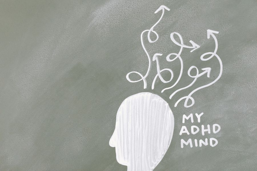
Cognitive load is the mental effort required to process information and complete a task. Every click, every choice, every line of text consumes cognitive resources. Visitors have a limited budget. Once it's spent, they leave.
"The strongest case studies explain what didn't work before explaining what did.">, 10 Best Blog Ideas for 2026 That People Actually Read
High cognitive load manifests as bounce rates, time-on-page that's too short, or form abandonment. In paid ads, it shows up as low conversion rates despite solid traffic. You're paying for attention you can't hold because you're demanding too much mental energy.
The fix is ruthless prioritization. Ask: What is the ONE thing you want this visitor to understand right now? Everything else is noise. Once they understand that, move to the next step.
Step-by-step approach to reducing friction

Start with observation. You can't fix what you don't see. Use session recordings, heatmaps, and user testing to identify where visitors get stuck. Watch where they hover without clicking. Note where they scroll back up. These moments reveal confusion.
Then work through this sequence:
- Audit your language: Read your copy aloud. Does every sentence add value? Remove jargon. Replace "leverage our platform" with "save time." Use short, simple words. People with lower digital literacy, ESL backgrounds, or ADHD will thank you, and so will your conversion rate.
- Clarify your value proposition: State your offer in one sentence. Not "We help businesses optimize customer engagement through data-driven insights." Say "We help you get more customers." Lead with benefit, not feature.
- Simplify your funnel: Each step should remove one piece of friction. Don't ask for email, phone, AND company in one form if you only need email to start. Spread it out. One choice per screen.
- Use visual hierarchy: Make the next action obvious. One clear call-to-action per section. Contrast, size, color, and position should guide the eye.
- Test with real visitors: Recruit someone outside your company to use your site with no guidance. Watch them click. Listen to what confuses them. Iterate.
Tools and workflows that help
Session replay tools (Clarity, Hotjar, FullStory) show you exactly where visitors struggle. You see the clicks, the hesitation, the rage-clicks. This is gold.
Heatmaps highlight attention. If visitors aren't looking at your key message, move it or rewrite it.
Form analytics reveal where people abandon. If half your leads drop off at the phone number field, make it optional or remove it.
A/B testing lets you measure the impact of changes. Simplify language in a headline and measure lift. Change button color. Reduce form fields. Each test teaches you what works for your specific audience.
User testing services (UserTesting, Maze, Respondent) connect you with real people who'll interact with your site. They're not as cheap as analytics, but the insights are worth it. You learn not just what people do, but why.
Accessibility checkers (WAVE, Axe DevTools) catch technical issues, but they miss cognitive barriers. That's where qualitative feedback from real visitors matters most.
Cognitive Accessibility Quick Audit
This dashboard shows what a quick cognitive audit looks like. Each item is something you can measure and improve. The goal isn't perfection, it's progress.
Reduce Cognitive Load: Action Checklist
Your progress is saved automatically in your browser.
FAQ
Frequently Asked Questions
The visitors leaving your site aren't stupid. They're just confused. That confusion is costing you revenue. Start by watching them struggle. Then get ruthless about removing the friction you see. Your conversion rate will thank you.
Additional Resources
- 10 Best Blog Ideas for 2026 That People Actually Read - 1. “What I Wish I Knew Before…” Posts · 2. Opinion Posts That Explain the Reasoning · 3. Behind-the-Scenes Reality Posts · 4. Step-by-Step How-To ...
- Best Niches & Trending Topics to Start a Blog in 2026 - Find out what to blog about in 2026—top niches, trending topics, and money-making ideas to help you grow and profit from your blog.
- The 50 Best Blogs in the World, Ranked by Popularity - Detailed - The best blogs in the world are tracked and ranked daily by our unique algorithm.