

Your website visitors are bouncing off your pages not because they don't want your product, but because they can't understand it quickly enough. Cognitive accessibility, the ability for anyone to comprehend your content and navigate your interface without mental strain, directly impacts your bottom line. Most founders optimize for traffic volume while ignoring comprehension barriers that cost them conversions. This guide shows you how to audit for cognitive friction and fix the accessibility issues draining your conversion rate.
Photo by Pavel Danilyuk from Pexels
TL;DR:- Cognitive accessibility issues cause 42% of visitors to struggle, leading to silent cart abandonment and signup drop-off.
- Common barriers include jargon overload, unclear CTAs, information clutter, and confusing navigation flows.
- Audit your site with real user testing and automated tools; then systematize clarity in copy, layout, and interaction design.
- Small fixes to comprehension often yield faster ROI than traffic acquisition alone.
Most sites leak conversions at the cognitive layer. Your analytics show drop-off. Heatmaps show where. But neither answers why a first-time visitor hit your pricing page and left three seconds later. They didn't bounce because the design looked bad, they bounced because they couldn't figure out what you actually do within five seconds. That's a comprehension failure, not a design failure. Cognitive accessibility isn't a nice-to-have compliance checkbox; it's the conversion multiplier nobody talks about.
Why cognitive friction kills conversion

Visitors with undiagnosed ADHD, anxiety, dyslexia, low digital literacy, or simply high cognitive load make up a massive portion of your traffic. They're not a minority edge case, they're your market. When your site forces them to work too hard to understand your value, they leave. Unlike technical accessibility (which breaks for screen-reader users and causes legal liability), cognitive accessibility breaks silently. No error message. No angry support ticket. Just abandonment.
The barrier isn't always what you think. It's rarely the colors or the button size. It's usually one of five things:
- Jargon density: Using industry terms or acronyms without definition.
- Information overload: Throwing too many features or choices at once.
- Unclear hierarchy: Making it impossible to find the main call-to-action.
- Navigation confusion: Requiring visitors to think too hard about where to go next.
- Ambiguous copy: Headlines and CTAs that don't clearly state what happens next.
Common mistakes that drain conversions
Mistake one: Assuming clarity for your ideal customer. You write copy for someone who already understands your market. Your accountant visitor understands "automate your P&L reconciliation." Your first-time visitor understands "stop doing this tedious task by hand." Same product, different entry point. Most sites only speak the language of the ideal customer, leaving newcomers confused.
Mistake two: Burying the core value proposition. Your hero section is a lifestyle image and a vague headline like "Empower Your Workflow." Five seconds later, the visitor still doesn't know what your product does or who it's for. They move on.
Mistake three: Forcing a choice too early. Your signup flow asks for role, company size, and use case before the visitor has even kicked the tires. Friction before value delivery causes abandonment. Ask the minimum first; segment later.
Mistake four: Mixing metaphors or visual conventions inconsistently. You use icons for navigation on mobile but different icons on desktop. Your primary button is sometimes blue, sometimes green. Small inconsistencies force the visitor to re-learn the interface.
Mistake five: Relying on context that isn't there. Your landing page refers to "our enterprise tier" without ever explaining what makes it enterprise. The visitor has to infer. Inference takes cognitive effort. Most bounce rather than click to find out.
Audit for cognitive barriers systematically

The first step is diagnosis. You need to see your site through fresh eyes. That's harder than it sounds when you're embedded in the product.
Start with real-user testing. Recruit five to ten people outside your company who match your target persona. Screen-record them using your site without guidance. Tell them a single task: "Find the pricing" or "Sign up and explore." Watch where they hesitate. Listen to what they say. Don't help them. Hesitation is data.
You'll hear things like:- "I'm not sure what this feature is for."
- "Should I click this or scroll down first?"
- "Is this the main thing or just an option?"
- What is this product?
- Who is it for?
- Why should I care now?
Use a cognitive accessibility tool. Page Person scans your site and surfaces barriers like jargon density, unclear call-to-action placement, information clutter, and navigation inconsistency. It shows you which visitors struggle and how. You get metrics instead of guesses.
Analyze your traffic patterns. Where do visitors drop off? If 40% leave from your pricing page, it's not the pricing, it's the clarity of the offer. If 60% abandon during signup, the form has too many fields or the value isn't clear enough. Cross-reference drop-off points with your usability test notes. The pattern will emerge.
Fix comprehension one layer at a time
Layer one: headline and value clarity. Rewrite your hero headline to assume zero context. Not "Streamline workflows." Say "Reduce your data entry by 80% with automated reconciliation." Replace marketing copy with specific, benefit-focused statements. Test headlines with real people outside your team.
Layer two: simplify copy. Cut jargon. Replace "leverage our API integration" with "connect it to your existing tools." Use short sentences. Use active voice. Use second-person ("you"). Write the way you'd explain to a friend.
Layer three: organize information by priority. What does the visitor need to know first? Put it first. Use clear, short headings. One idea per section. Bury details behind "Learn more" links.
Layer four: reduce choices upfront. Show one primary call-to-action per page. If you have multiple CTAs, one should be 10x more prominent. Too many options = decision paralysis = abandonment.
Layer five: make navigation obvious. Use consistent patterns. If your main nav is horizontal at the top, keep it there. Use recognizable icons. Label them. Don't hide navigation in hamburger menus unless on mobile.
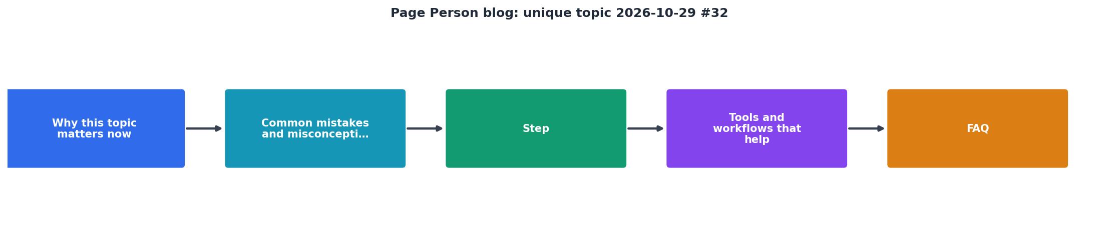
The process is audit, prioritize, fix, measure. One layer at a time. Each fix is small. Collectively, they compound.
Measure the impact
You don't optimize what you don't measure. Track these metrics before and after each clarity fix:
- Time on page: Shorter is not always better, but visitors who understand your offer quickly tend to stay longer.
- Bounce rate by page: Does it drop after your rewrite?
- Conversion rate: This is the one that matters. A 2-5% lift from clarity fixes alone is realistic and worth tens of thousands annually.
- Task completion in usability tests: Can new users find pricing without asking for help?
Build cognitive clarity into your workflow
Clarity isn't a one-time audit. It's a system.
Rule one: Write for first-time visitors, not power users. Every major page should stand on its own. A visitor should never think, "I don't get it."
Rule two: Test with fresh eyes weekly. Bring in one or two external users monthly. Screen-record them. Watch where they hesitate. Fix that hesitation.
Rule three: Simplify before you add. Before launching a new feature, ask: does this increase cognitive load? If yes, can we make it optional? Can we explain it faster?
Rule four: Build a clarity checklist and use it for every page. Does this page pass the five-second clarity test? Is the main value clear? Is the CTA obvious? Is the copy jargon-free? New pages shouldn't go live until they pass.
Rule five: Treat cognitive accessibility like a product feature. Assign someone to own it. Run monthly audits. Track metrics. Report on impact.
Your Cognitive Clarity Baseline
The dashboard above shows what a typical founder's baseline looks like. Most sites score lower on clarity than founders expect. The good news: fixes here compound faster than traffic acquisition.
"The site is updated daily and even has a magazine for longer-form pieces."
Tools and workflows that help
Automated audits: Page Person scans your site and identifies cognitive barriers in minutes. You get a ranked list of issues and visitor impact. No guessing.
Copy testing: Tools like Unbounce and ConvertKit let you A/B test headlines and CTAs. Run three headlines against your current one. The winner isn't always what the team guesses.
Usability testing platforms: UserTesting and Maze let you record real users and collect insights without recruiting. Five sessions teach you more than a hundred analytics reports.
Readability checkers: Hemingway App and Grammarly flag dense sentences and jargon. Use them on every major page.
Heatmap and session recording: Hotjar and FullStory show you where visitors click and where they hesitate. Correlate hesitation with your clarity audit.
The best workflow combines them. Audit → prioritize → test → measure → repeat.
Cognitive Clarity Action Checklist
Your progress is saved automatically in your browser.
FAQ
Frequently Asked Questions
The question isn't whether your visitors are struggling to understand your site. The question is whether you're willing to measure it and fix it. Run a test this week. You'll be surprised how obvious the problems become once you watch someone unfamiliar with your product use it for the first time.
Additional Resources
- The 50 Best Blogs in the World, Ranked by Popularity - Detailed - The best blogs in the world are tracked and ranked daily by our unique algorithm.
- Blog Design Examples: 40+ Well-Designed Websites (2026) - The blog post page design is like any good one: readable fonts, structured text, everything. However, the blog landing page is a bit unique.
- Best Niches & Trending Topics to Start a Blog in 2026 - Find out what to blog about in 2026—top niches, trending topics, and money-making ideas to help you grow and profit from your blog.