
Most visitors abandon checkout not because they don't want what you're selling, but because the words confusing them make them unsure what they're about to do. Checkout microcopy, those small labels, button text, and helper messages, can be the difference between a completed sale and a bounced visitor. Plain language turns friction into clarity, and clarity into conversions.
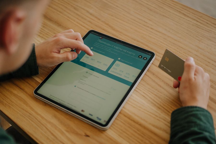
- Checkout microcopy includes button text, field labels, error messages, and progress indicators, every word matters.
- Plain language reduces cognitive load, eliminates jargon, and uses active verbs to guide users with confidence.
- Test your microcopy with real visitors to catch confusion before it costs you conversions.
- Industry data shows that clarity in checkout microcopy can improve conversion rates by up to 17% and reduce cart abandonment significantly.
This guide walks you through why checkout microcopy matters, the most common mistakes, and a practical step-by-step approach to writing words that actually move visitors to purchase.
Why checkout microcopy matters now
Checkout is the final gate. Visitors have already decided they might buy. They've navigated your landing page, read your pricing, clicked the sign-up button. Then they hit unclear instructions, jargon-heavy labels, or vague button text, and they leave.
The stakes are concrete. Every visitor who abandons at checkout is revenue lost. For a SaaS company with 10,000 monthly visitors and a 5% baseline conversion rate, that's 500 signups. A 17% improvement in clarity could add 85 more conversions per month, compounding to over 1,000 new customers annually.
But clarity isn't just about conversion math. It's about respect. A visitor filling out their payment information is vulnerable. They're trusting you. Unclear microcopy, words like "finalize transaction," "confirm initiation," or "submit authorization request", treats them like data entry clerks, not people deciding whether to give you their money. Plain language acknowledges that nervousness and removes unnecessary friction.
The checkout phase is also where cognitive load peaks. The visitor is making a decision, entering sensitive data, and watching for security signals all at once. Every extra cognitive load, a confusing error message, an ambiguous label, a button that doesn't clearly state what happens next, increases the chance they'll abandon.
Common mistakes and misconceptions
Jargon and formal language
The worst offender is formal, jargon-heavy language masquerading as professionalism. Words like "process transaction," "authorize payment," "confirm subscription initiation," or "submit billing information" don't sound professional, they sound defensive. They make visitors wonder what's really happening.
Real SaaS checkouts sometimes use:- "Finalize" instead of "Complete" or "Pay"
- "Billing details" instead of "Payment method"
- "Subscription terms" instead of "What happens next"
- "Verify identity" instead of "Confirm your email"
"The foundations of microcopy lie in this approach, and it's probably what you'll come across most often.">, Using Microcopy to Guide Your Users to Checkout
Assuming prior knowledge
Many SaaS checkouts assume visitors know your terminology. You reference "workspaces," "organizations," or "team seats" without explaining what choosing one means. You ask for "billing cycle preferences" without clarifying when the first charge hits. You offer "enterprise sign-on" without saying whether it's optional.
Each assumption is a cognitive speed bump. If the visitor has to pause and think, or worse, guess, you've lost momentum toward the purchase.
Passive voice and unclear consequences
"Your account will be created" is passive and vague about when. "You'll be charged $99/month starting today" is active and specific. Passive voice removes the actor and the timeline, leaving visitors uncertain about what actually happens.
Missing error context
Error messages often state the problem without offering a solution: "Invalid email format" vs. "Please use your full email address (example@company.com)." The first makes the visitor feel blamed. The second explains what to do.
Step-by-step approach to plain checkout microcopy
Follow this process to audit and rewrite your checkout language:
Step 1: Audit every word on your checkout flow. Screenshot or print your checkout pages. Highlight every label, button text, helper message, error state, progress indicator, and confirmation text. You're looking for anything the visitor reads between deciding to buy and completing the purchase.
Step 2: Test each word against the active voice + clarity test. Ask: Is this a verb (not a noun)? Does it say what happens to the user? Is there a timeline? Example: "Complete purchase" passes. "Process order" fails (noun, unclear consequence). "Confirm billing" fails (vague, confirm what?).
Step 3: Replace jargon and abbreviations. Abbreviations that are common internally are often opaque to visitors. "MFA" becomes "two-factor authentication (your phone or email)." "SSO" becomes "log in with your company account." "GAAP-compliant reporting" becomes "reports auditors can use."
Step 4: Add context to every field. "Email" is clear. "Work email" is better (signals what kind). "Work email (you'll get a verification link here)" is best (explains the consequence). For complex fields like "billing address," add "We need this to process your payment and send receipts."
Step 5: Write error messages that solve, not blame. Instead of "This field is required," write "Please enter your company name so we can personalize your account." The error becomes a guide, not a judgment.
Step 6: Test with real visitors. This is non-negotiable. Watch someone navigate your checkout without talking them through it. Where do they hesitate? Which button text makes them pause? Where do they click the wrong field? Each hesitation is a microcopy failure.
Here's the workflow in visual form:
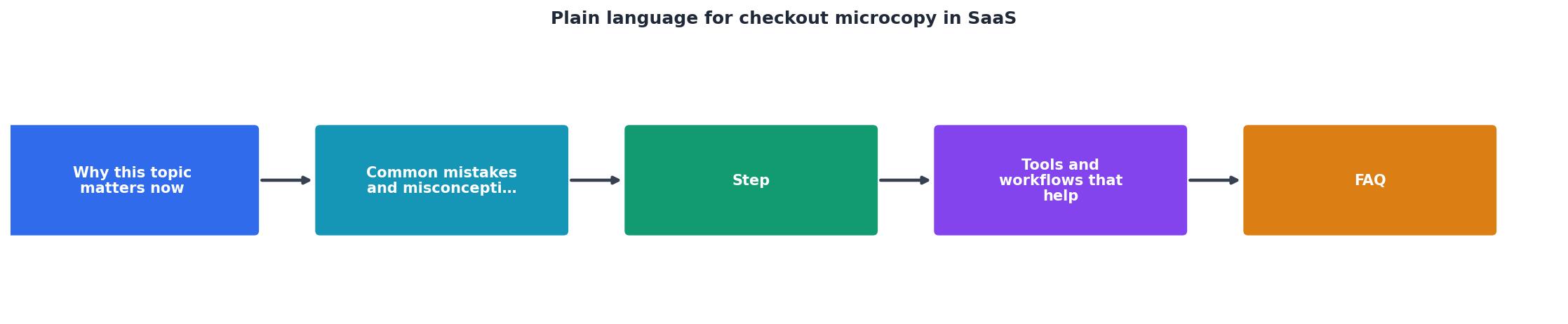
Building a plain-language checkout workflow
The best checkout flows guide visitors through a conversation, not a gauntlet. Here's how to structure that:
Progress indicator: Tell the visitor where they are. "Step 1 of 3: Billing" is clear. "Checkout" alone leaves them guessing how long this takes.
Field labels and hints: Pair every label with a hint or example. "Company name" + "e.g., Acme Inc." or "Password (at least 12 characters, with a number)" removes guessing.
Confirmation before charge: Before the final payment button, show exactly what's about to happen. "You're about to be charged $99/month, starting today. Cancel or go back anytime in your account settings." This honesty reduces buyer's remorse and support emails.
Success state: After purchase, be explicit about what the visitor should do next. "Check your email (including spam folder) for your login link" is better than "Thank you for your purchase." It's an action, not a dead end.
Next steps in context: If they need to set up a payment method or verify their email, don't bury the instruction in fine print. Make it part of the flow: "We've sent a verification link to your email. Check it now or continue setting up your account first."
Tools and workflows that help
Annotation tools and design systems
Use a tool like Figma or Miro to annotate every element of your checkout. Write the current microcopy, then the plain-language alternative next to it. This creates a visible before/after that helps align your team on the change.
User testing platforms
Tools like UserTesting.com or Maze let you watch real visitors navigate your checkout. Recruit people outside your company who match your customer profile. The insights are immediate and unambiguous.
Analytics and heatmaps
Heatmap tools like Hotjar or Clarity track where visitors click, hover, and abandon. A cluster of clicks on a field label suggests that label is confusing. Users spending 10+ seconds on a single field suggests the field or its instruction needs clarification.
Plain-language checklist during code review
Before code review, require checkout microcopy review. Have someone who's not on the product team read the text aloud. If they trip over a word, it's too complex. If they pause to understand a sentence, it needs simplifying.
A/B testing framework
Once you've rewritten your microcopy, test it against the old version. Measure not just conversion rate but also cart abandonment, support tickets mentioning "I wasn't sure...", and time spent on checkout. A well-written checkout feels faster because visitors move with confidence, not hesitation.
Real-world examples
Stripe keeps its checkout minimal but hyper-clear. Instead of "Enter card details," it says "Card information." Instead of a generic "Submit," it says "Pay $X now" (exact amount visible). Every word reduces doubt.
Slack guides you through signup with clear consequences. When you create a workspace, it explains: "Workspaces help teams collaborate. You can invite others and control permissions here." It doesn't assume you know what you're building.
Notion does the same with billing. When you upgrade, the page states: "You'll be charged monthly. Cancel anytime, no questions asked." It removes the fear that commitment is permanent.
These companies aren't overthinking their checkout language. They're just removing the fog.
Interactive checkout clarity assessment
To help you visualize your own checkout health, here's a simple assessment dashboard showing what high-clarity checkout metrics look like:
Checkout Clarity Benchmarks
These benchmarks represent what clear, plain-language checkout typically achieves. If your checkout is hitting these numbers, your microcopy is working. If you're below them, microcopy is one of the highest-ROI places to focus.
Checklist: Plain-Language Checkout Audit
Use this checklist to audit your checkout flow before deployment:
Your progress is saved automatically in your browser.
FAQ
Frequently Asked Questions
Measuring the impact
After you deploy plain-language checkout microcopy, track these metrics weekly for the first month:
- Checkout completion time: Should stay the same or improve (visitors move with confidence).
- Cart abandonment rate: Should drop 5–15%.
- Support tickets about checkout: Should drop, especially emails about confusion.
- Conversion rate: May improve 3–17% depending on your baseline and changes.
- User testing observations: Run the same test again with new visitors. Hesitations should decrease.
Wrapping it up
Plain language for checkout microcopy isn't trendy or optional. It's the difference between guiding visitors to purchase or leaving them uncertain and clicking away. Every word in your checkout is a chance to either build confidence or plant doubt. Choose carefully.
The work isn't complicated. It's just precise, remove jargon, use active verbs, add context, and test with real people. Small changes compound into significant conversion improvements. Teams that nail their checkout microcopy aren't smarter; they're just more disciplined about testing the words they've already written.
Start today with your audit. You might be surprised how much fog you've been leaving in your checkout.
Additional Resources
- Using Microcopy to Guide Your Users to Checkout - Using plain English, snappy sentences and more colloquial language would help to shake off the official air that many institutions ...
- UX Writing for SaaS: Microcopy that Clarifies and Converts - Use plain language. Don't. Use only icons or “Success!” without context; Overload with details—save those for in-line alerts. Tip. Write toast ...
- UX Microcopy: Examples, Formulas & Best Practices ... - Three parts, in order: what happened, why, and the next step — in plain language, with no error codes as the headline and no blame. 'That ...