
Your B2B SaaS website probably reads like it was written by a committee of engineers who already know the product inside out. The problem is your visitors do not. Every sentence loaded with jargon, every paragraph that buries the action behind abstraction, costs you signups and revenue. Plain language fixes that gap, and cognitive accessibility makes sure the fix works for the widest possible audience.

- Plain language means choosing shorter sentences, common words, and direct structure so first-time visitors understand your product in seconds.
- Cognitive accessibility goes further: it accounts for how people with ADHD, anxiety, dyslexia, or high cognitive load actually process your pages.
- Combining both turns the same traffic into more conversions without spending another dollar on ads.
Why plain language matters for SaaS revenue
Most B2B SaaS sites lose visitors not because the product is wrong, but because the copy is unclear. A first-time visitor lands on your pricing page, reads "enterprise-grade orchestration layer for cross-functional alignment," and leaves. They did not understand what you sell. That bounce just cost you the full CPC of whatever ad brought them there.
Plain language is writing that your audience can understand the first time they read it. No re-reading, no guessing, no context they do not have yet. For B2B SaaS, this means:
- Replacing internal terminology with words your buyer already uses
- Keeping sentences under 20 words on average
- Leading with the benefit, not the feature architecture
- Using active voice so the reader knows who does what
Common mistakes that kill clarity
Teams make the same errors repeatedly. Here are the ones I see most often on SaaS sites:
Curse of knowledge
You built the product. You know what "multi-tenant data mesh" means. Your visitor does not. Every feature page written from the builder's perspective instead of the buyer's perspective creates a comprehension wall. The fix: describe what the feature does for the user, not how it works internally.
Wall-of-text syndrome
Long paragraphs with no visual breaks force the reader to hold too much information in working memory. People with dyslexia or attention difficulties abandon these pages fast. Break content into chunks of 2-4 sentences. Use headers, bullets, and whitespace as cognitive rest stops.
Inconsistent terminology
Calling the same thing "workspace" on one page, "project" on another, and "environment" in the docs creates unnecessary cognitive load. Pick one term. Use it everywhere. Define it once in plain language.
Hiding the action
If your CTA says "Get Started" but the next page asks for a credit card, you broke trust. If your pricing page says "Contact Sales" for every tier, you created friction. Plain language applies to buttons and navigation too. Say exactly what happens next.
Step-by-step: rewrite your site for clarity
Here is a concrete process. Each step builds on the previous one.
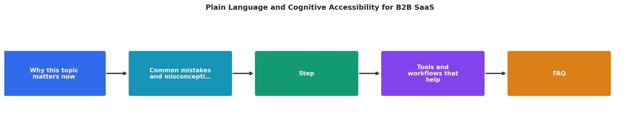
- Audit current copy - Collect every page a visitor sees before converting: homepage, pricing, features, signup flow. Score each for readability grade level.
- Identify jargon - Highlight every word or phrase a non-expert would not immediately understand. Build a glossary mapping internal terms to plain alternatives.
- Rewrite headlines first - Headlines carry the most weight. Rewrite each one to answer "What does this do for me?" in under 10 words.
- Simplify body copy - Shorten sentences. Replace passive voice. Remove filler words like "leverage," "utilize," "facilitate." Use "use," "help," "do."
- Structure for scanning - Add subheadings every 150-200 words. Use bullet lists for any sequence of three or more items. Bold key terms on first use.
- Test with real users - Ask someone outside your company to read your homepage for 10 seconds, then tell you what the product does. If they cannot, rewrite again.
"The research backs this up: A 2024 randomized trial found that health information revised for plain language dropped reading grade level by nearly 3 full grades while retaining all key content.">, How to Write Accessible Content: Plain Language, Readability, and WCAG
That finding applies directly to SaaS. Dropping your reading level does not mean dumbing down your product. It means removing barriers between your visitor and the "yes" decision.
Tools and workflows that help
You do not need a massive budget to start. These categories of tools cover the essentials:
- Readability analyzers like Hemingway Editor or readable.com grade your text and flag complex sentences. Use them on every page before publishing.
- Cognitive accessibility auditors like PagePerson Insights scan your site for comprehension barriers that standard accessibility checkers miss, showing you where visitors with ADHD, anxiety, or low digital literacy actually struggle.
- Content style guides from organizations like plainlanguage.gov provide rewriting patterns. Adopt their principles as your internal writing standard.
- User testing platforms like UserTesting or Maze let you watch real people attempt to understand your site. Five-second tests reveal whether your headline communicates the core value.
Here is an example of what a typical readability improvement looks like across key SaaS pages when you apply plain language principles:
Reading Grade Level: Before vs. After Rewrite
Before and after: real rewrites
Seeing the difference makes the principle concrete. Here are three typical B2B SaaS sentences and their plain language versions:
| Original Copy | Plain Language Version |
|---|---|
| "Leverage our AI-powered orchestration engine to streamline cross-functional workflows." | "Automate tasks across your team with AI." |
| "Our platform facilitates seamless integration with your existing technology stack." | "Connect to the tools you already use." |
| "Unlock enterprise-grade scalability with our multi-tenant architecture." | "Grows with your business. No migration needed." |
Notice the pattern: the rewritten versions are shorter, use common verbs, and tell the reader what they get. The originals describe internal architecture. Your visitor does not care about architecture. They care about outcomes.
Plain Language SaaS Audit Checklist
Your progress is saved automatically in your browser.
FAQ
Frequently Asked Questions
Additional Resources
- How to Write Accessible Content: Plain Language, ... - Plain language turns WCAG's understandability principle into something you can implement. It cuts cognitive load and improves outcomes for ...
- Accessible Marketing Boosts B2B Results with Lisa Riemers - Clear language and thoughtful formats help decision-makers actually consume content, not just skim it. When marketing is easier to use, it works ...
- Ensure an accessible B2B SaaS product - Standard Beagle - An accessible B2B SaaS product make it easier for people to use accessibility products and heightens legibility.