

You spent thousands on paid traffic last quarter, watched visitors land on your pricing page, and then watched them leave. Your analytics showed the drop-off point but not the reason. The copy made perfect sense to your team, yet first-time visitors bounced before they even reached the signup button. The missing variable in that equation is cognitive accessibility, and it has a measurable dollar value.

- Cognitive accessibility in SaaS means designing interfaces and copy so that visitors with varying cognitive abilities (ADHD, anxiety, dyslexia, low digital literacy) can understand and act without friction.
- You measure its ROI through conversion rate lifts, reduced support ticket volume, improved trial-to-paid ratios, and lower churn.
- Setting up the right analytics takes a few hours, not weeks, and the payoff compounds every month as the same traffic converts better.
What cognitive accessibility actually means
Most SaaS teams think "accessibility" and picture screen readers, alt text, and color contrast ratios. Those matter. But cognitive accessibility covers a different layer: whether a visitor can comprehend what your product does, navigate your interface without confusion, and decide to take action without mental overload.
This includes people with ADHD who lose focus on dense pricing tables, users with anxiety who freeze when error messages are vague, dyslexic readers who struggle with long unbroken paragraphs, and the large group of people who simply have low familiarity with SaaS conventions. That last group is bigger than you think.
When nearly half your visitors hit cognitive friction, every improvement to comprehension translates directly into revenue. Not in theory. In your next monthly report.
Why ROI measurement matters here

SaaS founders often skip cognitive accessibility because it feels soft. "Make the copy clearer" sounds like a nice-to-have, not a revenue lever. That changes the moment you attach numbers to it.
Here is why measuring ROI specifically for cognitive accessibility is worth the effort:
- Budget justification. When you can show that simplifying your onboarding flow increased trial-to-paid conversion by 12%, the next round of UX improvements gets funded without a fight.
- Prioritization. Not all cognitive fixes are equal. Measuring lets you rank changes by impact and tackle the highest-value ones first.
- Compounding returns. Unlike a one-time ad campaign, a clearer interface keeps converting better month after month on the same traffic.
- Reduced CAC. If your landing page converts 20% more visitors, your effective cost per acquisition drops by the same proportion without touching your ad spend.
"The next dependency for increased maturity would be to establish the metrics by which your success will be measured.">, Establishing metrics for accessibility ROI
The point is straightforward: you cannot improve what you do not measure, and cognitive accessibility is no exception.
Metrics that reveal cognitive friction
Not every metric in your dashboard matters for this. Focus on the ones that directly reflect comprehension and decision-making:
- Conversion rate by page. Track signup, trial start, or purchase conversion on each key page before and after cognitive changes.
- Time on task. How long does it take a user to complete onboarding steps? Shorter is usually better here, because it signals clarity.
- Support ticket volume by category. Tag tickets related to confusion, unclear instructions, or "how do I..." questions. A drop after changes is direct evidence.
- Trial-to-paid ratio. If users understand your product faster during the trial, more of them convert.
- Bounce rate on high-intent pages. Pricing pages and signup flows should have low bounce rates. High bounce on these pages often signals cognitive overload, not lack of interest.
- Task completion rate. In-app, measure how many users finish key workflows (like setting up their first project) without abandoning.
That number represents a massive revenue leak. Every percentage point you recover goes straight to your bottom line.
Setting up analytics to track it

You do not need a custom data warehouse for this. Standard tools like Google Analytics 4, Mixpanel, Amplitude, or PostHog handle it. The key is setting up the right events and segments before you make changes, so you have a clean baseline.
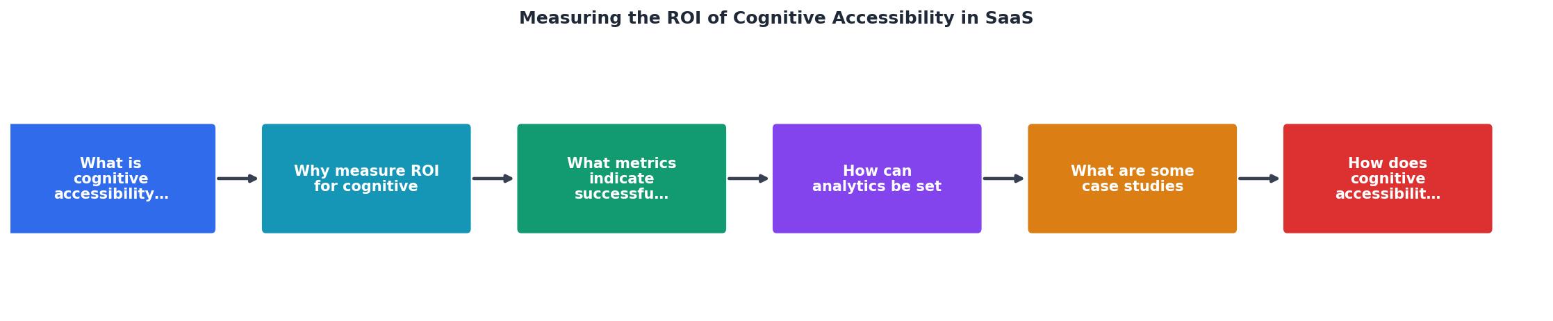
Follow these steps:
- Baseline - Record current conversion rates, bounce rates, support ticket counts, and onboarding completion rates for at least two weeks.
- Tag - Add event tracking to key interaction points: signup button clicks, onboarding step completions, pricing page scroll depth, and help-link clicks.
- Segment - Create user segments by traffic source, device type, and geography. Cognitive friction often hits harder on mobile and in non-native-language markets.
- Change - Implement one cognitive accessibility improvement at a time. Simplify a pricing table, rewrite error messages, break a long form into steps.
- Measure - Wait at least two weeks (or until you have statistical significance) and compare the same metrics against your baseline.
- Calculate - Multiply the conversion lift by your average revenue per user. That is your ROI number.
How cognitive accessibility cuts support costs
Every confusing label, ambiguous button, or unclear error message generates support tickets. Those tickets cost real money: the average B2B SaaS support ticket costs between $15 and $30 to resolve when you factor in agent time, tooling, and overhead.
Here is how cognitive improvements reduce that cost:
- Clearer onboarding flows mean fewer "how do I get started?" tickets. Intercom, Zendesk, and Freshdesk all let you tag and track these.
- Plain-language error messages eliminate the "I got an error but I don't know what it means" category entirely.
- Simplified navigation reduces "where do I find X?" questions.
- Better microcopy on forms prevents input errors that trigger support contacts.
| Before Cognitive Fixes | After Cognitive Fixes |
|---|---|
| Vague error messages | Plain-language explanations |
| Dense pricing tables | Scannable comparison cards |
| Long unbroken forms | Multi-step wizards |
| Jargon-heavy onboarding | Simple task-based guidance |
| ~500 confusion tickets/mo | ~350 confusion tickets/mo |
Real-world patterns that work
Specific cognitive accessibility changes that SaaS companies have used to move metrics:
Slack simplified its onboarding by breaking workspace setup into small, clearly labeled steps. Each step had one action and one clear instruction. This pattern reduced drop-off during setup significantly.
Mailchimp rewrote its campaign builder interface to use plain language instead of marketing jargon. "Recipients" became "To," and "Campaign" became "Email." These changes made the product accessible to small business owners who had never used email marketing software before.
Notion introduced templates as the default starting experience instead of a blank page. A blank page is cognitively overwhelming for new users. Templates provide structure and reduce the decision load.
These are not accessibility-specific initiatives in the traditional sense. They are cognitive accessibility improvements that directly impacted activation, retention, and revenue.
The following dashboard illustrates how these metrics connect in a typical SaaS scenario after implementing cognitive accessibility improvements:
Cognitive Accessibility ROI Dashboard
Example: SaaS with 10K monthly visitors, $50 ARPU, after 3 months of improvements
Connecting accessibility to retention
Cognitive accessibility does not just help with first impressions. It keeps users around. When your product is easy to understand, users build habits faster. They reach their "aha moment" sooner. They stick.
Churn driven by confusion is one of the most underdiagnosed problems in SaaS. Users who never fully understood your product's value do not complain. They just stop logging in. You see it as churn. The real cause was cognitive friction during the first week.
Track these retention-specific signals:
- Day 1, Day 7, Day 30 retention rates before and after cognitive changes.
- Feature adoption depth. Are users discovering and using core features, or staying on the surface?
- Session frequency. Users who understand the product come back more often.
Cognitive Accessibility ROI Tracking Setup
Your progress is saved automatically in your browser.
FAQ
Frequently Asked Questions
Additional Resources
- Measuring Accessibility ROI: Breaking the Cycle - If you don't measure ROI, you can't prove accessibility works. The accessibility ROI loop is simple: 1. You understand the benefits of ...
- Establishing metrics for accessibility ROI - For accessibility ROI, your goal is to minimize the cost of disruption by minimizing the accessibility defects in your websites or software.
- The ROI of Digital Accessibility - Measure how accessible experiences boost organic traffic, leads, and sales. · Identify cost savings from fewer support issues, rework, and legal ...