
Your landing page looks great on your designer's Retina display. Then a customer on a five-year-old laptop in a sunlit room squints at your CTA button and leaves. Contrast failures are one of the most common reasons visitors bounce without converting, and most teams only catch them after launch, if they catch them at all. Screenshot-based contrast checking gives you a fast, repeatable way to find these problems before they cost you revenue.

- Screenshot-based contrast checks let you verify color contrast ratios across entire pages without inspecting individual DOM elements.
- Integrating these checks into your design QA workflow catches contrast failures before deployment, protecting conversion rates.
- Automated screenshot pipelines combined with manual spot-checks give you the best coverage with the least effort.
Why contrast kills conversions
Low contrast text does not just fail accessibility audits. It directly reduces readability for every visitor. A light-gray paragraph on a white background forces cognitive effort. Visitors who have to work harder to read your value proposition leave faster.
That number is not hypothetical. A significant portion of your traffic includes people browsing on dim screens, in bright environments, or with mild visual impairments they have never been diagnosed with. When your contrast ratios sit below WCAG AA thresholds (4.5:1 for normal text, 3:1 for large text), you are filtering out paying customers.
The traditional approach to contrast checking involves a developer opening browser DevTools, selecting an element, and reading the computed contrast ratio. That works for a single button. It does not scale to a 40-page marketing site with seasonal promotions, A/B test variants, and dynamic content.
Screenshot-based checking flips the process. Capture the rendered page as an image, then analyze pixel-level contrast across the entire viewport. You test what the visitor actually sees, not what the CSS says they should see.

Common mistakes teams make
Checking only static mockups. Figma files have perfect contrast because designers set exact hex values. The live site has gradients, background images, overlapping elements, and browser rendering quirks. If you only check the design file, you miss the problems that actually reach visitors.
Relying on a single viewport. A contrast ratio that passes at 1440px can fail at 375px when text reflows over a different part of a background image. Screenshot-based checks need to cover at least three breakpoints: mobile, tablet, and desktop.
Ignoring interactive states. Hover states, focus rings, disabled buttons, and error messages all have their own color combinations. A screenshot captured on page load misses these. You need screenshots of key interaction states too.
Treating contrast as a one-time audit. Every deploy can introduce new contrast issues. A marketing team member changes a banner color. A developer updates a CSS variable. Without recurring checks, regressions slip through.
Step-by-step screenshot contrast workflow
This is the core process. Five steps, repeatable, and automatable.
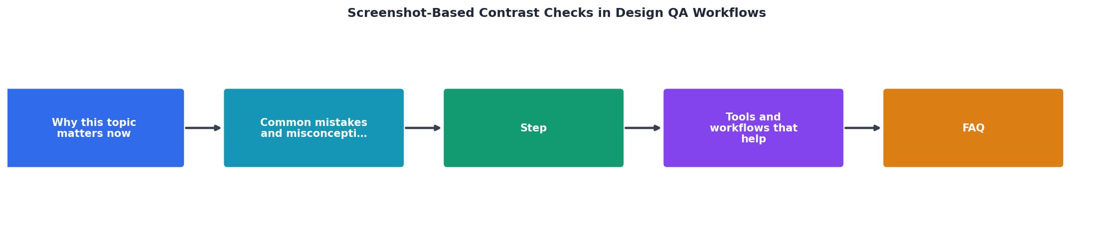
- Capture screenshots. Use a headless browser (Playwright, Puppeteer, or Cypress) to take full-page screenshots at three viewport widths: 375px, 768px, and 1440px. Capture each key page and each critical interaction state (form errors, modals, dropdown menus).
- Run contrast analysis. Feed screenshots into a contrast analysis tool. Tools like Colour Contrast Analyser (CCA) work for manual spot-checks. For automation, use libraries like
axe-corescreenshot integrations or dedicated visual regression tools like Percy or Chromatic that include contrast flagging.
- Flag failures. Any text region below WCAG AA thresholds gets flagged with its location, measured ratio, and required ratio. Group failures by severity: critical (below 2:1), moderate (2:1 to 4.5:1 for body text), and minor (large text between 3:1 and 4.5:1).
- Fix and re-capture. Designers or developers adjust colors, then the pipeline re-captures and re-analyzes. This loop continues until all critical and moderate failures are resolved.
- Baseline and monitor. Store passing screenshots as baselines. On every subsequent deploy, compare new screenshots against baselines. Any contrast regression triggers a build warning or failure.
"Nearly 70% of UI defects are reported by users rather than caught during testing!">, Visual QA Testing: Tools, Benefits, and Best Practices for 2026
That statistic should make you uncomfortable. Screenshot-based contrast checks move defect detection from "users report it" to "CI catches it."

Tools that fit this workflow
Not every tool does the same thing. Here is how the main options compare.
| Manual Tools | Automated Pipeline Tools |
|---|---|
| Colour Contrast Analyser (CCA) | Percy by BrowserStack |
| WebAIM Contrast Checker | Chromatic (Storybook) |
| One page at a time | Hundreds of pages per run |
| Good for spot-checks | Good for CI/CD integration |
| Free | Paid (free tiers available) |
Playwright + custom scripts sit in the middle. You write a script that captures screenshots and runs pixel-sampling contrast checks using a library like color-contrast-checker in Node.js. It is free, flexible, and fits into any CI pipeline. The tradeoff is maintenance: you own the code.
Percy and Chromatic handle screenshot capture, comparison, and visual diffing out of the box. They are built for visual regression testing, and contrast checking is a natural extension. Percy integrates with GitHub, GitLab, and Bitbucket. Chromatic ties directly into Storybook component libraries.
For a quick cognitive accessibility scan that goes beyond just contrast, PagePerson Insights can flag areas where visitors struggle with comprehension and readability, giving you a broader picture of what your landing page gets wrong.
Building contrast checks into QA

The goal is making contrast checks as automatic as linting. Here is how to get there.
Add screenshot capture to your CI pipeline. If you use GitHub Actions, add a step after your build that runs Playwright to capture screenshots. Store them as artifacts.
Set contrast thresholds as pass/fail criteria. Define what "passing" means for your team. A strict policy: zero failures below WCAG AA. A pragmatic policy: zero critical failures, moderate failures tracked as tech debt.
Assign ownership. Contrast failures need an owner. In most small teams, the person who changed the CSS fixes the contrast. In larger teams, the design system owner reviews flagged components.
Review screenshots in pull requests. Tools like Percy post visual diffs directly in your PR. Reviewers see exactly which pixels changed and whether contrast degraded. This turns contrast review into a two-second glance, not a 20-minute manual audit.
Teams that automate screenshot-based contrast checks typically review visual changes three times faster than teams doing manual audits. The time savings compound with every deploy.
The following dashboard shows what a typical screenshot contrast QA summary looks like after integrating automated checks into a weekly deploy cycle for a 25-page marketing site.
Weekly Contrast QA Summary
Screenshot Contrast QA Checklist
Your progress is saved automatically in your browser.
FAQ
Frequently Asked Questions
What is the first page on your site you would run a screenshot contrast check on? Start there, and the rest of the workflow builds itself.
Additional Resources
- Visual QA Testing: Tools, Benefits, and Best Practices for ... - Visual QA tests check whether UI elements appear correctly on the screen, including layout, spacing, text, and colors. They capture screenshots during test ...
- AI Visual Testing: The Complete Guide for 2026 - OverlayQA - AI visual testing replaces the repetitive, low-value parts of visual QA: screenshot comparison, spec checking, and initial bug description.
- Why screenshot-based testing falls short - Screenshot-based testing can help catch visual bugs, but it's not enough to ensure a consistent user experience across all devices and browsers ...