

Google stopped caring about keywords years ago. What it watches now is how people behave on your page. If visitors land, squint at a cluttered layout, and hit the back button within four seconds, that signal travels straight into your rankings. Reducing cognitive load fixes the root cause behind those ugly engagement numbers, and the SEO payoff is measurable.

- Cognitive load is the mental effort a page demands from visitors. Lower it, and bounce rates drop while session duration climbs.
- Google uses engagement signals (dwell time, pogo-sticking, interaction depth) as ranking factors. Better comprehension feeds better signals.
- Simplified content structure, clear visual hierarchy, and intuitive navigation create a direct line from usability improvements to higher search visibility.
Why cognitive load shapes SEO
Search engines rank pages that satisfy intent. Satisfaction is invisible, so Google approximates it through behavior: did the visitor stay, scroll, click deeper, or bounce back to the results page? Cognitive load is the total mental processing a page requires from a visitor. When that load exceeds what someone is willing to spend, they leave. The page loses the engagement signal, and rankings erode over time.
Three types of cognitive load matter for web design:
- Intrinsic load comes from the complexity of the content itself. Tax law is harder than a cookie recipe.
- Extraneous load comes from bad design: confusing navigation, inconsistent layouts, walls of unbroken text.
- Germane load is the productive effort a visitor spends actually learning or deciding. This is the one you want to maximize.
How cognitive load affects engagement

Engagement metrics are the bridge between usability and rankings. Here is what happens when cognitive load is too high:
- Bounce rate spikes. A visitor who cannot parse the page within a few seconds leaves. Google sees a short, single-page session and interprets it as a failed result.
- Session duration shrinks. Even visitors who stay will skim less content if the layout is exhausting. Shorter sessions mean fewer pages per visit.
- Pogo-sticking increases. The visitor clicks your result, bounces, clicks the next result, and stays there. That pattern tells Google the competitor answered the query better.
- Scroll depth drops. Content below the fold never gets seen if the above-the-fold experience is overwhelming.
- Bounce rate (lower)
- Average session duration (higher)
- Pages per session (higher)
- Scroll depth (deeper)
- Click-through on internal links (higher)
- Form completion rate (higher)
The gap between those two numbers represents content that exists on your page but never gets read. From an SEO perspective, that content might as well not exist.
SEO gains from better engagement

Google's ranking systems use interaction data at scale. The exact weight of each signal is proprietary, but the direction is clear: pages that hold attention rank better. Here is how reduced cognitive load translates into concrete SEO benefits.
Dwell time and ranking position
When a visitor stays on your page for 90 seconds instead of 12, that extended dwell time signals relevance. Pages in the top three positions on Google tend to have significantly higher average dwell times than pages on position eight or nine. Reducing cognitive load is one of the most reliable ways to extend that time without adding more content.
Lower pogo-sticking rate
If your page answers the query clearly and the visitor does not return to the SERP, Google treats that as a satisfied click. Simplified layouts, scannable headings, and front-loaded answers all reduce the chance of pogo-sticking.
Improved Core Web Vitals
Cognitive load reduction often overlaps with performance improvements. Removing unnecessary images, scripts, and layout shifts reduces both mental effort and page weight. Cumulative Layout Shift (CLS) drops when you stop cramming competing elements into the viewport. Largest Contentful Paint (LCP) improves when you simplify above-the-fold content.
Featured snippet eligibility
Google pulls featured snippets from content that answers questions concisely. Pages structured with clear headings, short paragraphs, and direct answers are easier for Google to parse. That same structure happens to be exactly what reduces cognitive load for human readers.
Design strategies that cut cognitive load

Knowing that cognitive load hurts SEO is step one. Fixing it requires specific design decisions. Here are the strategies that deliver the biggest impact.
Simplify visual hierarchy
Every page needs one clear focal point. If a visitor's eyes bounce between a hero banner, a sidebar CTA, a notification bar, and an auto-playing video, extraneous load skyrockets. Use size, contrast, and whitespace to guide attention in a single direction.
Stripe's documentation pages are a good example. One column, generous spacing, code examples inline. The hierarchy is so clear that visitors find what they need without conscious effort.
Front-load answers
Journalists call it the inverted pyramid: put the conclusion first, then the supporting detail. For SEO, this means the answer to the query should appear in the first 100 words. Visitors who get their answer immediately are more likely to keep reading for depth, not less.
Reduce choice overload
Hick's Law states that decision time increases logarithmically with the number of options. Navigation menus with 15 top-level items create more cognitive load than menus with five. Dropdowns with 40 options are worse than a search field. Every unnecessary choice is friction.
"Most products add complexity with every release.">, Web Design Principles that Reduce Cognitive Load
Use consistent patterns
When a button looks different on every page, visitors spend mental energy re-learning the interface. Consistent typography, color coding, and interaction patterns let visitors build a mental model once and reuse it. That frees cognitive budget for actually engaging with your content.
Break content into chunks
Miller's Law suggests people can hold about seven items in working memory at once. Long paragraphs with multiple ideas per sentence overload that capacity. Break content into:
- Short paragraphs (2-4 sentences)
- Bulleted or numbered lists
- Descriptive subheadings every 200-300 words
- Visual separators between distinct topics
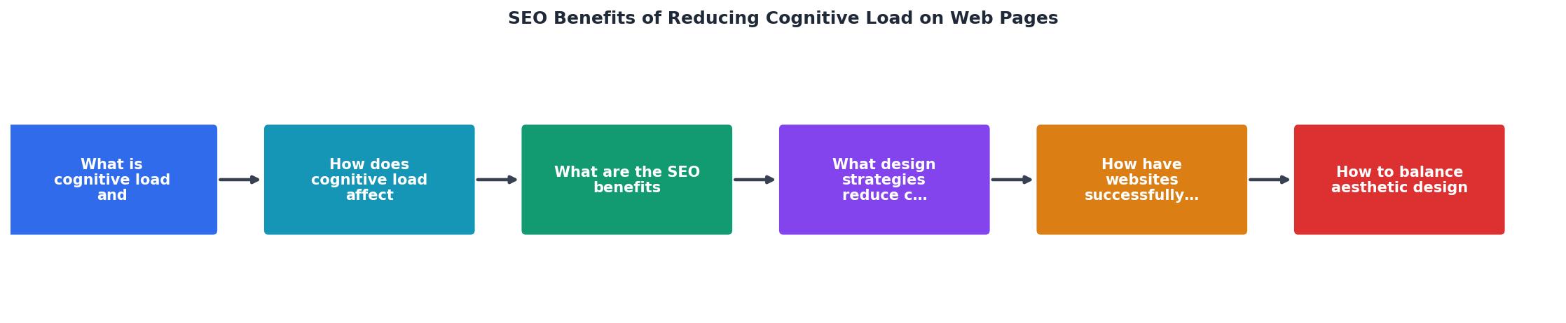
When referencing the diagram: Simplify hierarchy leads to Lower bounce rate, which feeds Better rankings. Front-load answers drives Higher dwell time. Reduce choices improves Deeper scroll depth. Each step in the chain is measurable.
Real-world cognitive load wins
Concrete examples make this tangible. Here are cases where simplifying pages produced SEO-visible results.
GOV.UK rebuilt its entire web presence around plain language and minimal design. The UK Government Digital Service stripped out jargon, reduced page templates to a single column, and limited navigation options. The result: task completion rates jumped, and organic search traffic grew as pages started ranking for queries they previously lost to third-party explainer sites.
Booking.com runs thousands of A/B tests per year, many focused on reducing decision fatigue. Their hotel listing pages progressively disclose information rather than showing everything at once. Filters are contextual. The cognitive load stays manageable even with millions of options, and their organic visibility in travel search is consistently among the highest globally.
Mailchimp redesigned its help documentation to use shorter sentences, clearer headings, and step-by-step formatting. Support page bounce rates dropped, and several help articles began appearing in Google's featured snippets for email marketing queries.
The following interactive card shows a typical before-and-after scenario when cognitive load reduction is applied to a landing page:
Before: High Cognitive Load
After: Reduced Cognitive Load
Balancing aesthetics with usability
A stripped-down page is not automatically a good page. Removing all visual interest creates a different problem: the page feels generic, untrustworthy, or boring. The goal is to use design elements that serve comprehension rather than compete with it.
Purposeful imagery
Stock photos of people shaking hands add zero information. A screenshot showing exactly where to click adds a lot. Every image should either explain something or create an emotional connection that supports the page goal. If it does neither, it is extraneous load.
Progressive disclosure
Show the essential information first. Let visitors expand details on demand. Accordion sections, tabbed content, and "read more" links keep the initial cognitive load low while making depth available. Apple's product pages use this extensively: the hero section is clean and focused, but scrolling reveals layers of technical detail.
Whitespace as a tool
Whitespace is not wasted space. It separates ideas, creates breathing room, and signals hierarchy. Pages with generous margins and padding consistently outperform cramped layouts in usability testing. From an SEO perspective, the improved engagement metrics speak for themselves.
Tools like PagePerson Insights can help identify specific areas where cognitive load is highest on your pages, giving you evidence-based priorities instead of guessing which elements to simplify first.
| High Cognitive Load Design | Low Cognitive Load Design |
|---|---|
| Multiple competing CTAs | Single primary CTA per section |
| Dense paragraphs, no headings | Chunked content with descriptive H2/H3s |
| Autoplay video + animations | User-initiated media |
| 12+ navigation items | 5-7 focused navigation items |
| Inconsistent button styles | Unified design system |
| Information shown all at once | Progressive disclosure |
Cognitive Load Reduction Checklist for SEO
Your progress is saved automatically in your browser.
FAQ
Frequently Asked Questions
Additional Resources
- Web Design Principles that Reduce Cognitive Load - Design choices that reduce cognitive load: faster scanning, fewer errors, and clearer paths to completion across enterprise UX.
- Minimizing Cognitive Load in Web Design for Better UX - Minimizing cognitive load ensures visitors understand, navigate, and act effortlessly. Here are practical strategies to design websites that ...
- Cognitive Load Theory in Website Design & SEO - Lower cognitive load leads to better user engagement signals, longer time on page, more pages per session, and lower bounce rates.