
You simplified your checkout copy, broke a wall of text into scannable chunks, and swapped a confusing icon for a plain label. The page feels better to you. But your gut feeling is not a conversion rate. A/B testing cognitive accessibility changes turns subjective design opinions into revenue data, and this guide walks through every step from metric selection to stakeholder reporting.

- Pick metrics that reflect comprehension, not just clicks: task completion rate, time-on-task, error rate, and form abandonment.
- Design test variations that isolate one cognitive accessibility change at a time so you know exactly what moved the needle.
- Run tests long enough to reach statistical significance (typically two full business cycles), then translate results into revenue impact for stakeholders.
Why A/B test accessibility changes?
Most teams ship accessibility improvements on faith. They follow best practices, push the update, and hope the numbers go up. That approach has two problems. First, you never learn which specific change drove the lift. Second, you cannot defend the investment when someone asks for proof.
A/B testing solves both. You serve the original page to one group and the modified page to another, then compare measurable outcomes. For cognitive accessibility, this means you can quantify how much a clearer heading structure, simplified language, or reduced visual clutter actually improves conversions.
That number is not hypothetical. Nearly half of all visitors encounter cognitive friction on a typical website. Testing lets you measure the exact revenue impact of reducing that friction.
Select the right metrics

Standard A/B tests track conversion rate and bounce rate. Cognitive accessibility tests need more granular signals. Here are the metrics that actually tell you whether comprehension improved:
- Task completion rate tracks the percentage of users who finish a defined goal (signup, purchase, form submission) without abandoning or backtracking.
- Time-on-task measures how long users spend completing a step. A drop usually means the step got easier to understand.
- Error rate counts incorrect form entries, wrong button clicks, or repeated actions. Fewer errors signal clearer UI.
- Form abandonment rate shows where users give up mid-flow. Cognitive overload is the top cause of mid-form exits.
- Rage clicks and dead clicks reveal frustration. Tools like FullStory or Hotjar capture these automatically.
- Scroll depth on key sections indicates whether simplified copy keeps readers engaged deeper into the page.
Most teams stop at conversion rate alone. Adding comprehension-specific metrics gives you a complete picture of what changed and why.
Design effective test variations

The golden rule: change one cognitive accessibility variable per test. If you rewrite the headline, simplify the body copy, and add a progress bar all at once, you will never know which change mattered.
Effective single-variable tests:
- Readability level. Variant A uses your current copy. Variant B rewrites it at a 6th-grade reading level using the Hemingway App or similar tool.
- Information chunking. Variant A shows a long paragraph. Variant B breaks it into bullet points with bold lead-ins.
- Navigation labels. Variant A uses "Solutions" (vague). Variant B uses "Pricing Plans" (specific).
- Form complexity. Variant A presents all fields on one page. Variant B splits them into a three-step wizard with a progress indicator.
- Color contrast and font size. Variant A uses 14px body text at 4.2:1 contrast. Variant B uses 16px at 7:1 contrast.
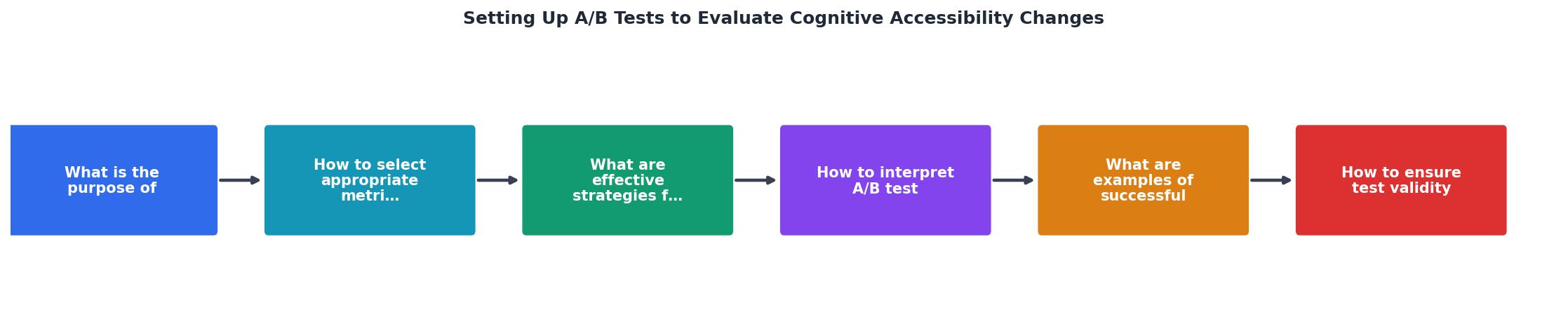
The process follows a clear sequence: Identify barrier leads to Hypothesize fix, then Build variation, Run test, Analyze results, and finally Ship or iterate. Each step feeds the next, and the loop restarts whenever results are inconclusive.
Interpret A/B test results

Raw numbers lie without context. Here is how to read your results correctly:
Statistical significance first. Do not call a winner until you hit at least 95% confidence. Tools like Google Optimize (sunset, but alternatives like VWO, Optimizely, or Convert exist), AB Tasty, and Statsig calculate this automatically. A 5% lift at 80% confidence is noise, not signal.
Segment by audience. Cognitive accessibility changes often produce outsized gains for specific segments: mobile users, users over 55, users on slow connections, or users arriving from paid ads (who have less context than organic visitors). Break your results down by device, traffic source, and geography.
Watch for metric conflicts. Sometimes time-on-page goes up while conversion also goes up. That can mean users are reading more carefully and converting with higher intent. Or it can mean the page got harder to scan. Cross-reference with scroll depth and error rate to disambiguate.
"First we guess it; then we compute the consequences of the guess, then we compare the result with the experiment.">, How to Conduct A/B Testing in 2026: A Practical Guide for Experimenters
Translate to revenue. Stakeholders do not care about p-values. If your test shows a 12% lift in task completion on a checkout page that processes $200K/month, that is $24K/month in recovered revenue. Lead with that number.
Real-world examples
Three patterns show up repeatedly when teams test cognitive accessibility changes:
1. Simplified pricing page copy. An e-commerce SaaS rewrote its pricing page from a Flesch-Kincaid grade 12 to grade 7. Task completion (selecting a plan and starting checkout) increased by 17%. Time-on-page dropped by 22 seconds, meaning users understood faster and acted sooner.
2. Progress indicators on multi-step forms. A DTC brand added a three-step progress bar to its checkout flow. Form abandonment dropped by 9%. The progress bar reduced working memory load by showing users where they were and how much remained.
3. Icon-to-label swap in navigation. A fintech startup replaced ambiguous hamburger-menu icons with text labels ("Menu", "Account", "Help"). Mobile task completion rose by 14%, with the largest gains among users over 50.
These are not edge cases. They are the kind of changes you can test in a single sprint using any mainstream A/B testing platform.
PagePerson Insights can help you identify which pages carry the highest cognitive load before you even write your first test hypothesis, so you focus testing effort where it will move revenue most.
The following dashboard illustrates what a typical A/B test result comparison looks like when you track cognitive accessibility metrics alongside standard conversion data:
A/B Test Results: Simplified Checkout Copy
Ensure test validity
Running a test is easy. Running a valid test takes discipline. These are the most common mistakes that invalidate cognitive accessibility A/B tests:
- Insufficient sample size. Use a calculator (Evan Miller's is free) before you start. Most cognitive accessibility tests need 3,000+ sessions per variant to detect a 5% lift.
- Stopping early. Peeking at results daily and stopping when you see a winner inflates your false positive rate. Set a minimum runtime and stick to it.
- Testing during anomalies. A product launch, holiday sale, or viral social post skews traffic composition. Run tests during normal traffic periods.
- Ignoring mobile vs. desktop splits. Cognitive load differs dramatically by device. A change that helps mobile users might be neutral on desktop. Segment results.
That number is not exaggerated. Research on A/B testing practices consistently shows that early stopping is the single biggest source of false wins.
A/B Test Validity Checklist
Your progress is saved automatically in your browser.
FAQ
Frequently Asked Questions
Additional Resources
- A/B testing: A systematic literature review - Initial options include A/B test alteration (adjusting individual A/B tests), A/B test triggering (starting subsequent A/B tests manually), A/B test supervision ...
- How to Conduct A/B Testing in 2026 - A/B testing is easy to run but hard to do well. This guide shows how to design, analyze, and scale experiments you can trust in 2026.
- A/B Testing 101 - 4 Steps for Setting Up an A/B Test · 1. Start with a Hypothesis · 2. Define the Changes to Make · 3. Choose Outcome Metrics · 4. Determine the ...