

Every extra toggle, plan comparison, or optional field on your SaaS signup page costs you conversions. Visitors arrive with a finite budget of mental energy, and the moment your form asks them to think too hard, they leave. This article breaks down exactly where decision fatigue creeps into signup flows, how to strip it out, and what measurable gains you can expect when you do.

- Decision fatigue on SaaS signup pages is the single biggest silent conversion killer: too many choices, unclear copy, and premature plan selection drain visitor willpower before they ever click "Start."
- Reducing form fields, deferring plan choice to post-signup, and using progressive disclosure can lift signup conversion by 20-40%.
- A clear visual hierarchy with one primary CTA per screen eliminates the cognitive overhead that sends prospects back to Google.
Why signup clarity matters now
Paid acquisition costs keep climbing. The average cost-per-click for SaaS keywords sits well above $3 in most verticals, and some competitive terms push past $15. When you spend that kind of money driving traffic to a signup page that confuses people, you are literally burning cash.
The problem is not that founders and product teams are careless. The problem is that they know their own product too well. They see three pricing tiers and think "clear options." A first-time visitor sees three pricing tiers and thinks "which one is right for me, and what happens if I pick wrong?" That gap between internal clarity and external confusion is where conversions die.
Decision fatigue is the deterioration of decision quality after a long session of decision-making. Psychologist Roy Baumeister's research established that willpower is a depletable resource. Your signup page is rarely the first decision a visitor makes that day. By the time they land on your form, they have already chosen what to eat, which emails to answer, and which of your competitors to skip. Every unnecessary question you ask chips away at whatever decision-making energy they have left.
"The uncomfortable truth is this: Most products don't fail because of bad visuals.">, Reducing Decision Fatigue in UX Design
They fail because the signup experience asks too much, too soon.
Common mistakes that drain visitors

Most SaaS signup pages share the same handful of design mistakes. Recognizing them is the first step to fixing them.
- Forcing plan selection before signup. Basecamp famously moved plan choice to after account creation. The visitor's first job is to try the product, not to predict their future usage. Asking "which plan?" before someone has experienced value creates anxiety and stalls momentum.
- Showing all options at once. A pricing page with four tiers, annual/monthly toggles, add-on checkboxes, and a "Contact Sales" button gives the visitor six or more simultaneous decisions. That is not transparency. That is a wall.
- Requiring unnecessary fields. Phone number, company size, job title, "How did you hear about us?" Each field is a micro-decision. Typeform found that reducing form fields from 11 to 4 increased completion rates by over 120%.
- Vague or competing CTAs. "Start Free Trial," "Book a Demo," "Talk to Sales," and "See Pricing" all visible on the same screen. The visitor does not know which path is right, so they pick none.
- No default selections. When you present radio buttons or dropdowns without a pre-selected default, you force an active choice. Defaults reduce friction because they let the visitor accept rather than decide.
Step-by-step: strip decision fatigue
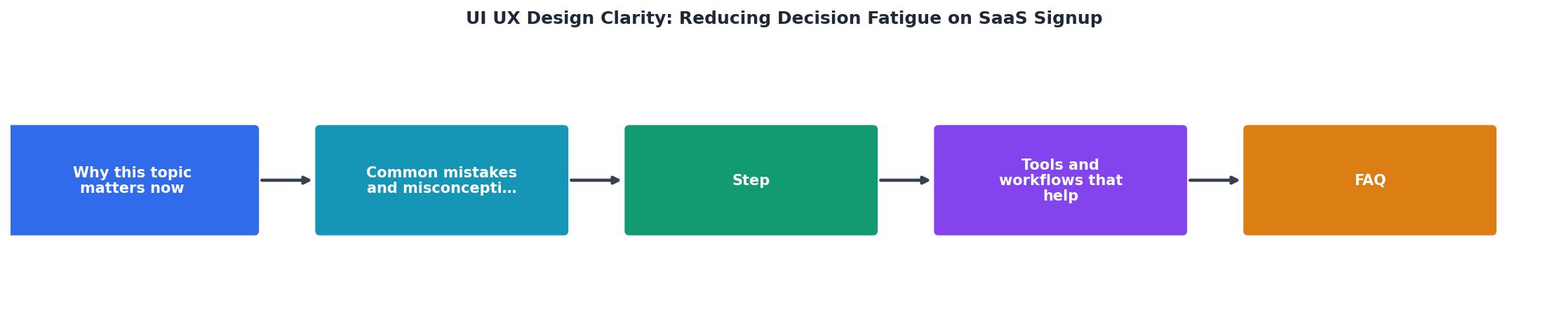
Follow these steps in order. Each one builds on the previous.
Audit current decisions
Open your signup flow in an incognito browser. Screenshot every screen from landing page to dashboard. On each screenshot, circle every point where the visitor must choose, type, or click. Count them. Write the number down.
Eliminate non-essential fields
For each field, ask: "Do I need this before the user gets value?" Name and email are usually enough. Everything else can wait until onboarding or first use. Stripe's initial signup asked for just an email address. That is not an accident.
Defer plan selection
If you offer a free trial, let everyone start on the same plan. Show upgrade options after the user has experienced the product. Slack, Notion, and Linear all follow this pattern. The user signs up, uses the tool, and hits a natural upgrade trigger (team size, storage, features) rather than guessing upfront.
Reduce CTAs to one per screen
One screen, one action. The signup page has one job: get the visitor to create an account. "Start Free Trial" is the only button that matters. Move "Book a Demo" to a separate page or a small text link below the fold.
Use progressive disclosure
Show information only when it becomes relevant. Instead of displaying all plan features in a comparison table on the signup page, let users discover features inside the product. Tooltips, contextual banners, and in-app prompts replace the need for upfront information overload.
Set smart defaults
Pre-select the most popular plan. Pre-fill country based on IP. Default the toggle to monthly billing (lower perceived commitment). Every default you set is one fewer decision the visitor has to make.
Tools and workflows that help

You do not need a full usability lab to diagnose decision fatigue. A few targeted tools cover most of the ground.
- Hotjar or Microsoft Clarity for session recordings. Watch real visitors hesitate, scroll back up, or rage-click on your signup page. Hesitation patterns reveal exactly where cognitive load spikes.
- Google Optimize (or VWO/Optimizely) for A/B testing reduced-field variants. Run a test with your current form against a stripped-down version. Let the data settle the internal debate.
- PagePerson Insights to scan your signup page for cognitive accessibility barriers. It flags issues like competing CTAs, dense copy blocks, and unclear hierarchy that standard analytics tools miss entirely.
- Figma with the Stark plugin for checking contrast and readability during design. Cognitive clarity starts in the design file, not after launch.
Signup Page Cognitive Load Audit
Example: before/after optimization on a B2B SaaS signup page
Measure what you changed

Reducing decision fatigue is not a one-time project. It is a continuous loop of audit, change, measure, repeat.
Track these metrics after each change:
- Signup completion rate (form starts vs. account created). This is your primary metric.
- Time to completion. Shorter is usually better, but watch for users who complete in under 3 seconds. They might be bots.
- Drop-off by field. If you use multi-step forms, identify which step loses the most people.
- Post-signup activation rate. A simpler signup means nothing if users create accounts and never return. Make sure you are not just moving the friction downstream.
Run each test for at least two full business weeks before drawing conclusions. Weekday and weekend traffic behave differently, and you need both cycles in your data.
Signup clarity checklist
SaaS Signup Decision Fatigue Audit
Your progress is saved automatically in your browser.
FAQ
Frequently Asked Questions
What is the single biggest source of friction on your signup page right now? Count your decision points this week and see what you find.
Additional Resources
- Reducing Decision Fatigue in UX Design | Success Joel ... - Simple ways to reduce it: • Add microcopy that explains actions • Show outcomes before commitment • Make irreversible actions obvious • Use ...
- Avoiding Decision Fatigue: UX Design Tips for Benefits ... - Reducing decision fatigue starts with empathy and design clarity. When employees can explore benefits confidently, they make better, more informed choices.
- Decision Fatigue: Simplifying User Choices Through Design - Simplifying choices not only combats decision fatigue but also enhances the user experience. When users can make decisions effortlessly, they ...