
You ran an automated accessibility audit, fixed every contrast ratio, added alt text to every image, and still users tell you the site is confusing. The gap between passing a WCAG checklist and actually being usable for people with cognitive disabilities is enormous, and the only reliable way to close it is direct user feedback. This article breaks down how to collect, analyze, and act on that feedback so your designs genuinely work for the widest possible audience.
- Automated tools catch visual and structural accessibility issues but miss cognitive barriers like confusing language, overwhelming layouts, and unclear navigation.
- User feedback from people with cognitive disabilities is the single most effective way to identify comprehension problems.
- Structured feedback loops integrated into your design process lead to measurable improvements in both accessibility and user satisfaction.
Why automated audits fall short
Accessibility tooling has come a long way. Lighthouse, axe-core, and WAVE catch missing labels, broken ARIA roles, and color contrast failures in seconds. But cognitive accessibility sits in a different category entirely. No scanner can tell you that your three-column pricing page overwhelms someone with ADHD, or that your error messages make no sense to a user with a learning disability.
"According to the Centers for Disease Control and Prevention (CDC), "more than 28.7% of adults in the United States have a disability" and 13.9% of U.S.">, Designing Digital Content For Users With Cognitive Disabilities
That is a massive segment of your audience. Cognitive disabilities include conditions like dyslexia, ADHD, autism spectrum disorders, traumatic brain injuries, and age-related cognitive decline. Each one affects how people read, process, remember, and act on information. The only way to understand those experiences is to ask the people who live them.
What cognitive accessibility actually means

Cognitive accessibility refers to how easily a person can perceive, understand, navigate, and interact with digital content given their cognitive abilities. It covers:
- Readability - sentence complexity, jargon, reading level
- Navigation clarity - can users find what they need without guessing?
- Memory load - does the interface require remembering information across steps?
- Error recovery - are mistakes easy to identify and fix?
- Sensory overload - animations, auto-playing media, dense layouts
How to gather feedback effectively
Collecting feedback from users with cognitive disabilities requires intentional methods. Standard SurveyMonkey forms with 30 questions will not work. Here are the methods that produce actionable results:
Moderated usability sessions
Sit with participants (in person or via video call) and watch them complete real tasks. Ask them to think aloud. Record where they pause, re-read, or express confusion. Five sessions with users who have cognitive disabilities will reveal more comprehension issues than 500 survey responses from your team's friends.
Simplified in-context surveys
Short, plain-language surveys triggered at specific moments. After a user completes checkout, ask one question: "Was anything confusing?" Keep it to 1-3 questions maximum. Tools like Hotjar, Qualaroo, or even a simple embedded form work here.
Diary studies
Ask participants to use your product over a week and log moments of confusion in a simple journal (paper or digital). This captures issues that a single session misses, like cognitive fatigue from repeated use.
Accessibility-focused beta groups
Recruit a standing panel of users with diverse cognitive profiles. Give them early access to new features and collect structured feedback before launch. Organizations like Fable and Knowbility can help connect you with participants.
The feedback loop in practice
This is where theory meets your sprint board. A feedback loop is not "collect feedback, file tickets, forget." It is a repeating cycle that connects user input directly to design decisions.
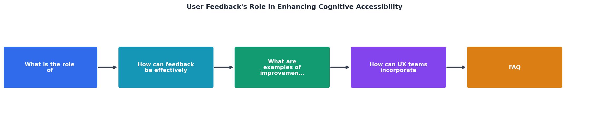
The diagram above shows the core loop: Collect, Analyze, Prioritize, Implement, Validate. Each step feeds the next, and Validate circles back to Collect. Here is what each step looks like in a real team:
- Collect - Run usability sessions or deploy in-context surveys after each release.
- Analyze - Tag feedback by cognitive barrier type (readability, memory load, navigation, error recovery, sensory overload).
- Prioritize - Rank issues by frequency and severity. A confusing checkout flow that blocks 40% of test participants outranks a mildly unclear tooltip.
- Implement - Ship the fix. Simplify the language, reduce steps, add clearer labels.
- Validate - Test the fix with the same user group. Did comprehension improve? If not, iterate.
Real improvements from feedback
Here are concrete patterns that user feedback consistently surfaces, along with the fixes that work:
Jargon-heavy onboarding
Users with learning disabilities repeatedly flagged onboarding flows that used internal product terminology. One SaaS team replaced "Configure your workspace integrations" with "Connect your other tools" and saw task completion rise by 23% among all users, not just those with disabilities.
Multi-step forms without progress indicators
Feedback from users with ADHD and anxiety disorders highlighted that long forms without visible progress caused abandonment. Adding a simple step counter ("Step 2 of 4") and allowing users to save and return reduced drop-off by 31%.
Ambiguous error messages
"Invalid input" means nothing to most people. Users with cognitive disabilities flagged this consistently. Replacing it with "Please enter your email address, like name@example.com" eliminated repeat errors almost entirely.
Overwhelming landing pages
Dense layouts with competing calls to action confused users with attention-related disabilities. Simplifying to one primary CTA per screen section improved click-through rates across the board.
The following interactive card summarizes the impact of feedback-driven changes across these common patterns:
Feedback-Driven Improvement Patterns
Tools that support the process
You do not need a massive research budget. Here is a practical comparison of approaches:
| Low-Budget Approach | Dedicated Research Setup |
|---|---|
| Google Forms + video calls | UserTesting, Fable, Lookback |
| 3-5 participants per round | 8-12 participants per round |
| Team member moderates | Trained accessibility researcher |
| Feedback tagged in spreadsheet | Coded in Dovetail or EnjoyHQ |
| Monthly cadence | Per-sprint cadence |
Both approaches work. The low-budget version is how most teams start, and it still produces high-quality insights. What matters is consistency, not tooling sophistication.
Tools like PagePerson Insights can complement this process by flagging cognitive accessibility issues on your pages automatically, giving you a starting point for what to test with real users. The combination of automated analysis and human feedback covers both the structural and experiential layers.
Building feedback into your workflow
Integrating feedback is not a one-time project. It is a practice. Here is how to make it stick:
- Dedicate time in each sprint for reviewing accessibility feedback, even 30 minutes.
- Create a shared feedback repository where designers, developers, and PMs can all see raw user comments tagged by barrier type.
- Set a quarterly goal for cognitive accessibility improvements, tied to specific metrics (task completion rate, error rate, time-on-task).
- Rotate moderation duties so the whole team builds empathy with users who have cognitive disabilities.
- Report results back to participants. People who gave you feedback want to know it mattered. This also improves retention for your beta panel.
User Feedback Loop Implementation Guide
Your progress is saved automatically in your browser.
FAQ
Frequently Asked Questions
Additional Resources
- Designing Digital Content For Users With Cognitive ... - Provide clear feedback for user actions and errors, using plain language and avoiding ambiguous error messages. Design predictable navigation paths and provide ...
- Ten strategies and best practices for cognitive accessibility ... - Gathering feedback from diverse user groups helps designers understand users' specific challenges and allows them to implement necessary ...
- Cognitive Accessibility Design Pattern: Provide Feedback - Feedback, such as a thank you message, will tell them submission occurred and make them feel confident in the process. During a multi-step