
You redesigned the onboarding flow, ran it past the team, and everyone agreed it looked clean. Then real users started dropping off at step two. The gap between what designers assume is clear and what actual people experience is where cognitive accessibility breaks down, and user feedback is the only reliable bridge across that gap.

- User feedback exposes cognitive load problems that analytics and automated audits miss entirely.
- Structured feedback loops (collect, analyze, prioritize, implement, re-test) turn subjective confusion into measurable design improvements.
- Inclusive sampling, lightweight surveys, and task-based usability tests are the most effective methods for surfacing comprehension barriers.
Why feedback drives cognitive accessibility
Automated accessibility checkers catch contrast ratios, missing alt text, and heading hierarchy. They do not catch a user with ADHD losing track of a multi-step form, or someone with low digital literacy misunderstanding a button label. Cognitive accessibility covers comprehension, memory load, attention demands, and decision complexity. These are human problems, and they require human signals.
Feedback fills the gap between what WCAG conformance reports tell you and what people actually experience. A color-contrast pass does not mean a user understood your pricing page. A screen-reader-compatible nav does not mean someone with anxiety could complete checkout without abandoning the cart.
That number is not hypothetical. It accounts for people dealing with situational stress, cognitive fatigue, language barriers, learning disabilities, and attention disorders. Feedback from these users is not a nice-to-have. It is the primary data source for cognitive accessibility work.
How to gather the right feedback
Not all feedback is equal. A five-star rating tells you almost nothing about cognitive load. You need methods that surface why someone got confused, not just that they were unhappy.
Task-based usability testing
Give participants a specific goal ("Sign up for the free trial") and observe where they hesitate, re-read, or backtrack. Record think-aloud sessions. The moments of silence or visible frustration are your data points.
In-context micro-surveys
Tools like Hotjar, Qualaroo, or custom intercepts can trigger a single question at the exact moment a user lingers on a page. "Was anything on this page confusing?" with a free-text field produces more actionable data than a post-visit NPS score.
Accessibility-focused feedback panels
Recruit testers who represent the cognitive diversity of your actual audience. This means including people with dyslexia, ADHD, anxiety disorders, older adults, and non-native speakers.
"A good target is to incorporate inclusive sampling into all research projects, at least 15% of usability testers should have a permanent, temporary or situational disability.">, Leveraging User Feedback For Inclusive Design
Session recordings with annotation
Platforms like FullStory or Microsoft Clarity let you watch real sessions and tag moments of confusion. Look for rage clicks, rapid scrolling, and repeated visits to the same section. These behavioral signals complement direct verbal feedback.
Here is a quick comparison of common methods:
| Method | Cognitive Load Signal | Cost | Speed |
|---|---|---|---|
| Task-based usability test | High (direct observation) | Medium | Slow |
| In-context micro-survey | Medium (self-reported) | Low | Fast |
| Session recordings | Medium (behavioral inference) | Low | Medium |
| Accessibility panel | High (diverse perspectives) | High | Slow |
| Post-visit survey | Low (recall bias) | Low | Fast |
Analyzing feedback for cognitive patterns

Raw feedback is noise until you categorize it. The goal is to identify recurring cognitive friction patterns, not individual complaints.
Tag by cognitive barrier type
Create a simple taxonomy:
- Comprehension - user did not understand the content or terminology
- Memory load - user had to remember too much information across steps
- Decision overload - too many options or unclear next action
- Attention fragmentation - distractions, competing elements, unclear hierarchy
- Navigation confusion - user could not find what they needed
Quantify severity and frequency
A single user confused by jargon on a pricing page is an anecdote. Twelve users confused by the same term is a design defect. Track both how often a pattern appears and how much it blocks task completion.
In most feedback audits, comprehension problems (unclear labels, jargon, ambiguous instructions) dominate. This is good news: they are also the cheapest to fix.
Prioritize by impact on task completion
Not every piece of feedback deserves a sprint ticket. Rank issues by:
- Frequency - how many users reported or exhibited this problem
- Severity - did it cause abandonment, or just mild confusion
- Fix effort - copy change vs. full redesign
Building a feedback loop into design

A one-time usability study is useful. A continuous feedback loop is transformative. The difference is whether cognitive accessibility improves once or keeps improving with every release.
The following diagram shows the five-step cycle that keeps feedback flowing into design decisions:
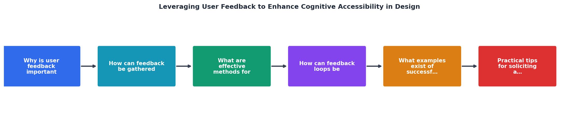
The steps in the cycle are: Collect feedback from diverse users, Analyze it by tagging cognitive barrier types, Prioritize issues by frequency and severity, Implement targeted fixes, and Re-test with the same user groups to validate improvements. Then the loop restarts.
Embed collection points in the product
Do not wait for quarterly research rounds. Add persistent, low-friction feedback mechanisms:
- A "Was this page helpful?" widget on documentation and key flows
- A post-task question after checkout, signup, or onboarding completion
- An optional accessibility feedback link in the footer
Schedule regular analysis cadences
Weekly or biweekly, someone on the team reviews new feedback, tags it, and updates the priority list. This takes 30-60 minutes. Without a cadence, feedback piles up unread.
Close the loop with users
When you fix something based on feedback, tell the people who reported it. This builds trust and encourages future participation. A simple email ("We simplified the checkout labels based on your feedback") goes a long way.
Real examples of feedback-driven improvements
Concrete cases show what this looks like in practice.
GOV.UK rebuilt its entire content strategy around user feedback and usability testing. Their research team observed that users with low literacy struggled with long paragraphs and passive voice. The fix: short sentences, active voice, reading-level targets. The result was measurably higher task completion rates across all user groups, not just those with disabilities.
Booking.com runs thousands of A/B tests annually, many triggered by user feedback about confusing pricing displays and overwhelming option lists. Their iterative approach to reducing decision overload (fewer visible options, clearer default selections) directly improved conversion.
Slack redesigned its onboarding after feedback revealed that new users felt overwhelmed by channels, threads, and DMs appearing simultaneously. The staged onboarding that replaced it introduced one concept at a time, reducing cognitive load for first-time users.
These are not accessibility-specific projects in the traditional sense. They are cognitive accessibility improvements driven by listening to what users actually struggled with.
The dashboard below shows an example of how feedback categories typically distribute across a product audit. This kind of breakdown helps teams see where cognitive barriers concentrate.
Feedback Audit: Cognitive Barrier Distribution
Practical tips for better feedback
Getting useful feedback requires intentional design of the feedback process itself.
- Ask specific questions. "Was anything confusing?" beats "How was your experience?" every time.
- Time your asks. Trigger surveys immediately after a task, not days later when memory fades.
- Lower the effort. One question with a text field outperforms a 10-question survey in response rate and honesty.
- Diversify your testers. If your test group is all 25-35 tech-savvy English speakers, you are testing for yourself, not your audience.
- Combine qualitative and quantitative. Session recordings show what happened. Surveys and interviews explain why.
- Share findings visibly. Post a monthly "top 5 cognitive friction points" in your team channel. Visibility creates accountability.
User Feedback for Cognitive Accessibility Checklist
Your progress is saved automatically in your browser.
FAQ
Frequently Asked Questions
What cognitive accessibility barrier has user feedback helped you uncover in your own product? Share your experience in the comments.
You redesigned the onboarding flow, ran it past the team, and everyone agreed it looked clean. Then real users started dropping off at step two. The gap between what designers assume is clear and what actual humans find confusing is where cognitive accessibility lives, and user feedback is the only reliable bridge across that gap.

- User feedback exposes cognitive load problems that analytics and automated audits miss entirely.
- Structured feedback loops (collect, analyze, prioritize, implement, re-test) turn subjective complaints into measurable design improvements.
- Inclusive sampling, lightweight surveys, and task-based usability tests are the most effective methods for surfacing comprehension barriers.
Why feedback drives cognitive accessibility
Automated accessibility checkers catch contrast ratios, missing alt text, and heading hierarchy. They do not catch a user with ADHD losing track of a multi-step form, or someone with low digital literacy misunderstanding a button label. Cognitive accessibility covers the comprehension, memory, and attention demands a design places on people. The only way to measure those demands accurately is to watch and listen to the people experiencing them.
Designers often rely on heuristic evaluations or internal reviews. Those help, but they carry a built-in bias: the team already knows how the product works. Feedback from real users, especially users with diverse cognitive profiles, reveals friction that no internal review can replicate.
That number is not hypothetical. A significant portion of any audience deals with situational or permanent cognitive challenges: stress, fatigue, unfamiliar language, ADHD, dyslexia, anxiety. Ignoring their feedback means designing for a narrow slice of your actual user base.
How to gather the right feedback

Not all feedback is equally useful. A five-star rating tells you almost nothing about cognitive load. You need methods that surface why someone struggled, not just that they did.
Task-based usability testing
Give participants a specific goal ("Sign up for a free trial") and observe where they hesitate, re-read, or abandon. Record think-aloud sessions. The pauses and backtracking reveal cognitive friction points that click data alone cannot explain.
In-context micro-surveys
Place a single-question survey at the exact moment of potential confusion. Examples:- "Was this step clear?" (yes/no + optional text)
- "What did you expect to happen next?"
- "Rate how easy this page was to understand" (1-5 scale)
Inclusive participant recruitment
"A good target is to incorporate inclusive sampling into all research projects, at least 15% of usability testers should have a permanent, temporary or situational disability.">, Leveraging User Feedback For Inclusive Design
This is not a nice-to-have. If your test group only includes tech-savvy 28-year-olds, you will miss the exact problems cognitive accessibility aims to solve. Recruit participants with varying levels of digital literacy, attention profiles, and language backgrounds.
Open feedback channels
Support tickets, chat transcripts, and app store reviews contain unfiltered cognitive accessibility signals. Users rarely say "the cognitive load is too high." They say "I couldn't figure out where to click" or "this page is confusing." Those phrases are gold.
Analyzing feedback for cognitive patterns
Raw feedback is noisy. You need a system to extract cognitive accessibility insights from it.
Tag and categorize
Create a tagging taxonomy specific to cognitive issues:
- Comprehension failure - user did not understand what a label, instruction, or element meant
- Memory overload - user forgot earlier information needed for a later step
- Attention loss - user got distracted or lost their place in a flow
- Decision fatigue - too many options caused hesitation or abandonment
- Navigation confusion - user could not find the next step or expected destination
Quantify the qualitative
Pair qualitative tags with quantitative data. If users report confusion on a specific page, check the analytics for that page: time on page, scroll depth, exit rate. The combination of "users say it's confusing" and "analytics show 60% exit rate" creates a compelling case for redesign.
Severity scoring
Not every piece of feedback warrants immediate action. Score issues by:- Frequency - how many users report it
- Impact - does it cause task failure or just mild annoyance
- Affected population - does it disproportionately affect users with cognitive disabilities
The following dashboard illustrates how tagged feedback data might look after a round of usability testing on a typical SaaS onboarding flow:
Cognitive Feedback Tags, Onboarding Flow
Building a feedback loop into design

Collecting feedback once is a project. Collecting it continuously is a system. The difference determines whether cognitive accessibility improves over time or decays after launch.
The process follows five repeating stages:
- Collect - gather feedback through surveys, usability tests, support tickets, and analytics
- Analyze - tag issues by cognitive category, score severity
- Prioritize - rank by frequency, impact, and affected population
- Implement - redesign the specific element causing friction
- Re-test - validate the fix with the same feedback methods
| One-Time Feedback | Continuous Feedback Loop |
|---|---|
| Snapshot of issues at launch | Ongoing detection of new friction |
| Fixes based on assumptions | Fixes validated by re-testing |
| Team forgets after shipping | Cognitive accessibility stays on the roadmap |
| No baseline for comparison | Measurable improvement over time |
Real examples of feedback-driven improvements
Concrete cases show what this looks like in practice.
GOV.UK rebuilt its service pages after extensive usability testing with users who had low digital literacy. Feedback revealed that users did not understand bureaucratic language or multi-column layouts. The redesign used single-column layouts, plain language, and one action per page. Task completion rates improved significantly across all user groups.
Mailchimp simplified its campaign builder after user feedback consistently flagged the "too many options" problem. They reduced visible settings, introduced progressive disclosure (showing advanced options only when requested), and rewrote labels in plain language. The result: fewer support tickets about "how do I send a campaign" and faster time-to-first-send for new users.
Duolingo runs continuous A/B tests informed by user feedback on lesson difficulty. When users report feeling overwhelmed, the team adjusts lesson length, hint frequency, and vocabulary load. This feedback-driven iteration keeps cognitive load manageable across skill levels.
Tools like PagePerson Insights can accelerate this process by analyzing pages for cognitive accessibility barriers before you even start collecting feedback, giving you a baseline to measure against.
Practical tips for better feedback
Getting useful cognitive accessibility feedback requires deliberate effort. Here are methods that consistently produce actionable results:
- Ask about understanding, not satisfaction. "Did you understand what to do next?" beats "How satisfied are you?" every time.
- Test with real tasks, not hypotheticals. "Book an appointment using this page" reveals more than "What do you think of this design?"
- Record the environment. A user testing on a phone during a commute faces different cognitive demands than someone at a desk. Context matters.
- Close the loop with participants. Tell testers what changed because of their feedback. This builds trust and improves future participation rates.
- Separate aesthetic feedback from comprehension feedback. "I don't like the color" is different from "I didn't notice the button." Track them separately.
User Feedback for Cognitive Accessibility Checklist
Your progress is saved automatically in your browser.
FAQ
Frequently Asked Questions
Additional Resources
- Leveraging User Feedback For Inclusive Design - Leveraging user feedback for inclusive design means gathering insights directly from people with a range of abilities and backgrounds to create products and ...
- Ten strategies and best practices for cognitive accessibility ... - Gathering feedback from diverse user groups helps designers understand users' specific challenges and allows them to implement necessary ...
- Designing Digital Content For Users With Cognitive ... - Provide clear feedback for user actions and errors, using plain language and avoiding ambiguous error messages. Design predictable navigation paths and provide ...