
Most accessibility audits stop at contrast ratios and alt text. The cognitive layer, where users with ADHD, dyslexia, anxiety, or low digital literacy actually lose track of what a page is asking them to do, rarely gets the same structured attention. User personas built around cognitive diversity change that. They turn vague complaints like "the flow is confusing" into specific, defensible design decisions backed by evidence your stakeholders can read.

- User personas that include cognitive profiles (attention span, reading level, memory load tolerance, anxiety triggers) give design teams a concrete reference point for every layout, copy, and interaction decision.
- Building these personas requires real user research, not assumptions, and they must be maintained as living documents.
- When done right, cognitive personas bridge the gap between WCAG compliance checkboxes and genuinely inclusive experiences.
Why standard personas fall short
A typical persona sheet lists demographics, goals, frustrations, and a stock photo. It might say "Sarah, 34, marketing manager, wants to compare pricing quickly." That tells you what she wants. It tells you nothing about how her brain processes the page.
Cognitive accessibility covers a wide range of real conditions: working memory limits, difficulty parsing dense text, sensitivity to motion, trouble maintaining focus across multi-step forms. Standard personas ignore all of this. The result? Designers optimize for an idealized user who reads every word, remembers every field, and never gets overwhelmed.
That gap is where real users drop off. And it is exactly where cognitive personas earn their place in your design toolkit.
What are cognitive accessibility personas?
Cognitive accessibility personas are user profiles that explicitly document how a person processes information, not just what they want to accomplish. They extend traditional personas with fields like:
- Attention profile: Can they sustain focus for a 6-step checkout, or do they need progress indicators and the ability to save mid-flow?
- Reading and comprehension level: Do they scan headings or read linearly? What reading grade level matches their comfort zone?
- Memory load tolerance: How many options can they hold in working memory before decision fatigue kicks in?
- Anxiety and error sensitivity: Does a vague error message ("Something went wrong") cause them to abandon the task entirely?
- Sensory preferences: Do animations help orientation or trigger distraction?
How to build cognitive personas

Building these personas is not guesswork. It requires structured research, synthesis, and validation. Here is the process at a glance:
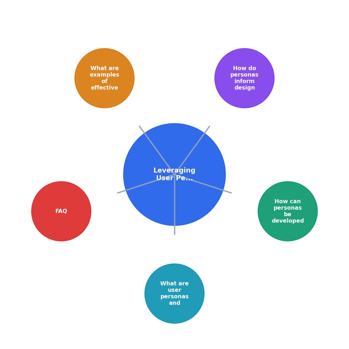
The steps break down as follows:
- Recruit diverse participants. Screen for cognitive diversity explicitly. Include people with ADHD, dyslexia, anxiety disorders, age-related cognitive changes, and varying digital literacy. Five to eight participants per cognitive profile is a solid starting point.
- Run task-based sessions. Give participants real tasks on your product. Observe where they pause, re-read, backtrack, or abandon. Record think-aloud commentary.
- Map cognitive friction points. For each session, note the specific cognitive barrier: was it memory overload, unclear language, too many choices, missing feedback, or disorienting navigation?
- Cluster patterns into profiles. Group similar cognitive behaviors. You will typically find 3 to 5 distinct cognitive profiles across your user base.
- Draft persona documents. Write each persona with the cognitive fields listed above. Include direct quotes from research sessions.
- Validate with stakeholders. Present personas to product managers, developers, and content writers. Adjust language so every team member can use them without accessibility expertise.
- Integrate into design workflow. Pin personas to your design system documentation. Reference them in design reviews and sprint planning.
How personas guide design decisions
Once cognitive personas exist, they change how you evaluate every design choice. Here are concrete examples:
Navigation structure. A persona with low working memory tolerance tells you that mega-menus with 40+ links are hostile. You simplify to grouped categories with clear labels, and you add a persistent search bar.
Form design. A persona with high anxiety sensitivity means inline validation must use encouraging language ("Almost there, just fix the email format") instead of red error text with no guidance.
Content hierarchy. A persona who scans rather than reads linearly needs front-loaded headings, bullet points, and bold key terms. Long paragraphs without visual anchors will lose them.
Progress indicators. A persona with attention difficulties needs explicit step counts ("Step 2 of 4") and the ability to save progress. Without these, a multi-page flow becomes a trap.
The following interactive card shows how a single persona profile translates into specific, actionable design requirements:
Persona: "Jamie", Cognitive Profile
Design implications
Real-world persona examples
The U.S. Section 508 program publishes sample personas that include users with cognitive and learning disabilities. These personas specify concrete needs like content zoom requirements:
"Ensure there is a mechanism to resize, scale, or zoom in on the content at least to 200% of original size without loss of content or functionality.">, Sample Personas for Users With Disabilities
GOV.UK built accessibility personas that include users with dyslexia, screen magnifier users, and people with low digital literacy. Their design system directly references these personas in component documentation. When a developer picks up a form component, the docs explain which persona benefits from each feature (like the character count helper or the error summary at the top of the page).
BBC created cognitive accessibility guidelines tied to persona research. Their iPlayer team used personas representing users with learning disabilities to simplify the playback interface, reducing the number of visible controls and adding clearer iconography.
These are not theoretical exercises. Each organization traced specific interface changes back to persona-documented needs. That traceability is what makes the approach defensible in design reviews and compliance audits.
Tools like PagePerson Insights can accelerate this process by identifying cognitive friction points across your pages, giving you real data to feed into persona development instead of relying solely on scheduled usability sessions.
Keeping personas alive
A persona document that sits in a Confluence page nobody visits is useless. Cognitive personas need maintenance:
- Quarterly review cycles. Revisit personas when analytics show new drop-off patterns or when you ship major flow changes.
- Link personas to design tokens. If your design system has spacing, typography, and color tokens, annotate which persona needs drove those choices.
- Include personas in sprint rituals. During story refinement, ask: "Which cognitive persona does this story affect, and how?"
- Track outcomes. When a design change improves task completion for a specific cognitive profile, document it on the persona sheet. This builds the evidence base over time.
| Standard Persona | Cognitive Persona |
|---|---|
| Demographics and goals | Demographics, goals, and cognitive profile |
| "Wants quick checkout" | "Needs max 3 steps, inline validation, save-and-resume" |
| Guides feature prioritization | Guides feature and interaction design |
| Updated annually | Updated quarterly with analytics data |
| Used by product and marketing | Used by product, design, dev, and content |
Persona template for cognitive accessibility
Use this checklist as a starting point when creating or auditing your own cognitive personas:
Cognitive Accessibility Persona Checklist
Your progress is saved automatically in your browser.
FAQ
Frequently Asked Questions
What cognitive barriers have you uncovered in your own products that a standard persona would have missed? Share your experience in the comments.
Additional Resources
- Sample Personas for Users With Disabilities - Developing multiple and diverse personas helps identify the varying needs and expectations of different user types by understanding how individuals utilize ...
- Creating accessibility personas - Accessibility means that people with a wide range of hearing, movement, sight, and cognitive abilities are able to access your products and services.
- Build Accessibility Personas: A Framework for Product Teams - A step-by-step playbook for building, validating, and operationalizing accessibility personas across product, UX, and SEO.